Edit (2020-12-19): The scoring has changed. Read up on the follow-up post.
F1 2020 is over - Mercedes took 1st and 2nd position, with Red Bull right behind them in 3rd. But which team won in terms of web speed performance?
How Scores are Measured
PageSpeed Insights is a tool that reports on site performance and it includes both lab data and real-world field data.
Lab Data is collected by running Lighthouse and is measured under controlled conditions - simulating a single device with fixed network conditions. Field Data is collected from Chrome User Experience Report (CrUX) and it is capturing real-world user experience - these are from real page views over a set period of time.
I have aggregated the results and built a site to show us a summary: F1 Page Speed Insights.
We will start with the score everyone wants to see first:
Performance Score
At the time of this post, Haas takes the lead with a score of 64. This score is a weighted average of a collection of performance metrics measured in Lighthouse:
- First Contentful Paint (FCP) - time at which first content appears.
- Speed Index - how quickly content visibly populates.
- Largest Contentful Paint (LCP) - time at which largest content appears.
- Time to Interactive - time at which page becomes interactive.
- Total Blocking Time - time from FCP to Time to Interactive.
- Cumulative Layout Shift (CLS) - the movement of elements within the viewport.
Important to note here that these Lighthouse scores are based on Lab Data.
A score of 90 or above is considered good. So these teams have some work to do on their season breaks.
Field Data Scores
The list is ordered according to their Performance Scores. We can see Racing Point takes the lead for Cumulative Layout Shift and Williams for Largest Contentful Paint.
You will notice 3 of the Field Data metrics are used in the Performance Scores. The 4th one being First Input Delay (FID). Each of these metrics have their own scoring.
Team Breakdown
Racing Point
The big number is the performance score we spoke about earlier. Right under it is the Core Web Vitals assessment summary.
Core Web Vitals are a common set of signals critical to all web experiences, measuring the quality of a site's user experience. A site either passes, or does not pass the assessment. 3 metrics are used to measure a website's Core Web Vital assessment: Largest Contentful Paint (LCP), Cumulative Layout Shift (CLS) and First Input Delay (FID).
To pass the assessment, 75% of page views need to hit the recommended target of each metric for it to be considered good performance. When the 3 metrics hit that target, the site passes the assessment. Take a read on how Google defines the metrics thresholds.
In the example above, Racing Point passed. And it can be seen in more details on the right hand side. These are the Field Data scores we saw earlier, but broken down to indicate the percentage of viewers and their experience. For example, for CLS - 79% of viewers had a good experience and 9% had a poor experience.
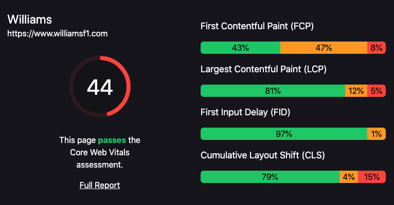
Let's take a look at the Williams too. They scored very similar scores but with a noticable difference:
Williams
The Lab Data didn't perform as well (which is totally fine! Lab Data has its purposes) and it passed the Core Vital assessment from the Field Data, collected from real-world users.
Time strips
Perhaps it is not always about the score? Take a look at the time strip Lighthouse has generated for both sites:
Racing Point Timestrip
Williams Timestrip
We can see that content is loaded earlier for Williams.
Read More
Jake Archbald has written a detailed post on who has the fastest website in F1. Highly recommend to read his break down analysis.
How does 'F1 Page Speed Insights' site work?
F1 Page Speed Insights was built using Next.js - Using the PageSpeed Insights API and the Chrome UX Report API to collect the data. Both sets of data are collected during the build of the app and a static export is deployed on Netlify. This site will refresh monthly for us to monitor changes to the data.


Top comments (0)