
I always wanted to have a tech blog, as a journal of my learnings and growth, but until now this idea seemed so far away from me because of my lack of self-confidence to share technology content with others, I always felt like I didn’t have anything innovative, attractive or even interesting to show. However, recently, I’ve been particularly inspired by my friends’ blogs, especially this one, by Alexandre Cisneiros, and I decided to just do it. I’ve been reading a lot about this and now I’m convinced that keeping a journal or a blog is not only about teaching something new frequently, but it’s also a matter of tracking my evolution as a programmer and become more self-confident about my skills, so I’m very excited to see what happens next.
CSS Animations
My strategy for maintaining a consistent writing routine will be to take baby steps, so I started building a simple CSS animation using only scales and translations. You can see the entire code below e then and I will explain a few concepts for a better understanding.
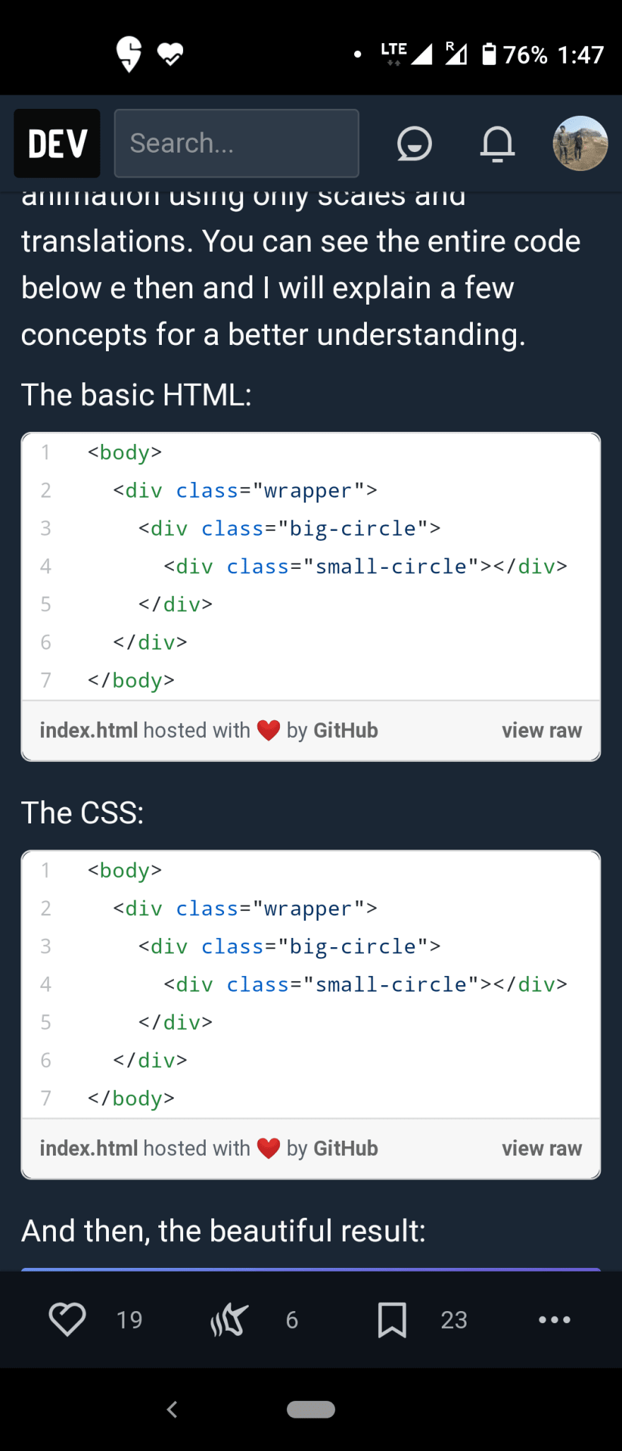
The basic HTML:
<body>
  <div class="wrapper">
    <div class="big-circle">
      <div class="small-circle"></div>
    </div>
  </div>
</body>
The CSS:
body {
  background: linear-gradient(90deg, rgba(122, 180,255,1) 0%, rgba(123,91,217,1) 100%);
}

.wrapper {
  margin-top: 200px;
}

.big-circle {
  animation: pulse 1.5s alternate infinite;
  margin: 0 auto;
  border-radius: 50%;
  width: 200px;
  height: 200px;
  background-color: rgba(255, 255,255,.3);
}

.small-circle {
  position: relative;
  top: 50px;
  left: 50px;
  border-radius: 50%;
  width: 100px;
  height: 100px;
  background-color: white;
}

.small-circle:hover {
  animation: shake .1s alternate infinite;
}

@keyframes pulse {
  from {
    transform: scale(1);
  }
  to {
    transform: scale(1.5);
  }
}

@keyframes shake {
  0% {
    transform: translate(0%);
  }
  25%, 75% {
    transform: translateY(1%);
  }
  50%, 100% {
    transform: translateX(1%);
  }
}
And then, the beautiful result:
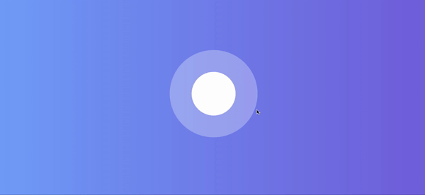
How it works
My focus here is to show you how these two animations work, pulse and shake, so the rest of the HTML and CSS can be the topic for another blog post.
According to MDN:
CSS animations make it possible to animate transitions from one CSS style configuration to another. Animations consist of two components, a style describing the CSS animation and a set of keyframes that indicate the start and end states of the animation’s style, as well as possible intermediate waypoints.
Let’s take a look at these two components.
Style describing the CSS animation
First of all, we have to set the style of our animation and this is what I did in these two lines.
Here:
animation: pulse 1.5s alternate infinite;
And here:
animation: shake .1s alternate infinite;
I chose the elements that I wanted to animate, in this case, the big circle and the small circle (in its hover state), and I used the shorthand version animation to configure the name, duration, direction, and iteration count of my animations.
However, I could write the complete version, as you can see below:
animation-name: pulse; // or shake
animation-duration: 1.5s; // or .1s
animation-direction: alternate;
animation-iteration-count: infinite;
These names are self-explained, but let's take a particular look in animation-direction, this property sets whether an animation should play forward, backward, or alternate back and forth between playing the sequence forward and backward. In this example, I used the alternate, which indicates that the animation reverses direction each cycle, with the first iteration being played forwards. You can check more here.
The keyframes
Ok, but where is our animation? I used the CSS @keyframes that controls the intermediate steps in a CSS animation sequence by defining styles for keyframes (or waypoints) along the animation sequence. As you can see in the two animations, we can use from/to or percentages to set how many keyframes we need along the animation course.
Finally, I used the transform function with scale, translate, translateX and translateY to build the final animation, in which the entire object is always scaling in and out, and then, if the small circle is in the hover state, the shake animation is activated.
I hope you enjoyed it! ;)


Top comments (7)
Small error. The html & css has same code called from GitHub raw.
omg, thank you! I don't know what happened, I checked and the links are ok here. Is it still happening?
Sadly, yes.
Congrats, Paula. Keep writing technical articles 👏
Thank you! <3
Clean and elegant, can't wait to see more examples like this one!
Thank you so much! <3