From the desk of @colin_walker
Continuing in our series of Dev Dashboard improvements, we're excited to deliver even more good news about expanded functions, ease of use improvements, and more ways we are giving you more information with fewer clicks. (To read about past improvements, see Dev Dashboard Improvements Abound! and Dev Dashboard Improvements, Round Two.)
My Apps & Credentials
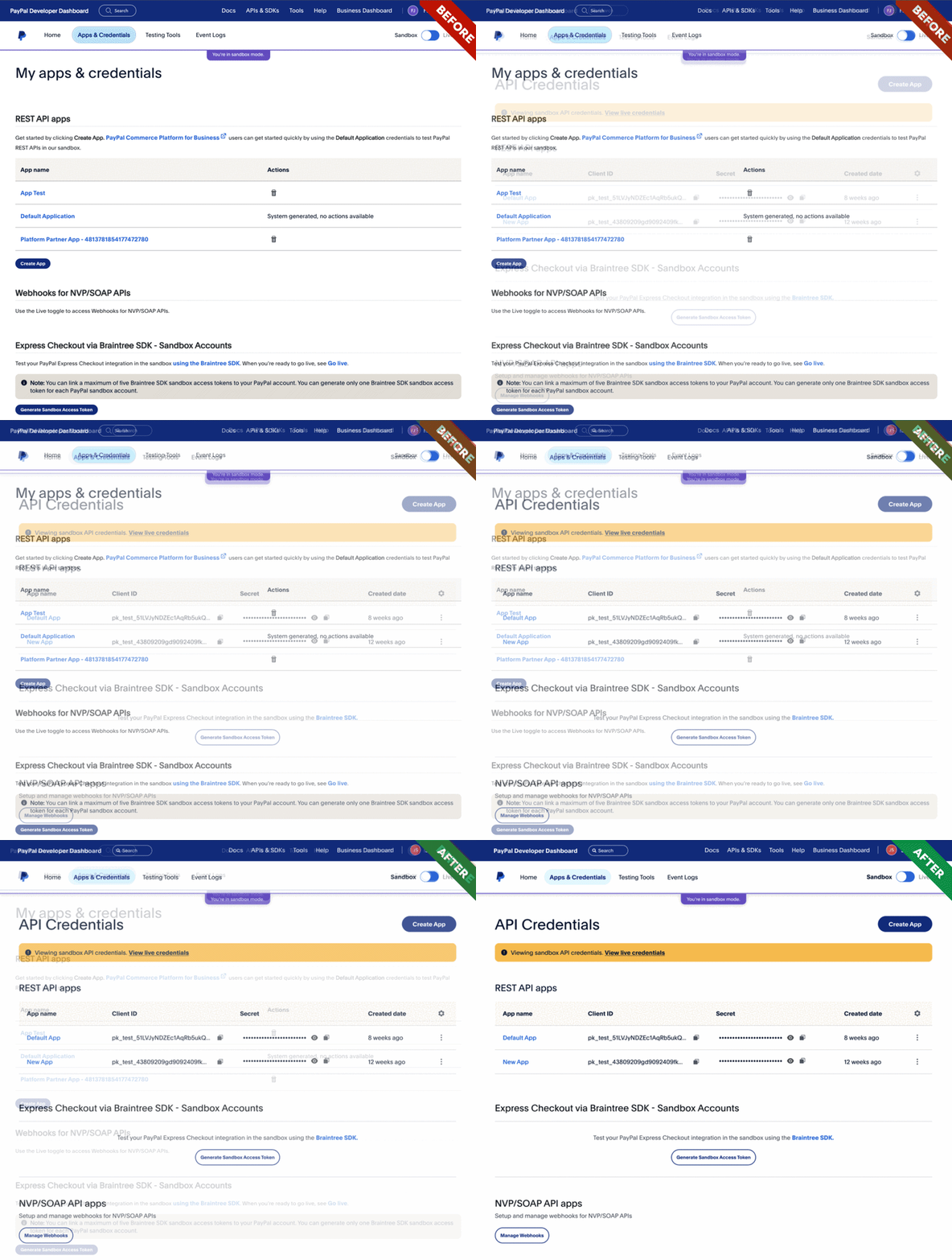
We want to continue to empower developers by saving them time. To do this, our goal for the latest Dev Dashboard release was to provide more information about apps on a single page and reduce the number of clicks it takes to get there. We also added a banner to alert developers when they are accessing their sandbox API credentials. This ensures developers are always aware of which credentials are being accessed before entering them into a local environment, thereby saving time and helping to avoid confusion when attempting to update live apps.
Application Details
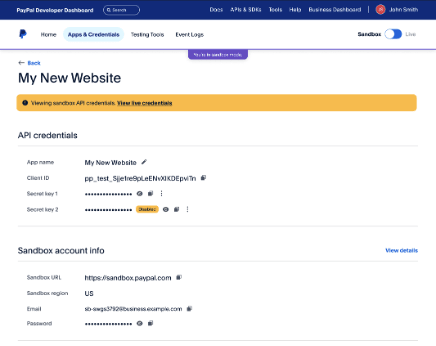
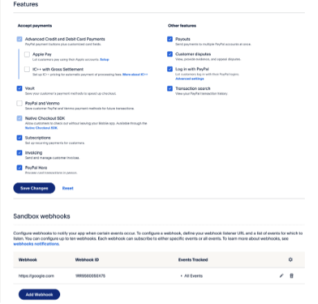
Another area where we're applying the "more for less" theme is the application details page, where we are adding more information and improving usability. With this version, we're now presenting account information tied to the specific application instance (sandbox or live account) to eliminate the need to switch between different pages within the logged-in experience. We've also reorganized the feature section of the application details to group features that are dependent on one another to reduce complexity when enabling features.
Log in with PayPal (also known as LIPP)
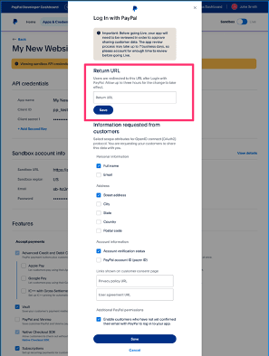
This feature has had a small update as well. We moved the Return URL from the App view and bundled it with activating Log in with PayPal. After enabling LIPP, users can configure their return URL and other LIPP input fields through a popup ensuring that these inputs are related to the LIPP feature and there's no need to toggle to find them.
Webhook Events
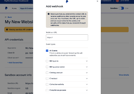
First, we've made adding webhook events easier, in line with the new LIPP style mentioned above. In this modal, it'll be easier to configure your webhook events.
Screenshot of new experience configuring webhook events
Previously, all webhook events were listed with no organization, such as grouping. In this new update, our team migrated to a modal, then grouped and organized webhook events by category, so developers can quickly view which webhook events are made available and are enabled. Are you sensing a theme?
I hope you're excited about these efficiency-focused, time-saving features. I know we are! As always, we'll keep doing what we can to offer the best dev user experience we're able. If there's anything in the dashboard on your wish list, don't hesitate to let us know!
To access the developer dashboard, visit the portal and sign up or log in to your dashboard here.



Top comments (0)