Dashboards for data visualisation, such as R Flexdashboard, R Shiny and Tableau, allow the interactive exploration of data by means of drop-down lists and checkboxes, with no coding required from the final users. The apps can be useful for both the data analyst and the public.

Visualisation apps run on internet browsers. This allows for three options: private viewing (useful during analysis), selective sharing (used within work groups), or internet publication. Among the available platforms, R Shiny and Tableau stand out due to being relatively accessible to new users. Apps serve a broad variety of purposes (see this gallery and this one). In science and beyond, these apps allow us to go the extra mile in sharing data. Alongside files and code shared in repositories, we can present the data in a website, in the form of plots or tables. This facilitates the public exploration of each section of the data (groups, participants, trials...) to anyone interested, and allows researchers to account for their proceeding in the analysis.

Publishers and journals highly encourage authors to make the most of their data by facilitating its easy exploration by the readership--even though they don't normally offer options for hosting web visualisations yet.

Apps can also prove valuable to those analysing the data. For instance, my app helped me a lot in identifying the extent of noise in a section of the data. Instead of running through a heavy score of code, the drop-down lists of the app let me seamlessly surf through the different sections.

At a certain point, I found a data section that was consistently noisier than the rest, and eventually I had to discard it from further statistical analyses. Yet, instead of removing that from the app, I maintained it with a note attached. This particular trait in the data was rather salient.

Beyond such a salient feature in the data, a visualisation app may also help to spot subtler patterns such as third variables or individual differences.
There are several platforms for creating apps (e.g., Tableau, D3.js and R Shiny). I focus on R Shiny here for three reasons: it is affordable to use, fairly accessible to new users, and well suited for science as it is based on the R language (see for instance this article).
How to Shiny
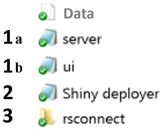
Shiny apps draw on any standard R code that you may already have. This is most commonly plots or tables, but other stuff such as images or Markdown texts are valid too. This is a nice thing to keep in mind when having to create a new app. Part of the job may already be done! The app is distributed among five different areas.
- Data file(s) These are whatever data files you're using (e.g., with csv or rds extensions).
1a. server.R script
The server script contains the central processes: plots, tables, etc. Code that existed independently of the app app may be brought into this script by slightly adapting it. At the top, call the shiny library and any others used (e.g., 'ggplot2'), and also read in the data. The snippet below shows the beginning of an example server.R script.
# server

library(shiny)
library(ggplot2)

EEG.ParticipantAndElectrode = readRDS('EEG.ParticipantAndElectrode.rds')
EEG.ParticipantAndBrainArea = readRDS('EEG.ParticipantAndBrainArea.rds')
EEG.GroupAndElectrode = readRDS('EEG.GroupAndElectrode.rds')
EEG.OLDGroupAndElectrode = readRDS('EEG.OLDGroupAndElectrode.rds')


server =

shinyServer(

  function(input, output) {

# plot_GroupAndElectrode:
    output$plot_GroupAndElectrode <- renderPlot({

dfelectrode <- aggregate(microvolts ~ electrode*time*condition,
EEG.GroupAndElectrode[EEG.GroupAndElectrode$RT.based_Groups==input$var.Group,], mean)

df2 <- subset(dfelectrode, electrode == input$var.Electrodes.1)

df2$condition= as.factor(df2$condition)
df2$condition <- gsub('visual2visual', ' Visual / Visual', df2$condition)
df2$condition <- gsub('haptic2visual', ' Haptic / Visual', df2$condition)
df2$condition <- gsub('auditory2visual', ' Auditory / Visual', df2$condition)

df2$time <- as.integer(as.character(df2$time))
colours <- c('firebrick1', 'dodgerblue', 'forestgreen')
# green:visual2visual, blue:haptic2visual, red:auditory2visual

spec_title = paste0('ERP waveforms for ', input$var.Group, ' Group, Electrode ', input$var.Electrodes.1, ' (negative values upward; time windows displayed)')

plot_GroupAndElectrode = ggplot(df2, aes(x=time, y=-microvolts, color=condition)) +
  geom_rect(xmin=160, xmax=216, ymin=7.5, ymax=-8, color = 'grey75', fill='black', alpha=0, linetype='longdash') +
  geom_rect(xmin=270, xmax=370, ymin=7.5, ymax=-8, color = 'grey75', fill='black', alpha=0, linetype='longdash') +
  geom_rect(xmin=350, xmax=550, ymin=8, ymax=-7.5, color = 'grey75', fill='black', alpha=0, linetype='longdash') +
  geom_rect(xmin=500, xmax=750, ymin=7.5, ymax=-8, color = 'grey75', fill='black', alpha=0, linetype='longdash') +
  geom_line(size=1, alpha = 1) + scale_linetype_manual(values=colours) +
  scale_y_continuous(limits=c(-8.38, 8.3), breaks=seq(-8,8,by=1), expand = c(0,0.1)) +
  scale_x_continuous(limits=c(-208,808),breaks=seq(-200,800,by=100), expand = c(0.005,0), labels= c('-200','-100 ms','0','100 ms','200','300 ms','400','500 ms','600','700 ms','800')) +
  ggtitle(spec_title) + theme_bw() + geom_vline(xintercept=0) +
  annotate(geom='segment', y=seq(-8,8,1), yend=seq(-8,8,1), x=-4, xend=8, color='black') +
  annotate(geom='segment', y=-8.2, yend=-8.38, x=seq(-200,800,100), xend=seq(-200,800,100), color='black') +
  geom_segment(x = -200, y = 0, xend = 800, yend = 0, size=0.5, color='black') +
  theme(legend.position = c(0.100, 0.150), legend.background = element_rect(fill='#EEEEEE', size=0),
    axis.title=element_blank(), legend.key.width = unit(1.2,'cm'), legend.text=element_text(size=17),
    legend.title = element_text(size=17, face='bold'), plot.title= element_text(size=20, hjust = 0.5, vjust=2),
    axis.text.y = element_blank(), axis.text.x = element_text(size = 14, vjust= 2.12, face='bold', color = 'grey32', family='sans'),
    axis.ticks=element_blank(), panel.border = element_blank(), panel.grid.major = element_blank(),
    panel.grid.minor = element_blank(), plot.margin = unit(c(0.1,0.1,0,0), 'cm')) +
  annotate('segment', x=160, xend=216, y=-8, yend=-8, colour = 'grey75', size = 1.5) +
  annotate('segment', x=270, xend=370, y=-8, yend=-8, colour = 'grey75', size = 1.5) +
  annotate('segment', x=350, xend=550, y=-7.5, yend=-7.5, colour = 'grey75', size = 1.5) +
  annotate('segment', x=500, xend=750, y=-8, yend=-8, colour = 'grey75', size = 1.5) +
  scale_fill_manual(name = 'Context / Target trial', values=colours) +
  scale_color_manual(name = 'Context / Target trial', values=colours) +
  guides(linetype=guide_legend(override.aes = list(size=1.2))) +
   guides(color=guide_legend(override.aes = list(size=2.5))) +
# Print y axis labels within plot area:
  annotate('text', label = expression(bold('\u2013' * '3 ' * '\u03bc' * 'V')), x = -29, y = 3, size = 4.5, color = 'grey32', family='sans') +
  annotate('text', label = expression(bold('+3 ' * '\u03bc' * 'V')), x = -29, y = -3, size = 4.5, color = 'grey32', family='sans') +
  annotate('text', label = expression(bold('\u2013' * '6 ' * '\u03bc' * 'V')), x = -29, y = 6, size = 4.5, color = 'grey32', family='sans')

print(plot_GroupAndElectrode)

output$downloadPlot.1 <- downloadHandler(
    filename <- function(file){
    paste0(input$var.Group, ' group, electrode ', input$var.Electrodes.1, ', ', Sys.Date(), '.png')},
    content <- function(file){
            png(file, units='in', width=13, height=5, res=900)
            print(plot_GroupAndElectrode)
            dev.off()},
    contentType = 'image/png')
  } )

# ...
1b. ui.R script
The ui script defines the user interface. For instance, a factor column in the data that has multiple categories may be neatly displayed with a drop-down list on the side bar of the website. The interface may present a central plot before by a legend key below. The snippet below shows the beginning of an example ui.R script.
# UI

library(shiny)
library(ggplot2)

EEG.GroupAndElectrode = readRDS('EEG.GroupAndElectrode.rds')
EEG.ParticipantAndBrainArea = readRDS('EEG.ParticipantAndBrainArea.rds')
EEG.ParticipantAndElectrode = readRDS('EEG.ParticipantAndElectrode.rds')
EEG.OLDGroupAndElectrode = readRDS('EEG.OLDGroupAndElectrode.rds')


ui =

shinyUI(

   fluidPage(

    tags$head(tags$link(rel='shortcut icon', href='https://image.ibb.co/fXUwzb/favic.png')),  # web favicon
    tags$meta(charset='UTF-8'),
    tags$meta(name='description', content='This R Shiny visualisation dashboard presents data from a psycholinguistic ERP experiment (Bernabeu et al., 2017).'),
    tags$meta(name='keywords', content='R, Shiny, ggplot2, visualisation, data, psycholinguistics, conceptual processing, modality switch, embodied cognition'),
    tags$meta(name='viewport', content='width=device-width, initial-scale=1.0'),

    titlePanel(h3(strong('Waveforms in detail from an ERP experiment on the Conceptual Modality Switch'), a('(Bernabeu et al., 2017)',
    href='https://figshare.com/articles/EEG_study_on_conceptual_modality-switching_Bernabeu_et_al_in_prep_/4210863', target='_blank',
    style = 'color:#3E454E; text-decoration:underline; font-weight:normal'),    align = 'center', style = 'color:black'),

    windowTitle = 'Visualization of ERP waveforms from experiment on Conceptual Modality Switch (Bernabeu et al., 2017)'),


    sidebarLayout(
    sidebarPanel(width = 2,


# Condition 1 for reactivity between tabs and sidebars

   conditionalPanel(
    condition = 'input.tabvals == 1',

    h5(a(strong('See paper, statistics, all data.'), 'Plots by group and brain area shown in paper.',
    href='https://figshare.com/articles/EEG_study_on_conceptual_modality-switching_Bernabeu_et_al_in_prep_/4210863',
    target='_blank'), align = 'center'),
br(),

    selectInput('var.Group', label = 'Group', choices = list('Quick','Slow'), selected = 'Quick'),
    h6('Quick G.: 23 participants'),
    h6('Slow G.: 23 participants'),
br(),

    selectInput('var.Electrodes.1', label = h5(strong('Electrode'), br(), '(see montage below)'),
                  choices = list('1','2','3','4','5','6','7','8','9','10',
            '11','12','13','14','15','16','17','18','19','20','21',
            '22','23','24','25','26','27','28','29','30','31','33',
            '34','35','36','37','38','39','40','41','42','43','44',
            '45','46','47','48','49','50','51','52','53','54','55',
            '56','57','58','59','60'), selected = '30' ),
br(), br(),

    h6('Source code:'),
    h6(strong('-  '), a('server.R', href='https://osf.io/uj8z4/', target='_blank', style = 'text-decoration: underline;')),
    h6(strong('-  '), a('ui.R', href='https://osf.io/8bwcx/', target='_blank', style = 'text-decoration: underline;')),
br(),
    h6(a('CC-By 4.0 License', href='https://osf.io/97unm/', target='_blank'), align = 'center', style = 'text-decoration: underline;'),

br(), br(), br(), br(), br(), br(), br(), br(), br(), br(), br(), br(), br(), br(),
br(), br(), br(), br(), br(), br(), br(), br(), br(), br(), br(), br(), br(), br(), br(), br(), br(), br(),

    h5(a(strong('See paper, statistics, all data.'),
    href='https://figshare.com/articles/EEG_study_on_conceptual_modality-switching_Bernabeu_et_al_in_prep_/4210863',
    target='_blank'), align = 'center'),
br(), br(), br(), br(), br(), br(), br(), br()
),

# ...
2. Deployment and logs
This script contains the commands for deploying the app on- or off-line, and for checking the session logs in case of any errors.
3. Automatically created folder
When the app is first deployed on the internet, a subfolder is automatically created with the name 'rsconnect'. This folder contains a text file which can be used to modify the URL and the title of the webpage.
Steps to create a Shiny app from scratch:

As mentioned above, create a ui.R script for the code containing the user interface, and create a server.R script for the code containing the main content (your plots / tables, etc).
At the top of both ui.R and server.R scripts, enter the command library(shiny) and also load any other libraries you're using (e.g., ggplot2).
Test your app by deploying it locally, before launching online. For this purpose, first save the ui and server parts independently, as in:
ui =

 shinyUI(

   fluidPage(

# ...
Then deploy locally by running:
shinyApp(ui, server)
Managing to run the app locally is a great first step before launching online (which may sometimes prove a bit trickier).
2. User token (link). Sign up and read in your private key—just to be done once in a computer.
3. Go for it. After locally testing and saving the two main scripts (ui.R and server.R), run deployApp() to launch the app online.
4. Bugs and session logs. Most often they won't be bugs actually, but fancies, as it were. For instance, some special characters have to get even more special (technically, UTF-8 encoding). For a character such as 'μ', Shiny prefers 'Âμ', or better, the Unicode expression("\u03bc").
Cling to your logs by calling the line below, which you may keep at hand in your 'Shiny deployer.R' script.
showLogs(appPath = getwd(), appFile = NULL, appName = NULL, account = NULL,
entries = 50, streaming = FALSE)
At best, the log output will mention any typos and unaccepted characters, pointing to specific lines in your code.
It may take a couple of intense days to get a first Shiny app running. Although the usual rabbit holes do exist, years of Shiny have already yielded a sizeable body of free resources online (tutorials, blogs, vlogs). Moreover, there's also the RStudio Community and then StackOverflow etc., where you can post any needs/despair. Post your code, log and explanation, and you’ll be rescued out in a couple of days. Long live those contributors.
It's sometimes enough to upload a bare app, but you might then think it can look better.
5 (optional). Advance. Use tabs to combine multiple apps on one webpage, use different widgets, include a download option, etc. Tutorials like this one on Youtube can take you there, especially those that provide the code, as in the description of that video. Use those scripts as templates. For example, I made use of tabs on the top of the dashboard in order to keep the side bar from having too many widgets. The appearance of these tabs can be adjusted. More importantly, the inputs in the sidebar can be modified depending on the active tab, by means of 'reactivity' conditions.
mainPanel(

    tags$style(HTML('
        .tabbable > .nav > li > a                       {background-color:white; color:#3E454E}
        .tabbable > .nav > li > a:hover                 {background-color:#002555; color:white}
        .tabbable > .nav > li[class=active] > a         {background-color:#ECF4FF; color:black}
        .tabbable > .nav > li[class=active] > a:hover   {background-color:#E7F1FF; color:black}
    ')),

    tabsetPanel(id='tabvals',

            tabPanel(value=1, h4(strong('Group & Electrode')), br(), plotOutput('plot_GroupAndElectrode'),
            h5(a(strong('See plots with 95% Confidence Intervals'), href='https://osf.io/2tpxn/',
            target='_blank'), style='text-decoration: underline;'),
            downloadButton('downloadPlot.1', 'Download HD plot'), br(), br(),
            # EEG montage
            img(src='https://preview.ibb.co/n7qiYR/EEG_montage.png', height=500, width=1000)),

            tabPanel(value=2, h4(strong('Participant & Area')), br(), plotOutput('plot_ParticipantAndLocation'),
            h5(a(strong('See plots with 95% Confidence Intervals'), href='https://osf.io/86ch9/',
            target='_blank'), style='text-decoration: underline;'),
            downloadButton('downloadPlot.2', 'Download HD plot'), br(), br(),
            # EEG montage
            img(src='https://preview.ibb.co/n7qiYR/EEG_montage.png', height=500, width=1000)),

            tabPanel(value=3, h4(strong('Participant & Electrode')), br(), plotOutput('plot_ParticipantAndElectrode'),
            br(), downloadButton('downloadPlot.3', 'Download HD plot'), br(), br(),
            # EEG montage
            img(src='https://preview.ibb.co/n7qiYR/EEG_montage.png', height=500, width=1000)),

            tabPanel(value=4, h4(strong('OLD Group & Electrode')), br(), plotOutput('plot_OLDGroupAndElectrode'),
            h5(a(strong('See plots with 95% Confidence Intervals'), href='https://osf.io/dvs2z/',
            target='_blank'), style='text-decoration: underline;'),
            downloadButton('downloadPlot.4', 'Download HD plot'), br(), br(),
            # EEG montage
            img(src='https://preview.ibb.co/n7qiYR/EEG_montage.png', height=500, width=1000))
    ),
The official Shiny gallery offers a great array of apps including their code (e.g., basic example). Another feature you may add is the option to download your plots, tables, data...
# In ui.R script

downloadButton('downloadPlot.1', 'Download HD plot')

#___________________________________________________


# In server.R script

spec_title = paste0('ERP waveforms for ', input$var.Group, ' Group, Electrode ', input$var.Electrodes.1, ' (negative values upward; time windows displayed)')

plot_GroupAndElectrode = ggplot(df2, aes(x=time, y=-microvolts, color=condition)) +
  geom_rect(xmin=160, xmax=216, ymin=7.5, ymax=-8, color = 'grey75', fill='black', alpha=0, linetype='longdash') +
  geom_rect(xmin=270, xmax=370, ymin=7.5, ymax=-8, color = 'grey75', fill='black', alpha=0, linetype='longdash') +
  geom_rect(xmin=350, xmax=550, ymin=8, ymax=-7.5, color = 'grey75', fill='black', alpha=0, linetype='longdash') +
  geom_rect(xmin=500, xmax=750, ymin=7.5, ymax=-8, color = 'grey75', fill='black', alpha=0, linetype='longdash') +
  geom_line(size=1, alpha = 1) + scale_linetype_manual(values=colours) +
  scale_y_continuous(limits=c(-8.38, 8.3), breaks=seq(-8,8,by=1), expand = c(0,0.1)) +
  scale_x_continuous(limits=c(-208,808),breaks=seq(-200,800,by=100), expand = c(0.005,0), labels= c('-200','-100 ms','0','100 ms','200','300 ms','400','500 ms','600','700 ms','800')) +
  ggtitle(spec_title) + theme_bw() + geom_vline(xintercept=0) +
  annotate(geom='segment', y=seq(-8,8,1), yend=seq(-8,8,1), x=-4, xend=8, color='black') +
  annotate(geom='segment', y=-8.2, yend=-8.38, x=seq(-200,800,100), xend=seq(-200,800,100), color='black') +
  geom_segment(x = -200, y = 0, xend = 800, yend = 0, size=0.5, color='black') +
  theme(legend.position = c(0.100, 0.150), legend.background = element_rect(fill='#EEEEEE', size=0),
    axis.title=element_blank(), legend.key.width = unit(1.2,'cm'), legend.text=element_text(size=17),
    legend.title = element_text(size=17, face='bold'), plot.title= element_text(size=20, hjust = 0.5, vjust=2),
    axis.text.y = element_blank(), axis.text.x = element_text(size = 14, vjust= 2.12, face='bold', color = 'grey32', family='sans'),
    axis.ticks=element_blank(), panel.border = element_blank(), panel.grid.major = element_blank(),
    panel.grid.minor = element_blank(), plot.margin = unit(c(0.1,0.1,0,0), 'cm')) +
  annotate('segment', x=160, xend=216, y=-8, yend=-8, colour = 'grey75', size = 1.5) +
  annotate('segment', x=270, xend=370, y=-8, yend=-8, colour = 'grey75', size = 1.5) +
  annotate('segment', x=350, xend=550, y=-7.5, yend=-7.5, colour = 'grey75', size = 1.5) +
  annotate('segment', x=500, xend=750, y=-8, yend=-8, colour = 'grey75', size = 1.5) +
  scale_fill_manual(name = 'Context / Target trial', values=colours) +
  scale_color_manual(name = 'Context / Target trial', values=colours) +
  guides(linetype=guide_legend(override.aes = list(size=1.2))) +
   guides(color=guide_legend(override.aes = list(size=2.5))) +
# Print y axis labels within plot area:
  annotate('text', label = expression(bold('\u2013' * '3 ' * '\u03bc' * 'V')), x = -29, y = 3, size = 4.5, color = 'grey32', family='sans') +
  annotate('text', label = expression(bold('+3 ' * '\u03bc' * 'V')), x = -29, y = -3, size = 4.5, color = 'grey32', family='sans') +
  annotate('text', label = expression(bold('\u2013' * '6 ' * '\u03bc' * 'V')), x = -29, y = 6, size = 4.5, color = 'grey32', family='sans')

print(plot_GroupAndElectrode)

output$downloadPlot.1 <- downloadHandler(
    filename <- function(file){
    paste0(input$var.Group, ' group, electrode ', input$var.Electrodes.1, ', ', Sys.Date(), '.png')},
    content <- function(file){
            png(file, units='in', width=13, height=5, res=900)
            print(plot_GroupAndElectrode)
            dev.off()},
    contentType = 'image/png')
  } )
Apps can include any text, such as explanations of any length and web links. For instance, we can link back to the data repository, where the code for the app can be found.

An example of a Shiny app is available, which may also be edited and run in this RStudio environment, inside the 'Shiny-app' folder.
The Shiny server (shinyapps.io) allows publishing dashboards built with various frameworks besides Shiny proper. Flexdashboard and Shinydashboard are two of these frameworks, which have visible advantages over basic Shiny, in terms of layout. An example with Flexdashboard is available.

Logistics
Memory capacity can become an issue as you go on, which will be flagged in the error logs as: 'Shiny cannot use on-disk bookmarking'. This doesn't necessarily lead you to a paid subscription or to host the website on a custom server. Try pruning the data file, outsourcing data sections across the five available apps.
App providers have specific terms of use. To begin, Shiny has a free starter license with limited use, where free apps can handle a certain amount of data, and up to five apps may be created. Beyond that, RStudio offers a wide range of subscriptions starting at $9/month. For its part, Tableau in principle deals only with subscriptions from $35/month on. While they offer 1-year licenses to students and instructors for free, these don't include web hosting, unlike Shiny's free plan. Further comparisons of these platforms are available online. Last, I'll just mention a third language, D3, which is powerful, and may also be used through R.
In the case of very heavy data or frequent public use, if you don't want to host your Shiny app externally, you might consider rendering a PDF with your visualisations instead.
pdf("List of plots per page", width=13, height=5)
print(plot1)
print(plot2)
# ...
print(plot150)
dev.off()
High-resolution plots can be rendered into a PDF document in a snap. Conveniently, all text is indexed, so it can be searched (Ctrl+f / Cmd+f / 🔍) (see example). Furthermore, you may also merge the rendered PDF with any other documents.
Summary in slides available.
Feel free to share any thoughts or questions in a comment below.

Top comments (0)