While working on a project, I needed to change the position of two divs based on screen size. This meant that when the website is viewed on desktop, the divs are stacked same way as designed but when viewed on mobile, the divs should be reversed. I already knew there was a css property using display: none but that would mean duplicating code. Several solutions found only discussed row/column reverse. After some experimentation, I realized I could just reverse the flex direction. The goal of this tutorial is to show both div reverse ordering and column reverse ordering based on screen width <500px. Let us begin.
The Goals
Div Reverse

Div Reverse Mobile
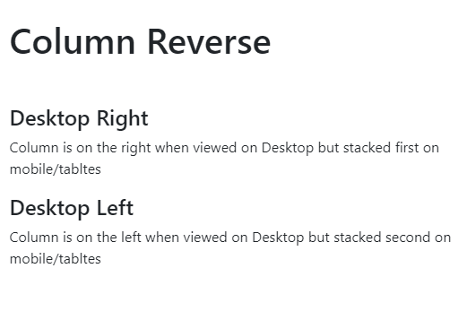
Column Reverse

Column Reverse Mobile
The Markup
Since I am using bootstrap, I added a few inline styles:
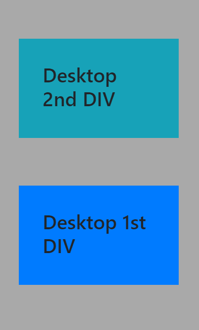
<div class="divReverse p-5 mt-5 mb-4">
  <div class="mb-5 mt-5 p-5 bg-primary">
    <h1 class="first">Desktop 1st DIV </h1>
  </div>
  <div class="mb-5 mt-5 p-5 bg-info">
    <h1>Desktop 2nd DIV </h1>
  </div>
</div>
Basic Styles
Used some CSS methods to reverse the div order
@media only screen and (max-width: 600px) {
  .divReverse {
    background: #A9A9A9;
    display: flex;
    flex-wrap: wrap-reverse;
  }
}
Conclusion
In this tutorial, we saw how we can easily reverse a div. For the complete code and that of column-reverse ordering, I have added a link to codepen https://codepen.io/dukeofwest/pen/JjdKbEV


Top comments (2)
Great Tuts...👍
Thanks @frank . The goal is to deliver more before the end of the year