
I recently joined Booking.com, apart from the fact that this is a very interesting company that faces complex challenges every day, for me it was an opportunity to look at the colourful side of the company. I chose to take a small technical challenge and create the company's brand logo only using CSS, that is, without the use of images, minimal coding and of course in an innovative & optimal way.
In this post I will walk you through a step-by-step guide and share with you code examples, thoughts and knowledge that will also make you experts who can implement this logo (or similar ones) in 4 easy steps.
First, lets get impressed with the outcome we are going to achieve:
What technologies are being used here?
- Flexbox // css-tricks flexbox guide or this practical guide
- Responsive web design using Media Queries // W3C Doc
- SCSS // https://sass-lang.com/guide.
- Some more advanced features of CSS.
Step 0/4: Defining the colours palette & requirements
Like a good handyman or a shoemaker, before actually doing the task, we, too, as client side developers needs the right tools for the right job.
Luckily, this is only a design implementation exercise, however, we are aiming for a perfect result that requires both using the precise colours and implementing rest of the design characteristics elements in the logo. For the benefit of these, we will extract the necessary colours and understand the requirements & the overall look needed for the logo.
This is a colours palette presented in a nice way but we won't really need this visual presentation in the next step, besides the hex colours itself.
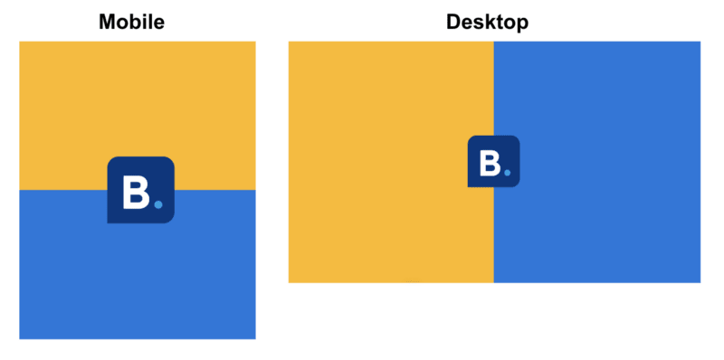
Step 1/4: Creating the responsive layout
Let's set the right layout for the logo, first we will split the background into two items, then, we will colour each item in a different colour and make it aesthetic to our needs.
The main
bodyof the HTML has some built-in browser styles applied to it and these can conflict with our design, so let's reset these and style it withmargin: 0.Thinking Mobile-first:
Markup: We would like to have a nice markup that can be used for both Mobile and Desktop while on both devices we basically have the same idea - two items which are contained either inside a row or a column. Note: we would not want to manipulate the DOM for any device change but simply adjust the stylings accordingly.
Styles: We are going to take the advantage of the mobile-first approach and basically style it for mobile with 1 column and 2 rows, and have few more additional styles to be used when the desktop is targeted so it can have instead 1 row with 2 columns.HTML markup: We would have a basic
divcontainer (withcontainerclass) that has twodivitems nested within it (each should haveitemclass). Note: since we are using here block-elements,divitem one will occupy the first line of its containing element (thecontainer) followed by the seconddivitem - which is exactly what we need for the Mobile!Desktop Target: To apply styles to Desktop - we will use a media query that let us scope styles according to a media device (by minimum width of pixels) when targeted:
@media screen and (min-width: 600px) { /* styles for Desktop will be placed here */.Desktop Stylings: These can be achieved in many ways (floats & clear, grid, flexbox), while I find it easier to implement using Flexbox. The main container will act as the "flex container" (which sets the context for the flexbox layout) and the div items will be the "flex items" (the actual elements we layout using flexbox). It worth mentioning that any element (block-level or inline-element) can be a flex container.
The flex container: let's set the container div with
display: flex(this will get the two items as columns to be side by side) and to make sure it fills up the screen we will also addheight: 100vh(W3 Doc about viewport height). What about theflex-direction(which sets the direction of the main-axis)? Basically we don't need to set it since the default value isrow(that fits our needs), but since we want this to be clear we will set it ourselves withflex-direction:row.The flex items: Each div column item should have 50% of screen size. The flex way of doing this would simply be by applying to it
flex: 1. Note: (1) We could set any number we want (for example:flex: 100, as it will be equal for each column anyway). (2) Yes, we could usewidth: 50vwinstead of the flex styling (but let's avoid it this time..).To colour the items, we will add the SCSS colour variables and use its accordingly:
$bg-left-color: #feba02;
$bg-right-color: #1875dd;
//...
&:nth-child(1) {
    background: $bg-left-color;
}
&:nth-child(2) {
    background: $bg-right-color;
}
Final result would be:
/* Mobile first approach */
.container {
  min-height: 100vh;
.item {
    min-height: 50vh;
&:nth-child(1) {
      background: $bg-left-color;
    }
    &:nth-child(2) {
      background: $bg-right-color;
    }
  }
}
/* Desktop */
@media screen and (min-width: 600px) {
  .container {
    display: flex;
    flex-direction: row;
.item {
      flex: 1;
    }
  }
}
Step 2/4: Shaping the logo
Let’s add another
divto our layout (the logo container) with alogoclass and place it inside the main container.Shaping this container as the logo requires the following styling:
 height: 100px;
  width: 100px;
  position: absolute;
  left: 50%;
  top: 50%;
  margin: -50px;                 // Place it in middle
  border-radius: 17% 17% 17% 0;  // Making fancy borders
Note: Make sure you understand how we were able to place in the middle of the screen using both left: 50%; top: 50%.
- Finally, let’s colour it! Add
$logo-bg-color: #003580;variable and apply it on the.logoclass using:background: $logo-bg-color;
Step 3/4: Adding the “B” letter
Though we don’t need to add extra HTML markup for the B content, we do want that the inserted B content of the logo will be fully owned and styled by the logo. A nice way to achieve this would be to use the
::beforeselector which is available in CSS. Before using it, let’s add first the colour variable needed:$logo-text-color: #fff;(white colour).Adding the “B” text can be done using the following styling:
.logo:before {
  color: $logo-text-color;
  content: "B";
  display: block;
  font: bold 70px BlinkMacSystemFont, -apple-system, "Segoe UI", Roboto, Helvetica, Arial, sans-serif;
  margin: 10% 0% 0% 20%;
}
Note: The “B” text is written as string in the content property (W3 Doc) which can be used only with the ::before and ::after pseudo-elements.
Step 4: Adding the logo’s dot shape
Ok so we are almost done, it is time to add the extra “dot” in the logo to finalise it’s look:
Add the needed colour $logo-dot-color: #009fe3; and continue on to the next step. This time we are going to use another pseudo-element — ::after, and apply the following styling:
.logo:after {
  background-color: $logo-dot-color;
  content: "";
  display: block;
  width: 12px;
  height: 12px;
  -moz-border-radius: 7.5px;
  -webkit-border-radius: 7.5px;
  border-radius: 7.5px;
  top: 66px;
  right: 18px;
  position: absolute;
}
Focusing on what we just implemented — At this step we were using ::after and on the previous step (when we added the “B” text) we used ::before — this kinda makes sense as we progressively created the entire logo.
Interesting point to think about: What would happen if we switched between these two pseudo-elements (and keep the stylings as is), will the stylings be applied correctly? In other words, this step would use the ::before and the previous one would use ::after — can this achieve the same result? — Try it and make sure you understand what happens...
Cheers! We finally have our nice logo :)
Note: I have set the proper font (used in the “B” letter) only for the final result.
If you liked the article, please click the ❤️ below so other people will see it on DEV.to :) ! Feel free to follow me on Github


Top comments (0)