We can all agree that Horizontal Scrolling for a Website is a bit unusual. We mostly see and create vertical, well also default scrolling for websites, but to be honest, there is something in horizontal scroll.
Yes it is unusual, yes it is a surprise for our visitors and all of that is good, but how do we even make it? Let me show you and guide you through the process of creating of creation such a website.
What will you create today?
Well, the idea for this is very simple. We will create a Website which will hold 5 Sections and we will be able to scroll through those by using Horizontal Scroll.
If you wish to follow my code in the video version, not just in the written version, I also have a full video for this example and you can find it on my YouTube Channel.
YouTube Video - How to Create a Website with Horizontal Scrolling
If you wish to see a full code example of this project, then I advise you to take a look into my CodePen, there you can find full code for Website with Horizontal Scrolling.
CodePen Example - How to Create a Website with Horizontal Scrolling
Setup your Project
First of all, before we start working on Horizontal Scroll, well, we must have a project and also set up that project. Let's first create an index.html file and also styles.css file.
index.html
<!DOCTYPE html>
<html>
 <head>
  <meta charset="UTF-8" />
  <meta name="viewport" content="width=device-width, initial-scale=1.0" />
  <title>Horizontal Website</title>
 </head>

 <body>
 </body>
</html>
styles.css
/* Base */
* {
 margin: 0;
 padding: 0;
}
body {
 font-family: 'Lucida Sans', 'Lucida Sans Regular', 'Lucida Sans Unicode', Geneva, Verdana, sans-serif;
}
Few things that you can see is that we will start off with a simple html file, but for our css, we will reset spacing with margin and padding on all elements and also we will change default font to font that we wish to use ( you can use another one ).
One thing now, don't forget to import your css file into your index file, otherwise, you will not see any styling that we will write.
<link rel="stylesheet" href="./styles.css" />
Create a Wrapper
Now that our project is set, we can start working on it. Let's first create a wrapper that will hold our content and specific content wrapper that will hold our sections.
<!-- Container -->
<div class="container">
 <!-- Content Wrapper -->
 <div class="content-wrapper">
 </div> <!-- End of Content Wrapper -->
</div> <!-- End of Container -->
Sections and Content for Those
Now that we have our wrapper for our content, let's create that content. To be more precise, let's create our 5 sections that we will have and also content for those.
<!-- Container -->
<div class="container">
 <!-- Content Wrapper -->
 <div class="content-wrapper">
  <div class="section one">
    <div>One</div>
  </div>
  <div class="section two">
    <div>Two</div>
  </div>
  <div class="section three">
    <div>Three</div>
  </div>
  <div class="section four">
    <div>Four</div>
  </div>
  <div class="section five">
    <div>Five</div>
  </div>
 </div> <!-- End of Content Wrapper -->
</div> <!-- End of Container -->
Okay, good, we now have all 5 sections that we need. One thing that you can notice is that each of our sections have specific, well different class to that section. Well, as we will style those differently a bit, I added specific class to each of those.
Your page now should look something like this…
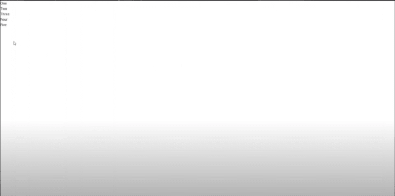
Nothing much to see, just our text for each of our sections that we have.
Removing Vertical and Adding Horizontal Scrolling
As we prepared our markup now, we can set up our Horizontal Scroll and remove our Vertical Scroll.
Removing Vertical Scroll
To remove Vertical Scroll, we must hide it and we will do that on a body level of our web page.
body {
 font-family: 'Lucida Sans', 'Lucida Sans Regular', 'Lucida Sans Unicode', Geneva, Verdana, sans-serif;
 overflow-y: hidden;
}
Adding Horizontal Scroll
Now that we removed our Horizontal Scroll, our plan is to use our .container section as a scrollable section and we will also make our .content-wrapper in that way that it won't wrap our sections.
By doing that, we are assuring that our sections can be aligned next to each other.
/* Container */
.container {
 width: 100vw;
 height: 100vh;
}
/* Content Wrapper */
.content-wrapper {
 width: 100vw;
 white-space: nowrap;
}
Aligning Sections and Text Inside
We don't have much to do now, we prepared everything, so let's just align our content.
Let's first make sure that our sections are in full width of our screen and also let's make sure that those are aligned next to each other.
/* Sections */
.section {
 width: 100vw;
 height: 100vh;
 display: inline-block;
}
Let's now make sure to put our text, well content of each section in the center of it and also, while we are working on that, let's also style it a bit.
First, make sure to add position relative on your sections, as we will absolutely style our content inside.
Add this to your .section in css
position: relative;
Now, to style content of our sections
/* Headings */
.section div {
 font-size: 100px;
 color: #000000;
 position: absolute;
 top: 50%;
 left: 50%;
 transform: translateX(-50%) translateY(-50%)
}
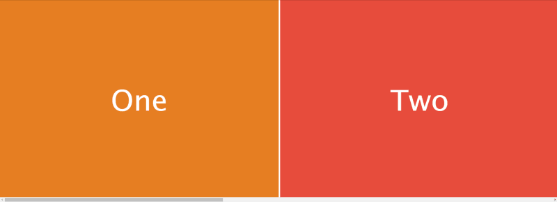
Don't worry now, I know that you see only white screen now. That is only because we have background color as default which is one and we also colored our section content into white.
Let's make sure to change that.
Coloring our Sections
Now we will add background colors to each of our sections, that's why we also added specific classes to our sections.
By the way, feel free to use the colors that you wish.
/* Coloring */
.one {
 background-color: #e67e22;
}
.two {
 background-color: #e74c3c;
}
.three {
 background-color: #2c3e50;
}
.four {
 background-color: #27ae60;
}
.five {
 background-color: #3498db;
}
You should be able now to see your content and also you should be able to scroll through your sections Horizontally.
Conclusion
Here we are, at the very end. Horizontal Scrolling is something very surprising to see and in most cases, it will drive people's attention, so, maybe your viewers would like to stay longer on your page and see what is all about.
As it is unusual behaviour for a Website, it is rarely used, but if you plan to use it, I would like to honestly see your projects. So make sure to create code examples of those and share those with me by commenting on this Blog Post.
If you like to see more of my content, feel free to check my other posts. Also, make sure to subscribe to my YouTube Channel for more Tutorials.

Latest comments (0)