
When we talk about flexbox properties we should separate between properties for parent & properties for children
Properties for the Parent
- Display
.container {display: flex;} vs .container {display: inline-flex;}
Well, both of them has the same effect on the children but the only different is on the parent. flex-inline makes the parent display inline.
- Flex-Direction
There are 4 main directions which are:
-
.container{flex-direction: row}(default)
the main axis is from left to right & the cross axis is from top to bottom
.container{flex-direction: row-reverse}
the main axis is from right to left & the cross axis is from top to bottom
.container{flex-direction: column}
the main axis is from top to bottom & the cross axis is from left to right
.container{flex-direction: column-reverse}
the main axis is from bottom to top & the cross axis is from left to right
But what is the main axis & cross axis?
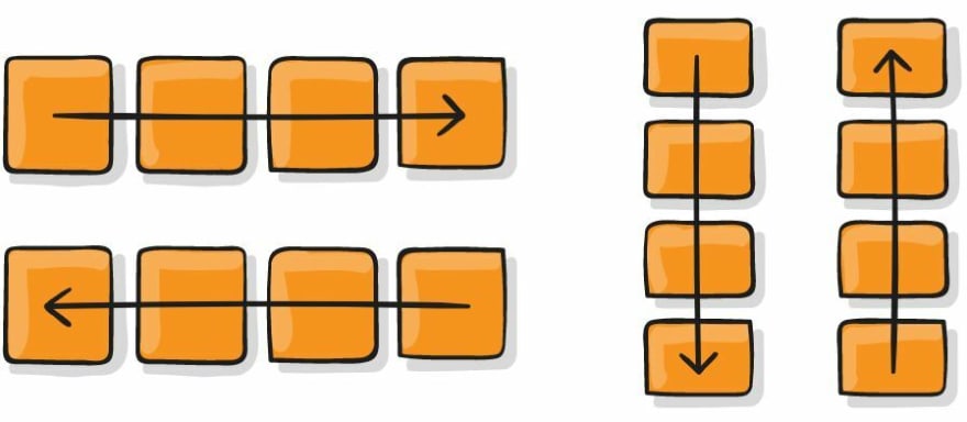
Let's first understand the axis in the flexbox. Flexbox is a one dimension layout which means it apply the flex properties on only one dimension. That means we have more than one axis which are the main axis & the cross axis
- Flex-Wrap
By default, flex items will all try to fit onto one line. We can change that and allow the items to wrap as needed with this property.
-
.container{flex-wrap: nowrap}(default)
all flex items will be on one line
.container{flex-wrap: wrap}
flex items will wrap onto multiple lines, from top to bottom.
.container{flex-wrap: wrap-reverse}
flex items will wrap onto multiple lines from bottom to top.
- Flex-Flow
Well, flex-flow is shorthand for the flex-direction and flex-wrap properties. For example
.container {flex-flow: column wrap;}
- Justify-Content
justify-content defines the alignment along the main axis so that it helps us to distribute extra free space leftover. And its types are:

-
.container{justify-content: flex-start}(default)
items are packed toward the start of the flex-direction.
.container{justify-content: flex-end}
items are packed toward the end of the flex-direction.
.container{justify-content: center}
items are centered along the line.
.container{justify-content: space-between}
items are evenly distributed in the line; first item is on the start line, last item on the end line.
.container{justify-content: space-around}
items are evenly distributed in the line with equal space around them. Note that visually the spaces aren’t equal, since all the items have equal space on both sides. The first item will have one unit of space against the container edge, but two units of space between the next item because that next item has its own spacing that applies.
.container{justify-content: space-evenly}
items are distributed so that the spacing between any two items (and the space to the edges) is equal.
.container{justify-content: start}
items are packed toward the start of the writing-mode direction.
.container{justify-content: end}
items are packed toward the end of the writing-mode direction.
.container{justify-content: left}
items are packed toward left edge of the container, unless that doesn’t make sense with the flex-direction, then it behaves like start.
.container{justify-content: right}
items are packed toward right edge of the container, unless that doesn’t make sense with the flex-direction, then it behaves like end.
- Align-Items
align-items defines the alignment along the cross axis so it is the same version of justify-content but in diferent axis. And its types are:

-
.container{align-items: stretch}(default)
stretch to fill the container.
.container{align-items: flex-start | start | self-start}
items are placed at the start of the cross axis. The difference between these is subtle, and is about respecting the flex-direction rules or the writing-mode rules.
.container{align-items: flex-end | end | self-end}
items are placed at the end of the cross axis. The difference again is subtle and is about respecting flex-direction rules vs. writing-mode rules.
.container{align-items: center}
items are centered in the cross-axis.
.container{align-items: baseline}
items are aligned such as their baselines align.
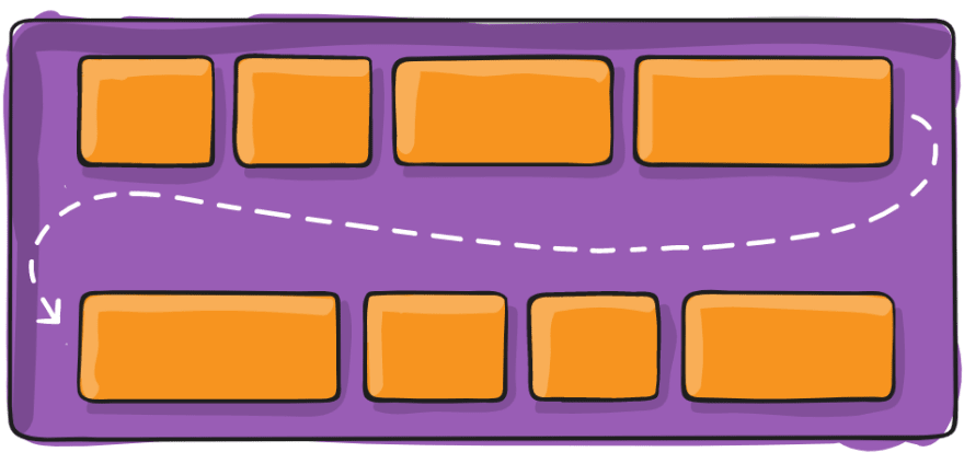
- Align-Content
To work with align content we should use flex-wrap: wrap since it works with items in multiple lines as it is described in the photo below:

-
.container{align-content: normal}(default)
items are packed in their default position as if no value was set.
.container{align-content: flex-start | start}
items packed to the start of the container. The (more supported) flex-start honors the flex-direction while start honors the writing-mode direction.
.container{align-content: flex-end | end}
items packed to the end of the container. The (more support) flex-end honors the flex-direction while end honors the writing-mode direction.
.container{align-content: center}
items centered in the container.
.container{align-content: space-between}
items evenly distributed; the first line is at the start of the container while the last one is at the end.
.container{align-content: space-around}
items evenly distributed with equal space around each line.
.container{align-content: space-evenly}
items are evenly distributed with equal space around them.
.container{align-content: stretch}
lines stretch to take up the remaining space.
- Gap & Row-Gap & Column-Gap
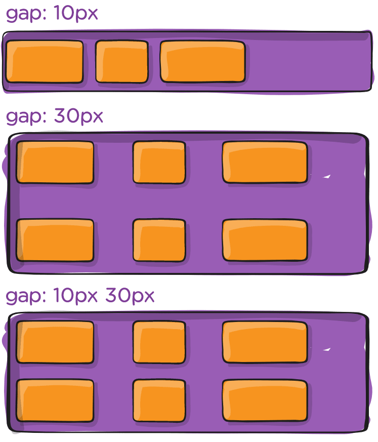
The gap property controls the space between flex items. It applies that spacing only between items not on the outer edges.
when we apply
justify-content: space-between;the gap will only take effect if that space would end up smaller.
This article did not cover all the flexbox parent properties tricks but it has covered the most used ones.
I hope it is helpful. And I am open to any comments or updates.

Top comments (0)