Adding themes is not usually the first thing you'd think about when starting a new project, but what if it was really simple to set up? Imagine living in a world where you were limited to the default VSCode or Slack colour scheme 😱
We're going to look at a way of creating your own dynamic themes using the awesome CSS Variables, which we will be able to update dynamically from within our app to change our whole colour scheme. I'm using TailwindCSS as a css framework here, as it provides everything you need to easily build beautiful, custom user interfaces. Just know that CSS variables are a universal web concept, and you can apply the theming techniques in this article to any javascript project, not just with react and tailwind.
Table Of Contents
- Project Setup
- Adding and configuring TailwindCSS
- Setting up our themes
- Getting Tailwind to use our theme
- Implementing our theme switcher
- Conclusions
Project Setup
We are going to make use of create-react-app as an easy starting point for our themed app. Just run the npx command below to get your project going.
npx create-react-app my-themed-react-app --template typescript
Note: We are going using react with typescript in this tutorial. Feel free to go with the standard template, it won't make too much difference in what we're trying to cover here.
Adding and configuring TailwindCSS
Now, we're going to add tailwind as a devDependency to our project. Run the below code:
yarn add tailwindcss -D
Then we're going to generate a config file to allow us to customise our tailwind installation. This step is important as this config file will act as a bridge between our theme colours and our tailwind classes.
npx tailwind init tailwind.js
We're going to add tailwind as a PostCSS plugin, and also add autoprefixer to parse our CSS and add vendor prefixes to CSS rules using values from Can I Use. We'll also add the postcss-import plugin, to allow us to break up our css across multiple files.
yarn add postcss-cli autoprefixer postcss-import -D
Then we configure PostCSS by creating a postcss.config.js file in our root directory:
// postcss.config.js
const tailwindcss = require('tailwindcss');

module.exports = {
  plugins: [
    require('postcss-import'),
    tailwindcss('./tailwind.js'),
    require('autoprefixer'),
  ],
};
Now here is where things get interesting. We are going to have PostCSS process our css and generate a new css file. This new auto-generated file will have all our app's css, as well as all the tailwind classes.
So how we are going to do this is:
- We are going to move the current
src/App.cssto a new directory:src/css/app.css. - We will have PostCSS read in
src/css/app.cssand output a new css file to the originalsrc/App.css. - We will create a new css file for our tailwind imports, and import that file into
src/css/app.css. - We will create a script to run PostCSS before our app starts.
- For good measure, we will add
src/App.cssto.gitignore, as it will be recreated every time we run the project.
/* src/css/tailwind.css */
@import 'tailwindcss/base';
@import 'tailwindcss/components';
@import 'tailwindcss/utilities';
And then at the top of src/css/app.css:
/* src/css/app.css */
@import './tailwind.css';
Now we'll add a script to our package.json to run before we start our app. This will tell PostCSS to generate the css file to be used by our app.
  "scripts": {
    ...,
    "prestart": "postcss src/css/app.css -o src/App.css"
  },
Be sure that your main
App.tsxfile is importing the auto-generated csssrc/App.css. If you followed all the naming conventions, it should be doing so by default.
And that's it! Now when we start our app, we will be able to make us of all the tailwind goodies. Let's test it out by adding a tailwind class to change the background colour of the default app screen.
// src/App.tsx
<div className="App bg-red-900">

Et Voilà!
Setting up our Themes
I just want to take a second to think about what we are trying to achieve here. We want to create a theme, configured in a central location and applied across the whole app. We want to be able to create many different themes, and dynamically apply them. As a bonus, it would be great to be able to extend an existing theme (For example, to create a Dark Mode).
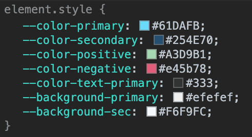
So I'm going to start off by creating a new folder src/themes, and in it create a file called base.ts. In this file I'm going to store some variables for our theme.
// src/themes/base.ts
export default {
  primary: '#61DAFB',
  secondary: '#254E70',
  negative: '#e45b78',
  positive: '#A3D9B1',
  textPrimary: '#333',
  backgroundPrimary: '#efefef',
  backgroundSecondary: '#F6F9FC',
};
Now we are going to need a way to take these variables, and map them to css variables to be used by our app. Let's create a new file in the src/themes called utils.ts. Here we will create a function to map our theme variables.
// src/themes/utils.ts
export interface ITheme {
  [key: string]: string;
}

export interface IThemes {
  [key: string]: ITheme;
}

export interface IMappedTheme {
  [key: string]: string | null;
}

export const mapTheme = (variables: ITheme): IMappedTheme => {
  return {
    '--color-primary': variables.primary || '',
    '--color-secondary': variables.secondary || '',
    '--color-positive': variables.positive || '',
    '--color-negative': variables.negative || '',
    '--color-text-primary': variables.textPrimary || '',
    '--background-primary': variables.backgroundPrimary || '',
    '--background-sec': variables.backgroundSecondary || '',
  };
};
Now we are going to need to create a new function to take this theme, and apply the css variables to the :root element of our document. This function, applyTheme, is going to take the string name of our theme, map the variables, then apply it to the :root element.
First, let's create a way to export all our themes in one place, src/themes/index.ts.
// src/themes/index.ts
import base from './base';
import { IThemes } from './utils';

/**
 * The default theme to load
 */
export const DEFAULT_THEME: string = 'base';

export const themes: IThemes = {
  base,
};
Now we can import the list of themes into our new applyTheme function in utils.ts. This function will take the name of our theme, look for it in our list of exported themes, map the css variables, then loop over the mapped object and apply each style to the :root element.
// src/themes/utils.ts
import { themes } from './index';

...

export const applyTheme = (theme: string): void => {
  const themeObject: IMappedTheme = mapTheme(themes[theme]);
  if (!themeObject) return;

  const root = document.documentElement;

  Object.keys(themeObject).forEach((property) => {
    if (property === 'name') {
      return;
    }

    root.style.setProperty(property, themeObject[property]);
  });
};
If you are wondering, the reason why we map our variables instead of just starting with a mapped object, is so that we can make use of the original javascript theme variables anywhere in our components later on if we need.
Now we can call applyTheme anywhere in our app, and it will dynamically apply our new themes variables. As a finishing touch, let's add a function to utils.ts that will allow us to extend an existing theme, and then create a dark theme that we can switch to.
Our extend function will take an existing theme, and then make use of the ES6 spread operator to clone the existing theme and then override it with any new variables that we pass it.
// src/themes/utils.ts

...

export const extend = (
  extending: ITheme,
  newTheme: ITheme
): ITheme => {
  return { ...extending, ...newTheme };
};
Now we can create our dark theme, and export it.
// src/themes/dark.ts
import { extend } from './utils';
import base from './base';

export default extend(base, {
  backgroundPrimary: '#444444',
  backgroundSecondary: '#7b7b7b',
  textPrimary: '#fff',
});
Getting Tailwind to use our theme
Now we need to tell Tailwind to make use of our css variables, so that when we make use of a tailwind class like text-primary, it uses the colour we supplied in our active theme. Tailwind makes this pretty easy for us to do; all we need is to add the variables that we have created into the root tailwind.js file.
// tailwind.js
module.exports = {
  theme: {
    extend: {
      colors: {
        primary: 'var(--color-primary)',
        secondary: 'var(--color-secondary)',
        negative: 'var(--color-negative)',
        positive: 'var(--color-positive)',
        'primary-background': 'var(--background-primary)',
        'sec-background': 'var(--background-sec)',
        'primary-text': 'var(--color-text-primary)',
      },
    },
    backgroundColor: (theme) => ({
      ...theme('colors'),
    }),
  },
  variants: {
    backgroundColor: ['active'],
  },
  plugins: [],
};
And that's it! Now we can make use of the tailwind classes, and those classes should make use of our active theme. Let's test it out by changing the background colour of our app to our primary-background colour.
First we need to apply our default theme when the app loads. To do this we will make use of the useEffect hook to run our applyTheme function the very first time the app loads, and every time we change the theme state. We'll create a component state variable to track the active theme, and set the initial value to our default theme.
// src/App.tsx
import React, { useEffect, useState } from 'react';
import { DEFAULT_THEME } from './themes';
import { applyTheme } from './themes/utils';
import logo from './logo.svg';
import './App.css';

function App() {
  const [theme, setTheme ] = useState(DEFAULT_THEME);

  /**
   * Run the applyTheme function every time the theme state changes
   */
  useEffect(() => {
    applyTheme(theme);
  }, [theme]);

  return (
    <div className="App bg-primary-background">
      <header className="App-header">
        <img src={logo} className="App-logo" alt="logo" />
        <p>
          Edit <code>src/App.tsx</code> and save to reload.
        </p>
        <a
          className="App-link"
          href="https://reactjs.org"
          target="_blank"
          rel="noopener noreferrer"
        >
          Learn React
        </a>
      </header>
    </div>
  );
}

export default App;
If we start our app and examine our root element, we should be able to see all the css variables that we set.
Now let's change the background class to use our primary background colour.
// src/App.tsx
<div className="App bg-primary-background">

Awesome right?! Now we can make use of tailwind's classes with our custom colours, and if the css variables in our document root ever change, so will all the colours across our app.
Implementing our theme switcher
Now that we have our theme set up, let's create a way to switch between different themes. What I'm going to do is create a simple button component that we can use to demonstrate our theme switching. This button will make use of the tailwind colour classes, so we can better see how our theme changes as we click the button. Let's create a Button.tsx component in a new folder src/components.
// src/components/Button.tsx
import React from 'react';

type ButtonProps = {
  children?: React.ReactNode;
  onClick?: () => void;
};

export const Button: React.FunctionComponent<ButtonProps> = ({
  children,
  onClick = () => {},
}: ButtonProps) => {
  const baseClasses: string =
    'border-2 outline-none focus:outline-none normal-case tracking-wide font-semibold rounded shadow-xl text-xs px-4 py-2';

  const colourClasses: string =
    'border-primary active:bg-primary-background text-primary bg-sec-background';

  /**
   * Render the button
   */
  return (
    <button className={`${baseClasses} ${colourClasses}`} type="button" onClick={() => onClick()}>
      {children}
    </button>
  );
};
We can now import our button into our main App.tsx component. Let's use some conditional rendering to show one button for our base theme, and another for our dark theme. In this example we are just going to assume that only these two themes exist. Each button will execute our setTheme function, which which update our state variable and in turn execute the applyTheme function in the useEffect hook.
// src/App.tsx
import React, { useEffect, useState } from 'react';
import { DEFAULT_THEME } from './themes';
import { applyTheme } from './themes/utils';
import { Button } from './components/Button';
import logo from './logo.svg';
import './App.css';

function App() {
  const [theme, setTheme] = useState(DEFAULT_THEME);

  /**
   * Run the applyTheme function every time the theme state changes
   */
  useEffect(() => {
    applyTheme(theme);
  }, [theme]);

  return (
    <div className="App bg-primary-background">
      <header className="App-header">
        <img src={logo} className="App-logo" alt="logo" />
        <p className="text-primary-text">
          Edit <code>src/App.tsx</code> and save to reload.
        </p>
        <div className="mt-4">
          {theme === 'base' ? (
            <Button onClick={() => setTheme('dark')}>Apply Dark Theme</Button>
          ) : (
            <Button onClick={() => setTheme('base')}>Apply Light Theme</Button>
          )}
        </div>
      </header>
    </div>
  );
}

export default App;
And now we can finally see our theme switching in action!

Conclusions
And that's a wrap! Thanks for getting to the end, I hope you found the techniques in this article useful. I just want to reiterate that the main concepts that we used here are not specific to react projects or tailwind. You can create your own classes/styles using the css variables that we set in our themes - that's the awesome thing about css variables!
This post got pretty long, so I'm going to follow it up with another one which will cover providing theme context to your whole app using the Context API, optimising your css build for production, handling dynamic css classes and writing unit tests for everything.
Source code: https://github.com/ohitslaurence/react-dynamic-theming


Top comments (17)
Great article!! This helped me implement a similar system in Svelte. However, I noticed that any box-shadows are removed when
applyTheme()runs. Do you have any idea how I might get around this issue?Thanks for your article and insight ... very good information!
I am a new tailwind user. In my learning quest, I just published a color theming utility called tw-themes that is in-line with your article.
You can find the docs here: tw-themes.js.org/
It promotes dynamic color themes that are selectable at run-time. The best part is it automates your dark-mode through "shade inversion"!
When you have time, I would be curious of your thoughts.
Hello Laurence
I have implemented the code as per above instruction. But, when I am clicking on button to change the dark mode getting some error. Like : TypeError: Cannot read property 'primary' of undefined
Can you please help me that what are the reason behind of this?
Hi Sahil,
So I was just looking at the above code, and I can see where it might be going wrong. So if you look for the line where I say
Now we can create our dark theme, and export it., I don't say explicitly where to export that file to. So what you need to do is go tothemes/index.ts, and add the dark theme in.Now, when the
applyThemefunction looks at your exported themes, it will be able to find your dark theme and apply it. Hope that helps!Great article, I have a question, It is necessary to apply the theme every time the state changes?, Wouldn't it lead to performance issues?
Thanks man! Great question, so the short answer is no. It's not running every time the state updates, but rather every time the
themestate variable updates. If you take a look ouruseEffecthook, we have thethemevariable as an effect dependency. This means it will only run the first time we set that variable (in theuseStatehook), and then when we make changes to it (through thesetThemefunction). It's why hooks are so awesome, no hidden side-effects.If this were not just an example app, I would create a theme context provider and use a hook to run the
applyThemethe very first time the app loads only. All subsequent changes would be done directly through an action of some sorts. I'm hoping to show that in a follow-up post :)Oh, thank you for the explanation, I wasn't looking at the dependency array. Now it is clearer.
Excellent article
You helped me a lot! Thanks for taking the time to write the article
Extremely helpful - the only issue I have encountered is that when my postcss script runs and generates App.css, the script is not generating my theme styles (--color-primary) for most prefixes.
For example, it builds text-primary but does not build bg-primary.
When I downgrade my postcss/tailwind dependencies to the version used in this tutorial, i get the bg-primary classes in the App.css.
Why would the latest postcss not build all my themed styles?
I figured it out - Tailwind v2+ has a Just In Time mode so it will only generate styles if the builder reads them ahead of time. I was using a value loaded from state in the classNames so it couldn't read it.
From what I can tell, you have a couple of options if you want to references your style themes from variables :
Not great IMO
How do you support live css watch in this setup?
Great article
This is powerfull, my respect
you made my day, thank you so much <3
Great article, really clean implementation and very clear steps.
I was too late to explore the project myself. This article was very helpful to me. Thank you very much! ! Specially registered an account to thank you.