This major release is the third update of VLC 3. We focused on improving the UX and UI of the app.
Global design rework
Main navigation
When VLC 3.2 came out, a lot of work has been done on the UI to fit the Material guidelines. But we thought we could go further.
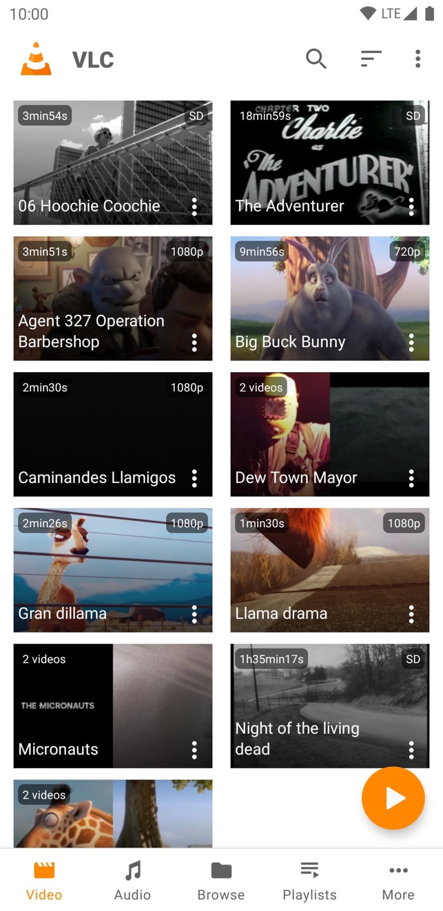
The main navigation has changed, say hello to the bottom navigation!
This redesign improves drastically the space usage and reduce the number of interactions to do a task.
Having the main navigation at the bottom of the screen improves also the reachability of the screens for users with a large device.
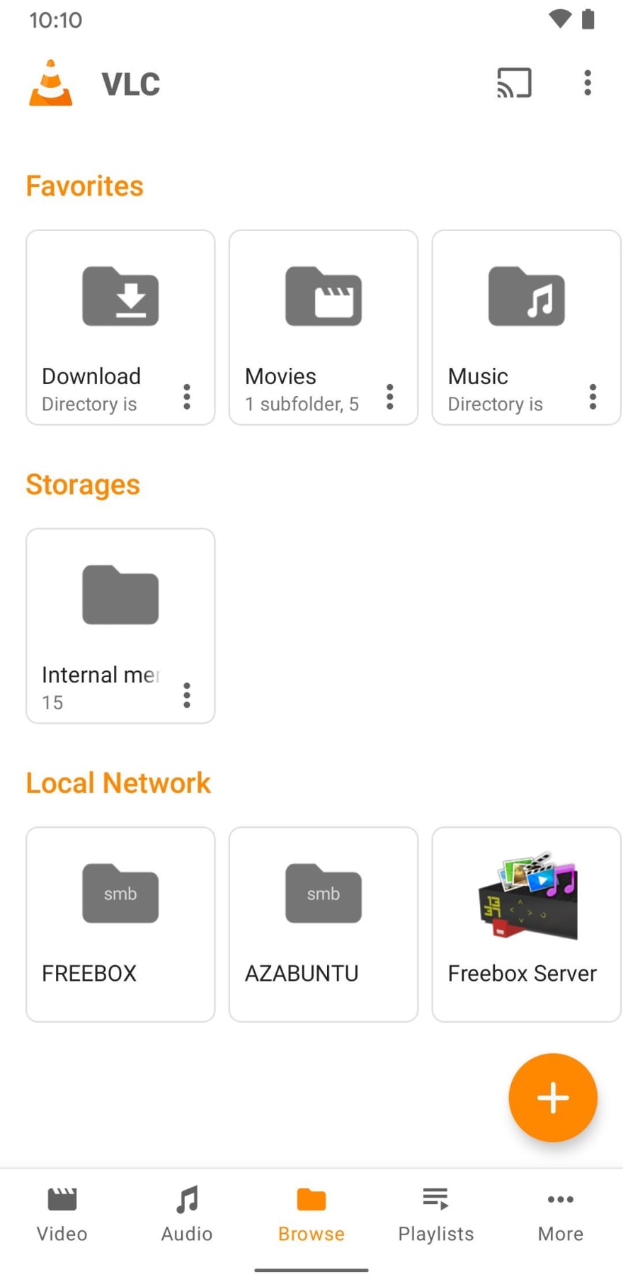
The new browsing screen groups local and network browsing. With this new compact design, you will find your media more easily.
The dark mode now displays a completely black theme, wich is perfect for OLED screens
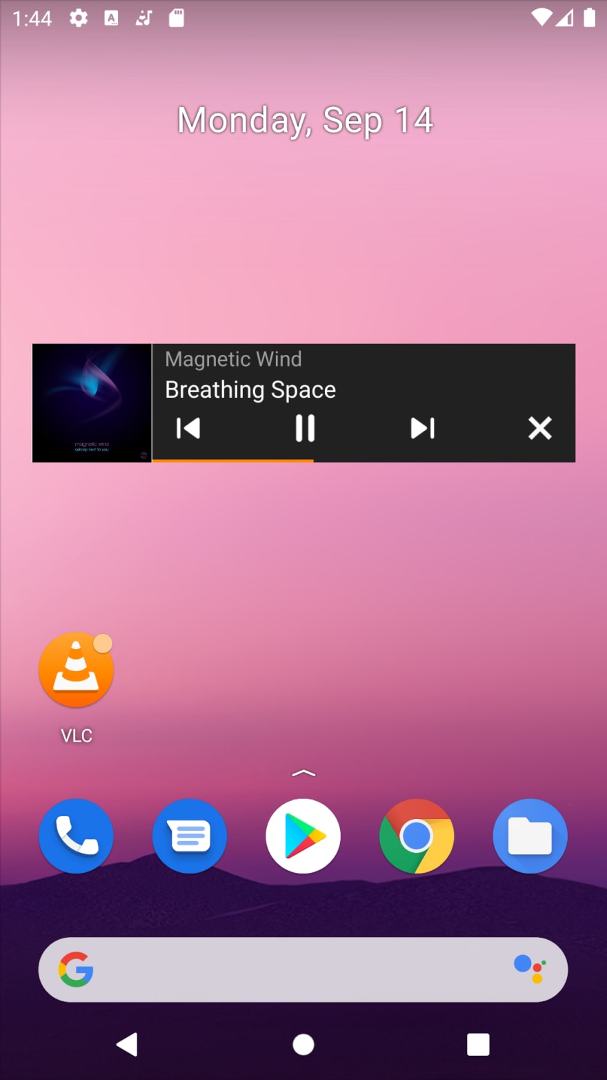
The app icon has also been improved!
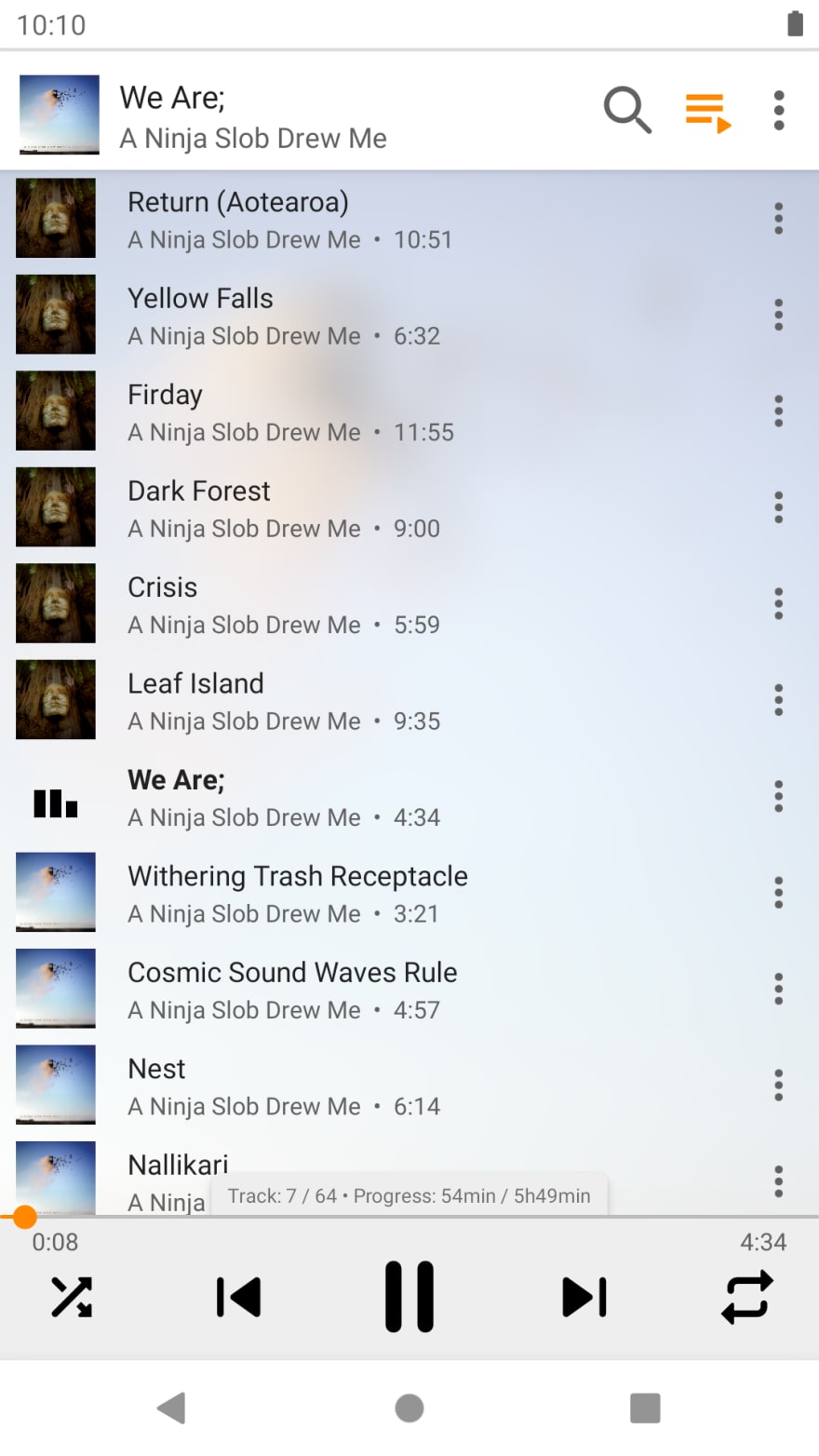
The audio player now displays the overall progress of your play queue
Video player
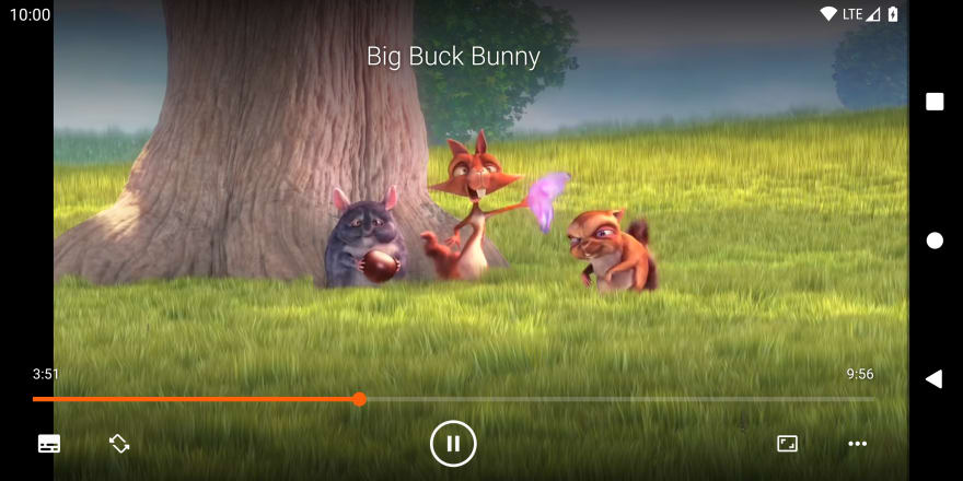
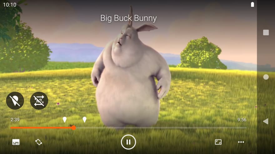
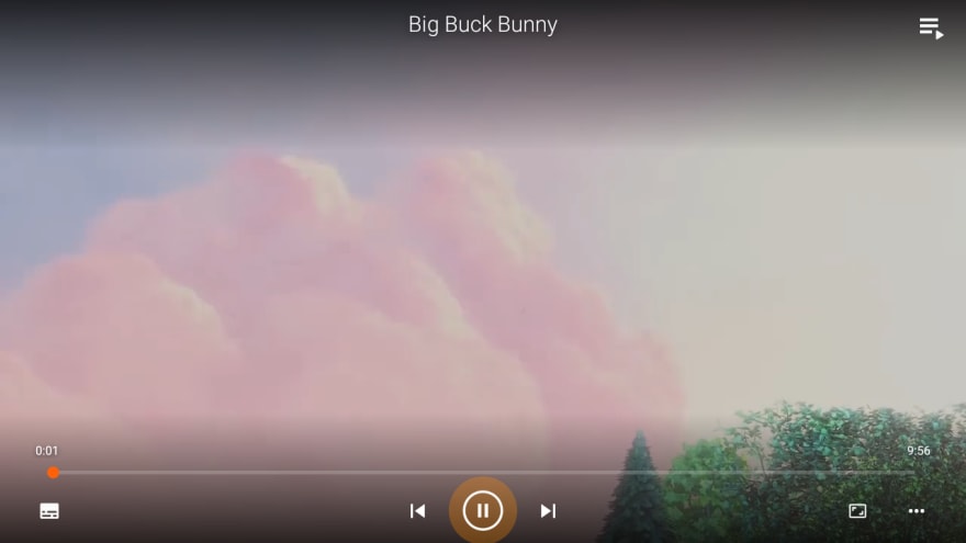
Due to popular demand, the video player has been redesigned to have a more modern look
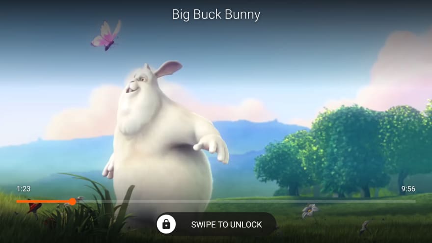
The lock player feature has been improved. You can now lock your orientation directly in the controls or lock the whole screen in the advanced options.
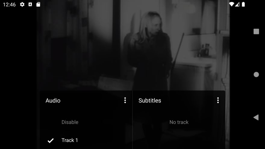
All the different tracks can now be changed in one place:
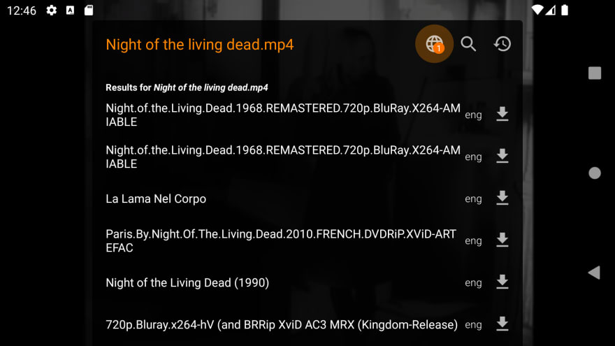
The subtitle downloader has been revamped too, making it easier to find what you're looking for
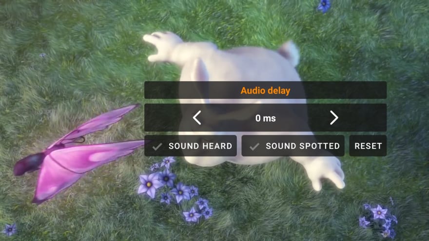
A brand new interface has been done to sync the audio or subtitles tracks. You can now do it in a comprehensible way by clicking when something happens and then fine tune it.
The AB repeat feature has been redone from scratch to be easier to use.
Of course, all of the player improvements are available on Android TV as well
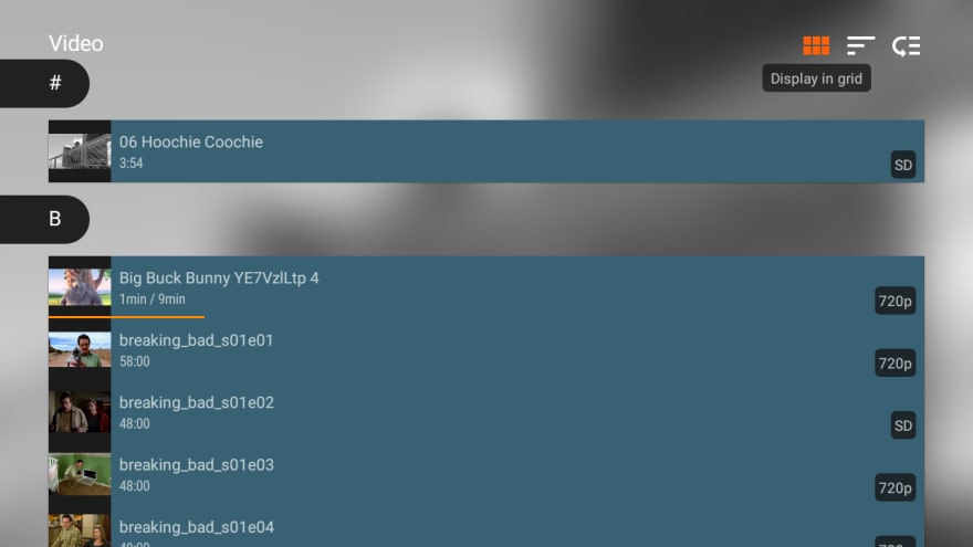
Speaking of TV, you can now display all of the browsing screens in list instead of grid to get a more compact view.
DVD and Blu ray support have also been improved. The app now saves your current progress when playing this kind of media.
New features
Sponsorship
You can now sponsor VLC Android to help us improve the app.
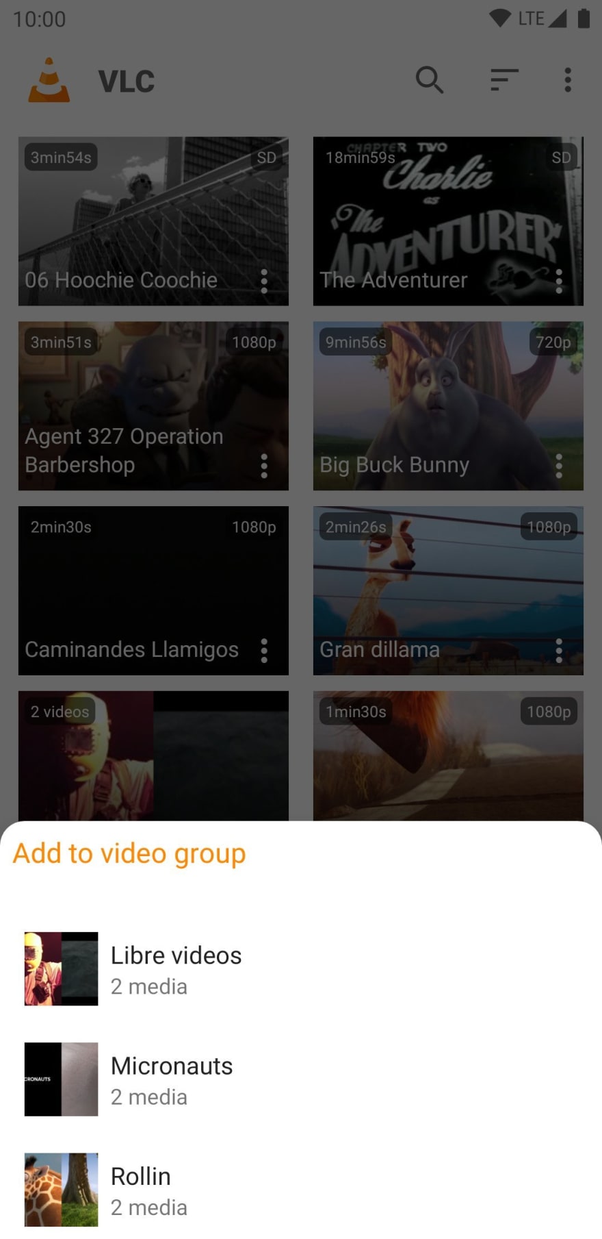
Video grouping
It’s nice to have a well sorted video collection, and sometimes automatic grouping is not enough. This release lets you create custom groups and always have your videos in the right place
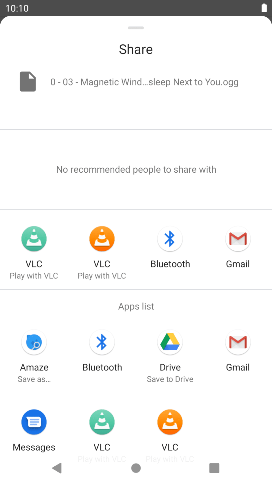
Media sharing
Share a media with all of your friends.
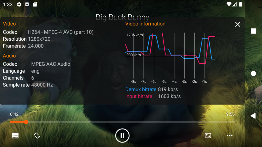
Video stats
You can now display stats in real time when playing a video.
Others
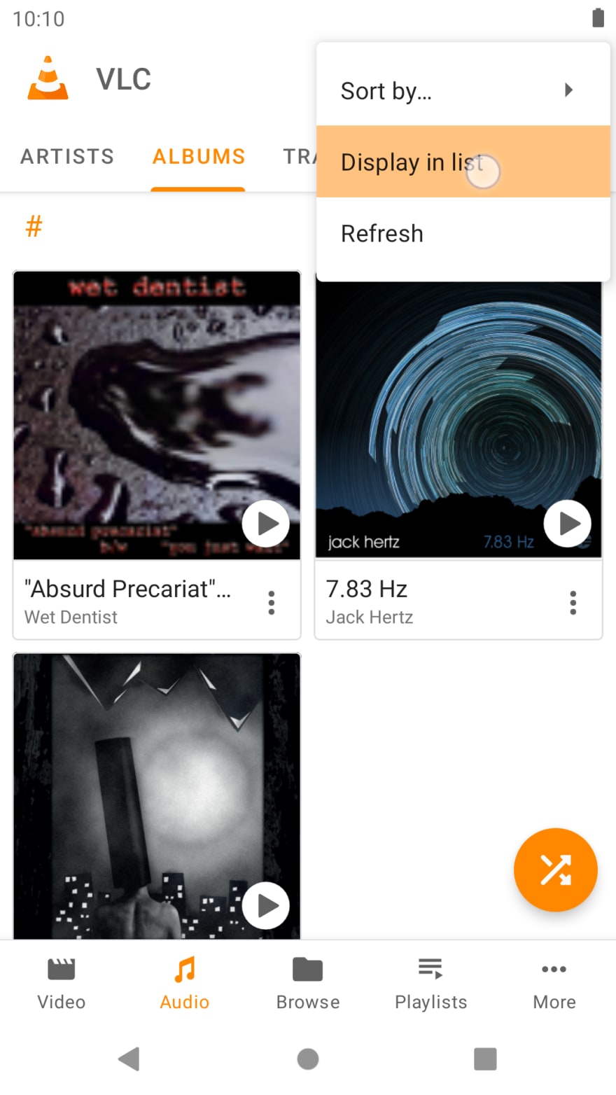
To decrease the app complexity, the settings have been cleaned up and, when applicable, some settings are now displayed in the corresponding screens. Thanks to that, some settings can now be changed by screen instead of the whole app.
For example, you can now change the layout of only one of the audio screens:
The Android 11 compatibility has been checked and there is no known issue.
Under the hood
The project is now split into gradle modules, reducing drastically the build time.
The
VideoPlayerActivityhas been refactored using the delegate pattern to reduce its size and complexityMost of the icons are now vector drawables
The extensive use of coroutines and ViewModel pattern improves the responsiveness and thread safety of the app
A lot of work has been done on the CI, allowing us to build our releases on it and, in the future, automate releases and app screenshots for the stores




Top comments (0)