
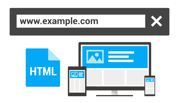
Even though your website works perfectly on a desktop, doesn’t mean it’ll render perfectly on mobile or tablets as well. With the plethora of devices available, you’re bound to miss out a few crucial ones, and hurt your users’ experience. Optimising your website for every single device seems like a daunting task, but what if i told you that you don’t have to do it!
All you need to do is make sure that your website has responsive web design, i.e your content adjusts to different devices automatically, and you’re good to go. But, it is easier said than done, even while making your website responsive, you’re bound to face certain challenges on the way.
In this article on responsive web design, I’ll explore the challenges faced with responsive web design to ease out the process for you. Also, I’ll also explain how to transition to responsive web design and why you should go for it? So, hold on to your seats, coz you’re in for a ride!
What Is Responsive Web Design?
Responsive Web Design is the design approach where you make sure that the web pages automatically adjust to the different view ports they are being accessed on. In simpler terms, it means making web pages that look great on all devices.
While making your website responsive, you have to ensure that all the elements automatically scale in accordance with the screen size and resolution. This makes sure that all the different users accessing your website using different devices gets a seamless user experience.
Why Should You Go for Responsive Web Design?
The purpose of Responsive Web Design is to deliver a smooth viewing and interactive user experience across all devices. Even Google recommends Responsive Web Design for creating mobile-optimized websites to enhance user experience of mobile users. With more than 50% of the web traffic coming from mobile devices, it’d be unwise not to care about these audiences.
It’s vital for your website to opt for responsive web design, as it opens a lot of doors which will help you to ultimately provide a better user experience to your users. Without further ado, the reasons are:
Provides a Seamless User Experience
This one is a no brainer! Responsive websites help in providing a seamless user experience. With non-responsive websites, it can get tricky to view content on other devices like mobile phones or tablets, as images might not align with the borders, texts might get jumbled up, ultimately making it difficult for the user to access the content.
With such a poor experience, do you think that any user might ever come back to your website? Answer is simple, they’d never!
So, to make sure that you don’t lose your users, it’s quintessential to perform responsive test online to check mobile view of website on various devices, to ensure responsive web design.
Adapt Easily To Any Screen Size
Having a great website ready for all different mobile view of website and is adaptable to any screen size provides many advantages.
With responsive web design, you’re way ahead of your competition, as it automatically makes sure that your web content renders on any device, be it an iPad, Android devices, Tablets, etc. Your website can adjust automatically to suit different types of screens.
Do you know Web Notifications can be created to alert users of your website from outside the web page. That is, as long as they are accessing it through a device that has Web access (such as a smartphone).
Lower Cost And Website Maintenance
Earlier businesses preferred creating two versions of a single website. One specially designed for Mobile phone users and other the one for the Desktop. Building two separate versions of a single website and then maintaining them can be pretty expensive.
Some people still continue with this practice, but with the exponentially growing mobile users, creating and maintaining two versions of a single website is too hectic and time-consuming.
The best solution to overcome this problem is to make your website responsive for all devices so that the content automatically adjusts itself depending on the screen size. And not to mention the rich user experience for both mobile and desktop users which will help you in gaining more traffic.
Building a website with responsive web design means that you don’t have to maintain two different versions and take care of their maintenance. The cost will be pocket friendly and maintaining one website instead of two will give you some breathing space and also frees up some time for you so that you can think of tasks that matter more.
A Responsive Website Improves Your SEO Efforts
Responsive websites have a higher ranking in the search engine. Search engines take in various factors when it comes to the search rankings, taking several factors into account such as dwell time, bounce rate extra. If your website is not optimized for mobile view, your user might not stay in your website for long, affecting dwell time, bounce rate etc.
By ensuring responsive web design, a user might spend more time on your website, ultimately giving a significant boost to your Serp rankings.
Check this out: Online/offline status- This module provides access to the user's online and offline status. You can use this module with navigator.onLine which returns the on/off status of the network connection
Challenges In Responsive Web Design And Their Fixes
As I mentioned earlier, there are quite a few challenges you might face while ensuring responsive web design. Some of the major challenges you might face for responsive web design are:
Handling Navigation
A navigation menu acts as a map of the website, providing directions throughout the web page. Responsive navigation should scale in proportion to the relative screen size, but it should not have a discrete structure. If you change the structure of your navigation for each device, people will be very puzzled and irritated if they access our website from different devices.
Fix: The main aim here should be to make the Navigation Menu more intuitive and self-explanatory for small screen devices also. Information architecture and exploration of the website’s data could support you in making a good navigation decision. In addition, doing responsive testing online on multiple devices will help you derive meaningful results for much-improved accessibility of your site.
Desktop View vs Mobile View
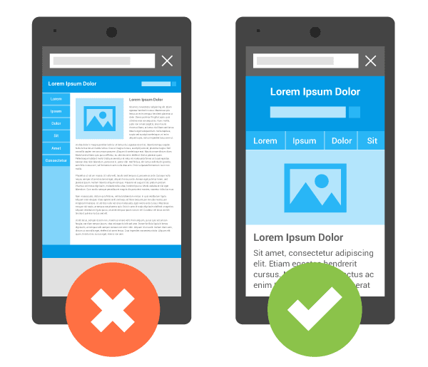
Let’s take an example of a website that has been developed with a padding of 200px. The user might view the website appropriately in the desktop version, but when the same website is viewed through his mobile phone, it’ll look shabby and disoriented. This is a major problem that the user faces for responsive web design and should be certainly keep in mind while checking mobile view of website. You can see the example in the picture below:

Fix: The above problem can be fixed by ensuring that your website has responsive web design. The best solution for the above example could be using “Percentage” instead of “Pixels”.
The “Percentage” option will display the content based on the size and resolution of the screen. If the size of the screen is small, the content of the screen should get adapted automatically according to the screen size and shrink the content size. Unlike the pixels, it will only display the fixed amount of spacing as commanded while developing.

Above image is the updated mobile view of website after using percentage instead of pixels.
Browser Compatibility
While developing a website with responsive web design, you should keep in mind that it should work uniformly cross-platform i.e. the behaviour of the website should not be changed if viewed on different browsers.
Responsive Design includes the use of CSS3 Media Queries, which is supported by almost all modern browsers and it reactively determines the screen size of a device and then renders the content appropriately on the screen layout. With a set of media queries, you will be able to display different layouts on different devices.
Some old browsers like Internet Explorer 8, do not support media queries. You can ensure that your efforts don’t get affected due to lack of browser support by performing browser compatibility testing.
Fix: While developing, JavaScript can be used to make changes in the page layout as it can adjust the size as per the browser window.The initial layout can be maintained by using Polyfill. It encourages the developer to implement technology that the browser is expected to provide primarily and natively.
Another way out is to accurately use a conditional IE stylesheet with elementary styling.
Slow Loading
Everyone knows the importance of the website speed,you could be exploring one of the most stunning websites ever, but if it takes too long to properly load, what are you likely going to promptly do? We bet you had no hesitation in leaving and going elsewhere.
Many times, responsive sites are the primary reason for slow loading of web pages as they weigh a lot. As it not only attracts traffic from desktops but even from mobile devices, the experience of the user might suffer .
Fix: The finest solution to this issue is conditional loading, which calls for loading of only those page elements what the end users need. Instead of flooding the website with pictures, text, video, documents, downloads etc, you can ensure the fast loading of those elements that are of most importance to let the users know what you are supplying to them.
Since more and more people surf the internet through their mobiles rather than desktops, conditional loading stands the best way to eradicate your responsive site’s loading stress.
Displaying Data on Small Screens
Since there is a huge amount of data displayed in tables. Which usually have a huge number of rows and columns. It becomes a very tough and boring job to show them on small screens and be responsive in nature as their dimensions need to change as per the size of the screen. And it becomes even tougher to deal with tables which are complex, crowded, and elaborated.
Fix: The best way to handle data display problems on small screens is to opt for responsive tables.
Instead of using the grid layout for responsive web design, you can switch to create a smaller table without horizontal using the scrolling feature. Create a smaller version or a view of the table, provide users with a glimpse of it and give a link to the full version.
Display only key elements, while the drop-down menu provides a way into all the contents of the table. Use the rainbow tables where colors would replace the columns.
Hide & Show Elements In A Responsive Layout
While developing a responsive website, CSS can be used to hide and show appropriate elements on the page. Using CSS properties it can interact with screen sizes and adjust the contents for a rich user interface.
Fix: Media Queries in CSS3 are used to ensure responsive web design. A media query is segregated into two parts. One part is the media feature that describes the characteristics of the device like screen ratio where the contents needs to be displayed.
You need to perform responsive testing online to assure that the content adapts itself according to the size of the screen in which the content is viewed. “Only” keyword is used in the media query so that the content responsively reacts according to the size of the screen and then adjusts the content according to the minimum and maximum width of the screen respectively.
Example:
/* Check if the screen size is at least 600px */
 @media only screen and (min-width: 600px) {
    .lg {
                display: block;
          }
     }

     /* check if the screen size is at least 400px */
     @media only screen and (min-width: 400px) {
     .md {
                display: block;
          }
      }

     /* check if the screen size is at least 100px */
     @media only screen and (min-width: 100px) {
     .sm {
                display: block;
         }
        }
How To Make Images And Icons Responsive?
Responsive images and icons will automatically adjust and adapt to fit the size of the screen no matter what device you are using, whether it be a mobile phone, a tablet, or any laptop. This thing is of the utmost importance for a better user experience and will help you in gaining more web traffic.
Fix: If you want the images to scale properly upwards as well as downwards on responsiveness, the CSS width property should be set to 100% and height to auto:
<img src="nature.jpg" alt="Nature" class="responsive">
Example
.responsive {
  width: 100%;
  height: auto;
Dismissing Touch
Even though the whole idea is to provide an optimal experience for mobile devices. At times developers might end up forgetting or abusing touch. Also a lot of times the scroll can be a bit messy and can hamper overall user experience.
Fix: Make sure that all the buttons, sliders and even navigational are big enough and are easily accessible by users. To provide a better scroll experience, you can use smooth scroll feature to ensure a smooth navigation of the page. Also, scroll snap can be used to make sure that the scroll always snaps on the right positions.
Transitioning Into Responsive Web Design
For site owners who already have a website and want to make it responsive. You need to take care of the following things to ensure responsive web design:
Choose A Framework
The first step is to choose an appropriate framework while switching to responsive web design. Instead of starting from scratch, you can opt for a framework like Bootstrap or Foundation as it will be beneficial in modifications and up-gradation of the existing website’s code.
Converting The Code
Before converting the code make a list of all the components which are held responsible in Responsive web design like:
- Add Break-points which will trigger CSS Styles
- Add meta tags where the width of the device, width=device-width, initial-scale=1, and maximum-scale=1.
Instead of taking the whole website’s code to take one page, modify it and repeat the process for the next page. The more components you identify for migration, the easier it will be to convert your code.
Perform Responsive Test Online
After successfully making your website responsive, you need to perform responsive test online on multiple devices like Mobile Phones, Tablets, Laptops, Desktops to ensure the responsive web design and that content and images are adapting themselves as per the screen size in which they are being viewed on.
You can also perform responsive test online on different mobile view of the website, covering all the major viewports and screen resolution. The more you test, the better the user experience will be at the end. If you have embedded videos on your website, remember to check their responsiveness too. At the end, you can even check for the responsiveness of how your website responds when we take the print out of a certain page.
How Can LT Browser Help In Responsive Web Design?

LT Browser is a responsive testing tool to help developers and designers to perform live mobile view debugging. You can use it as a regular browser and perform test 25+ devices, and perform thorough responsive testing. In case you don’t find your favourite devices on the browser, you can even create custom devices and save it for future use.
Using LT Browser, you can directly compare two different mobile views with the side-by-side mobile view of website. As you scroll your website on the first device, the second one mimics it as well making it easier for you to test over different devices.
You can perform responsive test online on your locally or privately hosted website and test them on all the available and custom devices. Also, with the built in debugging tools, you can easily validate any quick fixes to debug your website.
But that’s not all, you can even share any bugs with your team on a single click on your favorite project management tool.
Some Key Points to Remember For Responsive Web Design
Now that you know about the major challenges with ensuring responsive web design, I’d like to highlight a few major points to get the most out of you efforts:
Preparation is the Key
Having a blueprint of your tasks and good preparation is the key to the successful design. A better preparation would yield a better responsive website.
As your website will be visited on different devices, you should have a clear vision in mind of how you want to structure your content for each of these devices and how it should look. For small screen devices, you should prioritize the content which should be displayed.
Starting from Scratch
If you have already developed the desktop design and now you’re thinking from a mobile perspective for the first time, then you need to start the preparation from scratch.
Instead of recycling the design from your old desktop website and modifying the code which will be a tedious job and may take a longer time as you need to understand the whole architecture first and then do the modifications.
Use Responsive Web Design Tools
Plenty of resources like Bootstrap, Wirefy, Invision, UXPin, etc are available online to help you in making a website with responsive web design.
Test, Test, and Test Again
Responsive Testing is a really important aspect of making your website responsive and you certainly shouldn’t miss out on this one. Performing responsive testing online helps ensure that your website is responsive across all the devices tested. Any issue can be found before it hampres user experience
Whether you’re developing a responsive website or not, but early and repetitive user testing is essential for any successful design and functioning.
Nowadays, most of the smartphones are touch screens, and testing of the behaviour for touch on regular screens is a challenging task and requires excessive testing. So get started with your favourite responsive testing tool and ensure a seamless experience for your users.
Do you know? Navigation Timing API enables access to timing information related to navigation and elements that appear dynamically in the user's view, or when the document is loaded.
All In All
As the number of mobile keeps growing, so should our effort to give them an optimal user experience. Responsive web design plays a huge role in ensuring that your users get seamless user experience regardless of the device being used.
In this article on responsive web design, I explored the various reasons you should go for it, also focusing on the challenges you might face on the way and how to fix them. Making your website responsive should be a high priority and you should certainly not miss out on it.
I hope you found this article informative. Feel free to ask any doubts or share your views in the comment section down below. We’d appreciate it if you could help this article reach a wider audience by sharing it with your peers! That’s all for now.😄

Top comments (0)