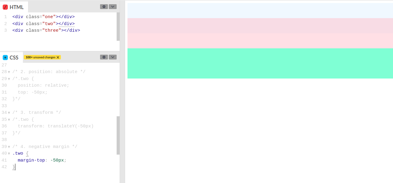
Imagine you have a design that involves moving a div upwards so it ends up partially covering the div above it. There are a lot of different ways of doing this, so let's have a look at them and see how they differ.
Set up
Here's how I've set this up, to make it easy to see what's happening. I have three divs with different background colours so you can see where they all are. Because they have no content I've set a width and height on them.
What we're going to do is to move the pink div up to cover half the blue div.
Options
1. Position absolute
If I add position: to .two it will position it relative to the body. So it'll be at the top and therefore completely covering the blue div. Because an absolutely positioned element is no longer part of the document flow, the green div moves upwards so it's directly below the blue div.
absolute
But we only want it to half cover the blue div. Since I know the blue div is 100px tall, all I need to do is to set top: and we get this:
50px;
The pink div is now covering half the blue div. But half the green div is covering it. Which may be what you want. If you don't, then you'll need to add some padding or margin to either the bottom of the blue div or the top of the green div to space them back out.
2. Position relative
We can also move elements relative to their original position. So adding position: to .two doesn't have any affect, but once we add
relative
top: to it we get this:
-50px;
We now have the opposite problem, because there's now a big space above the green div where the pink div used to be. To fix that you'd then need to move the green div up the same amount.
3. Translate
Translating things is a good way of moving things about. Rather than needing two lines, we only need one line here: transform: and we get this:
translateY(-50px);
The same gap we had with position relative.
4. Negative margin
Adding a margin to the top of the pink div would move it away from the blue div. So adding a negative margin will move it closer to the blue div: ```margin:
-50px;

This finally moves the pink div to be half on top of the blue div but still leaving space for the green div and without leaving space for where the pink div used to be.
## Which should you use?
It all depends on what you're trying to achieve.
Position absolute is positioned from the top of the parent. The rest involve moving the pink div relative to where it is now.
Position relative and translate give the same results, but translate takes one line, whereas relative takes two.
Negative margin positions everything else neatly without a gap for the div you moved.
This is also a very simple example - you won't have elements that are all 100px tall. They very probably won't be the same height on every screen.
The good thing about CSS is that you can try it out - just inspect the element, type in the CSS and see what happens.


Top comments (0)