I recently had a design where there was a box with rounded corners. However, due to the HTML structure (which I couldn't change) there was an element over the top of the box, making it look like the box wasn't as tall as it actually was. I couldn't add a border-radius to the middle of the box. I had to fake it instead.
The set up
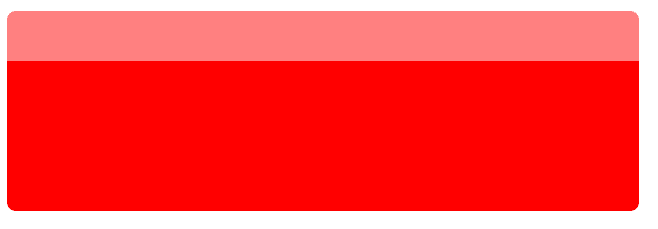
Here I have a contrived example to show the problem. I have two divs here, .fake-top and .bottom.
.bottom is red.
.fake-top is the same colour as the body and covers up the top 50px of bottom.
I've added some opacity to .fake-top, so you can see what is where. And that bottom has rounded corners on every corner.
In the real problem I have something on the top left, so it's just the top right corner that needs rounding. Here's how it looks with another div on the top left:
Faking the rounded corner
This is where pseudo-elements come to the rescue. And the time I've spent on CSS Battle came in useful.
What we can do is to add two pseudo-elements. One to effectively remove the corner ie make it white: the same colour as the fake-top and body. The other to add a bit of red with a rounded corner.
.fake-top::before,
.fake-top::after {
  content: '';
  position: absolute;
  width: var(--border-radius);
  height: var(--border-radius);
  top: 100%;
  right: 0;
}

.fake-top::before {
  background-color: white;
}

.fake-top::after {
  background-color: red;
  border-top-right-radius: var(--border-radius);
}
With just the before pseudo-element, it looks like it's had a bite taken out of it:
Here's where the after pseudo-element is:
But make the after pseudo-element the same colour as bottom then like magic, it looks like this:


Top comments (0)