Overview
As I mentioned in my last blog post, I finished the Telescope's issue and my PR got accepted. So I spend this week only for the second issue.
Issue
I had a hard time finding the design for the leaderboard. There were so many templates and also the design should match the whole website in general, especially the background of the site. This is the current temporary leaderboard they have:
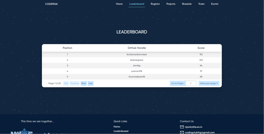
After hours, I came up with a few designs but this one like the most.
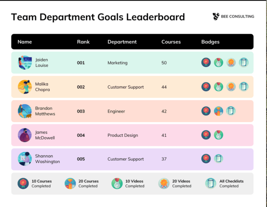
I send the design to Discord but none of the owners replied to me to I just started working on the leaderboard page.
Their project was a ReactJs project so setting everything up for me was not hard. However, there were like thousands lines of code and the way they write their code was confusing to me. My solution was just finding the right components for the leaderboard and where it was located so that I did not get distracted by something else. Luckily, after 15-30 minutes, I found that, but I had to write a bunch of console.log to know where the component was.
Progress
I started by creating a new branch. First thing I did was keeping the elements inside the JS file intact. I only added the className so that I could access it from the .css file. To know if my class were already applied to the elements, I added some background-color. After that, I spend some times to understand the React code and how they displayed the data to front-end. Another issue that just came to me. There were the gaps between the tr elements from the design:

I thought I just needed to add the margin to it. But it was not that easy, adding margin did work. I was really surprised and started to do some research about table element. The solution was separating the elements and adding the spacing for it:
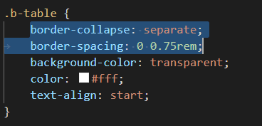
To match the design, I needed to add background for each row:
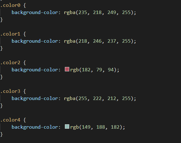
The reason I named my class like color0, color1 was utilizing the index parameter from the map function:

Also, we cannot add the border-radius for tr so I needed to add this feature to td instead:
tr td:first-child {
border-top-left-radius: 10px;
border-bottom-left-radius: 10px;
}
tr td:last-child {
border-top-right-radius: 10px;
border-bottom-right-radius: 10px;
}
tr th:first-child {
border-top-left-radius: 10px;
border-bottom-left-radius: 10px;
}
tr th:last-child {
border-top-right-radius: 10px;
border-bottom-right-radius: 10px;
}
I also had to remove some old CSS styling of the owner. And this is the final result:
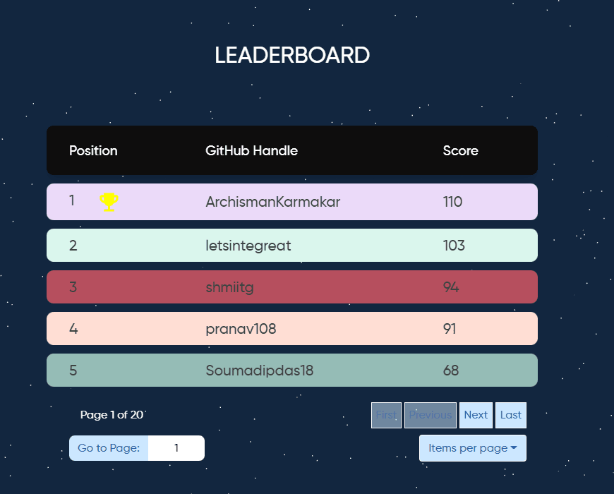
You will see I modify the Go to Page: 1 so it would be neat and more beautiful. Also I added a yellow cup (from material-ui) for the top player. This will make my design more interesting.
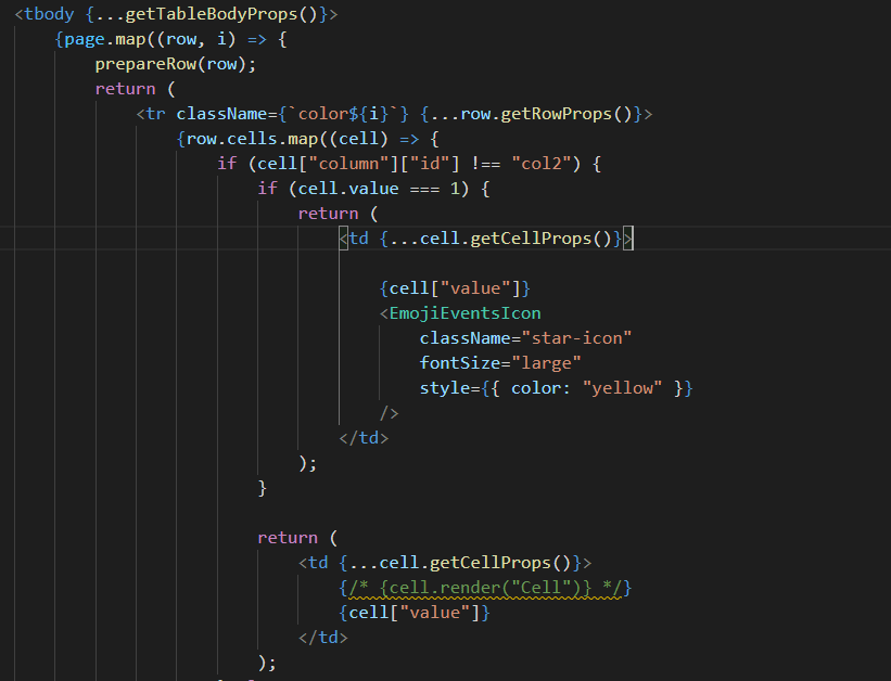
(Note that, only the cell that has value === 1 will have the cup icon)
Pull request
After that, I submitted a PR. It did not go smoothly because there were some request changes from the owner. He would like me to modify the colors and there was a bug related to displaying:
https://user-images.githubusercontent.com/72855990/145670180-16c00799-f1b7-4c01-9542-d1811b355cd9.png
(If more than 5 players are displayed, the rest will be transparent)
At the moment, I am still working on the changes to my PR and I am pretty sure that everything will be good because I know how to handle this problem.
Last thought
This final release was very useful, I have learnt a lot of things from understanding a completely new style of writing React code. Also, I learnt new feature of table elements in CSS, and this will be great for me in my future project that would use table.


Top comments (0)