One of the basic and the most important properties every web designer should learn is the float property. It is most commonly used for floating text around the image or creating the two column layout. The float property can cause a lot of frustration and confusion if it’s not fully understood, so we’re here to make those confusions disappear with this short explanation.
Also, be sure to check out our articles on some other properties, other than CSS float, that often cause confusion like css columns or relative font size.
The definition
The CSS float property specifies as the name says, how the element should float. With the usage of the float property, the element is placed along the left or right side of its container.
The float property has the possible values:
- Left - the element floats to the left side of its containing block.
- Right - the element floats to the right side of its containing block.
- None - the element must not float.
When an element has float set to it, it is shifted to the right or left side until it touches the edge of the container element or another floated element.
Support
The best place to check how well is the CSS property supported is the Can I Use service. Here, we see that the float property has an extremely high support, with over 97%.

Examples
Now, we will support the float theory with examples to make things understandable. The examples will show you how to float text around a div.
HTML
<div class=”container”>
  <div class=”left-segment”></div>
  <div class="right-segment”></div>
  <p class=”segment_text”>Cardigan aesthetic direct trade, migas locavore shoreditch DIY bicycle rights lyft street art bitters. Gastropub salvia flexitarian next level cold-pressed iceland williamsburg tofu biodiesel everyday carry. Direct trade selfies mixtape 8-bit jean shorts paleo. Roof party thundercats gastropub, jianbing williamsburg microdosing tbh dreamcatcher crucifix. Fingerstache crucifix shoreditch, kitsch selfies tumblr everyday carry aesthetic. Narwhal readymade cardigan gentrify.</p>
</div>
CSS
.container {
  border: solid thin #ccc;
}

.left-segment {
  height: 200px;
  width: 200px;
  background-color: #C98EED;
  float: left;
}

.right-segment {
  height: 200px;
  width: 200px;
  background-color: #8FC9FF;
  float: right;
}

In this example, we can see the two divs floated to the right and left the side of the container. The text is flowing around the divs and continuing below it.
Afterwards, we can give the elements some styling and the text some formatting.
HTML
<div class=”container”>
  <div class=”left_segment”></div>
  <div class=”left_segment”></div>
  <p class=”segment_text”>Cardigan aesthetic direct trade, migas locavore shoreditch DIY bicycle rights lyft street art bitters. Gastropub salvia flexitarian next level cold-pressed iceland williamsburg tofu biodiesel everyday carry. Direct trade selfies mixtape 8-bit jean shorts paleo. Roof party thundercats gastropub, jianbing williamsburg microdosing tbh dreamcatcher crucifix. Fingerstache crucifix shoreditch, kitsch selfies tumblr everyday carry aesthetic. Narwhal readymade cardigan gentrify.</p>
</div>
CSS
.container {
  border: solid thin #ccc;
}

.left-segment {
  Height: 200px;
  Width: 200px;
  Margin-right: 10px;
  Background-color: #A1ED8E;
  Float: left;
}
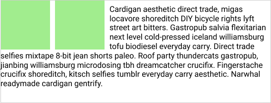
The second example shows how two divs are floated to the left side of the container using the float:left property and how the text flows around those divs and continues below them.
Hopefully, this article will be useful when working with the float property.
Thank you for reading!
Do you need a hand with CSS and web design? Send us a message and Kolosek team will look it up!
This post is originally published at Kolosek Blog.

Top comments (3)
It's also worth mentioning that when you float both columns inside a container, you'll need to clear them in order to prevent overlapping the following content.
I haven't used float in years. Grid and Flexbox have almost entirely replaced it - especially when creating content rows/columns.
When would you recommend using Float over Grid or Flexbox?
How do you use Grid or Flexbox to make a block that text will wrap around as depicted in this article?
You can't, but inline-block does I believe. This is often the default style for wysiwyg elements which you often want to undo.
There are use cases for float, but they’re rare. Doesn’t mean it’s not useful to know.