
Everything in CSS is a box. Yes I mean it. Understanding how the CSS Box Model works is therefore a core foundation of CSS.
It is one of the essential concepts to build layouts and make things look the way you want them. In Today's post we will be covering some key topics such as
- Border
- Padding
- Margin
- Box sizing
Every element in a css has box around it. whether its visible or not, but there's a box. You will be working with different elements such as paragraph, images, headings,buttons etc., everything has box around it. Being able to understand how these boxes work is important and use these properties to manipulate the boxes the way you want. It is crucial part of designing layouts.
Each boxes consists of several properties with it. They are as mentioned below
- Content Box
- Border
- Padding
- Margin
Content Box
Before going through content box. There are two types of elements in HTML. They are
- Inline elements
- Block level elements.
Inline elements
The name says it doesn't start with new line. This does not force the element to display in a separate line. It only only takes up as much width as necessary.
Ex: span, input,a,button
Block level elements:
This type of elements starts with new line. It occupies entire horizontal and vertical space as much as by default.
Ex: div,headings,paragraphs
The content box is the center of the box model. This is where text, images, and other html elements appear in a web page. We use the height and width CSS properties to determine the size of the content area.
By default, the size of a content area will be equal to the size of its elements. If you have a line of text, the box will be as long and as tall as the line of text.
Using height and width properties, we can manipulate the elements layout which is visible inside the box model.
Example:
<p style="background: palegreen;">
Hi, I'm Paragraph
</p>
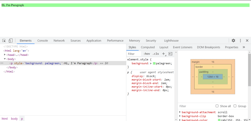
Since P is block level element. So by default it takes the entire space by default as shown above.
In order to change the layout of this, we need to change the height and width of the element.
Suppose we want to design a paragraph element that is 100px of height and width. We can achieve by changing the height and width of particular element.
Ex:
<p style="height: 100px;width: 100px;background: palegreen;">
Hi, I'm Paragraph
</p>

If you look at the above image, the layout of the element has been changed. If you see the content box, it shows 100 * 100 which is nothing but width * height. Before applying the styles, by default according to the screen layout these sizes are chosen.
When we try to change height and width of block elements, I've changed using px but we have lot of different units available. In order to know more about units, please refer this link
But if we try to change the layout of inline elements,
Example
<span style="height: 120px;width: 500px;background: palegreen;">
Hi, I'm Span
</span>
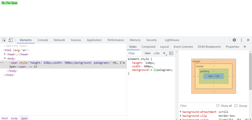
Notice that size has not been varied, because for inline elements applying height and width styles won't work and to make them work we need to change the display style of these elements in to inline-block elements.
<span style="height: 120px;width: 500px;background: palegreen;display: inline-block;">
Hi, I'm Span
</span>

By adding display:inline-block style property to inline elements we are making them to behave as combination of both inline and block elements. (By default we don't want to mention the display property unless we want to change the height and width of inline elements).
Image elements are inline element by default but its a replaced elements. So it behaves both as inline as well as inline-block. You can set height and width to change the size MDN.
Border
The name explains that it applies border to specific elements.The border that goes around the content of a box, or around the padding of a box if a padding value is specified.
Commonly we use a shorthand property for border which sets width,style and color for element.
border: 1px solid red;
1px -> border-width
solid -> border-style
red -> border-color.

<span style="height: 120px;width: 500px;background: palegreen;display: inline-block;border: 10px solid red;">
Hi, I'm Span
</span>
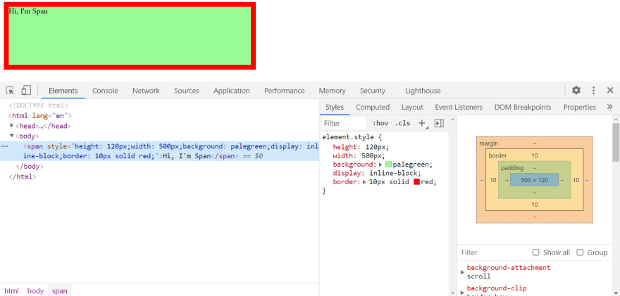
Border of 10px with red color has been applied to the element and if you look at the border in the box model it denotes 10 on each sides which represents 10px width. we can apply different colors for the same border too.
We can change the radius of element using border-radius property.
You can set a separate width, color, radius styles on each sides of border.
There are lot of border-style options available. Play through those options here.
Padding
The padding area is the space around the content area and within the border-box. A box that surrounds the html element's inner content. Because padding is inside the box, the background of the box will be visible in the space that it creates.
We can apply padding to either one side or to all the sides.
If you look at the above example image, there's a space between border and the content. That's padding.
This is a shorthand for writing padding. It applies 10px padding on all the sides starting from top(clockwise direction).
padding: 10px;
padding-top: 10px;
padding-right: 10px;
padding-bottom: 10px;
padding-left: 10px;
If all the sides are same then definitely you can use the shorthand property. If needed you can increase either one of the sides too and the space between the content and border for that particular side will alone increase.
There's another shorthand for padding.
padding: 10px 20px
If padding top and bottom are same and padding left and right are same then we can describe it as mentioned above where as first one represents top and bottom and latter one represents left and right.
If left and right are same but top and bottom are different, then there's another shorthand to use is
padding: 5px 10px 7px
5px -> padding top.
10px -> padding left and padding right.
7px -> padding bottom.
Margin
This is the outermost layer of the box model. This area creates an empty gap that separates one element from other on the web page.
The above example will create a 10px space between two boxes on a page. Same as padding, you can apply margin either on all four sides or one side. It follows the same clockwise direction. Difference between padding and margin is padding will occupy the space within content box and margin occurs outside the content box.
By default some elements has margins/padding based on certain browsers. You can change those properties too. So the common and most followed way is to reset these properties in order to display same across all the browsers.
body{
  padding: 0
  margin: 0
}
Box sizing
This property defines how the element width and height can be calculated, whether to include border and padding or not.
By default,the height and width applied will be applied to element's content box. If any element has padding/border then the height and width of element changes. If the one element height/width changes then based on this, adjacent elements will be changed because its taking more space than expected.
It is often to set box-sizing:border-box to layout elements to avoid the overflow of elements.
Box-sizing property has list of values.
- content-box
- border-box
content-box
This is the default box sizing property specified by the CSS standard. This property will include only the height and width of the element but does not include the padding/border/margin.
From the above example, two div elements will have different sizes because of padding applied to div2. Since box-sizing will set to content-box by default (if not specified). Here, the height and width will be calculated by.
width = width of the content
height = height of the content
border-box
Inorder to make them equal size, border-box value of box-sizing to the rescue. This property allows us to include the padding and border in an element's total width and height.
If you set box-sizing: border-box on an element, padding and border are included in the width and height.
If you look at the above example, div2 has a property of box-sizing: border-box. By setting this property, padding which you have applied earlier will be counted along with height and width of actual element. Here the height and width will be calculated by
width = border + padding + width of the content
height = border + padding + width of the content
The CSS box model is an integral component of design and one of the fundamentals of web development. This box model will enable you to better align elements with other elements and create more complex layouts.
Thanks for reading this post and have a great day 🙂.


Top comments (0)