Nowadays, we use our mobile devices more than our desktop devices. It’s pretty convenient and with the performance of mobile devices catching up with laptops, it was about time that we would prefer them. After all, isn’t it convenient to binge on your favorite shows online just before you head to sleep or catching up on your newsfeed while you’re on commute to the office on your mobile devices?
This is why as a developer, you need to make sure that your users get seamless experience on your website regardless of the device they are using. Since every mobile device might use a different viewport, you need to make sure that your website looks and perform on mobile devices as well as your desktop website. One way to make sure of this is by ensuring that your website has responsive web design and it renders perfectly on the different mobile devices. In case you’re wondering, what is a responsive web design, you can refer to our article on the topic.
It can be tricky to test on so many different viewports and debug them simultaneously. That’s where LambdaTest comes in, you can test your website for responsiveness on 56+ devices and make sure that your website looks great on all of them! In this article, I’ll highlight 9 important features that will help you to do Responsive testing easily.
1. Test Locally Hosted Website
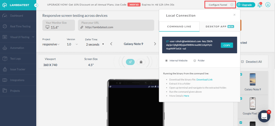
You can now test your local website before making the website live. With LambdaTest you can test you locally or private hosted website easily by using a tunnel to connect your machines to our cloud servers with a secure shell hosting(SSH) based integration tunnel. Using our tunnels you can easily validate your website with responsive testing across 56+ mobile devices and test on these different mobile devices for responsiveness.
There are two ways to configure Lambda Tunnel, you can use the command line or use our Underpass desktop application to bypass command line.
In order to set up the Lambda tunnel with the command line, you’ll have to use the following syntax to configure your tunnel:
LT --user {username} --key {access key}
You can also use our Underpass desktop application to configure the tunnel without using the command line. With Underpass you can save that extra effort to connect with the command line and get started with website responsive test with just a click! All you need to do is download the app, install, enter your credentials and you can easily perform local page testing.
2. Switch To Real-Time On The Same Configuration
This feature was actually requested by one of our users, and it has actually worked like a charm for a lot of users and helped them save their time while easily switching from responsive testing to real-time cross browser testing. A lot of time users would want to move to live sessions from responsive testing. Earlier this process at times proved to be a hassle as users would have to go again with the process of selecting browsers, OS, and their version. With this simple but effective feature, users can easily switch to live testing sessions on the same configuration
This was one of many times our users have helped us to improve. For us, at LambdaTest our users are really important and any such suggestions are always welcome and we’d love to go the extra mile for you guys.
As mentioned above, with the real-time feature, you can easily switch the session and perform live interactive testing of your website on the same configurations.
3. Switch Monitor Size
With Lambdatest you can pick your monitor size( diagonal length of your screen). This feature was rolled out in order to make sure that the viewport remains with different screen sizes, and there is no discrepancy in checking responsiveness on different screen sizes.
4. Mark Bugs With Single Click
Now you don’t have to worry about taking screenshots of bugs manually and uploading them to your project management tool to share it with your team. LambdaTest saves this effort by making this process much easier.
You can easily mark any bugs on your website with our ‘Mark as bug’ feature. It allows you to easily capture any UI deviation on your website and share it directly with your team. With our in-built image editor, you can easily highlight any UI deviation by using different shapes, text, and crayons in different colors.
After marking the bug you can easily share it with your team on your favorite project management tool. We offer integrations to various third-party tools such as Asana, Jira, Trello, etc. You can view all the integrations we offer here, in case we’re missing out on your tool do reach out to us and we’d make sure that we get it onboard for you.
5. Enable Smart Scroll
In certain cases, your pages might have some iframes and they have scrolls. What happens when we perform responsive testing then? Well, in such cases you’d have to scroll through every iframe, and scrolling through each one can prove to be such a hassle. So, how do you fix it? This issue can be easily fixed by turning on the smart scroll. This would ignore any scroll in the iframe and you wouldn’t have to spend eternity just scrolling down the page.
6. Basic Authentication For Password Protected Websites?
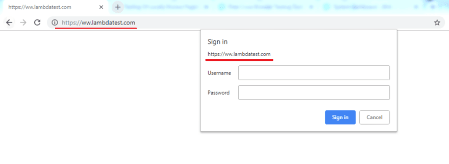
There might be certain pages which are password protected and you need to get through them to test. So what do you do in such situations?
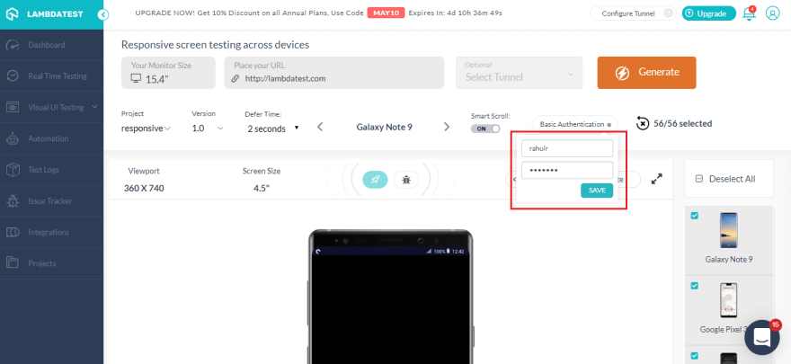
You’ve got nothing to worry about as LambdaTest has a feature addressing the issue. With our ‘Basic Authentication’ feature, you can enter your login details, click on save and you’re good to go.
After you’ve clicked on ‘Save’, you’d notice that basic authentication is enabled and now you can run website responsive test on your password-protected website or web applications.
7. Debug Your Website
You can now debug your websites with the new add-in functionality of LT Brower. You just need to click on the debug icon and it’ll take you to the LT Browser.
With LT Browser you can easily perform mobile website test and debug with the inbuilt chrome dev tools. You can test a website on different devices in side by side view and debug using separate dev tools for both the devices simultaneously.
8. How to Create Projects
You can now create different Projects and their different versions with LambdaTest. These project can also be viewed in the project tab to keep a tab on your website responsive test
9. How To View The Website On Landscape Mode?
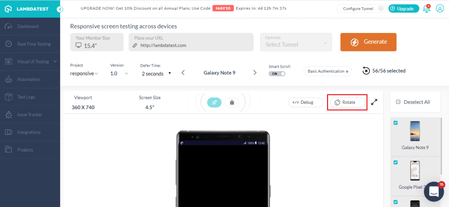
You can also test your website both on landscape and portrait mode. All you have to do is click on the rotate button marked below and you can ensure that your website is also responsive on the landscape mode as well.
There’s a lot more than that you can do with responsive testing with LambdaTest. You can also set ‘ defer time ’ for the website to load on different devices.
Bonus Step: Using LT Browser for Responsive Testing
At LambdaTest, we’ve come with a tool to make website responsive test easier for you. With LT Browser you can check the mobile view of the website on 25+ devices. With different iOS and Android devices to choose from you can check your website for responsiveness. You can also create custom devices to test on a viewport of your choice, with different device sizes and resolutions to choose from, no device is out of your reach.
Now you can do mobile website test and compare different devices simultaneously, now you can test on android phone and iPad simultaneously with LT Browser. Use chrome dev tools in LT Browsers to debug on the devices simultaneously as well. The major advantage of using LT Browser is that it is blazing fast in comparison to any cloud-based application.
Apart from these features, the LT Browser also has the option of integrating your favorite bug management tool to collaborate with your team. You can easily take screenshots of your webpage and even record different sections as well.
Wrapping It Up!
Responsive testing is becoming more important every day as the number of mobile users keeps on increasing. You need to ensure that your website renders on all the viewports seamlessly. In this article, I explored different features you can use with LambdaTest to perform responsive testing. These features help you to test your local website, mark bugs, test for a password-protected website. Further, I went through how you could utilize LT Browser for mobile website test.
If there any feature you feel that should be a part of LambdaTest for responsive testing, do let us know in the comment section down below. We’re always open to suggestions and would love to add any new features that would help our users along the way. Happy Testing!!! 😃


Top comments (0)