
I was making a project with good ol Vanilla CSS and I was trying to align elements on the screen and found it extremely tedious to align each element using relative positioning. And it took me considerable efforts to make a menu bar.
There had to be some way which made it easier and the solution was CSS Flexbox and this is what I learned from it.
What is CSS Flexbox?
CSS Flexbox is a Web Layout model that helps to craft screen layouts.
Using Flexbox, you can control position, size, and spacing of elements relative to their parent element and each other.
One great use of flexbox is that it works in making your screens responsive to varying screen types.
The point being you can make better NavBars, Menus, Grid Layouts, Bar Charts, Equal height columns and all that.
How to apply flex?
First off, we need to understand a container and flex-items. The image below does the explanation I feel.

Now this is the easy part, Lets say you have a container with three flex-items .
It would look like this.
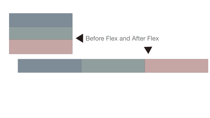
Flex is a display property. So apply flex on the parent container so that all the elements inside become the flex-items and they are put in a row/ column layout.
.container{ display: flex;}
Optional read: Most browsers support flexbox, but, Mordenizr is a JS Library that tells you if your browser supports flexbox or not!
Flex Properties (for flex-items)
Now that flex has been applied they have a nice row/column layout but it still looks shabby and needs an add-on to make it look prettier. So, in order to do that there are a few properties that we could use.
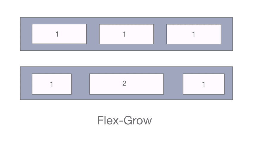
Flex Grow
This defines the ability for a flex item to grow if necessary. Basically like a growth rate. It takes in a unitless value and serves as a proportion of growth and as a result, uses up the space inside of the flex container.
If I gave flex-grow as 1 to all the elements, all of them will take up the container space equally. But if I gave one of the elements a value of 2 then it would grow twice as much as the other elements.
Flex Shrink
It is the exact opposite of flex-growth. It works exactly the same way just that you can think of it as a shrink rate. So, the bigger the shrink value the more it shrinks.
Note: Negative numbers are invalid.
Flex Basis
It is the starting width of an element like a min-width.This defines the default size of an element before the remaining space is distributed.
Default value of flex-basis is 'auto' which means “look at my width or height property”. or you could give it a custom length.
If I had to give flex-grow, flex-shrink and flex-basis combined, I'd do it as:
flex: (flex-grow) (flex-shrink) (flex-basis);
It's default goes like flex: 0 1 auto;
It's like a shorthand flex command.
Element Order
By default, flex items are laid out in the source order. However, the order property controls the order in which they appear in the flex container.
.one{order:2};

.two{order:0};

.three{order:1};
Let's talk about Axis
Flex Direction
In 8th standard Mathematics, I remember I was thought about The Cartesian coordinate system having four axes.
I can't help but relate the four flex directions with them.
The Positive X-axis is row. i.e left to right
The Negative X-axis is row-reverse i.e right to left
The Negative Y-axis is column. i.e top to bottom
The positive Y-axis is column-reverse. i.e bottom to top
The Direction along with the flow, is called as the main axis and the coordinate perpendicular to it is called the cross axis

Positioning elements on the main-axis and cross-axis
To position elements on the main axis we use Justify-content
It helps distribute extra free space leftover when either all the flex items on a line are inflexible, or are flexible but have reached their maximum size. It also exerts some control over the alignment of items when they overflow the line.
justify-content : flex-start | flex-end | center | space-between | space-around | space-evenly | start | end | left | right ... + safe | unsafe;
Here, Flex-start: will position all the flex-items of that container to the start of the container.
Flex-end : will position all the flex-items of that container to the end of the container.
center: will position flex-items to the center of the container on the main axis.
space-between: items are evenly distributed in the line; first item is on the start line, last item on the end line
space around: items are evenly distributed in the line with equal space around them.
space-evenly: items are distributed so that the spacing between any two items (and the space to the edges) is equal.
There are also two additional keywords you can pair with these values: safe and unsafe. Using safe ensures that however you do this type of positioning, you can’t push an element such that it renders off-screen. And unsafe is its antonym.

To position elements on the cross axis, we use Align-items
This defines the default behavior for how flex items are laid out along the cross axis on the current line. Think of it as the justify-content version for the cross-axis (perpendicular to the main-axis).
align-items: stretch | flex-start | flex-end | center | baseline | first baseline | last baseline | start | end | self-end + ... safe | unsafe;
stretch:stretch to fill the container (still respect min-width/max-width)
flex-start, flex-end, and center do the same functionality just that they perform this on the cross axis.
baseline:items are aligned such as their baselines align and first-baseline will align all elements with respect to the baseline of the first element .Similarly, last-baseline
safe and unsafe work the same as written above!

### Elements too crowded in one row?...Flex-wrap it!!
By default, flex items will all try to fit onto one line. You can change that and allow the items to wrap as needed with this property.
flex-wrap: nowrap | wrap | wrap-reverse;
nowrap: will have the default behaviour.
wrap: will move the last element to the next line as needed.
wrap-reverse : will move the last element to the previous line as needed.
An amalgamation of flex-direction and flex-wrap is flex-flow!
flex-flow: (flex-direction) (flex-wrap);
default: flex-flow: row nowrap;
Having looked through all these properties, Making screen layouts becomes wayyy easier.
Let's just look at making a navbar with Vanilla css versus with flexbox:
I was trying to clone a navbar from a social media page and I had to position each element with a particular value which was admittingly not the best way to make it. Not to forget the lines of repetitive code making it long and laborious.
But using flexbox not only was my code well structured but also really easy to make and required barely a line to position all the elements of the nav bar put together with some basic styling. Almost seemed magical
Even to style and position elements through the content is obviously more efficient and not to mention its benefit with making websites responsive.
Moreover, I've begun to understand to make most of the web pages with flexbox, and has indeed made my work more easy.
My social media handles:
Twitter: @MysoreSrividya
LinkedIn: Srividya M Venkatesh
Original Post: Hashnode Post

Top comments (0)