Originally posted by my colleague Bonnie Pecevich on mux.com/blog
In the process of creating a BART ad for the first time, we had some learnings that we thought we would share that could hopefully help someone else on their out-of-home ad buying journey. (We’ll also remember to follow our own advice for next time.)
Our learnings:
- Ask upfront for explicit restrictions on creative.
- Build in extra time for more than one round of feedback and time to iterate on design.
- Be realistic about what’s feasible, especially with an aggressive timeline.
- Submit a draft of the concept and see if they’ll approve it before you spend extra time finalizing the details (and telling everyone about it at the company all hands meeting.)
All of these learnings actually stemmed from one preeminent learning:
BART doesn’t allow any code on their ads. 😲
Why put code in an ad?
First, an introduction–Mux is a startup that does video, and one of our aspirational goals is for every developer to know that. With our headquarters located in San Francisco, we’re aware that our city has a great supply of developers so we thought we’d try advertising in some well-traveled, public spaces.
Doing ads in a BART station (the underground transit system in the Bay Area) is generally assumed to be expensive, maybe even beyond the reach of a startup which is what we thought, too. But we learned doing an ad could fit in our budget if we were flexible on timing–we were able to sign up for a single digital display at the Montgomery BART station with a 12/30/19 start date. Even though that only gave us about 2 weeks to create an ad (ignore the wailing coming from our one and only in-house designer), we were excited!
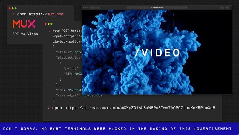
Since the ad is just :15 seconds long with a not-so-captive audience, we wanted to create something that quickly caught the attention of developers. We thought we could achieve this by showing a terminal with a blinking cursor and then typed code to show use of our API. Sure, it crossed our minds that a blank screen with a blinking cursor might look like the screen is broken (which adds to the eye-catching-ness), so we added browsers to frame the terminal and added our logo to the top left corner. Our hope was that someone would take away that Mux is for developers and, if we were lucky, that we do something with video.
Insert wrench here
The process was to submit a final file at least a week in advance of the live date to include time to get BART’s approval. There weren’t any specific guidelines beforehand on what’s allowed and what’s not but we assumed some common sense restrictions would apply like no explicit/harmful language imagery, etc. We figured getting BART’s approval would be relatively simple, like checking a box.
Wrong. Our ad was rejected! We received feedback that the beginning of the ad that showed the terminal could give the impression that “the screen is malfunctioning or has been hacked into.”
Busted. Turns out they also thought having a terminal on the screen would be eye-catching but not in a good way. We did feel a bit deflated, though, as we were all ready for our BART debut.
We went through the five stages of grief and settled on “Bargaining.” We tried to come up with a creative solution where we could still use the same ad. Hey, what if we could add a persistent banner to the ad that said something like “Don’t worry, no BART terminals were hacked in the making of this ad.”?
Or what if we stylized the terminal so it looked more illustrated and cartoon-y?
Alas, BART held firm and said, in no uncertain terms, “Nothing involving coding.” Since we couldn’t come up with a brand new design in 48 hours, our plans for a BART ad had to be put on hold.
Silver lining
All is not lost! We used the final video for our homepage and are genuinely excited at how it came out.
Although the BART approval process is still a bit of a black box, we're excited to continue to work with the same ad agency and pursue our out-of-home ad dreams. We’re looking forward to iterating our design and hopefully making a public appearance at CalTrain in the very near future. And if you see our ad, you’ll know the journey it took to get that little video up on those screens.


Top comments (0)