This tutorial will mainly focus on how to use transitions in CSS and make a toggle button for light as well as dark mode using little JavaScript. Let's dive into the world of transitions!
HTML
HTML Markup is pretty simple to understand. All you have to do is to make a container for the icons that we are going to use from fontawesome and nest the respective divs containing the icons inside the container.
<div class="container">
   <div class="sun sun-logo">
      <i class="fas fa-sun"></i>
   </div>
   <div class="moon moon-logo">
      <i class="fas fa-moon"></i>
   </div>
</div>
CSS
.container{
    position: relative;
}

.sun, .moon{
    font-size: 10rem;
    width: fit-content;
    height: fit-content;
}

.moon{
    position: absolute;
    inset: 0;
}
Set the container position to be relative and the moon container position to be absolute because we will position the moon icon in the same position as that of the sun icon.
Here's the interesting part. Instead of using top: 0; bottom: 0; left: 0; and right: 0; you can use inset: 0; to get the same result. It works!
Also, set the height and width of the sun and the moon container to fit-content. What this will do is, it will set the height and width of the container to match the height and width of the content inside it.
And, in order to change the size of the fontawesome icon, just change the font-size of the icon.
.moon-logo{
    opacity: 0;
    transform: translateY(20%) rotateZ(50deg);
}
Next, we will set up the initial position of the moon icon and its initial opacity when the webpage is rendered for the first time. Here, as the opacity of the moon icon is zero, only the sun icon will be visible to us.
The translateY(20%) declaration will offset the moon icon down along the Y-axis by 20% of the height of it's parent element.
Similarly, the rotateZ(50deg) declaration will rotate the moon icon along the Z-axis by 50 degrees.
.sun-logo{
    opacity: 1;
    transform: translateY(0) rotateZ(0deg);
}
In the same way, we will set the initial properties for the sun icon.
.animate-sun{
    opacity: 0;
    transform: translateY(20%) rotateZ(100deg);
    color: aliceblue;
}
Now, we will set the final properties of the sun icon to which it will transition into.
.animate-moon{
    opacity: 1;
    transform: translateY(0%) rotateZ(0deg);
    color: aliceblue;
}
Also, we will set the final properties of the moon icon to which it will transition into. One thing to note here is the default color of the icons is black, so if you want to change the color of the icon, then define its color property.
But wait, we haven't used the transition property yet, so how will it transition from one state to another? Yeah, that's the only thing left to do in CSS part.
.moon-logo{
    opacity: 0;
    transform: translateY(20%) rotateZ(50deg);
    transition: all 1s ease-out;
}
.sun-logo{
    opacity: 1;
    transform: translateY(0) rotateZ(0deg);
    transition: all 1s ease-out;
}
body{
    transition: background-color 1s;
}

.dark{
    background-color: black;
}
We will use the above class to change the background-color of the body when the transition of the icons will happen.
That's it. Your CSS part is ready.
Now, let's move on to the JavaScript part. We will use JavaScript to toggle the classes on click event.
JavaScript
document.querySelector(".container").addEventListener("click", () => {
    document.querySelector(".sun-logo").classList.toggle("animate-sun");
    document.querySelector(".moon-logo").classList.toggle("animate-moon");
    document.querySelector("body").classList.toggle("dark");
})
Here, we have added an eventListener to the container element so that when we click on the container, it will toggle the CSS classes for respective elements.
Which means that, if the CSS class is not present in the classList of an element, toggle function will add the CSS class to the classList of the respective element.
And, if the CSS class is already present in the classList of the element, it will remove it.
The classList is actually a DOMTokenList but we will not go into the specifics of it.
This is it. Here's the final output.


Oldest comments (36)
Opp bro 🔥🔥
Thanks !
Great!
Thanks 😊
i suggest you to embed the example using codepen
Okay, I will embed it!
It's now embedded!
Nice
Glad you like it
your writing code have some mistek please solve it its not changing moon icon
Make sure to link your CSS and JavaScript file with your HTML..
If you are still facing issues, then refer the CodePen of this tutorial.
esta muy bueno, pero lo he intentado y nada que me sale y he sido muy cuidadoso al punto de hacer tal cual como esta aquí sin cambiar nada desde mi entorno local.
Lo he solucionado, el script debe cargarse al final del body
Great! You have to link your CSS and JavaScript file in your HTML page..
O usa defer
Note:- The CodePen version of this tutorial is slightly different because I have used SVG icons from font-awesome in the codepen. So, do not get confused.
Weldone! I see you have a color property of value aliceblue in both icons. But I didn't notice any color change during the transition. Could it be because you placed it after the css opacity property, so it becomes fully transparent before any significant color change?
I just observed now that you don't have the color property set in the CodePen version.
Yeah, because I have used SVG icons there and you must use
fillproperty instead ofcolorproperty in order to change the color of the SVG element.Color change is visible. If you want to see it in slow motion, just increase the duration of the transition!
I suggest you use highlight for your code. 😃
Oh, I didn't get it. How would you do that?
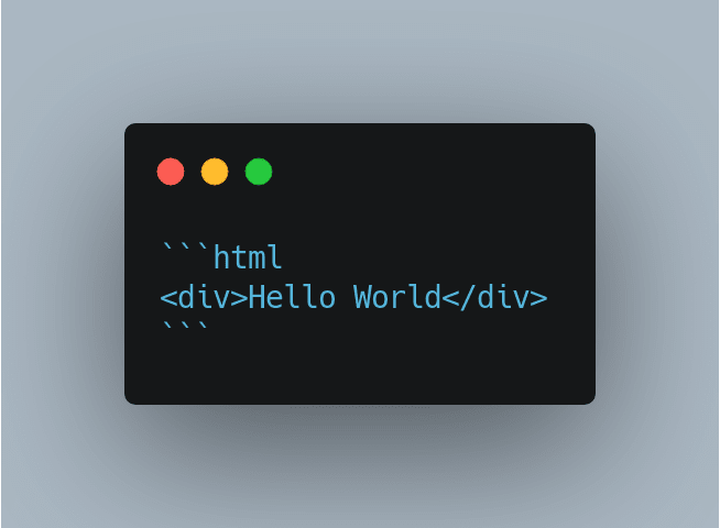
You can add the program language tag when you use markdown code syntax.

Like this:
That's amazing! Thanks for telling me. I wasn't aware of this. 🙌
Lol, Now this article looks more pretty.👍
Yup :)