
Recently, there was a Twitter poll floating around where the user asked their followers a question about CSS specificity . Unfortunately, I was unable to find the original tweet(comment below if you happen to find it!) but long story short, the majority of people got the answer wrong.
That Twitter poll (and its aftermath) led to me brushing up on my own knowledge on the topic of specificity and in turn, led me on a journey of fixing specificity issues in my own projects which brings me to the purpose of this post.
In this post, we will be refactoring CSS code from a project of mine that has CSS specificity issues that are in need of fixing.
CSS Specificity
Definition
Specificity is described by MDN Web Docs as "the means by which browsers decide which CSS property values are the most relevant to an element and therefore, applied."
Rules
When deciding which CSS property values are the most relevant to apply to an element, the browser uses the source order (i.e the cascade) of the CSS stylesheet to determine this. But this rule applies when the CSS selectors have equal specificity. What happens when the specificity of one CSS selector is higher than another?
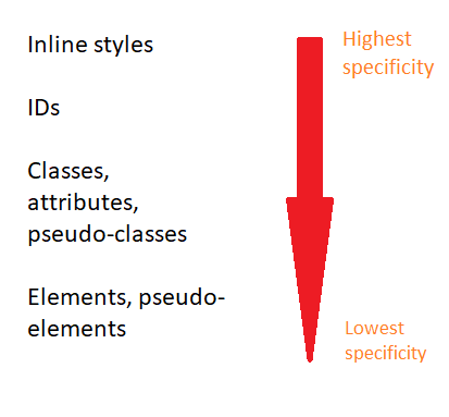
In that case, browsers will use the specificity of a CSS selector to determine what CSS statements to apply. The higher the specificity of a CSS selector, the more likely that browsers will apply its CSS declarations over another.
nav a {
  color: green;
}
a {
  color: red;
}
For example, in the example above, both of the CSS selectors are targeting the same HTML element, the anchor tag. In order to determine which CSS rule to apply to the anchor tag, the browser will calculate the specificity value and check which one is the highest. In this case, the first selector has a higher specificity value therefore, the browser will use its declarations to apply to the anchor tag.
I'd like to point out here that although !important is not a CSS selector, it is a keyword that is used to forcefully override a CSS rule regardless of the specificity value, origin or source order of a CSS selector. Some use cases include:
Temporary fixes (a bit like putting duct-tape on a leaky pipe)
Overriding inline styling
Testing/debugging purposes
As useful as using the !important keyword may seem, the use of it can be more problematic than useful. Over time, it can make it difficult to maintain your CSS and it can negatively affect the readability of your stylesheet particularly for anyone else who is or will be working with it in the future.
Which brings us to what we'll be doing today - fixing the specificity issues in a project.
The Project

A little background about the project we'll be refactoring - it is a Netflix inspired landing page using MovieDB's API.
The stylesheet
The aim is to remove the "!important" keyword from the CSS rules that it has been applied to by refactoring the code so that it follows specificity rules.
Below, you can see the stylesheet for the project.
@import url("https://fonts.googleapis.com/css?family=Montserrat:400,400i,700");
body {
  margin: 0;
  padding: 0;
  overflow-x: hidden;
}
.wrapper {
  width: 100%;
}
.wrapper #header {
  position: fixed;
  z-index: 300;
  padding: 15px;
  width: calc(100% - 30px);
  display: flex;
  justify-content: space-between;
  align-items: center;
  background: linear-gradient(to bottom, black 0%, transparent 100%);
}
.wrapper #header #brand-logo {
  color: #d32f2f;
  text-shadow: 1px 1px 2px black;
  letter-spacing: 5px;
  text-transform: uppercase;
  font-family: Montserrat;
  font-weight: bold;
  font-size: 22px;
}
.wrapper #header #menu-icon {
  display: none;
}
.wrapper #header .nav-link,
.wrapper #header .icon {
  color: #bdbdbd;
  cursor: pointer;
}
.wrapper #header .nav-menu {
  width: 400px;
  display: flex;
  justify-content: space-around;
  align-items: center;
}
.wrapper #header .nav-link {
  padding: 5px 10px;
  font-size: 15px;
  font-family: century gothic;
  text-decoration: none;
  transition: background-color 0.2s ease-in;
}
.wrapper #header .nav-link:hover {
  color: #c62828;
  background-color: rgba(0, 0, 0, 0.7);
}
.wrapper #header .icon {
  font-size: 16px;
}
.wrapper #header .icon:hover {
  color: #c62828;
}
.wrapper #site-banner,
.wrapper #categories {
  width: 100%;
}
.wrapper #site-banner {
  height: 550px;
  background-image: url("https://s1.gifyu.com/images/rampage_2018-1024x576.jpg");
  background-size: cover;
  background-position: center;
  background-repeat: no-repeat;
  background-attachment: fixed;
}
.wrapper #site-banner .main-movie-title,
.wrapper #site-banner .watch-btn,
.wrapper #site-banner .main-overview {
  position: absolute;
  z-index: 3;
}
.wrapper #site-banner .main-movie-title, .wrapper #site-banner .watch-btn {
  text-transform: uppercase;
}
.wrapper #site-banner .main-movie-title {
  top: 120px;
  left: 20px;
  background: -webkit-linear-gradient(#ff9100, #dd2c00);
  -webkit-background-clip: text;
  -webkit-text-fill-color: transparent;
  font-size: 55px;
  font-family: Montserrat;
  font-weight: bold;
}
.wrapper #site-banner .main-overview {
  width: 400px;
  top: 230px;
  left: 25px;
  color: #fafafa;
  line-height: 25px;
  font-family: helvetica;
}
.wrapper #site-banner .watch-btn {
  width: 150px;
  height: 35px;
  top: 350px;
  left: 25px;
  border: none;
  border-radius: 20px;
  color: #fafafa;
  cursor: pointer;
  transition: all 0.2s ease-in;
  background-color: #ff0000;
  box-shadow: 1px 5px 15px #940000;
}
.wrapper #site-banner .watch-btn:hover {
  color: #F5F5F5;
  background-color: #940000;
}
.wrapper .after {
  position: relative;
  top: 0;
  left: 0;
  z-index: 2;
  width: 100%;
  height: 100%;
  background-color: rgba(0, 0, 0, 0.3);
}
.wrapper #categories {
  padding: 30px 0;
  display: flex;
  flex-direction: column;
  background: linear-gradient(to top, #090909 0%, #000000 100%);
  overflow: hidden;
}
.wrapper #categories .category {
  margin: 30px 0;
}
.wrapper #categories .category-header, .wrapper #categories .content {
  margin-left: 20px;
  color: #B0BEC5;
  font-family: helvetica;
}
.wrapper #categories .category-header {
  margin-bottom: 50px;
  font-weight: normal;
  letter-spacing: 5px;
}
.wrapper #categories .content {
  position: relative;
  right: 0;
  display: flex;
  justify-content: flex-start;
  transition: all 3s ease-in-out;
}
.wrapper #categories .movie {
  margin-right: 10px;
  display: flex;
  flex-direction: column;
  align-items: center;
  justify-content: flex-start;
}
.wrapper #categories .movie-img {
  transition: all 0.2s ease-in;
}
.wrapper #categories .movie-img:hover {
  -webkit-filter: contrast(1.1);
          filter: contrast(1.1);
  -webkit-transform: scale(1.05);
          transform: scale(1.05);
  cursor: pointer;
}
.wrapper #footer {
  width: 100%;
  height: 120px;
  background-color: #090909;
  display: flex;
  align-items: flex-end;
  justify-content: flex-start;
}
.wrapper #footer #copyright-label {
  margin-left: 20px;
  padding: 10px;
  color: rgba(255, 255, 255, 0.3);
  opacity: 0.7;
  letter-spacing: 2px;
  font-family: helvetica;
  font-size: 12px;
}
//Media Query
@media (max-width: 750px) {
  .nav-menu {
    visibility: hidden;
  }
#menu-icon {
    display: block !important;
    font-size: 22px;
  }
.main-movie-title {
    font-size: 45px !important;
  }
.main-overview {
    width: 350px !important;
    font-size: 14px !important;
  }
.watch-btn {
    width: 130px !important;
    height: 25px !important;
    font-size: 13px;
  }
.movie-img {
    width: 170px;
  }
}
So, we can see from the stylesheet that the use of the !important keyword is mainly focused in the media query section which outlines the styles that the browser should apply when the screen-width is less than 750 pixels.
So, what happens when we remove the !important keyword from the CSS rules that it has been applied to? Well, we no longer have a "trump card" forcefully overriding the CSS rules of other CSS selectors that target the same HTML element. So, the browser will look at the stylesheet to see if there are any conflicting CSS rules.
If there are, then in order to determine which CSS rules to apply over another, the browser will use the source order, specificity and importance of the CSS selectors. If the CSS selectors with conflicting CSS rules have equal specificity, then the browser will use the source order rule and apply the CSS rules of the CSS selector that comes lower down in the stylesheet. Using this information, we can see that this situation is not the case for our stylesheet.
But, if the CSS selectors with conflicting CSS rules don't have equal specificity, then the browser will apply the CSS rules of the CSS selector that has higher specificity. We can see from our stylesheet that this is the case; the CSS selectors in our media query have lower specificity than the CSS selectors in the main part of our stylesheet.
Now that we have identified the issue, let's fix it!
First we have to locate the corresponding CSS selectors that match the CSS selectors in our media query.
.wrapper #header #menu-icon {
  display: none;
}
.wrapper #site-banner .main-movie-title {
  ...
  font-size: 55px;
  ...
}
.wrapper #site-banner .main-overview {
  width: 400px;
  ...
}
.wrapper #site-banner .watch-btn {
  width: 150px;
  height: 35px;
  ...
}
@media (max-width: 750px) {
#menu-icon {
    display: block !important;
    ...
  }
.main-movie-title {
    font-size: 45px !important;
  }
.main-overview {
    width: 350px !important;
    font-size: 14px !important;
  }
.watch-btn {
    width: 130px !important;
    height: 25px !important;
    ...
  }
}
We can see that the CSS selectors in the main part of the stylesheet have higher specificity than the corresponding CSS selectors in the media query. Despite the CSS selectors in the media query appearing later on in the stylesheet, because of specificity rules (which take precedence over source order rules), the browser will apply the CSS rules of the CSS selectors that come before it. To fix this, we must increase the specificity values of the CSS selectors in the media query. If we make it so that the CSS selectors that target the same HTML elements have equal specificity, then the browser will follow the source order rule; the CSS rules outlined in the media query (that's located lower down in the stylesheet) will be applied when the screen-width is less than 750 pixels.
The end result will look like this:
.wrapper #header #menu-icon {
  display: none;
}
.wrapper #site-banner .main-movie-title {
  ...
  font-size: 55px;
  ...
}
.wrapper #site-banner .main-overview {
  width: 400px;
  ...
}
.wrapper #site-banner .watch-btn {
  width: 150px;
  height: 35px;
  ...
}
@media (max-width: 750px) {
.wrapper #header #menu-icon {
    display: block;
    ...
  }
.wrapper #site-banner .main-movie-title {
    font-size: 45px;
  }
.wrapper #site-banner .main-overview {
    width: 350px;
    font-size: 14px;
  }
.wrapper #site-banner .watch-btn {
    width: 130px;
    height: 25px;
    font-size: 13px;
  }
}
And that's it! We have removed all traces of the !important keyword from the stylesheet. Already we can see that the stylesheet is easier to read and you can imagine that our refactored stylesheet would be a lot easier to work with and maintain particularly if others will be working on it too.
Conclusion
So, what have we learned?
We have learned about how browsers determine which CSS styles to apply by using the source order, specificity and origin of selectors. We have also learned about the problems which can arise by using !important in your CSS and why its uses should be kept to a bare minimum.
We do not have to resort to using !important in order to fix things - there are much better solutions out there.
The concept of specificity is one that can take a while to get your head around but I hope that by documenting the process and using a real project, it helps you better understand the concept of specificity and how to apply it in your own CSS.
Additional Resources
- MDN Web Docs
- Batficity by Mandy Michael
- CSS Specificity Wars by Andy Clarke
- Specificity Visualizer by Francesco Schwarz
- When using !important is the right choice by Chris Coyier
You can find the project we've been working on here.

Top comments (15)
I really like that you've emphasized that reading about specificity makes you review your own project and try to remove the !important quick fix solution from your project.
I'm now struggling with some legacy codebase where applying !important was the first idea to fix any problem, as investigating (especially because it involved third-party libraries with its own styles) was really time-consuming and quite hard.
And I'm wondering what is the best way to pass the knowledge and good practices about specificity to other developers in the team just to make them see the fastest solution is not the best because finally it could end up like this:
Keep up good work promoting learning about specificity instead of sticking to !important :)
PS: I think you've misspelled the resource of Mandy Michael. If wa talking about the same thing the project name is Batificity, and the link probably suppose to lead to batificity.com, not MDNsite :)
Hi Malgosia, I'm glad you enjoyed the post! Thank you so much for sharing your experience, it really puts it into perspective the repercussions of using !important as a fix, particularly on legacy codebases where resolving the problems that arise with the overuse of !important can be tedious and very time-consuming.
I'm sorry to hear that you have the difficult task of correcting the mistakes of your predecessors and wish you the best of luck.
That is a perfect GIF to describe the impact that abusing !important can have on codebases! With regards to the best ways of passing knowledge and good practices to your team, I came across a really good post by
Joe DuVall
How do you share knowledge?
Joe DuVall
Thank you for the heads up! I've fixed the error so it's linked to the correct resource :)
Awesome thank you :)
I think it's not only my struggle, there is a lot of projects like this :D
For me actually, it's not only about fixing it but what's more important for me - introduce good practices and teach my team members about the importance of avoiding !important :D and of course so they are convinced about this not only do it because someone asks :)
Really appreciate the article :) For sure will help me :)
Keep up spreading good CSS practices :)
This is an excellent article! Until recently, I had been extensively using
!importanton my code as well and one of my colleagues taught the importance of using specificity.A quick tip that helps me a lot when I want to target a specific element for writing CSS, is to right-click on that element's HTML element on the browser dev tools, and then use
Copy->Copy selector.For example, in the image attached below, it gives me this CSS selector:
#article-body > p:nth-child(43)This feature on the browser has helped me numerous times when I want to target specific elements strictly.
Image link: cld.wthms.co/Y8ORoK
That's a useful trick... but in your example it's only useful if the page content or theme never changes, because you can't guarantee your highlighted paragraph is going to be the forty-third forever...
Thank you Arun, I'm glad you enjoyed the post! I was the same, using !important excessively but no more! Once you learn about specificity and !important, it makes it difficult to willingly use it without thinking twice about it.
Thank you for the tip - I haven't used that feature before but I can definitely see its uses!
Nice post, emphasizing to remove
!importantwhere possible (and almost everywhere it is) is a good point. But how about dealing with specifity in your case from the other side? Instead of increasing the specifity in the media query you could reduce it in the former part. This would have the same effect and increases the readability. Seeing two nested id selectors always looks suspicious to me.Great post Muna! Was this tweet by @mxstbr the one you’re referring to?
Thank you Ben, that means a lot :D! Yes, that's the one! I bookmarked it on Twitter but couldn't find it anywhere!
Thank you Muna, it’s a great post.
Thank you! I'm glad you enjoyed the post! :)
I would encourage you to take this a step further and eliminate ID-based selectors from your CSS. Their specificity makes them very difficult to override without getting obnoxiously specific in your overrides, so you end up with some really ugly (and brittle) selectors that you end up fighting. I personally try to never write a selector that has more than three discriminators in it, because it makes CSS more reusable, but I must also admit I don't write very much CSS because the backend is my natural habitat :)
SMACSS allows usage of !important but only to state change like hover or active. I agree with that, it has sense.
Thank you Luis, I'm glad you enjoyed the article! Definitely, it really pays off to learn about specificity.
Great article! I try not to use it in any of my code... Except some times it is !important for JavaScript interactions to override certain things. But, for the most part, it isn't necessary.