Hey everyone! It's time for another post in my journey of re-learning web development. As I was re-learning most of it, I was seeing a lot of other developers do Todo lists in Javascript. I was beginning to learn Node.js and it occurred to me that a service I use could be replicated for practice. That service is Trello.
If you have no idea what Trello is, it is a task-tracking tool, a todo list of sorts that is simple and fast to use. The interface is especially cute and easy to learn. So, I thought, why not give it a go?
It wasn't long after I wrote my first few lines of code that I started to notice something strange.
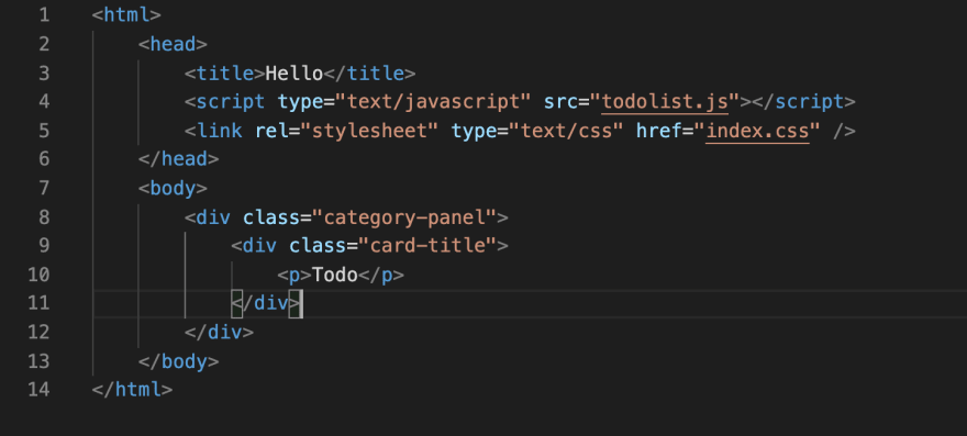
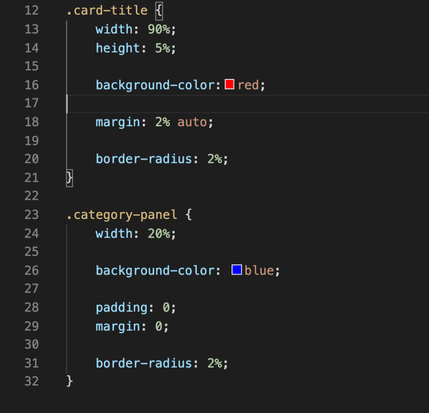
Let me show you my code.
As you can see, there is a parent div called "category-panel" and there is a child div called "card-title".
Now, look at the website that renders.

The parent div has a dark blue background colour while the child div has a red background colour.
So, what is happening here?
By referencing the code above, we should see that the child div would have a 2% margin-top and margin-bottom. However, that's not the case here.
Collapsing margins are at play.
By definition, collapsing margins are 2 vertical margins which come into contact with each other. If there are no parent-child divs, the margin with the highest value overthrows the one with the lower value. If there is a parent-child div like the example above, the parent margin will overthrow the child margin. In the above case, the margin amounts to 0.
This does seem frustrating. However, there are a few ways we can solve this.
The idea behind all these solutions is simple. Add something solid between the 2 divs or in the case of parent-child divs, add something solid to the parent div. In this way, both margins will be respected and applied.
There are 2 solutions that I have gathered.
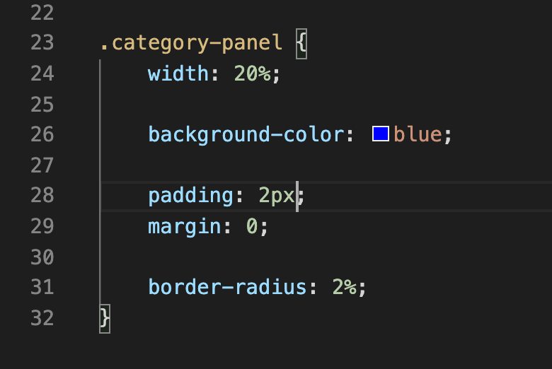
1) Add a padding surrounding the parent div. Here, the div with class "category panel" being the parent div.

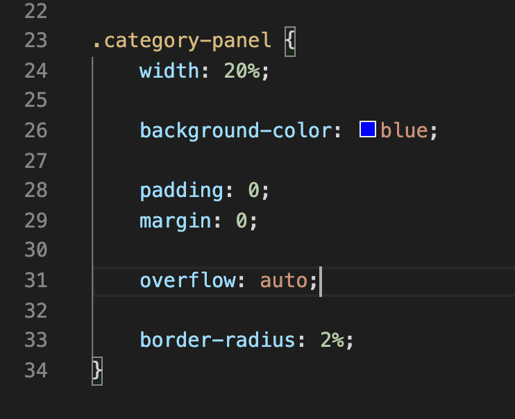
2) Add an overflow to the parent div.

As you can see, all the solutions put a solid property to the parent div. This separates the 2 margins from being in contact with each other, resulting in both margins being applied respectively.
This has been a short post but hopefully, you learned something along the way!


Top comments (0)