Learn the differences between scannable and skimmable. With practical examples on how to apply this to your landing page.
I've been telling various people on indiehackers.com to make pages more scannable in the last month. Some people asked me what it means to make something scannable. In this article, we will take a closer look at the differences of scannable and skimmable.
Scannable vs skimmable
There is a difference between scannable and skimmable web pages. I'll explain what the difference is between the two.
Once you open a landing page, the first thing you do is start interpreting how the page is build up. Your brain is not ready to read every sentence on the page yet, so you scan the page first. This way you'll get familiar with the layout. The navigation on the top, the sidebar on the right, an image in the centre. Vivid colours will help to focus your attention on one point. Like the red dot above, it is pretty small but it's probably still one of the first things you noticed on the page. We are programmed (oh the irony) to distinguish vivid colours. This is because back in the days those often meant venomous animals and plants.

The first image your mind processes while 'scanning' the page
Skimming through a page means that you start reading some headers and subheaders. You focus on some emphasized texts and text with different colours.
- You start reading
- Some bullet points
- That pull your attention
So making a page that is skimmable can really make a difference whether a visitor converts or not.
The first thing a visitor on your page wants to know: "is this going to solve my problem?"
This week's case
This week's case is about Minutes. Minutes is an app that helps you organize your meetings in a better way. Add tasks, reminders, due dates or ideas in organized sections. This way your meeting becomes more measurable and more efficiently.
Buyer persona
One of the concepts I use when I'm writing copy is creating a buyer persona. It's a fictional persona that represents your ideal customer.
This week that's Mario the Manager. Mario is 43 years old and works for a consultancy company as a manager of a team of developers. Lately, Mario is starting to hate meetings because they're always too long and inefficient. On top of that, people don't take action on the tasks they'd agreed to do. So he's is looking for a way to meet more efficiently with his team and keep track of all the tasks and deadlines agreed upon.
So what can we learn if we skim the homepage of Minutes? If you'd write down all the headers on this page there are a lot of features that don't say much about the app itself. Above the fold, there is a big header displaying
Take back control of your meetings with Minutes.
Mario is kind of interested although he is not sure what 'Take back control' means in this case. So he scrolls on to the feature blocks. He skims the feature blocks and sees a lot of buzz words. 'Local Storage', 'Dark mode', 'Dynamic types', 'CSV', 'Local notifications'. These are a lot of words a 43 years old manager might not be familiar with. But most of all, these are all features that don't solve a problem directly. Chances are that Mario leaves the page before he even reaches the end.
So what can we change so Mario wants to stay on this page? We want to address the problems Mario has with meetings, aka they are long and not efficient. That's the problem we want to solve for him. But how are you supposed to fill 13 blocks with the problems your visitor has? The answer is, you don't. People visit your website because they have 1 or 2 problems they want to solve. And it's your job to know which problems these are. When you have figured this out, you want to display it in the most skimmable way.
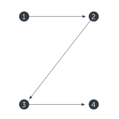
A best practice for creating skimmable content is to follow the Z pattern:

Z content pattern for websites.
You should start with the most important content on the top left. This is because most people read from left to right and apply this pattern when they skim the page.
Although Minutes also uses this pattern, you could increase the attention more on the text if you mirror the layout. So start with text and follow up with an image. In these blocks, you can easily fit the problems you solve with the application. After you have addressed the problem you can offer a solution in the form of a feature. So how can we turn these features into sentences that address a problem? Let's see:
- Take back control of your meetings with Minutes > Do you ever have meetings without a concrete outcome?
- Capture all the meeting value created in a single place > Capture all the tasks and ideas in a single app.
- Do ideas in meetings just remain ideas?
- Do people not meet their deadlines?
If you can touch 1 or 2 problems of your visitor's problems it's enough to convert them into a customer. They don't care about all the login methods they can use or if it has built-in dark mode support. It's about the value you add to their daily life, and that value isn't the dark mode you offer. It's about the problem you solve for them.
Tired of writing copy that doesn't convert? Try our copywriting editor on https://targetaudience.app!


Top comments (1)
Thank you for so freely providing this interesting and new case study. Particularly how you tackled improving the tone to fit the audience, I truly valued your methodical way of breaking out your process. Though your study made it abundantly evident how deliberate each word was, it's sometimes easy to ignore how much subtlety goes into crafting just a few lines of good content.
Your focus on clarity instead of ingenuity caught me especially. Copy frequently strives too hard to impress, while in reality it should be leading, connecting, and motivating tool. Your emphasis on carefully testing variants and linking material directly to user intent revealed a great mix of imagination and technique.
Seeing how precisely crafted and iteratively improved things is motivating. A great illustration of how well excellent copy can produce actual outcomes. Excellent work. Unlock the full potential of seo copywriting agency by clicking here to access our exclusive content, including how-to guides, FAQs, and customer testimonials.
Some comments may only be visible to logged-in visitors. Sign in to view all comments.