
Color is probably the most distinctive element of any design, and also the most important expression of brand identity (at least until Material You completely reverses this relationship, but it remains to be seen how it will be adopted). So how do we approach color when designing and implementing a design system so that our solution is usable, versatile, and scalable?
Color me curious
Besides conveying the brand and evoking emotions, colors have several other roles in current applications, including:
highlighting different application states such as errors, warnings, success, or info messages
ensuring usability, legibility, and accessibility of the application under all conditions
providing different themes from which the user (or system) can choose according to environmental conditions or personal preferences
Regarding the last point, users nowadays expect support for at least light and dark themes. Often this is more than just an aesthetic choice — for example, a car navigation app that dazzles drivers at night with large areas of bright colors can be downright dangerous.
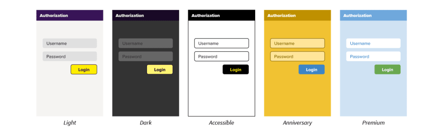
And while the app supports switching between themes, it doesn’t have to stop at just these two basic ones, for example:
Is accessibility extremely important to your app? Add a specially designed high-contrast or colorblind-friendly theme.
Does the app owner currently run a major promotion, have an anniversary, or celebrate some significant event? Make it known with a special temporary theme.
Do you want to differentiate products or make it clear that the customer bought a premium version of the app or service? Add a special, more luxurious-looking theme.
Theme support is a feature that is unique in that it makes both users and the marketing department happy. But how to construct it so that both designers and developers can actually work with it and be productive?
Layers of indirection
Let's start with what is definitely not suitable: Hardcoding the colors in the design tool and therefore in the code.

There are obvious drawbacks to this method, including the inability to change colors globally in a controlled manner (no, “find & replace” isn’t really a good idea in this case), and the need to copy and edit all designs for each additional theme we want to add (for designers), or cluttering the code with repetitive conditions (for developers). It also often leads to inconsistencies and it’s extremely error-prone - did you notice the mistake in the picture above?
Unfortunately, we still occasionally encounter this approach because many design tools will happily automagically present all the colors used, even if they are hardcoded, creating the illusion that the colors are under control and well-specified. They aren’t. Don’t do this.
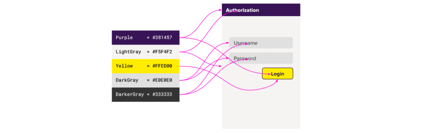
So how to get rid of hardcoded colors? The first step is to hide them behind named constants and reuse these constants in all places.
This is definitely better - the colors can be changed globally in one place, but the problem arises when supporting multiple themes. The naive solution is to override each constant with a different value in every theme. This works as long as the colors in the different themes change 1:1. But consider the following situation:
Since it is usually not advisable to use large areas of prominent colors in a dark theme, although the toolbar and button in a light theme are the same color, the toolbar should be more subdued in a dark theme. This breaks the idea of overriding the colors 1:1 in different themes because where one theme uses a single color, another theme needs more colors.
The solution to this situation is the so-called (and only slightly ironic) fundamental theorem of software engineering:
“We can solve any problem by introducing an extra level of indirection.”
In this case, that means another layer of named color constants. I kid you not - please stay with me, it’ll be worth it.
The solution
We achieve our goals, i.e. the ability to easily and safely change colors globally, and support any number of themes, by following these steps:
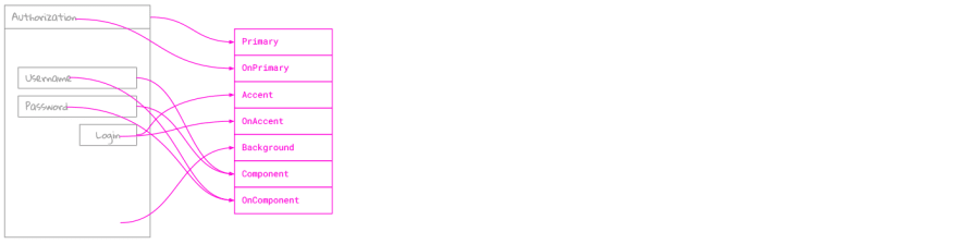
- Define a set of semantic colors. These are colors named and applied based on their purpose in the design. Their names must not express specific colors or shades, but roles. For example, Google’s Material Design defines the following semantic colors:

These names are a good starting point, but of course, you can define your own, based on your needs. What's important is that semantic colors don't have concrete values by themselves, they are placeholders or proxies that only resolve to specific colors when applied within a specific theme, meaning one semantic color will probably have a different actual value in each theme.
- Define a set of literal colors. These constants literally represent the individual colors of your chosen color palette. They are common to all themes, so there are usually more of them than semantic colors. Unlike semantic colors, they are named purely on the basis of their appearance. For example, an earlier version of Material Design defined the following shades:
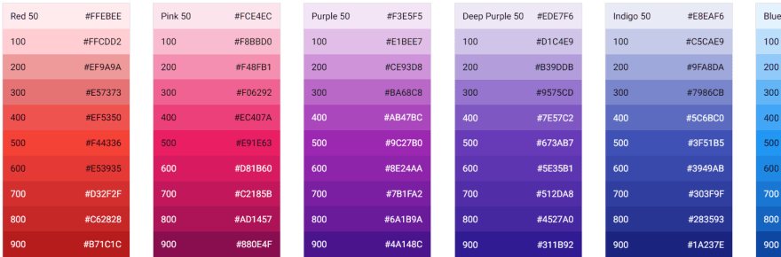
Recently it has become a common practice to distinguish colors with different lightness using a number where 1000 is 0% lightness (i.e. black) and 0 is 100% lightness (white), but of course you can devise your own system.
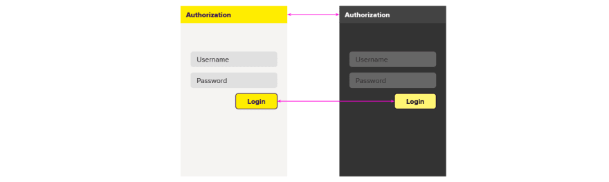
- Follow this rule in both design and code (no exceptions!): Semantic colors must be used exclusively and everywhere. Literal colors (or even hard-coded constants) must never be used directly. This means that the use of colors in design and implementation must have the possibility of being completely specified in the form of "wireframes" like this:
- Finally, map semantic colors to concrete literals per theme. This step ultimately produces a specific theme from the design specification, which is in itself independent of a particular theme. Based on our previous example, the final result will look like this:
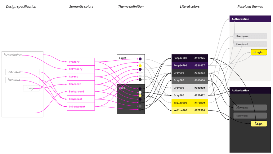
For example, toolbar background color is specified as Primary, which in Light theme is mapped to Purple700 literal color, but in Dark theme it resolves to Purple900. The most important thing is that Purple900 or Purple700 literal colors aren't mentioned in the design specification, only in theme definition.
It's just a little extra work, but the benefits are enormous. We have successfully decoupled the definition of the colors from the actual colors used in various themes.
Make it work for you
There are usually questions that often arise or choices that need to be made when implementing this system. Here are some tips based on our experience:
- Don't go overboard with the number of semantic colors. It's tempting to define a separate semantic color for every part of each UI element (e.g., ButtonBackground, SwitchTrack, ProgressIndicatorCircle_), which has the theoretical advantage that you can then change them independently, but it also makes it much harder to navigate the design and implementation. The ideal amount of semantic colors is one where one can hold more or less all of them in one's head at once. Try to find a minimum set of sufficiently high-level names that will cover 90% of situations. You can always add more names later.
- Naming is hard. Since semantic colors form the basis of the vocabulary used across the team and also appear everywhere in the code, it's a good idea to spend some time looking for the most appropriate names. If some of the chosen names turn out to be not that fitting, don't be afraid to refactor them. It's unpleasant, but living with inappropriate names for a long time is worse.
- Never mix literal and semantic names. For example, a set of semantic colors containing Orange, OrangeVariant, Secondary, Background, Disabled, etc. isn’t going to work well, even if the main color of your brand is orange and everyone knows it. Even so, create a purely semantic name for such a color, like Brand or _Primary.
- If you need multiple versions of a semantic color, never distinguish them with adjectives expressing properties of literal colors such as BrandLight, BrandDark, etc., because what is darker in one theme may be lighter in another and vice versa. Instead, use adjectives expressing purpose or hierarchy, such as BrandPrimary, BrandAccent, or even BrandVariant (but if you have Variant1 thru Variant8, you have, of course, a problem as well).
For each semantic color that can serve as a background color, define the corresponding semantic color for the content that can appear on that background. It's a good idea for these colors to contain the preposition on or the word content in the name, like OnPrimary or SurfaceContent. Avoid the word text (e.g., SurfaceText), as this color will often be applied to other elements such as icons or illustrations, and try to avoid the word foreground because sometimes the use of background and foreground colors can be visually inverted:

The use of the alpha channel in literal colors is a difficult topic. Generally speaking, the colors that will be used as backgrounds should be 100% opaque to avoid unexpected combinations when several of them are layered on top of each other (unless this effect is intentional). Content colors, on the other hand, can theoretically contain an alpha channel (useful, for example, for defining global secondary or disabled content colors that work on different backgrounds), but in this case, it is necessary to verify that the given color with its alpha value works with any background.
Another question is alpha channel support in your design tool and code - is the alpha value an integral part of the color, or can we combine separate predefined colors and separate predefined alpha values?
If your design tools don't directly support semantic colors or multiple themes at the same time, work around that. Tools come and go (or, in rare cases, are upgraded), but your design system and the code that implements it represents much more value and must last longer. Don’t be a slave to a particular tool.
All text should be legible and meet accessibility standards (icons on the other hand don’t need to do that, but it’s generally a good idea for them to be compliant as well) - see The Web Content Accessibility Guidelines (WCAG 2.0), and use automated tools that check for accessibility violations.
Design is never finished
...so it's important that your design system is able to evolve sustainably. This way of defining color, although certainly not the simplest, allows for exactly that. We'll look at other fundamental elements of design systems and how to handle them next time.
Written by: @jhutarek

Top comments (0)