Listen, we’re all busy people. I mean, right now I’m writing a blog post while in a meeting and chatting on Slack with one of my colleagues (ok… not really, I don’t multitask well). Anything I can do, though, to make my day a little easier, get rid of a few things to think about and save myself a little time helps me focus on the actual important things I have to do. For these reasons, I think the dashboard is one of the most underutilized features Kentico has to offer.
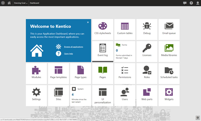
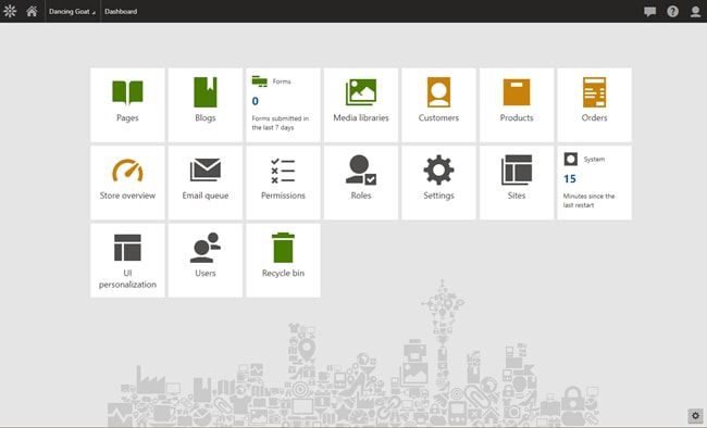
When you first log into Kentico you’ll be presented with a screen that looks something like this:
Each of these tiles will take you to a different application within the administrative side of your site. The tiles are meant to give you 1-click access to the parts of your Kentico implementation that you use the most. Some of them are even live tiles that give you at-a-glance information about the application it’s tied to (the Email queue and Web Analytics tiles are especially helpful here).
What some people don’t realize is that this view is fully customizable (cue angelic music) and it’s really simple to do!
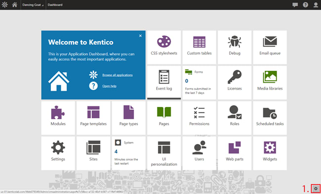
Click on the gear icon in the bottom right corner. Everything fades out a little bit and the tiles will shrink.
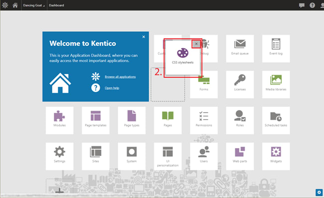
Drag the tiles around to reorder them or remove them altogether.
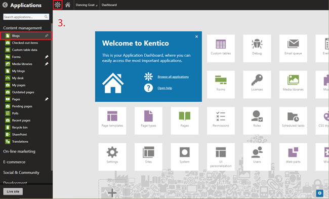
To add a tile open up the sidebar menu by clicking on the Kentico icon in the top left corner, find the application you wish to add a shortcut to and click it. It’s that easy.
Move things around, change your mind and remove one, change your mind again and put it back in (come on, you know you’re going to). Once everything is how you like it click the gear icon again and it will lock in your customized dashboard.
Note that you can get rid of the big Welcome To Kentico box to make more room which is what I usually do.
Bonus, this customization is handled on a per-user basis so making changes here will only be visible to you. That means you don’t have to worry about affecting anyone else’s dashboard customizations. This is your space, do whatever you like with it.
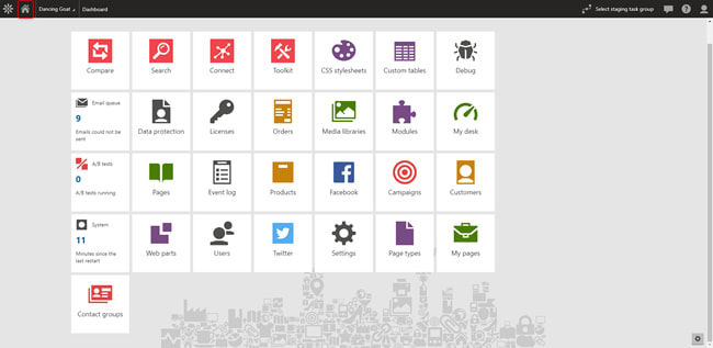
Ever find yourself 6 levels deep into Kentico doing something like modifying an email template? Don’t forget you can return to your dashboard at any time by clicking the Home Icon at the top left of your screen.
So that’s it! Nothing earth-shattering here but I hope it makes your Kentico experience a little bit better. Now I have to get back to that meeting...



Top comments (0)