Being WCAG conformant doesn’t mean being accessible.

This article assumes a basic familiarity with web accessibility and WCAG.
WCAG stands for Web Content Accessibility Guidelines and provides guidelines and success criteria that aim to make web content more accessible. However, accessibility is a broad concept that goes beyond just technical conformance.
Accessibility is about providing inclusive experiences by taking into account the diverse needs and preferences of individuals using the web.
Digital accessibility also extends to other aspects of user interaction with digital tools, such as assistive technologies, alternative formats, and other user experience considerations.
Below, you’ll find a few practical examples that illustrate why solely aiming for WCAG conformance as a checklist is not sufficient for your website to be considered accessible in a broader context.
1. Alternative text for images and visual assets
Providing alternative text (alt text) for images is a WCAG requirement to ensure that people who cannot view the image or use screen readers that convert text into speech can still understand the content of the image.
Success Criterion 1.1.1 Level A conformance.
Beyond WCAG
The alt text must be descriptive and to the point, and it should always consider the context in which the image or asset is presented.
If we find it challenging to convey the meaning of an asset through alt text alone, it may be worth considering including additional explanations within the visible content to enhance overall comprehensibility.
For example, if we have an image of a complex chart for our article, we may add a description of the chart as part of the article and keep the alt text as concise as possible.
Here’s an example of a chart image taken from the WebAIM Million report page, which shows the number of home page elements detected over the last five WebAIM Million studies.

They provide a concise alternative text as follows: alt=”Line chart showing number of home page elements steadily increasing from 782 in 2019 to 1050 in 2023.” Then, they include a paragraph in the article with a short analysis of the home page elements’ trends over the years.
I’ve sometimes noticed that people provide additional or irrelevant info or context in the alt text, especially on social media.

From the name itself, alt text is an alternative description of the content. If we provide new details in the alt text, people who don’t use screen readers are excluded from accessing that information, which goes against the principles of accessibility.
2. Color Contrast
Meeting the minimum color contrast ratios specified by WCAG ensures that text is readable for users with visual impairments: Success Criterion 1.4.3 (Level AA).
The success criterion 1.4.1 goes further in explaining that color is not the sole means of conveying information. So, it’s important to provide alternative visual cues for actions or important elements as well as consider the overall color scheme’s impact on people with colour vision impairments.
Beyond WCAG
Two of the trickiest colors to tackle when it comes to contrast issues are orange and light blue. If you’re a designer, you know what I’m talking about!
Many of you can easily read the text “Hello World” in the image below. However, none of these examples passes the conformance Level AA for text contrast. The color contrast ratio for these combinations is below 3:1, which is the minimum acceptable ratio for large text in the AA conformance level.
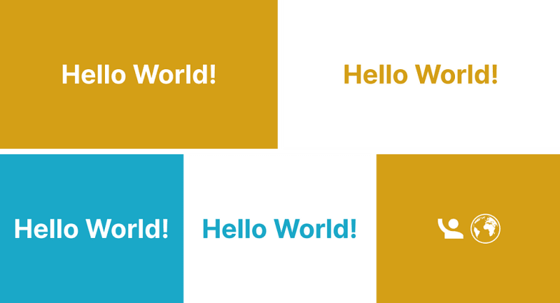
The image below would be the accessible version instead, where the white used for text and background is replaced with black. In this way, we get a contrast ratio above 7:1 in both cases, which is the minimum acceptable ratio for normal text in the AAA conformance level.

Many people find it more readable and even more aesthetically pleasing to use white text on an orange or light blue background. If your brand has similar colors, I feel ya!
Color contrast is a perception. A perfect contrast ratio for some might be too much or too low for others. There are many questions we should ask ourselves when picking a color combination. Are we using it for long or short text? Small or large text? Text or icon? Is the icon relevant to better understanding the content?
There’s a very eye-opening case study by Ericka O’Connor that does a thorough examination of the accessibility of the orange color. What emerges from this case study is that while black on orange is technically more accessible as per the WCAG standards, people prefer white text instead because they find it more readable.
Clearly, there’s a discrepancy here between people’s preferences and accessibility guidelines. The complexities of color contrast and individual preferences, particularly for people with color blindness, make it challenging to determine a definitive solution and further research is needed.
I don’t mean to confuse you even more with this, but it’s not always black and white (literally). Ultimately, our job is to provide people with a basic level of accessible content and, where possible, allow them to make necessary adjustments, such as enabling dark mode or utilizing personalised color palettes.
3. Cognitive impairment
Several success criteria and recommendations address cognitive accessibility, which you may find in the following link: https://www.w3.org/WAI/cognitive/
They generally cover language and content clarity, predictable website behaviour, and minimising distractions to support people with cognitive disabilities, among other aspects.
Beyond WCAG
To properly address cognitive accessibility, further considerations might include:
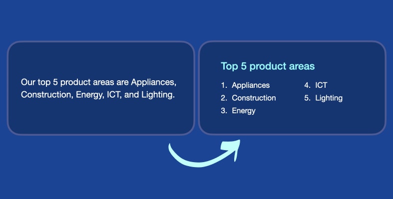
- providing step-by-step instructions,
- avoiding complex or ambiguous language,
- adding visuals or infographics to explain concepts.
In my view, one of the reasons why many people find WCAG hard to comprehend, or even read through, is that most of the time the guidelines lack all of the points above.
4. Language and cultural considerations
WCAG emphasizes the importance of using clear and understandable language when creating any type of content. By employing language that is easy to comprehend, we ensure inclusivity and accessibility for a diverse audience.
You can learn more about it at the following link: https://www.w3.org/WAI/perspective-videos/understandable/
Beyond WCAG
Depending on our audience or target audience, we should account for the diversity of languages and cultures that people may come from.

Blush illustration by Mariana Gonzalez Vega
We need to make sure not to leave out individuals with limited language proficiency or non-native speakers who may require additional support or cultural adaptations, to fully comprehend the content.
This doesn’t necessarily mean that we should exclude complex terminology and highly elaborated ways of expression at all times. The goal of accessible content is to provide alternative means or descriptions to allow people to better understand or remember certain concepts.
For example, if your article is highly technical, you may specify right away who it is intended for, or include the basic knowledge required to understand it.
5. Usability issues
Accessibility is part of usability. There are general recommendations and guidelines regarding visual design and layout.
They emphasise the importance of ensuring ease of navigation, the need for clear and easily locatable navigation menus, links and text sections, and the overall principles of user-friendly design and coherent organisation of web page components.
Beyond WCAG
The guidelines are useful for addressing specific issues, but may not fully cover all the design aspects that impact accessibility.
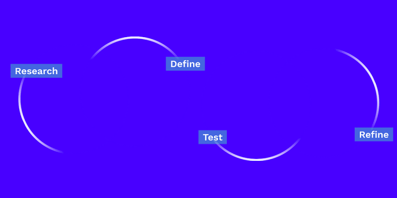
Detecting and solving usability issues in your interfaces require specific skills in research, testing, design, and implementing suitable solutions. This is an iterative process which revolves around actively seeking and incorporating user feedback to effectively address UX challenges.
In conclusion, WCAG serves as a strong foundation for web accessibility, but it should not be the sole focus. To truly create inclusive experiences, we need to go beyond them and take into account the diverse needs and preferences of our audience. This involves considering factors such as cognitive abilities, language proficiency, cultural backgrounds, and usability issues.
Accessibility should be viewed as an ongoing process of improvement, where user feedback and evolving technologies play key roles in creating a more inclusive and accessible digital environment.
I rely on accessibility guidelines to inform my design decisions; however, my choices are ultimately shaped by a combination of those guidelines as well as my own extensive research and experience in the field.
Thank you for reading this article! If you have any further questions or insights, or if you find inaccuracies in the content, I would be happy to hear from you. You can get in touch with me via email, Twitter, or LinkedIn.

Top comments (0)