
When comes to the navigation in app, Navigation drawer can be considered as a one of the one primary methods of Navigation
In Flutter, Navigation Drawer comes with the Scaffold widget. Therefore before adding a navigation drawer we need to define a Scaffold.
When we creating a sample flutter app, it comes with the default scaffold. There is an option to set a drawer like below.
            Scaffold(
              drawer:
            )
Create a basic navigation drawer
Now we already have a skeleton with the Scaffold widget. For that, we need to set Drawer widget.
To properly structuring the Drawer you need to set Header part and the below you can add some menu items. For that, you have to create a Listview and add the first child as a DrawerHeader and after that, you can add ListTile widget to show other menu items.
    drawer: Drawer(
      child: ListView(
        padding: EdgeInsets.zero,
        children: [
              DrawerHeader(
                   child: Text("Header"),
                 ),
              ListTile(
                  title: Text("Home"),
                )
        ],
      ),
  ),
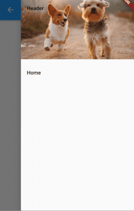
Navigation Drawer header image
Before adding an image you have to make an assets folder and create an images folder inside that. Then add your image to that folder.
Next inside the pubspec.yaml you need to import that asset. For that under the flutter add a assets section and image like below
 flutter:
   assets:
     - images/header.jpeg
The next thing needs to do is provide decoration to DrawerHeader. In there you can use set image using DecorationImage widget. Please remember to set fit type a BoxFit.cover
 drawer: Drawer(
      child: ListView(
        padding: EdgeInsets.zero,
        children: [
          DrawerHeader(
            decoration: BoxDecoration(
              image: DecorationImage(
                image: AssetImage("images/header.jpeg"),
                fit: BoxFit.cover
              )
            ),
            child: Text("Header"),
          ),
          ListTile(
            title: Text("Home"),
          )
        ],
      ),
  )
Navigation Drawer Sticky header
When you add drawer items inside the ListView it will scroll the all the child content when scroll. If you want to change that to keep the header part sticky and move only the below items you have to do some changes to the widget structure
 Drawer(
      child: Column(
          children: [
            Expanded(
              flex: 1,
              child: Container(
                width: MediaQuery.of(context).size.width * 0.85,
                child: DrawerHeader(
                  decoration: BoxDecoration(
                      image: DecorationImage(
                          image: AssetImage("images/header.jpeg"),
                          fit: BoxFit.cover)),
                  child: Text("Header"),
                ),
              ),
            ),
            Expanded(
              flex: 2,
              child: ListView(children: [
                ListTile(
                  title: Text("Home"),
                  onTap: () {
                    Navigator.of(context).pop();
                  },
                ),
                ListTile(
                  title: Text("Home"),
                  onTap: () {
                    Navigator.of(context).pop();
                  },
                ),
                ListTile(
                  title: Text("Home"),
                  onTap: () {
                    Navigator.of(context).pop();
                  },
                ),
                ListTile(
                  title: Text("Home"),
                  onTap: () {
                    Navigator.of(context).pop();
                  },
                ),
                ListTile(
                  title: Text("Home"),
                  onTap: () {
                    Navigator.of(context).pop();
                  },
                ),
                ListTile(
                  title: Text("Home"),
                  onTap: () {
                    Navigator.of(context).pop();
                  },
                ),
                ListTile(
                  title: Text("Home"),
                  onTap: () {
                    Navigator.of(context).pop();
                  },
                ),
                ListTile(
                  title: Text("Home"),
                  onTap: () {
                    Navigator.of(context).pop();
                  },
                )
              ]),
            )
          ],
        ),
  )

Close Navigation Drawer programmatically
It's pretty easy to close the drawer programmatically. You just need only use the pop method in Navigation class for the current context.
        ListTile(
            title: Text("Home"),
            onTap: (){
              Navigator.of(context).pop();
            },
          )
Open Navigation Drawer programmatically
First, you must set a key to the scaffold to identify. You can create a new object of GlobalKey class and set that to the scaffold key. Then using that you can access the current state of the Scaffold and open the drawer by calling openDrawer method.
You can call this method from any button and in here I added a FlatButton to the body and from there I am going to open the drawer. You can also add a custom button to AppBar and trigger like this to open a drawer.
final GlobalKey _scaffoldKey = new GlobalKey();
   return Scaffold(
      key: _scaffoldKey
      ) // set key
     FlatButton(
              child: Text("Open Navigation"),
              onPressed: (){
                _scaffoldKey.currentState.openDrawer();
              },
            ),
Navigation Drawer hamburger icon change and colour change
If you are using Appbar you can add leading Icon to replace the hamburger Icon. You can set IconButton for that and setting the colour will also change the Icon colour of that button.
But when you add a custom button it will lose the drawer open capability. But you can use the same old method to open the drawer programmatically by calling openDrawer method.
appBar: AppBar(
  leading: IconButton(
    icon: Icon(Icons.gamepad,color: Colors.yellow,),
    onPressed: (){
      _scaffoldKey.currentState.openDrawer();
    },
   ),
   title: Text(widget.title),
  ),
Navigation Drawer in the right side
It pretty easy to move drawer from left to right. When you are creating a drawer in the first place, it uses drawer option in Scaffold. You just need only to change that to endDrawer and the drawer will be open from the right. Also, hamburger menu will be a move to the right.
return Scaffold(
    key: _scaffoldKey,
   endDrawer: Drawer(
    child: ListView(
      padding: EdgeInsets.zero,
      children: [
        DrawerHeader(
          decoration: BoxDecoration(
            image: DecorationImage(
              image: AssetImage("images/header.jpeg"),
              fit: BoxFit.cover
            )
          ),
          child: Text("Header"),
        ),
        ListTile(
          title: Text("Home"),
          onTap: (){
            Navigator.of(context).pop();
          },
        )
      ],
    ),
),
Custom Navigation drawer
Drawer inside the Scaffold accepts Widget as a parameter. Therefore we can add custom widget without using Drawer widget inside the navigation.
In here I use Container as a main widget and wrap the other content inside that. Now when you test you will be able to see a full-screen drawer.
drawer: Container(
    width: MediaQuery.of(context).size.width,
    height: MediaQuery.of(context).size.height,
    color: Colors.white,
    child: ListView(
      padding: EdgeInsets.zero,
      children: [
        DrawerHeader(
          decoration: BoxDecoration(
              image: DecorationImage(
                  image: AssetImage("images/header.jpeg"),
                  fit: BoxFit.cover)),
          child: Text("Header"),
        ),
        ListTile(
          title: Text("Home"),
          onTap: () {
            Navigator.of(context).pop();
          },
        )
      ],
    ),
  ),

Conclusion
I hope you get a better idea about navigation drawer implementation in Flutter and how to customize drawer as you need. If you have any question feel free to ask from me.
Check the Video for More
Originally published at mightytechno


Top comments (6)
Good job! Thanks for sharing your knowledge!
Good Job
I want to force RTl
The word and title be in the right
unable to add tab in navigation drawer and customise also.
What's the issue?
want to create tabs on top of the navigation drawer.how to customize this?