[ CodePen Demo | Original Article ]
Tailwind CSS is a low-level CSS framework that provides building blocks for creating custom designs. As an introduction to the framework we’ll create a card component following the material design guidelines.
We won’t be modifying any of the Tailwind config so it can be loaded via CDN otherwise it can be installed via NPM:
<link rel="stylesheet" href="https://unpkg.com/tailwindcss@^1.0/dist/tailwind.min.css" />
With Tailwind everything is written using low-level utility classes directly in the HTML not a seperate CSS file.
Let’s start by creating a HTML wrapper div for the component with some basic Tailwind classes:
<div class="bg-white rounded shadow max-w-md mx-auto">
  <!-- header -->
  <!-- section -->
  <!-- footer -->
</div>
-
bg-white rounded shadow– gives us the rounded corners and drop shadow on a white background. -
max-w-md– sets the max width of the component as medium (28rem). -
mx-auto– applies margin auto on the x-axis (left & right) so the component is centrally aligned. Inside the wrapper the first element will be a header with the following markup:
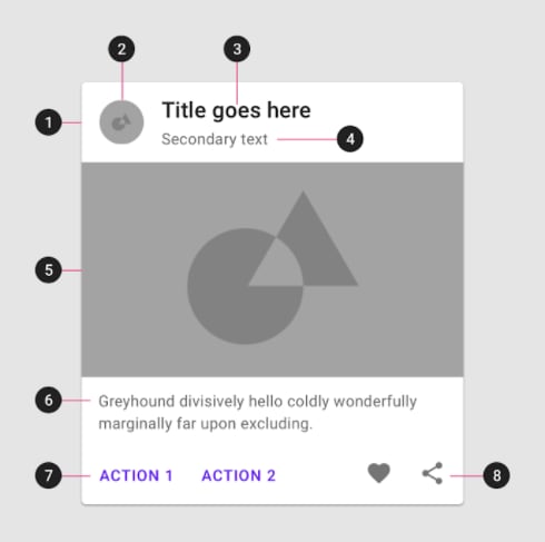
<header class="p-4">
  <img class="w-10 h-10 m-1 mr-3 float-left rounded-full" src="http://lorempixel.com/64/64/nature/5/" />
  <h3 class="text-lg font-bold">Island Escape Holiday Package</h3>
  <p class="text-sm text-gray-600">5 nights (inc flights) from $1999</p>
</header>
-
p-4– adds 1rem of padding on all sides of the header. -
w-10 h-10– sets the width and height to 2.5rem, like padding different values = different rem sizes. -
m-1 mr-3– applies and even margin all round with a larger override on the right margin. -
float-left rounded-full– floats the image next to the text and turns the square image round. -
text-lg font-bold– sets the font-size slightly larger than the base size and bold in weight. -
text-sm text-gray-600– sets the font-size slightly smaller than the base size and gray in color.
Next we’ll add the middle section with an image and supporting text:
<section>
  <img src="http://lorempixel.com/700/450/nature/5/" />
  <p class="text-sm text-gray-600 p-4">Omnis consectetur voluptatem labore aut et vel itaque recusandae. Et molestiae iure qui et nihil minus nes ciunt.</p>
</section>
Text styling/padding is the same as was used in the header for consistency.
Images in Tailwind are are responsive by default so no further classes are required here.
To complete the component we’ll add a footer with a couple of CTA’s and some icons (via icons8.com):
 <footer class="p-4">
  <a href="#" class="uppercase font-bold text-sm text-blue-700 hover:underline mr-3">Book Online</a>
  <a href="#" class="uppercase font-bold text-sm text-blue-700 hover:underline">More Info</a>
  <a href="#" class="float-right">
    <img src="https://img.icons8.com/flat_round/24/000000/share--v1.png"/>
  </a>
  <a href="#" class="float-right mr-3">
    <img src="https://img.icons8.com/flat_round/24/000000/hearts.png"/>
  </a>
</footer>
The text styling used here is pretty self explanatory and only other thing to do was float the icons on the right.
You should have something that looks like the following:


Top comments (0)