
Overview & text input
In react, form input is usually handled by the components while in HTML is handled by the DOM.
Basically a HTML form can be as simple as this:
<form>
  <p>Name:</p>
  <input type="text"/>
</form>
By default, this form will bring you to a new page. But most of the time there will be a script to handle the form submission and has access to the submitted value.
Now let's say we want to show what's being submitted by the user by showing what they're typing. We can do that by converting the form into a new component first
class App extends React.component {
  constructor(props) {
    super(props)
  }
  render() {
    return (
      <form>
        <p>Name</p>
        <input type="text"/>
      </form>
    )
  }
}
Then we need to define its state and add the onChange handler so we can get the name value and show it later on.
class App extends React.component {
  constructor(props) {
    super(props)
    this.state = { name: '' }
  }
  render() {
    return (
      <form>
        <p>Name:</p>
        <input type="text"
          onChange={(e) => this.setState({ name: e.target.value }) }/>
      </form>
    )
  }
}
Now we can see the current state by putting it in the render method. And finally, we can put the current state value to the input so the input won't be empty on the first load.
<form>
  { JSON.stringify(this.state) }
  <p>Name</p>
  <input type="text"
    value={ this.state.name }
    onChange={(e) => this.setState({ name: e.target.value })}
  />
</form>
Now it should look like this

Other input types (number, radio, select-option, checkbox)
For other input types, we need to add more variables for each respective input.
this.state = {
  name: '',
  age: 10, // for number
  gender: 'none', // for radio
  occupation: 'none', // for select-option
  isCool: false // for checkbox
}
For number input, it's similar to the text input, we can add it below the name input
<p>Age:</p>
<input type="number" value={ this.state.age }
  onChange= { e => { this.setState({ age: Number(e.target.value) })}}
  ></input>
Now with radio input, it needs an additional attribute called checked, it determines if the radio button is selected (checked) or not by accepting a boolean or true/false value.
<p>Gender:</p>
<input type="radio" name="gender" value="male"
  checked={ this.state.gender === 'male' }
  onChange={ e => { this.setState({ gender: 'male' }) }}
  />
<label>Male</label>
If you want multiple radio buttons which most of the time happens, you can duplicate the input tag with another different value in value, checked, and onChange attributes.
<p>Gender:</p>
<input type="radio" name="gender" value="male"
  checked={ this.state.gender === 'male' }
  onChange={ e => { this.setState({ gender: 'male' }) }}
  />
<label>Male</label>
<input type="radio" name="gender" value="female"
  checked={ this.state.gender === 'female' }
  onChange={ e => { this.setState({ gender: 'female' }) }}
  />
<label>Female</label>
For select-option, each option will have its value as usual, but if you want a value to be initially selected you can put value attribute to the root select tag along with onChange attribute.
<p>Occupation:</p>
<select name="occupation" value={ this.state.occupation } onChange={ e => this.setState({ occupation: e.target.value })}>
  <option value="">-- SELECT --</option>
  <option value="Frontend">Frontend</option>
  <option value="Backend">Backend</option>
  <option value="Full Stack">Full Stack</option>
</select>
And finally, for checkbox input, you can add checked and onChange attributes.
<p>Are you cool?</p>
<input type="checkbox" checked={ this.state.isCool } onChange={ e => this.setState({ isCool: e.target.checked })}/>
<label>Of course I'm cool!</label>
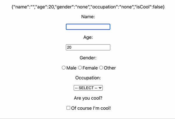
Now you can access all the input in your script and it should look like this
For further reading, you can go to:
https://reactjs.org/docs/forms.html


Top comments (0)