
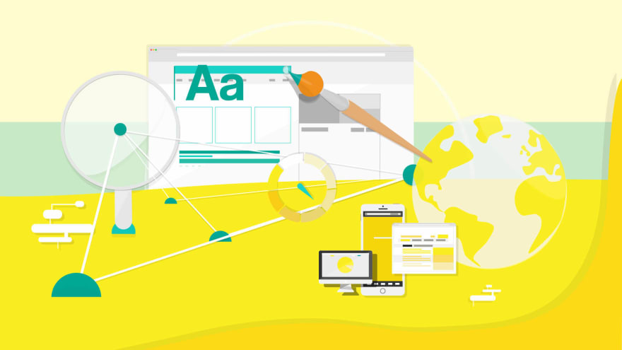
In a time and age when the world is getting further capsuled inside the digital bubble, a well-designed website is something one cannot afford to miss out on. Whatever the purpose is, be it amplifying the brand value of an entrepreneur or marketing a company’s products to its wider audience, a neat and most importantly, user-friendly website can go a long way. The aesthetics of the website have their own definitive value but, at the end of it all, it is the layout and seamless user experience and functionality that matters.
Here are some web designing tips and tricks that will emanate a sense of personal style, brand identity, and a great line of work to keep the audience coming back for more.
• The homepage should be minimalistic

Cluttering the home page with innumerable navigating options will only leave the user overwhelmed and confused. The chief objective of a website's homepage is to instantly communicate the core message of the company. Although minimalistic, it should be packed with the right keywords, sentences, and images so that the users have something credible to distinguish the brand by. The thumb rule is, the lesser number of tabs the visitors are made to read or click on, the easier will it be for them to engage and assess the content.
- The website should be able to relate its intention to the users as soon as possible so that they are spared from visiting different pages or scrolling down unnecessarily.
- The elements on the homepage must be spaced out properly to give it a well-balanced and unfussy feel.
- The images on a website play a crucial role in magnetizing a visitor's attention. Thus, using quirky icons, vector art, artistic photographs along with short and crisp texts will put across the point in the most effective manner.
- The call-to-action tab must be on the homepage of the website itself.
The content should be legible
In an attempt to surge the artsy feel of a website, the content should not be spurned in long, ornamental, and unintelligible sentences. Besides interrupting the reader's trail of thoughts, it can appear to be extremely vague and shallow. Decipherable words, sentences, and phrases increase the readability of a website and make skim-reading through it a cakewalk.The body of the text should be at least 16pt or more because most people have struggle reading small fonts.
The color of the texts and the backgrounds should be contrasting. If the brand that the website is representing has a specific color, it should be paired with a color that will provide enough distinction between the elements.
There must not be more than three distinct fonts on the website as it could distract the visitors from publicizing the true brand identity.
The website should be easy to navigate
Needless to say, the website should make it easy for the users to navigate everything that they came looking for. Firstly, the home page should have the logo of the brand and a menu that is tidily categorized and hassle-free to find. The sections should be structured as per their importance, and if possible, the groupings should be segregated into sub-groups so that the visitors come across exactly what they want in just one click. Furthermore, even though the footer is the last component of a website, it would be wise to have all the imperative links including locations, phone numbers, and social media links icons for the visitors to get redirected to the sites without any additional attempts.
This is why it is recommended that the responsibility of fabricating a website should be transferred to a proficient web designer like Lilo Perth to ensure that all the vital sections of the website are arranged corresponding to their significance.
- Turning to responsive web designing can be a game-changer For the uninitiated, responsive web designing is meant to provide flexible layouts that will adjust themselves as per the size of the screen they are opened from. Its feature of offering an optimized browsing experience can turn out to be an incredible game-changer. The bottom line is, the website will look stunning everywhere, be it a smartphone, tablet, laptop, or PC.


Top comments (5)
I enjoyed the post. Did you have anymore example sites that follow these rules?
That's the one I was searching for from a long time on the internet for tips for website design. Thank you for providing all of these important things.
Tips given by you are very good and useful.
Good tips and tricks. It is very helpful.
Some comments may only be visible to logged-in visitors. Sign in to view all comments.