
We will discuss the followings-
1. Structure
2. Nationwise example
-Without chart
-With chart
3. Global example
Stucture:
First we need to-
import pandas as pd
import chart_studio.plotly as py
import plotly.graph_objs as go
from plotly import __version__
from plotly.offline import download_plotlyjs, init_notebook_mode, plot, iplot
init_notebook_mode(connected=True)
It might seem really complex...so let's break it down into steps-
Step-1:
We need to begin to build our data dictionary. Easiest way to do this is to use the dict() function of the general form:

Custom colorscale
locationmode can be: USA|ISO-3|country names
location and locationmode are connected
For details check this
Step-2:
Then we create the layout nested dictionary:
![]()
The 'scope' property is an enumeration that may be specified as:
- One of the following enumeration value:['africa', 'asia', 'europe', 'north america', 'south america', 'usa', 'world']
Step-3:
Then we use:
![]()
to set up the object that finally gets passed into iplot()
Step-4:
![]()
To know all the dimensions, arguments1 and editing options check this
Nationwise example:
Without chart:
Let's plot USA states-


With chart:
For this a statistical chart of nationwise states has to be present in your repository.

We will use the columns for 'location', 'text', 'z' etc.

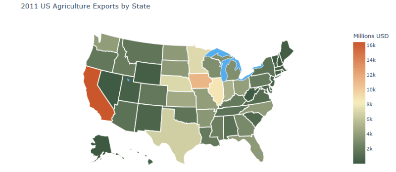
Here we used some customization.
Global Example:
Here we will have to include a statistical chart that includes all the countries in the world


We can plot different types of maps by changing the projection


So we have lots of customization option...Don't forget to reference the documentation....
(!)Wanna see the choropleth map of Bangladesh...see you soon...let's dive😉
Important Links:

Top comments (0)