](https://res.cloudinary.com/practicaldev/image/fetch/s--6ROXCCi5--/c_limit%2Cf_auto%2Cfl_progressive%2Cq_auto%2Cw_800/https://dev-to-uploads.s3.amazonaws.com/uploads/articles/kf49i1d0zugqcifirbg5.png)
A community is a social unit with commonality such as place, norms, religion, values, customs, or identity. There are many different type of communities, ranging from religions to social, to political and even Tech communities.
Being part of a community as a tech person or aspiring tech individual, is very important as it helps you grow and also open your mind to a million different possibilities to solving a particular problem.
I personally, I am part of many different communities, one of them is icodethis, a platform which really helped me improve my UI design and sharpen my coding skills. You can give it a try, and trust me you won’t regret.
At many instances, we were in one way or the other required to sign up for something before being able to fully use it. It being an offline service, or to take a course online, or even to a news letter. We all sign up for something atleast once in our life.
In this tutorial, we are going to build of this awesome component. A sign up form can have so many different forms. So I challenge you to look for other design, replicate it, and share it with us in the comment section.
For the time being, Let’s use this one, and get started.
Understanding the Task
It’s important to divide you work or design into different parts, I always do that, it help me break it down to smaller components that I can easy build, then join them together to form the bigger component. (I call it Divide and Conquer 😉)
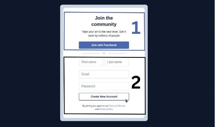
Essentially, we have 2 main parts, for easy referencing, we will call it Before and After OR
Structure of Code
I generally have the same structure when it comes to designing components. I believe they somehow have the same root. 😃
This is how it goes
<body>
<!-- First Layer -->
 <div>
<!-- Second Layer -->
  <div>
        <!--
              Here Goes the content
          -->
  </div>
 </div>

</body>
Before OR
As earlier agreed, we will reference the different parts as Before OR and After OR.
Now Let’s have a look at the first part.
<!-- Second Layer -->
<div class="bg-white rounded-xl text-center px-14 sm:px-20 py-4 ">
<!-- Form Header -->
<div class="my-5 w-full [&>*]:mx-auto">
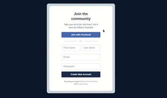
<h2 class="text-2xl w-4/5 font-semibold mb-3">Join the community</h2>
<p class="text-sm text-center w-[97%]">Take your art to the next level. Get it
seen by millions of people
</p>
</div>
<!-- Join with Facebook -->
<div class="bg-[#4968ad] text-white text-sm font-semibold shadow-sm shadow-[#4968ad] py-2 rounded cursor-pointer hover:scale-105"><h2>Join with Facebook</h2></div>
.
.
.
</div>
Let’s understand the above code;
bgstands for background, we gave a background of white to the container holding everything, give it a border radius (rounded-xl) and some padding-inline (px) and padding-block (py)For the form header, we gave some basic properties, margin-inline(
mx) of auto, width full (w-full) and margin-block (my)For the join button, we gave it a background color, shadow, white text and a hover effect of scale.
After OR
Now let’s build the different pieces of the different components after OR
<!-- Second Layer -->
<div class="bg-white rounded-xl text-center px-14 sm:px-20 py-4 ">
          .
          .
          .
          .
          .
          .
          .
      <!-- Input Fields -->
    <div class="grid grid-cols-2 [&>*]:border [&>*]:border-slate-300 [&>*]:mb-3 gap-2 [&>*]:rounded [&>*]:text-slate-600 [&>*]:w-full [&>*:focus]:ring-slate-900">
        <input type="text" placeholder="First name" class="col-span-2 sm:col-span-1">
        <input type="text" placeholder="Last name" class="col-span-2 sm:col-span-1">
        <input type="email" placeholder="Email" class="col-span-2">
        <input type="password" placeholder="Password" class="col-span-2">
    </div>


        <!-- Footer-->
    <div>
        <div class="bg-[#1e2c4b] text-white text-sm font-semibold py-2 rounded text-center cursor-pointer shadow-sm shadow-[#1e2c4b] border border-[#1e2c4b] hover:bg-white hover:text-[#1e2c4b]"><h2>Create New Account</h2></div>
        <div class="[&>span]:text-[#4968ad] text-[0.7rem] my-5 [&>span]:cursor-pointer [&>span:hover]:underline w-[90%] mx-auto">
            By joining you agree to our <span>Terms of Service</span>
            and <span>Privacy Policy</span>
        </div>
    </div>
</div>
I guess this is pretty clear, we
Separate the input fields from the others. we create a grid with two columns grid grid-cols-2 added border to each child
[&>*]:border [&>*]:border-slate-300 [&>*]:mb-3and also gave each child a focus effect[&>*:focus]:ring-slate-900.The second sub-part here (footer) has 2 part call to action button with the follow properties
bg-[#1e2c4b] text-white text-sm font-semibold py-2 rounded text-center cursor-pointer shadow-sm shadow-[#1e2c4b] border border-[#1e2c4b] hover:bg-white hover:text-[#1e2c4b]. This kinda look like jagons. But let’s break as such, we apply a dark blue background color, which changes to white on hover. we gave a white color to text which changes to dark blue on hover. And of course, we have a border and shadow of same color. Hope it makes senses. 🤓
And that should be it !
But wait a minute ! We did Before OR ✅, and After OR ✅, that’s true. But what about OR itself ? 😮
Let’s get that done too. . .✍️
<!-- Second Layer -->
<div class="bg-white rounded-xl text-center px-14 sm:px-20 py-4 ">
          .
          .
          .
          .
          .
          .
          .
      <!-- Input Fields -->
<p class="text-slate-300 my-3 font-semibold relative before:content-[''] before:absolute before:w-[35%] before:bg-slate-300 before:h-0.5 before:left-4 before:rounded-full before:top-1/2
after:content-[''] after:absolute after:w-[35%] after:bg-slate-300 after:h-0.5 after:right-4 after:rounded-full after:top-1/2">
    Or
</p>
          .
          .
          .
          .
          .

</div>
We have a normal Or text.
As for the horizontal line at the left and the right of the Or text, we are using the pseudo::selectors before for the line at the left and after for the line at the right.
Looks amazing, isn’t it ?😎
Conclusion
We just built a simple and responsive Sign Up Form component without opening our CSS file😃. Thanks to Tailwindcss.
Many employers will need such components to be added to their website, and right now you should be proud that you are one those few who knows how to build it in less than 5mins, and you can do that without even leaving you HTML document 😎.
You can have a Live preview on Codepen or find the code on Github
Remember our challenge ? Check on a new design of Sign Up Form, code it, and share it with us in the comment section.
If you have any worries or suggestions, don’t hesitate to leave it in the comment section! 😊
See ya ! 👋


Top comments (0)