 platform](https://res.cloudinary.com/practicaldev/image/fetch/s--h8aWs_1J--/c_limit%2Cf_auto%2Cfl_progressive%2Cq_auto%2Cw_880/https://dev-to-uploads.s3.amazonaws.com/uploads/articles/babcdrusjre4e8hfixjy.png)
By definition, A trip is a journey that you make to a particular place. We have in one way or another go for a trip at one instant in our life. Some might be a school field trip, a vacation trip, an adventure trip etc. I believe you get the idea.
In most situations, before going on this trip, we generally reserve or confirm our presence. This process is called Booking. Booking is an act of reserving accommodation, a ticket, etc. in advance.
In a constantly changing world, this act of reserving is done on the web, or through a mobile application.
I believe we now have a clear idea of what booking a trip is all about. Now, we are going to build this component, that aids us to book amazing trips when thinking of vacations and exploration.
Understanding the Task
As I usually say, It’s very important to divide your work or design into different parts, I personally always do that, it helps me break it down into smaller components that I can easily build, then join them all together to form the bigger component. I call it the “Divide and Conquer “ approach😉, and it turns out to be pretty helpful.

For the sake of easy identification, we are going to call them
Book-trip-Header
Book-trip-body
Now that we have our small sections, let’s get into our editor, and build this component in order to book our next vacation trip 😁
Structure of Code
The root code of almost all my components is almost always the same, just that their structure differs as I build it up.
This is how my base looks like
<body>
<!-- First Layer -->
 <div>
<!-- Second Layer -->
  <div>
        <!-- Book-trip-header -->
            <div></div>

        <!-- Book-trip-body -->
            <div></div>
  </div>
 </div>

</body>
Book-trip-header
As earlier agreed, we will reference the different parts as book-trip-header and book-trip-body.
For the first part, which is Book-trip-header, this is how it looks like 👨💻
<!-- Book-trip-header -->
<div>
<!-- Sub-header -->
<div class="bg-blue-400 flex items-center justify-center text-center relative h-[3rem]">
<div class="absolute left-5 text-4xl hover:text-white cursor-pointer hover:scale-105">
<svg xmlns="http://www.w3.org/2000/svg" width="1em" height="1em" viewBox="0 0 24 24"><path fill="currentColor" d="M14.71 15.88L10.83 12l3.88-3.88a.996.996 0 1 0-1.41-1.41L8.71 11.3a.996.996 0 0 0 0 1.41l4.59 4.59c.39.39 1.02.39 1.41 0c.38-.39.39-1.03 0-1.42z"/></svg>
</div>
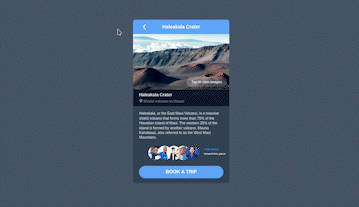
<h2 class="text-white font-semibold">Haleakala Crater</h2>
</div>
<!-- Preview Image -->
<div class="relative max-h-[11.5rem] overflow-hidden">
<div>
<img src="https://c.pxhere.com/photos/7b/3b/mountain_hill_mountain_ridge_barren_crater-144167.jpg!d" alt="" class="h-full object-cover object-center aspect-square hover:scale-105 transition-all ease-linear duration-300">
<!-- View More -->
<div class="bg-blue-50/20 hover:bg-blue-50/80 hover:text-slate-800 font-semibold w-fit text-[0.7rem] cursor-pointer px-4 py-2 rounded-full absolute bottom-2 right-2"><h2>Tap to view images</h2></div>
</div>
</div>
<!-- Location -->
<div class="bg-slate-900 py-2 text-sm font-semibold px-5">
<h2>Haleakala Crater</h2>
<div class="flex items-center text-xs mt-1 gap-0.5">
<div><iconify-icon icon="material-symbols:location-on-outline"></iconify-icon></div>
<h2 class="text-slate-500">Shield valcano in Hawai</h2>
</div>
</div>
</div>
Let's have a better understanding of what we just wrote
-
Sub-header:
<!-- Sub-header -->
  <div class="bg-blue-400 flex items-center justify-center text-center relative h-[3rem]">
    <div class="absolute left-5 text-4xl hover:text-white cursor-pointer hover:scale-105">
      <svg xmlns="http://www.w3.org/2000/svg" width="1em" height="1em" viewBox="0 0 24 24"><path fill="currentColor" d="M14.71 15.88L10.83 12l3.88-3.88a.996.996 0 1 0-1.41-1.41L8.71 11.3a.996.996 0 0 0 0 1.41l4.59 4.59c.39.39 1.02.39 1.41 0c.38-.39.39-1.03 0-1.42z"/></svg>
      </div>
    <h2 class="text-white font-semibold">Haleakala Crater</h2>
</div>
It is a flexbox container made up of two components, an icon and text. For the text, the text color of
text-whiteandfont-weightoffont-semibold. Regarding the icon, it is positioned absolute to its parent container, and placed at the left of the container withleft-5,font-sizeoftext-4xland hover effects ofhover:text-white cursor-pointer hover:scale-105 -
Preview Image:
<!-- Preview Image -->
<div class="relative max-h-[11.5rem] overflow-hidden">
   <div>
      <img src="https://c.pxhere.com/photos/7b/3b/mountain_hill_mountain_ridge_barren_crater-144167.jpg!d" alt="" class="h-full object-cover object-center aspect-square hover:scale-105 transition-all ease-linear duration-300">
This container has a
max-heightof max-h-[11.5rem], and contains the preview image. In order to make the image responsive, the propertiesh-full object-cover object-center aspect-squareare applied and a zooming effect was added onhoverwithhover:scale-105 -
View More:
<div class="relative max-h-[11.5rem] overflow-hidden">
   <div>
      <img src="https://c.pxhere.com/photos/7b/3b/mountain_hill_mountain_ridge_barren_crater-144167.jpg!d" alt="" class="h-full object-cover object-center aspect-square hover:scale-105 transition-all ease-linear duration-300">

        <!-- View More -->
    <div class="bg-blue-50/20 hover:bg-blue-50/80 hover:text-slate-800 font-semibold w-fit text-[0.7rem] cursor-pointer px-4 py-2 rounded-full absolute bottom-2 right-2"><h2>Tap to view images</h2></div>
     </div>
</div>
This is that transparent "Tap to view more images" found at the bottom right of the preview image. As you might have guessed, it has
padding-inlineofpx-4,padding-blockofpy-2,border-radiusofrounded-full, and it isposition absoluteto the parent container, and placed at that position usingbottom-2 right-2 -
Location:
   <!-- Location -->
<div class="bg-slate-900 py-2 text-sm font-semibold px-5">
   <h2>Haleakala Crater</h2>
   <div class="flex items-center text-xs mt-1 gap-0.5">
      <div><iconify-icon icon="material-symbols:location-on-outline"></iconify-icon></div>
      <h2 class="text-slate-500">Shield valcano in Hawai</h2>
        </div>
   </div>
Nothing extraordinary was added here, just playing around with
font-sizeandfont-weight
Book-trip-body
Similar to the header, this section isn’t difficult at all, and even if it was, we will cook it together 😉.
        <!-- Book-trip-body -->
<div class="bg-slate-700 px-5 py-4">
        <!-- Description -->
  <p class="text-xs mb-5">
   Haleakala, or the East Maui Volcano, is a
   massive shield volcano that forms more than 75%
   of the Hawaiian Island of Maui. The western 25%
   of the island is formed by another volcano, Mauna Kahalawai,
   also referred to as the West Maui Mountains.
  </p>
        <!-- People who visited -->
  <div class="w-full relative mb-5">
   <div class="flex items-center w-full [&>*]:overflow-hidden [&>*]:rounded-full [&>*]:w-12 [&>*>img]:aspect-square [&>*>img]:object-cover [&>*>img]:object-center [&>*:hover]:scale-110 [&>*:hover]:z-50 [&>*]:cursor-pointer">
        <!-- Image 1 -->
    <div><img src="https://media.licdn.com/dms/image/C5603AQFUDbmR_UhEMw/profile-displayphoto-shrink_400_400/0/1582951257140?e=1677715200&v=beta&t=0s-t16v1y46eEhQouDhl-Z8qj2hoOqx4OOU-Qkmc_nI" alt=""></div>
        <!-- Image two -->
    <div class="-translate-x-4"><img src="https://pbs.twimg.com/profile_images/1600477902490968064/CQc3scjL_400x400.jpg" alt=""></div>
        <!-- Image 3 -->
    <div class="-translate-x-8"><img src="https://media.licdn.com/dms/image/D4E03AQH7P9arsYmElA/profile-displayphoto-shrink_800_800/0/1671708712233?e=2147483647&v=beta&t=2zGHmVsWVcsifWCCt_FAuZr8vytcaU_nCc-twF-iWCk" alt=""></div>

     <div class="-translate-x-12"><img src="https://avatars.githubusercontent.com/u/72765949?v=4" alt=""></div>
        <!-- Image 4 -->
     <div class="-translate-x-16"><img src="https://avatars.githubusercontent.com/u/37558983?v=4" alt=""></div>
        <!-- Image 5 -->
     <div class="-translate-x-20"><img src="https://cdn.hashnode.com/res/hashnode/image/upload/v1677841863722/ui0fi1r4b.png" alt=""></div>
</div>

<div class="text-[0.68rem] font-semibold absolute -right-2 top-1">
           <!-- More People -->
 <h2 class="text-blue-500 cursor-pointer hover:underline">+16 users</h2>
 <p class="text-[0.55rem]">viewed this place</p>
 </div>
</div>
        <!-- Book-trip Button -->
<div class="bg-blue-400 text-white font-semibold hover:bg-blue-600 rounded-full py-2 text-center cursor-pointer shadow-sm shadow-blue-400 hover:scale-105 active:scale-90"><h2>BOOK A TRIP</h2></div>
</div>
This section is quite lengthy, but it doesn't make it any harder.
- Description:
<p class="text-xs mb-5">
   Haleakala, or the East Maui Volcano, is a
   massive shield volcano that forms more than 75%
   of the Hawaiian Island of Maui. The western 25%
   of the island is formed by another volcano, Mauna Kahalawai,
   also referred to as the West Maui Mountains.
  </p>
This is just a paragraph that gives some details about the destination. A font-size of text-xs and a margin-block-end of mb-5 is all we applied to it.
- People who visited
 <div class="w-full relative mb-5">
   <div class="flex items-center w-full [&>*]:overflow-hidden [&>*]:rounded-full [&>*]:w-12 [&>*>img]:aspect-square [&>*>img]:object-cover [&>*>img]:object-center [&>*:hover]:scale-110 [&>*:hover]:z-50 [&>*]:cursor-pointer">
        <!-- Image 1-->
        .
        .
        .
        <!-- Image 5-->
Strange name for a section, but I couldn't find anything better that describes this section. This is just a group of images that shows other people who visited the destination you want to go to
If you are used to my posts, by now you surely know the meaning of [&>*] in tailwindcss.
But if you are new, The property [&>*] simply means “select each child individually”, this allows us to apply the same styling properties to all the immediate children.
To each child, we gave it a width of w-12, we also gave it a border-radius of rounded-full, transform property of scale-110 on hover and a z-index of z-50 to make them stack on top of the other on hover.
We also use a similar approach to select the images inside their containers. This was achieved using [&>*>img]. In English it can be translated as, for every immediate child, select the image within it (Is tailwindcss not wonderful? 😍).
For each of these images, we gave them a height and h-full made them responsive with object-cover object-center and rounded with border-radius of rounded-full
- More views:
<div class="text-[0.68rem] font-semibold absolute -right-2 top-1">
           <!-- More People -->
 <h2 class="text-blue-500 cursor-pointer hover:underline">+16 users</h2>
 <p class="text-[0.55rem]">viewed this place</p>
 </div>
</div>
This part just refers to other additional people who viewed the destination you want to book for.
No extra styling new to us was used here. Just font-size and font-weight
- Book-trip button
<!-- Book-trip Button -->
<div class="bg-blue-400 text-white font-semibold hover:bg-blue-600 rounded-full py-2 text-center cursor-pointer shadow-sm shadow-blue-400 hover:scale-105 active:scale-90"><h2>BOOK A TRIP</h2></div>
And finally, we have our call to action button.
We gave a background-color of bg-blue-400 which changes to hover:bg-blue-600 on hover. A text color of text-white, font-weight of font-semibold, border-radius of rounded-full, padding-block of py-2, box-shadow of shadow-sm shadow-blue-400. Scales on hover with hover:scale-105 and also added that clicking feeling using active:scale-90
I believe it perfectly makes sense.
Now, Let's add some extra styling to the different layers and body to make it responsive and centered
<body class="bg-slate-600 flex items-center justify-center min-h-screen">
<!-- First Layer -->
 <div class="w-full max-w-[20rem] text-slate-200 rounded-lg shadow-md space-y-5 overflow-hidden mx-2 [&_*]:transition-all [&_*]:ease-linear [&_*]:duration-[250ms]">
<!-- Second Layer -->
  <div>
        <!-- Book-trip-header -->
            <div></div>

        <!-- Book-trip-body -->
            <div></div>
  </div>
 </div>

</body>
And that's pretty much it 😍

Conclusion
We just built a Book Trip Component 🤩. And I bet you realized it was very easy than we thought in the beginning 😏. We did all of this without any stress and without leaving our HTML file.
You can have a Live preview on Codepen or find the code on GitHub
Don’t hesitate to share with me if you were able to complete the tutorial on your end, I’d be happy to see any additional component and styling you added to your work
If you have any worries or suggestions, don’t hesitate to bring them up! 😊
See ya! 👋

Top comments (0)