We shall be engaging libraries such as dplyr, tidyr and ggplot located in our tidyverse package to undergo our data analysis.
The pandemic has provided an opportunity for data analysts to dissect soccer data as most leagues have been suspended.This analysis shall be carried out on the 2019/2020 English Premier league season. The season had already seen Liverpool cruising to their first Epl trophy in a long while until Covid-19 struck. Well, 29 games had been played(at least for most teams) across board leaving about 9 games left to play. With 29 games played by most teams, we have ample data to play with and generate insights from. So let's get to it.
First things first, we need to import our Epl dataset. The data is in csv form so we will be using read.csv to import it
prem_leag <- read.csv("Epl_Dataset_19_20.csv")
Import the tidyverse library
If you dont have the tidyverse library. You can install it by using:
install.packages('tidyverse')
We are aware of the fact that Liverpool is leading the charts and teams such as Norwich are battling relegation.But lets see if the number of goals scored by these teams correlate with their positions
prem_leag %>%
  select(id,Team, TGS, TP)%>%
  ggplot(aes(x=Team, y=TGS, fill=TP))+
  theme(axis.text.x = element_text(angle = 90, hjust = 1))+
  geom_bar(stat = 'identity')

We select the id, Team, Total Goal Scored(TGS) column and Total Point(TP) columns. We then plot Team against TGS and categorise it by the TP
We can see from the bar chart that the teams with the highest points also scored the highest number of goals. liverpool and Manchester city are the two teams that occupy the two top spots and they also scored the most goals.Norwich, Aston Villa and Watford scored the lowest number of goals from the very dark blue shades that describe them.
Let's check the teams that have the lowest number of points and see where this low scoring teams rank
prem_leag %>%
  select(id, Team)%>%
  arrange(desc(id))%>%
  head(5)

We Selected the id and Teams and arrange them in descending order of id.
From the table generated we can see that Norwich, Aston Villa and Watford are part of the teams with the least number of points. So its safe to say to that the more goals your teams score the more chances of survival in the premier league. This also means, teams like Norwich and Watford need to invest in better attacking options to have a better goals records.
Let's check the number of goals conceded by the Epl teams and see how they relate with their position on the table
prem_leag %>%
  select(id, Team, TGA)%>%
  ggplot(aes(x=Team, y=TGA, fill=id))+
  theme(axis.text.x = element_text(angle=90, hjust=1))+
  geom_bar(stat="identity")

The Team and Total Goals Against(TGA) columns were selected and then ggplot() was used to plot Team against TGA and the catgorised by the id column.
Teams like Aston Villa, Norwich and Southampton conceded the most goals. But from the shades where Norwich and Aston Villa have light colors showing, they are at the bottom of the log. Southampton is not as light. This signifies that Southampton is higher up the log.But which factor makes Southampton higher up even when they have conceded the 2nd number of goals?
prem_leag %>%
  select(Team, TGS)%>%
  filter(Team=="Aston Villa"|Team=="Norwich"|Team=="Southampton")%>%
  ggplot(aes(x=Team, y=TGS))+
  geom_bar(stat = "identity")

In the above code, we select Team and TGS and then filter by Aston Villa, Norwich and Southampton. We then plot Team against TGS.
From the chart, Southampton has more goals than the other teams. The difference between Southampton's figures and Aston Villa's goal figures are tiny. But in this game of survival, little details make a lot of difference.
We can fill colors based on the different teams using the fill variable.
prem_leag %>%
  select(Team, TGS)%>%
  filter(Team=="Aston Villa"|Team=="Norwich"|Team=="Southampton")%>%
  ggplot(aes(x=Team, y=TGS, fill=Team))+
  geom_bar(stat = "identity")

Lets take a closer look at the top 8 teams and look at how the goals they have conceded has affected their position on the Epl table.
prem_leag %>%
  select(id, Team, TGA)%>%
  arrange(id)%>%
  head(8)%>%
  ggplot(aes(reorder(Team, TGA), TGA, fill= id))+
  theme(axis.text.x = element_text(angle = 90, hjust = 1))+
  labs(x='Team', y='Total Goals Against')+
  geom_bar(stat="identity")
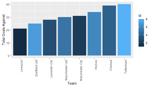
In running the above code, we select the id, Team and Total Goals Against(TGA).Then we arrange the table by id in ascending order. We select only the first 8 rows using the head() function. Then we plot Team against TGA. We sort our barchart in ascending order of TGA using the reorder() function.
As a football fan, I have come to expect some certain level of predictability in Football. I expect that the top teams like Man City, Liverpool and Chelsea concede the least number of goals when all is said and done So it comes as a surprise that Sheffield Utd(having just been promoted) has conceded the second lowest number of goals so far. That says a lot about their personnel, team chemistry and their organization. However their lighted blue shade shows that they didnt score enough goals to keep them in the top 4.
Please note from the code above I had to reorder my chart to ensure my Teams were aligned with respect to the goals conceded in ascending order. To switch it to a descending order format place a negative(-) sign before the TGA in the reorder bracket. The labs bracket is to label the x and y axis
Let's now analyse the teams with a strong home form. And also the teams with a strong goalscoring home form
prem_leag%>%
  select(id, Team, HP, HGS)%>%
  filter(id<=10)%>%
  ggplot(aes(reorder(Team,-HP), HP, fill=HGS))+
  labs(x="Team", y="Total Home Points")+
  theme(axis.text.x=element_text(angle=90, hjust = 1))+
  geom_bar(stat="identity")

From the chart, we can deduce that the teams that have the best home record have also scored alot of goals at home. At home we are most likely to see atleast a win or lots of goals from sides like Man city, Liverpool and Leicester city. Chelsea have only the 7th best home record at home. They have also not scored alot of goals compared to their Top 4 contemporaries. Safe to say the likes of Tammy Abraham and Giroud need to do more for the fans.
Lets now analyse away performances by these teams
prem_leag %>%
  select(id, Team, AMP, AP, TP)%>%
  filter(id<=10)%>%
  mutate(APP = round((AP/(AMP*3)*100), 2))%>%
  ggplot(aes(reorder(Team, -APP), APP))+
  labs(x="Team", y="% of Away points")+
  theme(axis.text.x = element_text(angle = 90, hjust = 1))+
  geom_bar(stat = "identity")
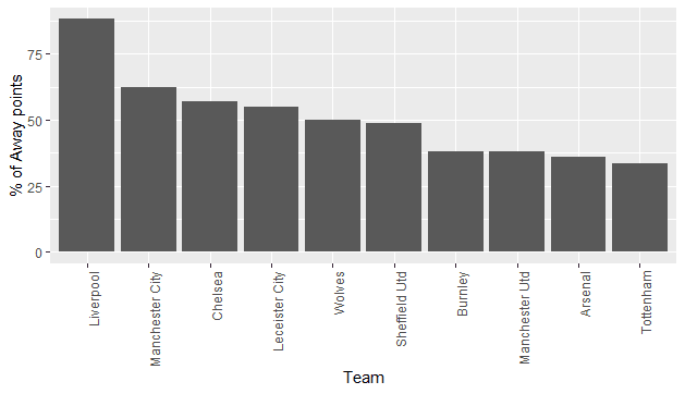
The code selects the id, Team, Away Matches played(AMP), Away points(AP)and Total points(TP). We once again filter by the top 10 teams. We want to see the performance of the teams. So we create an Away Percentage Points(APP) column that calculates the percentage of Away points garnered out of the total possible points. Note that AMP means (Away Matches Played). We then plot Team against APP where we ordered our chart in descending order using -APP.
The top four teams interestingly have the best away records with Liverpool collecting more than 80% of its possible away points. We might safely say the strength of EPL teams lie in their away record. Arsenal and Tottenham which are 8th and 9th have the worst away records in the top 10. Manchester united is just slightly above. These teams probably need to work on their mentalities when they play from home to improve performances
Now we will look to determine whether the number of passes made by teams correlated with positions on the table.
prem_leag%>%
  select(id, Team, TPS)%>%
  arrange(desc(TPS))%>%
  head(10)%>%
  ggplot(aes(reorder(Team,-TPS), TPS, fill=id))+
  labs(x="Team", y="Total Passes ")+
  theme(axis.text.x=element_text(angle=90, hjust = 1))+
  geom_bar(stat="identity")
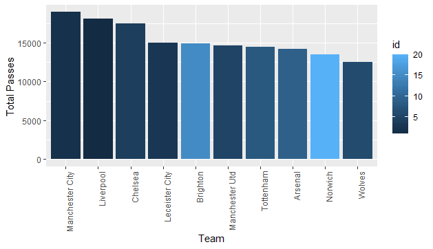
In creating this chart, we selected the id, Team and TPS(Total Passes). Then we order them by TPS in descending order using arrange(). Then we select the top 10. We then plot our Team against TPS ordering our bar chart in descending order of TPS.
Manchester city and liverpool raked in the most passes which proves that number of passes plays some role in your position on the table. However, Brighton and Norwich are also in the top 10 of this Total Passes but they are low on the general EPL table. This says few things: These teams have a good passing philsophy, they have technically gifted midfielders that pass the ball pretty well but it also means that they need to convert their passes to end product
Finally, we are going to do an analysis on shots(on goal) to goal ratio
prem_leag %>%
  select(id, Team, TSGR)%>%
  filter(id<=10)%>%
  ggplot(aes(reorder(Team, -TSGR), TSGR, fill=Team))+
  labs(x="Teams", y="Shots to Goal Ratio", title = "Shots to goal ratio
       of the top ten teams")+
  theme(axis.text.x = element_text(angle = 90, hjust=1))+
  geom_bar(stat = "identity")

We once again filtered for the top 10 teams on the EPL table. Then we label our chart using the labs() function.


Top comments (4)
Great work :)
Thank you David
Beautiful
I love this
Can it give predictions
No it cant
But I could work on something like that