
If you read some of my previous posts, you already know I've been using tailwindcss for my angular and svelte projects.
Here are some of my previous posts:
Why I use tailwind?
Because I love the process of building my own user interfaces from scratch, but I don't want to deal with the pain that comes from having to write custom CSS, or thinking about what's the best name I can use for each element. With tailwind, you can build complex components in a breeze thanks to features like Pseudo-class variants and responsive utility variants.
If you want to know more about tailwindcss, check out the official website
One of the things I love the most about tailwind is how easy is to use flexbox layouts in my components. That's why I decided to create these series to share some common layout scenarios so you can drastically accelerate your development process. In this first post, I'll build a simple two-column responsive form.
Full disclaimer: I'll use ugly colors and styles for these components. I only want to be focused on the layout with flexbox.
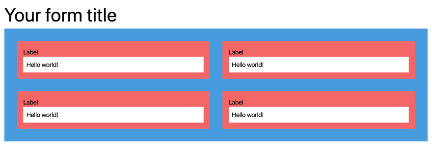
Responsive two-column form
Let's say we need to build the following two-column form:
Desktop:
Mobile:

For this form, I'll use the following key tailwind utilities for my flexbox layout:
-
flex(display: flex) -
flex-wrap: (flex-wrap: wrap) The flex container is multi-line. Flex items can wrap onto a new line. -
justify-between: (justify-content: space-between): Flex items are evenly distributed in the line. -
w-full(width: 100%) -
md:w-1/2(width: 50% only if the screen width is greater than 768px)
<body class="p-4">
    <h1 class="text-5xl">Your form title</h1>
    <form class="flex flex-wrap bg-blue-500 p-4">
        <!-- Input container -->
        <div class="w-full md:w-1/2 p-4">
            <div class="bg-red-500 p-4">
                <label for="input1">Label</label>
                <input type="text" name="input1" class="w-full p-2" value="Hello world!">
            </div>
        </div>
        <!-- Input container -->
        <div class="w-full md:w-1/2 p-4">
            <div class="bg-red-500 p-4">
                <label for="input2">Label</label>
                <input type="text" name="input2" class="w-full p-2" value="Hello world!">
            </div>
        </div>
        <!-- Input container -->
        <div class="w-full md:w-1/2 p-4">
            <div class="bg-red-500 p-4">
                <label for="input3">Label</label>
                <input type="text" name="input3" class="w-full p-2" value="Hello world!">
            </div>
        </div>
        <!-- Input container -->
        <div class="w-full md:w-1/2 p-4">
            <div class="bg-red-500 p-4">
                <label for="input4">Label</label>
                <input type="text" name="input4" class="w-full p-2" value="Hello world!">
            </div>
        </div>
    </form>
</body>
As you can see, we can build this kind of multi-column responsive layouts using 4 or 5 key tailwindcss utilities. This is SO powerful! If you want to build a three-column form, you just need to add 1 utility:
Change this:
<!-- Input container -->
<div class="w-full md:w-1/2 p-4">
For this:
<!-- Input container -->
<div class="w-full md:w-1/2 lg:w-1/3 p-4">
Cool right?


Top comments (8)
I simply don't see the point of tailwindcss. If you want to put your styling on each element in your HTML, just use the style attribute.
The secret of tailwindcss is that you'll think that it is a really bad idea until you start using it. About using the style attribute, is super different. Here are some reasons:
But again, give it a try and you will thank me later 😄
Check out this link: 2019.stateofcss.com/technologies/c...
TailwindCSS is leading the ranking both on interest and user satisfaction on 2019.
"The secret of tailwindcss is that you'll think that it is a really bad idea until you start using it"- completely agreed. Just a complain about flex-basis. With a bit elaborate use of flex can make tailwind significantly better.
No thanks. I'd rather keep my separation of concerns and my styling completely out of my markup. But thanks for responding.
In case you are interested in the argument for utility-first css (especially regarding separation of concerns) this article by the tailwind author really made it click for me:
The general case for utility first is nicely made in the tailwind docs:
tailwindcss.com/docs/utility-first
Thanks for the intro to Tailwind! I will give it a try for sure, I need to update a web project UI anyway. I can't think of a better excuse. :)
If you're using vscode, I highly recommend this extension for tailwindcss marketplace.visualstudio.com/items...