🙏🏾 Do you have a couple of minutes to help an aspiring Junior Web Dev?
TL;DR I'd love to become a Junior Dev, so during lockdown I've tried to teach myself lots of new skills. I've just published my first ever portfolio and would be so grateful if you could have a quick look and let me know how you think I can improve it, what else I should do to it, and what should be my next steps towards trying to get my first position? Thank you 👍
Hello everyone, I'm Matt, and this is my first post, I'm sorry it's not something more informative. I’ve been a member of Dev.to since May, and have enjoyed coming on here every day to read great articles. I must say, it’s one of those communities you discover and then wonder how you ever did without it.
I'll be straight with you - I did actually used to be a web developer, but it was back in the day when we were called a 'Web Master' for some reason and our (only) tool of choice was the wonderful Microsoft Frontpage. We used to (had to?) use tables for layouts and use weird and wonderful 'hacks' just to get content laid out properly, or indeed normally. Frontpage would actually change your code for you - not in a Prettier sort way, it would literally change the code and what it did. We used to use spacer gifs and clearfix hacks, and we were amazed when the css spec introduced floats. Around that time all the 'best' websites would have a Flash animated splash page before you entered the main site (useless for SEO but what the heck) and devs who knew Actionscript were in high demand.
Forward to modern-day and, perhaps because of my experience of the 'dark times', I absolutely love what Web Development has become. There are so many fantastic tools, libraries and frameworks to use now, the DX is immeasurably better! I'd love to rejoin the 'new' industry and have been using time during lockdown to learn all over again. It's a long road and I'm just at the beginning, I know that. I've just published my first ever portfolio and I'd be tremendously grateful if you could have a look and let me know how I could improve it, and what you think would be the best next steps towards trying to get my first position?
Have a great day and a great week. Thanks!


Top comments (7)
Very nice portfolio! I spot some problems:
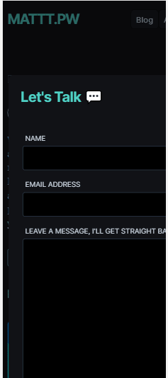
1.In responsive (small screen), The contact popup is cut :

2.I would consider adding the "Project" tab in the navbar- Because if I in the blog page, for example, and want to see your projects, I don't have simple navigation to them.
3.I would consider adding a GitHub link and a project link inside of your project description page.
Hi Tomer,
Thank you for having a look and posting a picture! Much appreciated.
Re. number 1, thanks for letting me know. Prior to launch, I tested the site on an iPhone 5 all the way through to an iPhone X sized phone and it rendered well on each. I'll change the size settings on the modal to a percentage on smaller devices instead of an absolute.
2 & 3) Very good points, I'll do those! Thank you.
Your welcome and good luck :)
Hi Matt!
I love your work! It's really cool. Keep learning😁
My only recommendation would be adding syntax highlighting for the codeblocks
Hi Ruheni,
Thank you, it means a lot! And that's a great idea about the syntax highlighting - I don't know why I didn't do that in the first place - I'll get on to it! Cheers
Looks very nice, I love your footer!
Haha, thank you Stephen!