
Peeps in one of my favorite Finnish tech-related podcasts @ Webbidevaus.fi have been gloating long enough about the awesomeness of Tailwind CSS that I finally needed to try it out. Luckily I had just a perfect project for that. After spring, when most of us has spent a lot of time inside due to Covid-19, my friends and I started to play Cards Against Humanity online a lot. Some dark humor to lighten these days. I also needed a new coding project to practice GraphQL, which I haven't used in any work project yet. I decided to take it as a challenge to create my own CAH server, which also would look nice and have some usability thought out. I can tell you at this point that it's not nearly ready yet, so there isn't much to show yet. Anyway, this was a nice starting point to have Tailwind CSS included in the project so I could quickly create some preliminary styling for a couple of first screens of the game.
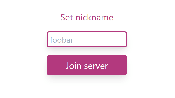
This is how the starting screen currently looks like. Simple label + input + button. First, I was horrified in putting all that clutter inside the JSX, which is already messy by itself by my standards. But very soon, I started to grow into it. I found this nice tutorial, which I followed for setting up Tailwind CSS https://www.smashingmagazine.com/2020/02/tailwindcss-react-project/ At least the installation part of it did explain clearly what I have to do and why. The only problem I encountered was with autoprefixer. I needed to install exactly version 9.8.6 because a newer version did cause some problems.
Like you can see, all of my first game screens consist of buttons, labels, and input fields so it was very easy to get the style in all of those screens. Next, we can take a look at the JSX of one of my function components, JoinServerDialog (the first screenshot). Now when I think about it, it's not even a dialog, but a full-page query.. need to think about renaming it.
<div className="h-screen flex flex-col
    justify-center items-center space-y-4">
<label className="text-pink-700 text-lg"
    htmlFor="nickname">Set nickname</label>
<input className="w-40 h-8 shadow-lg rounded
    border-2 border-pink-700 p-1 text-teal-700 text-md"
    type="text" id="nickname" name="nickname" placeholder="foobar"
    value={inputNickname} onChange={(event) => {
  setInputNickname(event.target.value);
}} onKeyDown={(event) => {
  if (event.key === 'Enter' && inputNickname) {
    setSubmitted(true);
  }
}}></input>
<button className="w-40 h-10 rounded bg-pink-700 shadow-lg
    text-white text-lg" key={"joinServerButton"}
    disabled={!inputNickname} onClick ={(event) => {
  setSubmitted(true);
}}>Join server</button>
</div>
There are four stylable items: parent div, label, input, and button. Tailwind provides a few basic colors for starters, but you can expand the selection with your own theme. I did not take a further look into that yet, because I just quickly wanted to get rid of default HTML styling, so I picked one of those ready-made colors as an accent color. Let's take a look at those stylable items one by one.
<div className="h-screen flex flex-col
    justify-center items-center space-y-4">
</div>
The parent div does some basic things like adding spacing between items and centering the content in both axes. Tailwind supports Flexbox under its hood, which is nice because that's what I've been using lately. That has satisfied me by fixing the most horrible first world problem about how to center an item with CSS.
<label className="text-pink-700 text-lg"
    htmlFor="nickname">Set nickname</label>
The label has only a couple of properties to set. For text color, I picked the accent color in a semi-dark shade. There are nine shades for all the predefined colors available, and they range from 100 to 900 by steps of 100. The other property I'm setting is size. There are five predefined font sizes available xs, s, base, lg, xl. Large seemed suitable for me. I'm not totally happy with the default font. The default font family includes several websafe sans type of fonts, but I might be changing to something more customized later. Anyway, now just want to get this up and running and finetune the details later so the default font is fine.
<input className="w-40 h-8 shadow-lg rounded
    border-2 border-pink-700 p-1 text-teal-700 text-md"
    type="text" id="nickname" name="nickname" placeholder="foobar"
    value={inputNickname} onChange={(event) => {
  setInputNickname(event.target.value);
}} onKeyDown={(event) => {
  if (event.key === 'Enter' && inputNickname) {
    setSubmitted(true);
  }
}}></input>
For the input, there are a few more properties to set. In addition to defining width and height, there are a few more properties. As I'm probably ending up using some variation of material design look, I added a shadow. There are a couple of default shadows available, but this is likely something I will customize later. For the border, I set a rounded style with a solid accent color with a 2 unit border width. Tailwind uses rems (root em) as size units to allow a unified look across the whole application. The last two parameters of the definition are for the input field text. P-1 adds a 1 unit spacing inside the input and I've picked a semi-dark shade of teal as a secondary accent color. It's used for user typed text in many places of the app.
<button className="w-40 h-10 rounded bg-pink-700 shadow-lg
    text-white text-lg" key={"joinServerButton"}
    disabled={!inputNickname} onClick ={(event) => {
  setSubmitted(true);
}}>Join server</button>
</div>
The properties of the button are basically the same I already defined for the label and the input. I use the same look, similarly sized, rounded, with shadow and accent color. In this case, the accent color serves as the background color and the text color is defined as white. This is how far I got. Now I'm looking into how I can efficiently re-use the styles I've defined for other similar components without copy-paste. Also when I get further into actual game logic, for fun and balance, I'll return to take a look at customizing and expanding the Tailwind defaults. The best tips and tricks are welcome in the comment section!

Top comments (2)
Awesome! I've been thinking about trying out Tailwind CSS for a long time now, but haven't gotten to it (mostly because I've been lazy with my projects, and avoided any extra-setup and ended up using just pure CSS). After reading your post, I really have to try 😁
Btw, I love the colors!
I can recommend at least trying it out to see if you like it or not. The setup for it seemed daunting at first sight, but after all, it was just: install a couple of packages, create a couple of directories, create a couple of files where you have been given the content you should put in, modify your package.json scripts a bit. Sounds a lot but a good tutorial explained it very well, so it overcame my laziness to set up new things 😅