
Hello. Today, I want to talk about some very powerful tool available in the CSS Grid tool belt — fr unit. I was surprised there is so much to talk about, so I decided to split this article into two smaller parts. Today’s part will be dedicated to all the basics that anyone needs to know to understand how fr unit works. In the future part, I want to cover all the edge cases related to this subject.
This article is part of my CSS Grid introduction series. If you want to check out my previous posts, here you can find the whole table of contents.
Grid track
In terms of fr unit definition, it’s important to know what the term grid track means. Grid track in simple words is a column or row in a grid. You may think of it as space between two adjacent grid lines (horizontal or vertical).

As you may recall we define grid using two CSS properties: grid-template-columns/grid-template-rows. This way we specify the size of every track in a grid. Grid track may be flexible when described using fr unit, and non-flexible, when described using any other unit (like px, rem, % etc).
.grid-container {
...
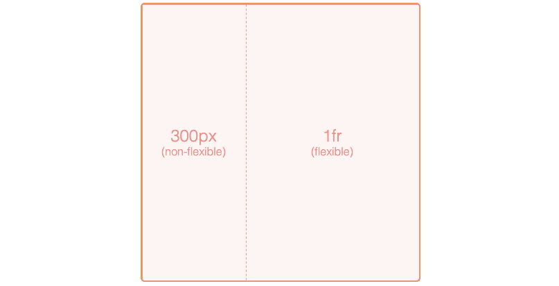
grid-template-columns: 300px 1fr;
}
Fr unit
Fr unit is a special unit available only in CSS Grid, supported in most popular browsers. It is used to determine the size of the grid track and means that the track can take some (or all) of the available free space. Free space is an area not occupied up by any non-flexible grid tracks or gaps. Look at the above example where the right column stretch to all available space left by a non-flexible left column.
Of course, we can use more than one flexible grid track in our grid. Their sizes are calculated by the CSS Grid algorithm. If there are not any non-flexible grid tracks, space is distributed between flexible tracks with specified proportions. To calculate the proportions algorithm use flex factors — the numerical value of the unit (e.g flex factor in ‘3fr’ is 3). Let's look at an example:
.grid-container {
    ...
    grid-template-rows: 1fr 2fr;
}

As you may notice the height of the container is split between two horizontal grid tracks in 1:2 proportion. This means that the lower row takes twice as much space as the upper row (1/3 vs 2/3 of container height). The simple formula shows what part of available space given track will take:
free space fraction = flex factor / sum of all flex factors
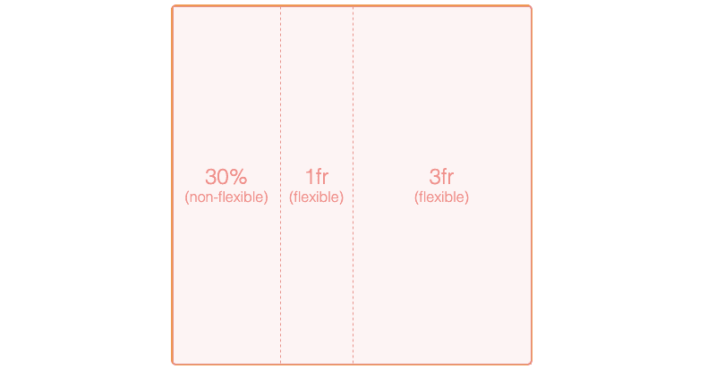
What if the grid contains more than one non-flexible grid track along with multiple flexible grid tracks? First, the algorithm calculates available space. It sums up all non-flexible tracks sizes, then subtracts this value from the total size of the container. Finally, available space is split between flexible tracks according to declared proportion. Let’s looks at an example:
.grid-container {
    ...
    grid-template-columns: 100px 5rem 1fr 2fr;
}

In the end, let’s consider some gaps between grid tracks. Available space is additionally reduced by the sum of all gaps. You can see the difference in flexible grid track sizes in the below example. Notice how flexible columns decrease it’s size whereas the size of non-flexible grid tracks stays unchanged.
.grid-container {
    ...
    grid-template-columns: 100px 5rem 1fr 2fr;
    column-gap: 30px;
}

Fr unit vs percent
Some would argue that this new fancy unit is unnecessary as we can achieve the same effect using percents. Well, that's not entirely true. Let’s consider the following example:

To reproduce this example using percents we should use a special CSS calc function. Here’s how it would look like:
.grid-container {
    ...
    grid-template-columns: 200px calc((100% - 200px) * 0.25) calc((100% - 200px) * 0.75);
}
This looks far less readable than using fr units. Moreover, we are forced to manually update flexible calc functions whenever the non-flexible width column changes. The presented example is very simple, but in real-world cases, there may be much more columns, grids, and more complicated proportions to handle. In such circumstances changing one column size, may require several adjustments to restore correct proportions.
What about gaps? How to include them in our calc functions? In the case of fr unit gaps are handled automatically for us, here’s not. Let’s see how columns definition may look:
.grid-container {
    ...
    column-gap: 10px;
    grid-template-columns: 200px calc((100% - 200px - 2 * 10px) * 0.25) calc((100% - 200px - 2 * 10px) * 0.75);
}
As you can see, we need to manually calculate the total gap space and include it in every calc function. Not to mention how easily the proportions of the grid may fall apart if we change gap size or non-flexible column width. In more complicated layouts this may turn into a nightmare.
At the end of this article, it is worth mentioning that we do not have to abandon percentage units in favor of fr. Both units get along pretty well and allow you to create desired layouts. Remember that columns defined using percentages are non-flexible:
Thank you for reading this short article. If you want to read more content like this you can follow my dev.to or twitter account. Also, feel free to give me any form of feedback. I'd love to read any comments from you. See you soon in my next article!
PS. If you would like to support my work, I will be grateful for a cup of coffee. Thank you. ❤️


Top comments (0)