
TL;DR
This article describes
How to customize the style of Google Maps to be embedded on a web page (Section 2)
How I've designed the color scheme of Google Maps with Google Maps Platform's style editor (Sections 3 and 4)
How I've fine-tuned the visibility of place labels by zoom level (section 5)
1. Introduction
I'm creating a web app which embeds Google Maps in custom style.
I find it a bit tricky to customize the color scheme of Google Maps and to control the visibility of place labels by zoom level.
This article shares what I have learned about how to custom-style Google Maps. I hope it will help those of you who struggle to style the Google Maps embedded in your website.
2. Using cloud-based style editor
2.1 It's better than JSON style declarations
Google Maps Platform's documentation describes two ways to customize the style of Google Maps: (1) cloud-based style editor and (2) JSON style declarations.
After quite a bit of trial and error (due to the lack of clear documentation by Google), I've learned that the cloud-based style editor allows a wider scope of customization than JSON style declarations. For example, with JSON style declarations, you cannot style the appearance of buildings or change the style by zoom level for any map element.
This fact and its reason is not described anywhere in the documentation as far as I'm aware. Instead I've found the following passage in Google Cloud's blog article (Cassidy 2020):
“Maps customization has been handled via client-side JSON which was sent to the server with map requests. This design meant the amount of customization that could be done was capped by URL character limits. We’ve heard from our customers–and experienced ourselves–how quickly that limit can be hit when styling a map. ... [The] move to cloud-based Maps styling increases the number of customizations that can be done on a map to over 250 for most browsers.”
So I've decided to go with the online style editor even though, from a programmer's perspective, it means the lack of automation.
2.2 How to apply the custom map style
To apply the map style made on the cloud-based style editor, we need to associate it with a Map ID on the Google Cloud Console's Map management website. Then, refer to this Map ID number in our JavaScript code to embed a map. If a Map ID is 1234567890abcdef, then:
map = new google.maps.Map(document.getElementById('map'), {
  center: {lat: -34.397, lng: 150.644},
  zoom: 8,
  mapId: '1234567890abcdef'
});
For more detail, see the section entitled "Using Cloud-based maps styling" in Google Maps Platform documentation.
By the way, if you don't know how to render Google Maps on a web page, it is clearly explained in Google Maps Platform's documentation on Maps JavaScript API. But the documentation refers to vanilla JavaScript, and if you are using Next.js as I do, a few tweaks are necessary. For detail, see Kudamatsu (2021), my own article discussing what needs to be done to render Google Maps with Next.js (it's a popular article as it hits the 4th place after googling "Next.js Google Maps").
3. Learning from (bad) examples
Initially I had no good idea about how to design a color scheme for a map. As I couldn't find any tutorial on the web, I decided to learn myself from examples: I analyzed the 33 different map color schemes that are available in Place.Guru, a web app that comes close to My Ideal Map App (the web app I'm building).


 The 33 map color schemes in Place.Guru (Image source: Screenshots of Place.Guru)
These map themes are apparently borrowed from Snazzy Maps, a repository of various custom styles of Google Maps (based on JSON style declarations).
It turns out that the majority of these map color schemes do not really work well, at least for the way My Ideal Map App will be used. This is great for my purpose: learning from bad examples is easier than from good examples. :-)
The lessons I've learned from these map styles will be mentioned below in this article where I describe how I've actually styled the map for My Ideal Map App.
4. Building a color scheme
Defining the style of each map element in Google Maps always takes three steps: choose (1) Feature type (roads, water, shops, etc.); (2) Element type (shape or text label); and (3) Stylers (color and whether to be visible or hidden):

A screenshot of Google Maps Platform's cloud-based style editor
It's best to work on the color scheme first and then move on to the visibility of place labels. Otherwise, it'll be quite confusing.
For a color scheme, I've taken the following seven steps.
4.1: Desaturation
First of all, I want the map to be rendered in shades of grey overall.
To do so with the cloud-based style editor, I desaturate the default style of Google Maps:
Feature type:
AllElement type:
AllStylers > Saturation:
-100
Which renders a map like this:
 The map around Fushimi Inari Shrine, rendered with the saturation of -100 (screenshot by the author)
Why do I turn the map into a black-and-white image?
It's due to the design concept for My Ideal Map App, the web app I'm making. "Dye Me In Your Hue From The Sky" is the phrase I've come up with to represent My Ideal Map App. It means that, by adding "colorful" marks for the places of interest, the user will turn nobody's Google Maps into their personal map (see my previous post for detail).
To represent "nobody's Google Maps" in this context, the lack of hues is appropriate.
Google Maps allows you to save places of your interest. But the markers for these saved places are in colors of similar levels of saturation to the map itself and to the icons for shops. As a result, it's not easy to focus on the places of your own interest only.
My Ideal Map App will solve this problem, by turning the map into a black-and-white image overall.
4.2: Streets
I set streets to be white:
Feature type:
RoadElement type:
Geometry > FillStylers > Color:
#ffffff
I also remove the outline of streets:
Feature type:
RoadElement type:
Geometry > StrokeStylers > Visibility:
Off
The map is now rendered as follows:
 The map around Fushimi Inari Shrine, rendered with streets in white without outlines (screenshot by the author)
Why do I set streets to be in white?
Streets are the most important pieces of Google Maps. That's where we move along to reach our destination. Therefore, streets should attract the user's attention. And white is the most noticeable color, even with lots of placemarks in various hues. That's one of many lessons I've learned from analyzing those 33 map themes:
 The map of Gion district in Kyoto, rendered in the Green and Blue theme (image source: a screenshot of Place.guru)
Why do I remove the outline of streets?
As long as there's a sufficient level of color contrast between streets and city blocks (which will be taken care of in Section 4.5 below), the outline of streets is a visual clutter, adding no extra information (this is another lesson from those 33 map themes that I've analyzed). As the data visualization guru Edward Tufte famously put it, we need to maximize the "data-ink ratio" (Tufte 1983).
Also, by removing the outline of streets, I can keep Google Maps rendering footpaths as dashed lines. If the outline of streets is also in white, footpaths will become solid lines, losing their distinction from roads for cars.
4.3: Green spaces
Then I render green spaces (city parks and mountains) in a pale shade of grey. For mountains:
Feature type:
Landscape > NaturalElement type:
GeometryStylers > Color:
#c0dac0
For city parks:
Feature type:
Points of interest > ParkElement type:
GeometryStylers > Color:
#c0dac0
The result is as follows:
 The map around Fushimi Inari Shrine, rendered with natural landscape and parks in a pale shade of green (screenshot by the author)
I set green spaces to be in a shade of green, because the location of green spaces helps us understand which part of a city the map currently shows on a computer screen. That's another lesson from analyzing those 33 map style examples. They play a role of "landmarks" that help formulate the spatial memory of the user (see Laubheimer 2020 for the implications of spatial memory on UX design).
To clearly and intuitively indicate where green spaces are, then, rendering them in a shade of green is essential. Otherwise, we cannot immediately notice where green spaces are on a map. That's probably because I'm (and, I believe, most of us are) used to seeing maps with green spaces literally in green. That's the mental model I have. If the user interface contradicts with the mental model of a user, he or she will have trouble with it. (See Scott Klemmer's UI design lecture video for a short introduction to mental models.)
As a shade of green for green spaces, I pick #c0dac0 for the following reasons.
For a hue, I pick pure green, that is, the H value of 120 when the color is expressed in the HSL color space.
- A value lower than 120 will be more yellow-ish while a value higher than 120 will be closer to cyan, both of which drift away from the color of leaves.
For the level of luminance, I want it to be 1.5 times less bright than the pure white used for streets so that it is visually distinguishable when streets run in the middle of green spaces.
- The relative luminance ratio of 1.5 to 1 is my rule-of-thumb for picking two colors to be perceptually different from each other. If luminance levels are similar between two adjacent blocks of color, human eyes cannot clearly tell where the boundary is between them—a fact that the 19th-century Impressionist painter Claude Monet took advantage of to paint the surface of water as if they were waving (see Livingstone 2014).
For the level of saturation, I follow the idea of Wilhelm Ostwald, an early 20th-century color theorist, who claimed that every color could be expressed as the mixture of pure hue, white, and black. Consequently, the level of saturation can be expressed as the share of pure hue. And I set the share of pure hue to be 10%.
- The design concept of My Ideal Map App dictates that the map needs to be of neutral color, in contrast to more vividly colored place marks that the user will add to the map. This means that the color needs to be a mixture of a small amount of pure hue with a large amount of grey.
- I go with a mixture of 10% pure hue with 90% grey: 5% would be too similar to black-and-white while 15% would be too vivid to be in harmony with the black-and-white image.
Now, with the existing color pickers, it is impossible to pick a color in a way I specify above. That's why I've created an open-source web app called Triangulum Color Picker. For a given hue set as the H value of HSL color space, the app allows me to pick a color based on "chroma" (the share of pure hue) and the relative luminance against pure black. Setting the chroma to be around 10% and the luminance to be around 14.00 (that is, the relative luminance of pure white against pure black, 21, divided by 1.5) yields the color code of #c0dac0:
 A screenshot of Triangulum Color Picker
4.4: Waterways
I set waterways (rivers, lakes, seas) to be in a pale shade of blue:
Feature type:
WaterElement type:
GeometryStylers > Color:
#99b2b2
The result looks like this:
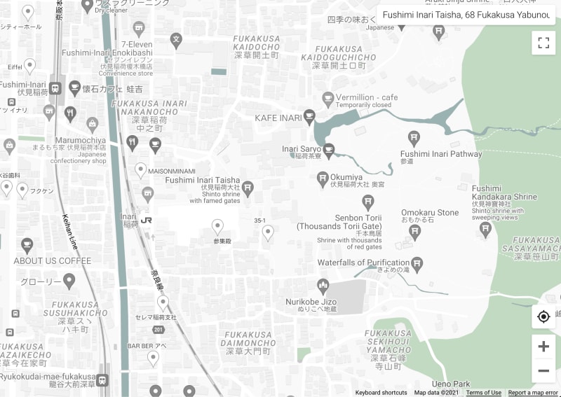 The map around Fushimi Inari, rendered with water in a pale shade of cyan (screenshot by the author)
Similarly to green spaces, waterways (rivers, canals, lakes, and seas) are important landmarks for us to navigate through a map. So they have to be rendered in a color distinguishable from black-and-white images.
Then the question is in which color waterways should be rendered. Certainly not in dark orange, because waterways will look like sewage as in the Orange map theme from Snazzy Maps (one of the 33 map themes that I've analyzed), which makes me puke...
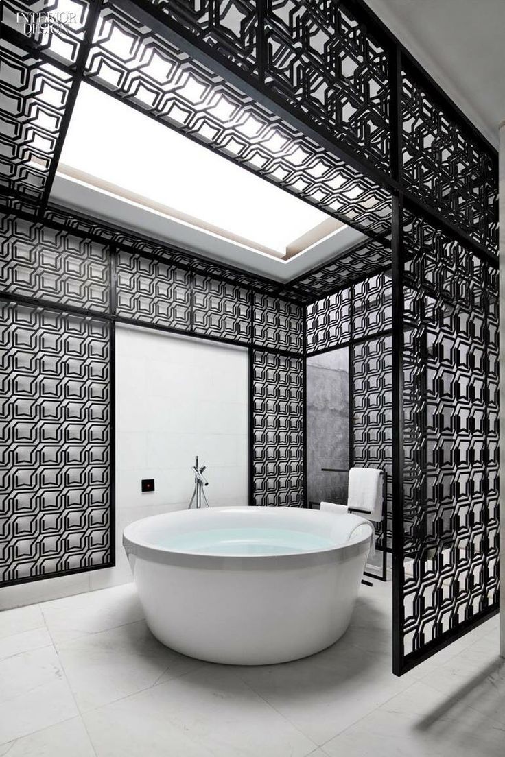
To go with the user's mental model, waterways should be rendered in a shade of cyan, the color of water (which I didn't notice until I read Chapter 6 of Gilbert and Haeberli 2011; now I can see it in this photo of a bathroom). Water molecules absorb various colors of light except for cyan. As a result, only cyan light is reflected against water and reaches our eyes.
The reason why I pick #99b2b2 as a shade of cyan is as follows:
For a hue, I pick pure cyan, that is, the H value of 180 in the HSL color system.
For the level of luminance, I want it to be 1.5 times less bright than green spaces to be visually distinguishable when waterways run in the middle of green spaces.
- Since green spaces are 1.5 times less bright than streets in pure white, waterways will be 2.25 times less bright than pure white.
- Green spaces are brighter than waterways, because the design concept of My Ideal Map App dictates that the map is the earth viewed from the sky. Water surfaces are below the top of trees. So green spaces should look nearer than waterways, if seen from the sky. As brighter color looks nearer, I've set green spaces brighter than waterways.
For the level of saturation, I want it to be the same as the green shade for green spaces: the mixture of 10% pure hue with 90% grey.
- This is because the same relative amount of pure hue ensures the harmony between colors, following Ostwald's idea of color harmony.
- Ostwald argued that color harmony would be achieved by selecting the colors with the same share of pure hues, in which case we can obtain the color combinations typically observed in nature (Ostwald 1933, Chapter 10). His ideas on color were influential in art education in the mid-20th century (Briggs 2019), by the way.
Again, I use my own web app, Triangulum Color Picker, to pick a shade of cyan that satisfies the above requirements. For a pure cyan, setting the chroma to be around 10% and the luminance to be around 9.33 (that is, the relative luminance of pure white against pure black, 21, divided by 1.5 twice) yields the color code of #99b2b2:
 A screenshot of Triangulum Color Picker
4.5: City blocks
By city blocks, I mean the area surrounded by city streets. Google Maps Platform's style editor doesn't allow us to directly set the color code for city blocks. A workaround that I have found is to set the lightness value for all features:
Feature type:
AllElement type:
AllStylers > Lightness:
-45
By setting lightness to be -45 (together with saturation of -100 as set in Section 4.1 above), city blocks will be rendered in #898989.
This results in the following map style:
 The map around Fushimi Inari, rendered with all features' lightness value to be -45 (screenshot by the author)
Now streets are very much visible. Label text is now hard to read, which will be fixed in Section 4.7 below.
The reason why I make city blocks rendered in #898989 is as follows.
One lesson from those 33 map themes is that city blocks should be rendered in a receding color. Bright, advancing colors such as red in the Christmas theme from Snazzy Maps are really distracting, driving attention away from streets. The best receding color is a shade of gray.
Another lesson is that the contrast in luminance between city blocks and streets has to be large enough; otherwise it's really difficult to trace along streets (as in the Shades of Grey theme from Snazzy Maps).
In addition, I want city blocks to be 1.5 times less bright than waterways so they are distinguishable even when waterways run in the middle of a city block.
As a result, luminance increases by 1.5 times as we move along from city blocks, waterways, greenspaces, and streets. This means that the luminance ratio between streets and city blocks is 3.375 (=1.5 x 1.5 x 1.5) to 1. This is enough to satisfy the 3-to-1 contrast ratio in luminance, required by the Web Content Accessibility Guideline for tappable UI components against their adjacent areas (see §1.4.11 of WCAG 2.1).
By searching for a shade of gray whose luminance is at least 1.5 times darker than the shade of cyan for waterways, I find #898989. The luminance contrast ratio between any pair of colors can easily be found with contrast-ratio.com.
4.6: Buildings
At high zoom levels, Google Maps shows the buildings on city blocks.
To style buildings, I first disable its default 3D rendering:
Feature type:
Landscape > Human-made > BuildingsElement type > Building style:
Footprints
Then I make its outline 1.5 times brighter than city blocks:
Feature type:
Landscape > Human-made > BuildingsElement type:
Geometry > StrokeStylers > Color:
#aaaaaa
Now the map looks like this:
 The map around Fushimi Inari, rendered with the outline of buildings in
 #aaaaaa (screenshot by the author)
The rationale behind the above styling for buildings is as follows.
By analyzing those 33 map themes, some of which omit buildings (e.g. the Partizanas theme from Snazzy Maps), I've learned that the location of buildings on a city block helps us learn which street a saved places faces. If a cafe is located at the back of a building, it'll be difficult to see which street we should enter from without the location of buidlings indicated on a map.
By default, these buildings on Google Maps are rendered in 3D. I find it an unnecessary detail, cluttering the user interface, just like those 3D shapes in Powerpoint slides. As far as I know, every single data visualization textbook and tutorial recommends NOT using 3D charts, because, as Schwabish (2016 p. 108) puts it, "the third dimension does not plot data values, it just adds clutter and often distorts the data."
To visually distinguish buildings from city blocks, one approach would be to render them in a darker shade of grey than city blocks. However, this will make the entire map too dark, as buildings occupy quite a bit of space in cities. To keep the map bright overall, I set the outline of buildings to be in a shade of grey whose luminance is 1.5 times brighter than the shade of grey for city blocks.
Using the Contrast-ratio.com, I find the gray of #aaaaaa to be 1.5 times brighter than #898989, the shade of grey for city blocks.
4.7: Label text
We need to make sure that text is legible against the background of streets and city blocks.
First of all, I set the fill color of text to be #767676:
Feature type:
AllElement type:
Labels > Text > Text fillStylers > Color:
#767676
Then, the outline of text is set to be white:
Feature type:
AllElement type:
Labels > Text > Text outlineStylers > Color:
#ffffff
With this setting, the map is now shown as follows:
 The map around Fushimi Inari, rendered with label text filled in
 #767676 and outlined in pure white (screenshot by the author)
Label text is now clearly seen. The pure white outline of text also lightens up the overall impression of a map.
The rationale behind these choices of color for text is as follows.
Legibility of text is achieved by observing the Web Content Accessibility Guideline (WCAG), which states that the luminance ratio of small text against its background must be at least 4.5 to 1 (§1.4.3 of WCAG 2.1). Accessibility Guidelines Working Group (2021) describes the rationale for the value of 4.5: it targets those with visual acuity of 20/40, typical for the age of around 80.
Against the pure white of streets, #767676 is the shade of gray that achieves the contrast ratio of 1 to 4.54.
But when this shade of grey is seen against the grey of city blocks (#898989), the contrast ratio is only 1 to 1.29.
A workaround that I have found is to outline each letter in pure white. This is a technique widely used among graphic designers for overlaying the text over photos, for example.
That's it for setting the color scheme of the map. The rest is to set the visibility of label text by zoom level.
5. Visibility of place labels
While using Google Maps, I always feel there is just too much text on the map. Places of no interest to me keep catching my eyes. That is not a pleasant user experience in my opinion.
Luckily, the cloud-based style editor allows us to control the visibility of label text (to some extent, at least). Here's how I set this up.
5.1: Turning off the visibility of all text
To begin with, I turn off all the label text:
Feature type:
AllElement type:
LabelsStylers > Visibility:
Off
Then I override this by turning on the visibility of label text feature by feature.
5.2: Countries
It's always helpful to see the names of countries when the map is zoomed out to show continents. So I turn on the label text for them:
Feature type:
Administrative > CountryElement type:
LabelsStylers > Visibility:
On

The default style of Google Maps removes country names for the zoom level of 7 or higher, at which level the map only shows one country. That's great.
5.3: Provinces
At a zoom level to show just one country, the names of provinces are helpful to figure out which part of the country we're looking at.
To do so on the style editor:
Feature type: Administrative > Province
Element type:
LabelsStylers > Customize across zooms > Add stop:
z0/ Visibility:OnStylers > Customize across zooms > Add stop:
z10/ Visibility:Off
The default setting of Google Maps appears to differ across countries in terms of at which zoom level the names of provinces start appearing. For Japan, it's the zoom level of 7. I think it's best to let Google decide.

However, the default setting never removes province names for higher zoom levels, which can be confusing because some provinces have the same names as cities (e.g., the state of New York and New York City).
So I want province names to be removed from the zoom level of 10 at which I will add the names of cities and towns. When the map shows the names of cities and towns, the user is likely to know which province they are looking at.
5.4: Cities and towns
The names of cities and towns will be shown at the zoom levels of 10 and 11:
Feature type:
Administrative > LocalityElement type:
LabelsStylers > Customize across zooms > Add stop:
z10/ Visibility:OnStylers > Customize across zooms > Add stop:
z12/ Visibility:Off
As described above, at the zoom level of 10, I want the names of cities and towns to be shown in place of province names. At a lower zoom level, city and town names will clutter the map.
I then want them to disappear for the zoom level of 12 or higher. At this zoom level, I find it more useful to see the names of railway stations instead of the names of cities and towns, at least for Japanese cities.
This may not be the case in other countries. I will work on it as time passes. (Let me know by posting a comment if this setting doesn't work for your country.)
By turning the visibility off for Locality features, not only city and town names but also the names of lower-level administrative divisions will also be hidden. We do not navigate ourselves in a city with the names of administrative divisions used in postal addresses. Instead, we navigate ourselves with the names of railway stations and streets, which I turn to next.
5.5: Stations
The names of railway stations (including metro and tram stations) will be shown from the zoom level of 12:
Feature type:
Transit > StationElement type:
LabelsStylers > Customize across zooms > Add stop:
z12/ Visibility:On

At zoom level of 12 or higher, the map is inside a city or a town. When I move around a city, it is railway stations that are helpful to navigate myself on a map. Administrative district names used in postal addresses never help me navigate through a city.
5.6: Streets
For the names of streets, I set them to be shown at all zoom levels:
Feature type:
RoadElement type:
Labels > TextStylers > Visibility:
On

The names of streets are essential to navigate ourselves in many cities around the world, even at a low zoom level with which drivers need to tell which streets to take to move to another city or town.
Setting the element type to be Labels > Text, rather than Labels, will keep label icons invisible. Label icons indicate the road numbers such as M25 in London. But Google Maps's default style for road label icons is not good enough that, when fully desaturated (as configured at the beginning of this article), no number can be discerned inside the box icon:
 A map of London with the visibility of
 Labels to be on for Road. (screenshot by the author)
All the A-numbered roads have the black rectangles that are supposed to indicate road numbers. I want to remove them all.
5.7: Shops, tourist attractions, etc.
The names of shops and tourist attractions, or "Points of interest", will be shown at a zoom level of 19 or higher:
Feature type:
Points of interestElement type:
LabelsStylers > Customize across zooms > Add stop:
z19/ Visibility:On

I find the zoom level of 19 is the level at which shop names become useful landmarks. So I turn on the visibility of shop names for zoom level 19 or higher.
As described above, the label text's color is set to be a shade of gray (#767676). Therefore, even with a full of shop names on the map, the user won't be distracted from the colored place marks for the saved places of their interest.
At a lower zoom level, however, the names of shops are unnecessary pieces of information. The default style of Google Maps goes too wild here, randomly picking the set of shops whose name is shown at each zoom level. I don't need to see the name of a shop that I'm not interested in when I'm browsing a map at a lower zoom level.
5.8: Green spaces
Green spaces play the same role as railway stations. It helps me navigate within a city or a town. So I make their names visible from the zoom level of 12 at which level the names of cities and towns disappear.
For mountains:
Feature type:
Landscape > NaturalElement type:
LabelsStylers > Customize across zooms > Add stop:
z12/ Visibility:On
For city parks:
Feature type:
Points of interest > ParkElement type:
LabelsStylers > Customize across zooms > Add stop:
z12/ Visibility:On

5.9: Waterways
The names of waterways should be visible at any zoom level.
Feature type:
WaterElement type:
LabelsStylers > Visibility:
On

Some lakes are large enough that their names should be visible at a low zoom level. So I let Google Maps decide at which zoom level the names of lakes, gulfs, rivers etc. should be visible.
6. How it's rendered
I've deployed a map styled as described in this article, with Cloudflare Pages. If you notice anything that needs to be improved, let me know by posting a comment to this article.
I hope this article will help some of you who want to customize the style of Google Maps to be embedded in your website!
In the next post, I'll describe how I style Google Maps for the dark mode. Watch this space!
Changelog
Sep 7, 2021: Add TL;DR.
Sep 5, 2021: Correct minor typos.
References
Accessibility Guidelines Working Group (2021) "Understanding Success Criterion 1.4.3: Contrast (Minimum)", Understanding WCAG 2.1, Jul 27, 2021 (last updated).
Briggs, David (2019) "Color Education", Understanding and Applying Colour (course offered at the National Art School, Sydney).
Cassidy, Ryan (2020) "Introducing new Maps customization features from Google Maps Platform", Google Cloud Blog, Jun 16, 2020.
Gilbert, P.U.P.A., and W. Haeberli (2011) [Physics in the Arts (Revised Edition)](https://books.google.co.jp/books?id=bobHqrTny4QC) (Academic Press).
Kudamatsu, Masa (2021) "4 gotchas when setting up Google Maps API with Next.js and ESLint", Web Dev Survey from Kyoto, Feb 12, 2021.
Klemmer, Scott (updated) "Mental Models", Design Principles: An Introduction (a Coursera course).
Laubheimer, Page (2020) "Spatial Memory: Why It Matters for UX Design", Nielsen Norman Group, Oct 11, 2020.
Livingstone, Margaret S. (2014) Vision and Art: the Biology of Seeing (Revised and Expanded Edition) (Abrams).
Ostwald, Wilhelm (1933) Colour Science (Winsor & Newton)
Schwabish, Jonathan (2016) Better Presentations (Columbia University Press)
Tufte, Edward (1983) The Visual Display of Quantitative Information (Graphics Press).

Oldest comments (0)