
TL;DR
Before starting to design the user interface of an app, I believe it's beneficial to find a design concept of the app first. A solid concept will guide each and every design decision throughout the project and, as a result, bring the visual consistency across all the design elements.
Here's how I have found a design concept for the web app I'm creating, starting with an example of user experience that I want to achieve with the app called My Ideal Map App.
User experience in Kyoto #2
(See my previous post for #1).
I was at home planning my visit to Fukuda Art Museum, one of my favorite places in Kyoto. Inside the museum there is a cafeteria with a great view of the museum’s water garden and the river beyond:
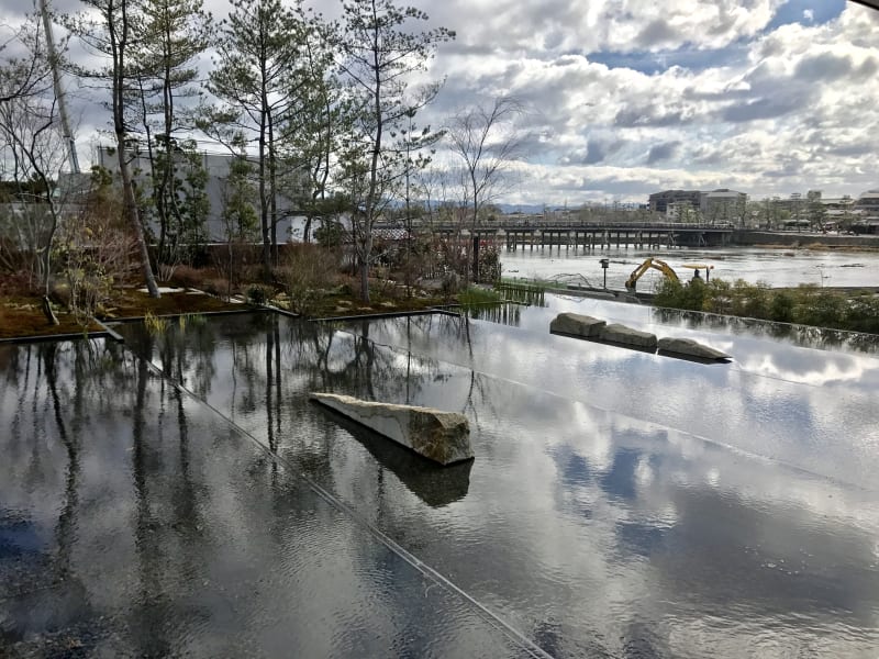 A view from Fukuda Art Museum's cafe (photographed by the author)
This time, however, I wanted to explore something new in the area around the museum.
With my laptop, I launched the browser and visited My Ideal Map App. The screen initially showed my current location (that is, my home) at the center, with my saved places around it, if any.
But there was a search field at the top of the screen, in which I started typing the name of my destination. Just like when you search for a place on Google Maps, the search field is equipped with the autocomplete feature, showing several suggestions while I was typing. By the time I entered “Fukuda A”, it showed Fukuda Art Museum as its top suggestion. I clicked it, and the app took me to the street map of the area around the museum.
I saw a few placemarks that I had saved before. One of them was Bread & Espresso & Arashiyama Garden, a cafe that I had been curious about. My Ideal Map App always reminds me of the places I want to visit.
Clicking the placemark showed a link to my Notion app page about the cafe. I clicked the link, and the opened page reminded me of what the cafe is special about: being housed in a historical thatched-roof private house and serving matcha French toast. Yummy.
 Matcha French toast topped with ice cream (image source: Bread & Espresso & Arashiyama Garden's Instagram account)
I decided to visit this cafe after leaving the museum.
And the cafe was beyond my imagination. It was a big private house built in 1809 that used to belong to a village headman:
 The exterior and front garden of Bread & Espresso & Arashiyama Garden (photographed by the author)
When I arrived, all tables were taken except for engawa seats, a quintessential feature of traditional Japanese houses that blurs the boundary between the interior and the exterior where neighbours would briefly sit for a small talk with the house owners:  Engawa seat of Bread & Espresso & Arashiyama Garden (photographed by the author)
No air-conditioning is available because engawa is by definition inseparable from the outside. But the long thatched eave, stretched down to the level of my height (163cm), offered the shade in the entire engawa area. Without direct sunlight, Japan’s summer heat turns into something manageable.
I sat down on the engawa seat. Spread in front of my eyes was a little well-maintained garden with lush green moss:
 A view of the garden from the engawa seat at Bread & Espresso & Arashiyama Garden (photographed by the author)
This is a very unusual cafe. With this traditional space, the cafe offers a European drink menu: caffe shakerato, café cortado, etc., plus an original fusion drink such as and mocktail mojito with red shiso: Mocktail mojito with red shiso (image source: Bread & Espresso & Arashiyama Cafe)
I just loved this place. Thanks to My Ideal Map App, I've discovered one more favorite place in Kyoto.
Benefits of being a web app
One of the key features of My Ideal Map App, indicated in the above user experience, is that it is not an iOS app or an Android app but it is a web app.
As long as you have a browser in your device, you can use the app. I don't want to gaze into a smartphone's small screen while I'm sitting in front of a large monitor screen of a desktop computer or a laptop, to plan for my holidays.
Mobile device users do not need to install anything so they can save the precious storage space of their mobile device for photos, videos, and other apps. If they prefer installing the app, however, they can do so because it is a Progressive Web App (more on this in a future post).
Design concept as the first step of UI design
I'm not sure if it is a standard practice in UI design to develop a design concept. But I think it's great to have it so (1) there will be a guiding principle in every single design decision throughout the project and (2) UI design will have consistency across its components, leading to pleasant user experiences.
Guiding design decisions
For the academic year of 2014–2015, I took a postgraduate diploma course in architectural interior design at Inchbald School of Design in London. (Back then, I was considering a career change into interior design.)
At one of the first lectures in the course, Alan Hughes, the school's principal who has graphic design background, taught us (i.e., me and other students) to develop a design concept before working on design details. I raised my hand, asking him why. His answer was convincing: the design concept helps designers make a decision whenever there are several choices up for grab.
A design project involves tons of decision-making: choosing a color palette, combining different shapes and materials, arranging the layout of design elements, and so forth. There are always many possibilities from which designers have to pick one. Without a design concept, these decisions are difficult to make.
It reminded me of the design process of the London 2012 Summer Olympic Stadium (described in Populous 2012, pp. 88-97). The client brief was something unprecedented: to downscale the stadium after the end of the Olympic games. London Olympic Stadium before (left) and after (right) the end of the 2012 Olympic Games (Image source: Populous)
The design team initially struggled to design a stadium with an anticipation of the demolition of its parts until they found a design concept: "Embrace the Temporary".
Once the concept was set up, the creative ideas started flowing in such as using textile (which would be avoided due to the lack of durability) and painting in saturated hues (which would usually be avoided as they would fade quickly).
Ensuring consistency
I also think having a design concept in mind helps achieve consistency in design, which I believe is one of the crucial aspects that constitute good design.
We humans are very good at noticing inconsistencies, presumably because they suggest the possibility of danger (I'm sympathetic with evolutionary psychology). Inconsistencies in design, consequently, distract us from the intended features of design, resulting in a poor user experience.
If every single decision in design is guided by the same design concept, then, a natural consequence is the consistency across all these design decisions and the resulting design elements.
Winding path towards a design concept
Coming up with a design concept is, however, not an easy task. It took several days for me to find the one I'm fully satisfied with.
After writing down several features of My Ideal Map App, I initially thought "minimalism" might be the design concept to reflect the core feature, because the app aims to minimize the number of taps/clicks to do what the user wants. So I did some research on minimalism in art and design.
 An example of minimalism in art: Donald Judd, Untitled (for Leo Castelli), 1977 (Photo by Los Angeles County Museum of Art. Source: Judd Foundation)
But I wasn't really satisfied. Looking back, I now understand that "minimalism" can be the feature of any app. Minimizing the number of taps/clicks to get the job done is one of the most basic principles in UI design. It cannot be what's unique to My Ideal Map App.
Another concept I came up with was "water ripples". As described above as part of the user experience, the app shows the places of the user's interest around a particular destination. This feature reminded me of a map projection known as the azimuthal equidistant projection: The Emblem of the United Nations contains the world map in the azimuthal equidistant projection centered around the North Pole (Image source: Wikimedia Commons)
Concentric circles, indicating the distances from the center, are the pattern seen as water ripples. Coincidentally, Google Maps (and any products of Google) features the rippling surface animation when the user taps/clicks a button. The rippling surface animation is one of the UI characteristics of Google products (Image source: Material.io)
But I couldn't be fully satisfied with this idea, either. Thinking about why, I realized that it doesn't really reflect the core feature of My Ideal Map App.
What is the core feature of My Ideal Map App? It is to save a place of the user's interest on a map. Water ripples have nothing to do with it.
The design concept must reflect the core feature of what to be designed, I learned.
Visualizing "saving a place on the digital map" in 2021
Then I started thinking of how I could visualize the act of "saving a place on the digital map", in the hope that it would lead me to a good design concept.
Around a decade ago, a typical UI representation of saving a place on the map was to drop a pin, just like we may want to do so with the physical map hung on the wall of a room:
 A product image of World Traveller Push Pin Map (image source: Not On The High Street)
In 2021, such an UI metaphor with a direct physical counterpart may look outdated. It is a legacy of what is known as skeumorphism, popularized by the first generations of iOS native apps: User interface of Notes app in iOS 6 or earlier (image source: idownloadblog.com)
Back then, when smartphones first appeared, an imitation of physical counterparts was effective for the user to learn how to use an app on a touch screen. More than ten years later, however, we know how to use smartphones today. A metaphor borrowed from the physical world is no longer an absolute necessity. (See Malewicz 2019 for more detail.)
And My Ideal Map App is very different from printed maps. It is customizable by adding saved places to the map, from which you can jump to other websites such as your Notion app pages about the places (as demonstrated in the above user story).
To emphasize such a feature that is beyond the printed maps, a metaphor like dropping a pin needs to be avoided.
Saving a place on the digital map is like painting on a blank canvas
Thinking deeply about what it means by saving a place on a digital map, I find something in common with the act of painting on a blank canvas. A digital map like Google Maps initially doesn't represent anyone's taste. Every time the user saves a place, the map will reflect the user's taste more and more. I see an analogy between this and painting on a canvas that is initially blank. Each brushstroke gradually adds the painter's own taste to the canvas:  (Image source: SurajFineArts via Google Images)
At this stage, a phrase suddenly came into my mind: "Dye me in your hue." Googling this phrase revealed that it came from a poem by Amir Khusro, a 13th-century poet in India. In the context of My Ideal Map App, the map is "me" and the user's taste is "your hue".
Sounded like a good phrase for the design concept of the app I'm going to build. But I still felt something missing...
A map is a bird's eye view of the earth
At the end of the day, a map is not a canvas. For a stronger design concept, I needed to figure out what a map really is.
It wasn't obvious to me, initially, because I took a map for granted. But I realized that a map is an imitation of what we would see from the sky if we could fly. Seeing a map on your smartphone while walking around a city is like flying high into the sky to see what's around your current location.
That's what a map is all about. It is a bird's eye view of the earth. An aerial photo (image source: Asahiair.com)
"Dye me in your hue from the sky"
My Ideal Map App, therefore, combines (1) the act of painting on a blank canvas (i.e., customing a map to your taste) and (2) the virtual view of a city seen from the sky (i.e., navigating yourself with a map on the smartphone).
These two aspects, when combined, can be paraphrased as "Dye me in your hue from the sky". Yes, the missing part was "from the sky".
When the user saves a place with My Ideal Map App, the user flies high into the sky and dyes the map in the user's hue.
Once I reached this phrase, I felt no aspect of the app left behind in it. That's the design concept for My Ideal Map App!
Next step: Visualizing the design concept
The banner image of this article, reproduced below, is a visual representation of "Dye me in your hue from the sky" that I have managed to find from the Internet: Paint Drop, a public space installation by 100architects in Shanghai (image source: 100architects)
Well, not quite... Something wrong with this image. I need to gather more images to visualize the concept. That's my next job: creating a mood board.
To be continued...
References
Malewicz, Michal (2019) "What’s the next UI design trend?", UX Collective, Nov 26, 2019.
Populous (2012) Stadia: Sport and Vision in Architecture (London: Sir John Soane's Museum).

Oldest comments (0)