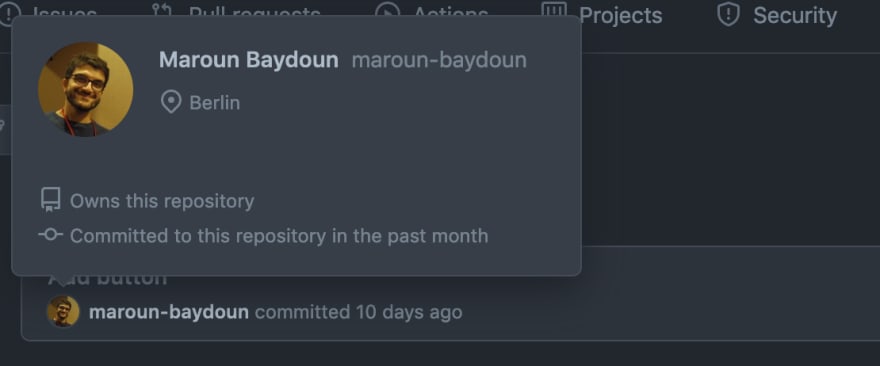
If you see this UI, what would you expect to happen when you click the username and profile picture respectively?
I'd expect to be shown the user profile in both cases. If not, then at least I'd expect those two elements to behave similarly.
It turns out that clicking on the profile picture leads to the user's profile. While clicking on the username shows all commits by that user.
To be fair, hovering the profile picture brings up a short preview of the user's profile.
Hovering the username displays a helpful tooltip.
However, that doesn't justify using two different patterns for two UI elements that are so closely related.
What do you think? Do you find it difficult to tell the difference? And how would you have designed it differently?


Top comments (0)