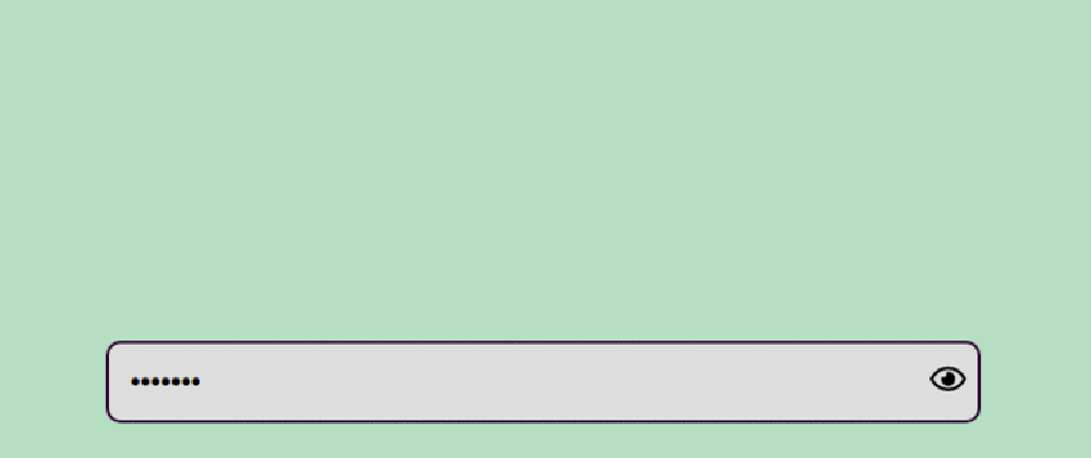
I have been coding in React for some time now(a while, like a long while) and throughout this period, I have come across some awesome stuff. However, for some reason, every time I created an authentication form, I didn't really feel the need to provide the user with the need to view their password while or after their input. Recently, I decided to integrate that option(feature I guess) and this is how I did it(more or less). I'll be using React Hooks, because, well, they're awesome and I kind of don't like writing classes.
Concept
The main concept behind pulling this off is one word actually, toggling. Basically, what we want to do is this, when the user clicks on a certain icon/field/element, we change the state accordingly such that if the input type is password, we show text and vice versa. To achieve this, we initialize two state variables, inputValue and isInputVisible. We then check the state(pun intended) of these variables and display based on that. Don't forget the state-changing functions or state-setters if you will. We name them setInputValue and setIsInputVisible respectively.
import React, { useState } from 'react';
import view from "./assets/eye-regular.svg";
import hide from "./assets/eye-slash-regular.svg";

function App(){
    const [inputValue, setInputValue] = useState(''); // boilerplate React stuff
    const [isInputVisible, setIsInputVisible] = useState(false);

    return (
        <div style={style}>
          <form method="post" style={form}>
            <div style={div}>
              <input
                type={isInputVisible ? "text" : "password"}
                id="passwordField"
                style={input}
                value={inputValue}
                onChange={(e) => setInputValue(e.target.value)}
                placeholder="Password"
              />
              <span style={eye}>
                <span onClick={() => setIsInputVisible(!isInputVisible)}>
                  <img
                    src={isInputVisible ? hide : view}
                    alt="password-toggle"
                    style={img}
                  />
                </span>
              </span>
            </div>
          </form>
        </div>
    );
}

const style = {
  width: "100%",
  display: "flex",
  alignItems: "center",
  justifyContent: "center",
  height: "100vh"
};

const formStyle = {
  form: {
    display: "flex",
    flexDirection: "column",
    width: "80%",
    margin: "0 auto"
  },
  div: {
    position: "relative"
  },
  input: {
    outline: "none",
    border: "solid 2px var(--secondary)",
    borderRadius: "10px",
    padding: "15px",
    backgroundColor: "#ddd",
    fontSize: "20px",
    width: "100%"
  },
  eye: {
    height: "100%",
    width: "25px",
    position: "absolute",
    right: "10px",
    top: 0,
    borderRadius: "50%",
    display: "flex",
    alignItems: "center",
    justifyContent: "center"
  },
  img: {
    height: "100%",
    width: "100%",
    cursor: "pointer"
  }
};

export default App;
## Explaining the code
Just to get it out of the way, I added some in-line styling to, you know, spice things up a little bit.
The magic is within the <form> tags. Inside the input tag, we have some stuff going on:
 <input
     type={isInputVisible ? "text" : "password"}
     id="passwordField"
     style={input}
     value={inputValue}
     onChange={(e) => setInputValue(e.target.value)}
     placeholder="Password"
     />
On the input type, we check if isInputVisible is true, if true, it means the user would like to view the password entered, we therefore change the type to text, else, we set the type to password, which is basically just a bunch of dots.
The value attribute is bound to state, which is modified by the next line onChange which modifies the state based on any change to the input element, in this situation, user input is the change. e.target refers to the input element, we then get the target's value.
We then have a span element, which just acts as the container to the image tag which contains the eye icon:
<span style={eye}>
    <span onClick={() => setIsInputVisible(!isInputVisible)}>
        <img
            src={isInputVisible ? hide : view}
            alt="password-toggle"
            style={img}
            />
    </span>
</span>
Inside the img tag, we change the source src based on the state of the isInputVisible variable. If the isInputVariable is true, we show the hide(eye with a slash) icon, else, we show the view(eye) icon.
This variable's state is modified with an onClick event to the span, parent of the img tag. onClick, the setIsInputVisible function returns the negation of the isInputVisible variable meaning if isInputVisible is true, it returns false and vice versa.
I have attached a link to view the entire code and its result, two of the MISSING imports can be found in the attached link.


Top comments (0)