Yesterday i built an advanced search component. For that component, we needed to implement a range search between two numbers. I didnt need something really complex and i had no plans to add a new library to the project. After a couple dumb searches like ' range slider double' and 'doublerange slinder'. I found this amazing codepen. So frist the acknowledgments, if you are reading that post, Thank you Kristof Friess.
This guy has a cool codepen with vanilla JS of that i was looking for, and it works perfectly :)

So today i will create a vue component based in that codepen and make a small contribution.
First, i will move the javascript code to a independt file, called ZbRangeSlider.js, and i will import it to my component. On the following steps i would like to migrate code to the component. But as a first aprroach it will work .And also, having the code on a different file enables us to use another double range implementation. We only will need changing our import and adapting html.
I will use $emit to update my model parameters. I am not happy at all with that solution, if you know a better one please leave a comment below.
Implementation
<template>
<div class="content">
  <div id="my-slider" :se-min="minThreshold" :se-step="step" :se-min-value="min" :se-max-value="max" :se-max="maxThreshold" class="slider">
    <div class="slider-touch-left">
      <span></span>
    </div>
    <div class="slider-touch-right">
      <span></span>
    </div>
    <div class="slider-line">
      <span></span>
    </div>
  </div>
</div>
</template>

<script>
import ZbRangeSlider from './ZbRangeSlider'

export default {
  props: {
    minThreshold: {
      type: Number,
      default: -100
    },
    maxThreshold: {
      type: Number,
      default: 100
    },
    step: {
      type: Number,
      default: 1
    },
    min: {
      type: Number,
      required: true
    },
    max: {
      type: Number,
      required: true
    }
  },
  data: function () {
    return {
      instance: undefined
    }
  },
  mounted: function () {
    this.instance = new ZbRangeSlider('my-slider')
    this.instance.onChange = (min, max) => this.updateValues(min, max)
  },
  destroyed: function () {

  },
  methods: {
    updateValues: function (min, max) {
      this.$emit('update:min', min)
      this.$emit('update:max', max)
    }
  }
}
</script>

<style>
.slider {
  display: block;
  position: relative;
  height: 36px;
  width: 100%;
  -webkit-user-select: none;
  -moz-user-select: none;
  -ms-user-select: none;
  -o-user-select: none;
  user-select: none;
}
.slider .slider-touch-left,
.slider .slider-touch-right {
  -webkit-box-sizing: border-box;
  -moz-box-sizing: border-box;
  box-sizing: border-box;
  display: block;
  position: absolute;
  height: 36px;
  width: 36px;
  padding: 6px;
  z-index: 2;
}
.slider .slider-touch-left span,
.slider .slider-touch-right span {
  display: block;
  width: 100%;
  height: 100%;
  background: #f0f0f0;
  border: 1px solid #a4a4a4;
  border-radius: 50%;
}
.slider .slider-line {
  -webkit-box-sizing: border-box;
  -moz-box-sizing: border-box;
  box-sizing: border-box;
  position: absolute;
  width: calc(100% - 36px);
  left: 18px;
  top: 16px;
  height: 4px;
  border-radius: 4px;
  background: #f0f0f0;
  z-index: 0;
  overflow: hidden;
}
.slider .slider-line span {
  display: block;
  height: 100%;
  width: 0%;
  background: orange;
}
</style>
Using the component
On the component´s demo i will add some inputs to see the value change event.
<template>
  <DoubleRangeSlider :min="min" :max="max" @update:min="value => min = value" @update:max="value => max = value"></DoubleRangeSlider>
</template>

    <label>Min</label><input type="text" v-model="min">
    <label>Max</label><input type="text" v-model="max">
<script>

import RatingComponent from '@/components/shared/rating/stars'
import ScrollTopArrow from '@/components/shared/blog/ScrollTopArrow'
import DoubleRangeSlider from '@/components/shared/slider/DoubleRangeSlider'

export default {
  data () {
    return {
      min: 0,
      max: 10
    }
  },
  components: {
    DoubleRangeSlider
  },
  name: 'HelloWorld',
  props: {
    msg: String
  }
}
</script>
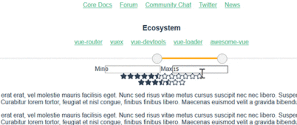
Result

References
Github
CodePen
zebresel Code Pen
StackOverflow - jquery ui :S
Multiple bindings


Latest comments (1)
Great work!.