Jetpack compose has an elegant way to cut out a Compose view into the desired shape. I'm covering few shapes that are available in the core compose lib and where do they differ.
All the shapes discussed here operate on views corners. So, before going through each, let's go through a basic building block called CornerSize.
...
...
📏 CornerSize
CornerSize is an interface that provides an abstraction to define size in different units. Concrete implementation of this interface converts the given unit to pixels. This pixel value can be used in other parts like Shape for computation.
interface CornerSize {
    fun toPx(shapeSize: Size, density: Density): Float
}
- DpCornerSize - allows defining corner cut in device-independent pixels. (DIP or DP)
- PxCornerSize - Pixel to pixel conversion is a wrapper implementation to return float which is a pixel.
- PercentCornerSize - Given a view size and percent, it takes min of height & width and computes the pixel size accordingly.
- ZeroCornerSize - Object that returns zero pixels.
...
All the above classes are private and exposed through few convenient functions as seen below. So, be wary of using different units with CornerSize functions.
fun CornerSize(size: Dp): CornerSize = DpCornerSize(size)

fun CornerSize(size: Float): CornerSize = PxCornerSize(size)

fun CornerSize(/*@IntRange(from = 0, to = 100)*/ percent: Int): CornerSize =  PercentCornerSize(percent.toFloat())
📐 Shapes
All the shapes discussed here has common characteristics listed below:
- Can cut specific corners or all at once
- Corner unit size defined in CornerSize. That means it can take the corner size in the form of pixels, dps or percent.
1. AbsoluteCutCornerShape
With AbsoluteCutCornerShape, the resulting shape will have rough corners. It has four member fields (one for each corner). And has few convenience methods to ease out symmetric cuts.
class AbsoluteCutCornerShape(
    topLeft: CornerSize,
    topRight: CornerSize,
    bottomRight: CornerSize,
    bottomLeft: CornerSize
): CornerBasedShape
As you have noticed, the corners are defined in terms of left and right. We've moved away from using left-right and started using start-end long back to support right-to-left(RTL) locales. Why give it up here?
Absolute direction is still preferred in few places like cutting top-left of an image. That means, when you wrap a content that is RTL agnostic, use AbsoluteCutCornerShape to cut its corner.
Here, listed wrapper functions for Dp unit. Cut out the pixel & percent counterparts for brewity.
fun AbsoluteCutCornerShape(size: Dp) = AbsoluteCutCornerShape(CornerSize(size))

fun AbsoluteCutCornerShape(
    topLeft: Dp = 0.dp,
    topRight: Dp = 0.dp,
    bottomRight: Dp = 0.dp,
    bottomLeft: Dp = 0.dp
) = AbsoluteCutCornerShape(
    topLeft = CornerSize(topLeft),
    topRight = CornerSize(topRight),
    bottomRight = CornerSize(bottomRight),
    bottomLeft = CornerSize(bottomLeft)
)
...
2. CutCornerShape
CutCornerShape is a RTL friendly version of AbsoluteCutCornerShape (not a subclass). This will mirror corner cuts when used in RTL locales. It has the same helper functions defined in the former.
class CutCornerShape(
    topStart: CornerSize,
    topEnd: CornerSize,
    bottomEnd: CornerSize,
    bottomStart: CornerSize
) : CornerBasedShape(
    topStart = topStart,
    topEnd = topEnd,
    bottomEnd = bottomEnd,
    bottomStart = bottomStart
)
...
3. AbsoluteRoundedCornerShape
AbsoluteRoundedCornerShape cuts corner with a given radius. So, the cutout shape will have smoother edges. Also, it can cut only specific edges while leaving the others in square cut shape.
class AbsoluteRoundedCornerShape(
    topLeft: CornerSize,
    topRight: CornerSize,
    bottomRight: CornerSize,
    bottomLeft: CornerSize
) : CornerBasedShape(
    topStart = topLeft,
    topEnd = topRight,
    bottomEnd = bottomRight,
    bottomStart = bottomLeft
)
AbsoluteRoundedCornerShape is RTL agnostic like AbsoluteCutCornerShape. And the helper methods are same as in AbsoluteCutCornerShape.
...
4. RoundedCornerShape
RoundedCornerShape is an RTL-friendly version of AbsoluteRoundedCornerShape. Let's fast-forward to next shape.
class RoundedCornerShape(
    topStart: CornerSize,
    topEnd: CornerSize,
    bottomEnd: CornerSize,
    bottomStart: CornerSize
) : CornerBasedShape(
    topStart = topStart,
    topEnd = topEnd,
    bottomEnd = bottomEnd,
    bottomStart = bottomStart
)
...
5. CircleShape
CircleShape is an object of RoundedCornerShape that cuts circle. When setting the corner at 50%, it will naturally result in a circle. No need to explain the use-case in applications. Yeah... circular image view!!
val CircleShape = RoundedCornerShape(percentage = 50)
↔️ RTL - comparison


This section summarizes the shapes that we discussed above. When a shape has cut only in right or left, we can see the difference between Absolute cuts and RoundedCornerShape / CutCornerShape.
So, I have placed four labels stick to the right side of the screen and corner is cut on the left side (or start of the RTL friendly shapes). When the shapes aligned to the right side the labels looks fine. However, when the device preference set to RTL (in developer options), the RTL friendly shapes mirrored themselves while the absolute layouts stick their noses to the edge.
...
@Preview(device = Devices.NEXUS_6P, showSystemUi = true)
@Preview(device = Devices.NEXUS_6P, locale = "ar", showSystemUi = true)
@Composable
fun RTLScreen() {
    MaterialTheme {
        Surface {
            Column(horizontalAlignment = Alignment.End) {
                SimpleButton(
                    text = "RTL Friendly",
                    shape = CutCornerShape(
                        topStartPercent = 50,
                        bottomStartPercent = 50
                    ),
                )

                SimpleButton(
                    text = "RTL Friendly",
                    shape = RoundedCornerShape(
                        topStartPercent = 50,
                        bottomStartPercent = 50
                    ),
                )

                SimpleButton(
                    text = "Absolute",
                    shape = AbsoluteCutCornerShape(
                        topLeftPercent = 50,
                        bottomLeftPercent = 50
                    )
                )

                SimpleButton(
                    text = "Absolute",
                    shape = AbsoluteRoundedCornerShape(
                        topLeftPercent = 50,
                        bottomLeftPercent = 50
                    )
                )
            }
        }
    }
}

@Composable
fun SimpleButton(text: String, shape: Shape) {
    Surface(
        shape = shape,
        color = color_orange,
        elevation = 4.dp,
        modifier = Modifier.padding(top = 20.dp)
    ) {
        Text(
            text = text,
            modifier = Modifier.padding(
                start = 24.dp,
                end = 8.dp,
                top = 6.dp,
                bottom = 6.dp
            ),
            fontWeight = FontWeight.Bold,
            color = Color.White
        )
    }
}
✂️ Cutting corners
In any application, there are practical use-case to draw few of these shapes below.
1. Tags
@Composable
fun ContentTag(color: Color, tagName: String) {
    Surface(
        shape = AbsoluteCutCornerShape(topLeftPercent = 50, bottomLeftPercent = 50),
        modifier = Modifier.padding(8.dp)
    ) {
        Box(
            modifier = Modifier
                .background(color)
                .padding(
                    start = MaterialTheme.typography.h6.fontSize.value.dp * 1.1f,
                    end = MaterialTheme.typography.h6.fontSize.value.dp / 2,
                    top = 4.dp,
                    bottom = 4.dp,
                )
        ) {
            Text(
                text = tagName,
                color = Color.White,
                style = MaterialTheme.typography.h6,
                fontWeight = FontWeight.W300,
                modifier = Modifier
                    .align(Alignment.Center)
            )
        }
    }
}
...
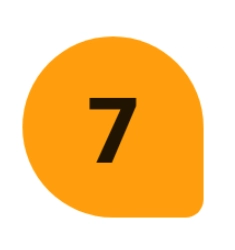
2. TearDrop
A TearDrop shape is basically a rounded rect that bends bottom right at 10% and others with 50%.
val TearDropShape = RoundedCornerShape(
    topStartPercent = 50,
    topEndPercent = 50,
    bottomEndPercent = 10,
    bottomStartPercent = 50
)

@Composable
fun TearDrop(modifier: Modifier = Modifier) {

    Surface(
        shape = TearDropShape,
        color = color_orange,
        modifier = Modifier
            .padding(24.dp)
            .size(60.dp)
    ) {
        Box(contentAlignment = Alignment.Center) {
            Text(text = "7", fontWeight = FontWeight.ExtraBold, fontSize = 30.sp)
        }
    }
}
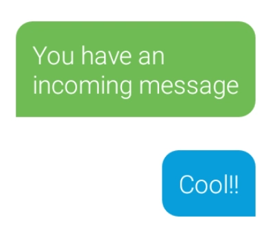
3. Message bubbles
val IncomingMessage = RoundedCornerShape(
    topStart = 8.dp,
    topEnd = 8.dp,
    bottomEnd = 8.dp,
    bottomStart = 0.dp)

val OutgoingMessage = RoundedCornerShape(
    topStart = 8.dp,
    topEnd = 8.dp,
    bottomEnd = 0.dp,
    bottomStart = 8.dp)

@Composable
fun MessageBubble(
    text: String,
    isIncoming: Boolean,
    modifier: Modifier = Modifier,
) {

    Surface(
        shape = if (isIncoming) IncomingMessage else OutgoingMessage,
        color = if (isIncoming) color_green else color_blue,
        modifier = modifier.padding(8.dp)
    ) {
        Text(
            text = text,
            fontWeight = FontWeight.Light, fontSize = 12.sp,
            color = Color.White,
            modifier = Modifier.padding(8.dp)
        )
    }
}

...
MessageBubble("You have an incoming message", true)
MessageBubble("Cool!!", false, modifier = Modifier.align(Alignment.End))
...
...
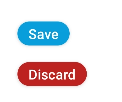
4. Stadium button
@ExperimentalMaterialApi
@Composable
fun StadiumButton2(
    text: String,
    color: Color
) {
    Surface(
        shape = RoundedCornerShape(percent = 50),
        color = color,
        modifier = Modifier.padding(12.dp),
        onClick = {},
        indication = rememberRipple(),
        elevation = 4.dp

        ) {
        Text(
            text = text,
            style = MaterialTheme.typography.h6,
            color = Color.White,
            modifier = Modifier.padding(horizontal = 16.dp, vertical = 4.dp)
        )
    }
}
...
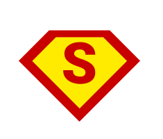
5. A half baked - House of El
@Composable
fun SupermanShape(color: Color, size: Dp) {
    Box(Modifier.rotate(45f)) {
        Surface(
            shape = AbsoluteCutCornerShape(topLeftPercent = 50),
        ) {
            Box(
                modifier = Modifier
                    .background(color)
                    .size(size)
            ) {
            }
        }
    }
}
...
6. Kryptonite
@Composable
fun Kryptonite(color: Color, size: Size) {
    Surface(
        shape = AbsoluteCutCornerShape(percent = 50),
        modifier = Modifier.padding(8.dp)
    ) {
        Box(
            modifier = Modifier
                .background(color)
                .height(size.height.dp)
                .width(size.width.dp)
        ) {

        }
    }
}
🛸 What's next?
Above shapes are basic and sharp cut corner or rounded rect. However, when looking at the Tag shape we can see the shape is not smooth around the edges. Since the shape is basically a path that cuts the rectangle, we can do complex path cuts or polish the above ones. A GenericShape has provision for the same, let's cover it in next article.



Top comments (0)