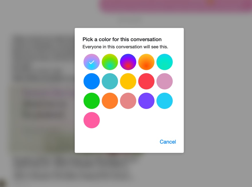
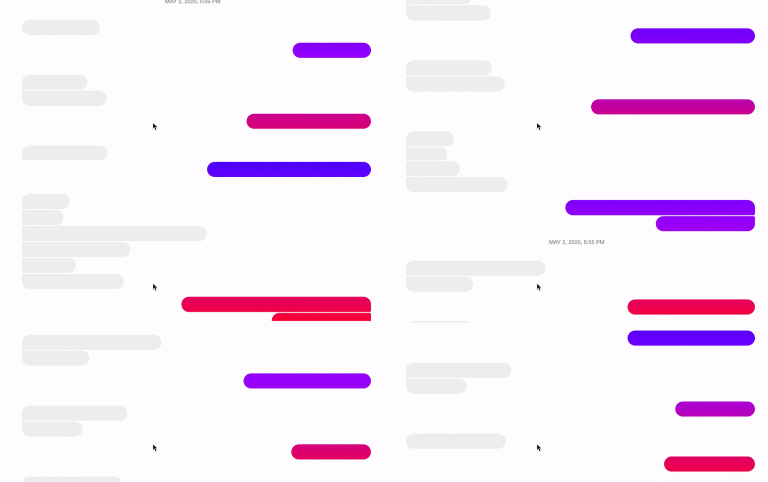
For those of you that use Messenger, you probably already know that there are ways to customize a chatroom by changing the message colors, emoji, group name and photo, nicknames, etc. However I recently found that you can add a gradient to you message bubbles which I find to be really pleasing:
So how does this work? It's actually really easy to do and a great use of background-attachment: fixed property value.
With background-attachment: fixed, the background does not scroll with its container, and it becomes fixed in place relative to the browser viewport. You can see this a lot in Squarespace templates to create that parallax image effect:
The same property can be used with gradients, since those are also treated as images in CSS, creating that scrolling gradient effect. If you also have multiple elements with the same background and fixed attachment, it makes it look like the background gradients flow into each other from bubble to bubble. Since the background is relative to the viewport, the size of the gradient is the size of the viewport:
What are some other neat things you can do with this? You can make it look like a box is disappearing when you scroll up:
It's pretty neat what one property in CSS can do to create such an interesting design effect. I'll definitely be putting this in my toolkit!


Top comments (3)
That is cool, thanks for sharing!
Can we make parallax efect with this?
Not really, but a fixed background effect like this does make it look like the image is detached from the rest of the content