
- Intro
- Definition of the problem
- Hypothesis on the solution
- Implementation of a solution
- Conclusions and credits
Intro
What is Vue.js?
Let's see what the docs say:
Vue (pronounced /vjuː/, like view) is a progressive framework for building user interfaces. Unlike other monolithic frameworks, Vue is designed from the ground up to be incrementally adoptable. The core library is focused on the view layer only, and is easy to pick up and integrate with other libraries or existing projects. On the other hand, Vue is also perfectly capable of powering sophisticated Single-Page Applications when used in combination with modern tooling and supporting libraries.
[...]
In other words, Vue is a frameworks used to build frontend projects. It's pretty easy to use and the template code requested is minimal, it's however quite performant, indeed it was able to gain a respectable place near giants like React and Angular.
What are Web Components?
We've read a lot about web components in the last few years, and a lot we will read about it in the next future, so I will bring only a little synthesis: web components, in short, are none other than frontend components that, once registered by the browser and therefore recognized by it, can be used like normal tags with their attributes, parameters and peculiar behaviour.
They can be defined via js vanilla classes or a framework that supports them, specifically, as it's easly to guess, in this post we will talk about web components defined through Vue.js.
What is Storybook?
Storybook is an excellent tool useful when we have to test visually UI components, it's compatible with all major frameworks js and it can be used with js vanilla. All we have to do is to specify which component we have to render, to provide some mock data and let storybook instantiate our component in its own iframe and that's it. The criticality with vue arises from the difficulty of being able to instantiate simple web components without using other dependencies.
Definition of the problem
Create a test project
Create web components with Vue it's not a problem, there's a powerful cli that permit to specify an appropriate target for this task and, with some tricks, it's possible to test them even with the develop server.
Let's go now a little more in details, the procedure to define a web components with Vue is definitely trivial, let's start from a normal Vue project:
vue create vue-webcomponent-storybook-test
my configuration was typescript, babel, scss (dart-sass) e basic linter on save.
What we will obtain will be a tree like this:
├── dist
├── node_modules
├── public
│   ├── favicon.ico
│   └── index.html
├── src
│   ├── assets
│   │   └── logo.png
│   ├── components
│   │   └── HelloWorld.vue
│   ├── App.vue
│   ├── main.ts
│   ├── shims-tsx.d.ts
│   └── shims-vue.d.ts
├── .gitignore
├── babel.config.js
├── package.json
├── README.md
├── tsconfig.json
├── vue.config.js
└── yarn.lock
If everything went smoothly, from the terminal, running yarn serve, we'll see our Vue app with the test component HelloWorld.vue make a fine show of its self on http://localhost:8080/.
Add Storybook
The next step is to install Storybook via the Vue plugin manager, also this operation like the last one it's not difficult at all:
vue add storybook
Storybook will add some files and folders:
├── config
│   └── storybook
│       └── storybook.js
├── dist
├── node_modules
├── public
│   ├── favicon.ico
│   └── index.html
├── src
│   ├── assets
│   │   └── logo.png
│   ├── components
│   │   ├── Helloworld.vue
│   │   └── MyButton.vue
│   ├── stories
│   │   ├── index.stories.js
│   │   └── index.stories.mdx
│   ├── App.vue
│   ├── main.ts
│   ├── shims-tsx.d.ts
│   └── shims-vue.d.ts
├── .gitignore
├── babel.config.js
├── package.json
├── README.md
├── tsconfig.json
├── vue.config.js
└── yarn.lock
We can safely delete the component in src/components/MyButton.vue and the story in src/stories/index.stories.mdx, they will no longer needed for our project.
In the src/stories/index.stories.js file we create a story form the component App.vue:
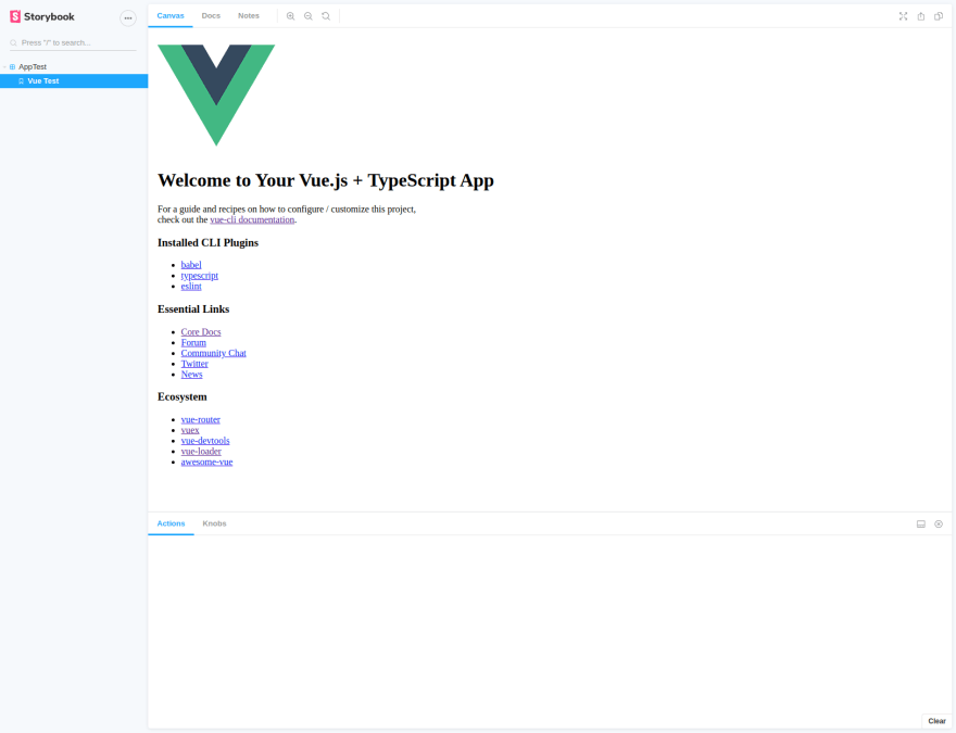
Now, running the task storybook:serve, a test server will start and it will permit to run Storybook and testing our component:
npm run storybook:serve

(At the time of writing it seems that starting storybook with yarn is not possible).
Create a web component
Now we have to wrap our component (we will work with the default root component, App.vue, this will permit us to see how inclusion of others style's components works, however what we're talking about is replicable with any other component) in a class that extends HTMLElement. This operation will not be done by us, but through an api provided by Vue. At the end of this step the main.ts file will appear like this:
customElements.define(https://developer.mozilla.org/en-US/docs/Web/API/Window/customElements) is part of the js api that actually permit to register the component to the browser with the tag name my-web-component.
A little side note, if you're, like me, using typescript, you may need to add to the file shim-vue.d.ts the definition of the module @vue/web-component-wrapper:
declare module '@vue/web-component-wrapper';
In this way you'll avoid the error Could not find a declaration file for module '@vue/web-component-wrapper'. that on ide like IntelliJ and similar, may appear. it's odd that there isn't a d.ts pre-intalled that solve the problem.
At this point in the index.html of our project (in public/index.html) we've to get rid of the predefined root component (il div con id="app") and replace it with the newly registered one. Our index will therefore be:
Problem with styles
Running now the yarn serve command we're going to see our component work like a charm, right?

Well nope...
I mean yes, but actually no... where the hell are my styles????
The trouble is that Vue included the styles in the tag <head> of the page like always, but the component it's closed in a shadow dom (https://w3c.github.io/webcomponents/spec/shadow/), a sort of event horizon through which it's difficult (not impossible, something passes after all) to pass information.
And with Storybook instead? Well, things are that the problem remains. Modifying the index.stories.js like this:
And registering the component before using it (Storybook seem to not use how we include in the main.ts), it is possible render it, but styles are not present:
Hypothesis on the solution
A possible solution is described here, it seems that the option shadowMode of vue-loader is false by default, hence the strange behaviour previously seen. At this point set true that property may be solve the problem.
vue_config.js
All we have to do now is the vue_config.js in the root of the project, if not exists yet, we have to create it.
To know what to fill our file with it's necessary to inspect the webpack configuration of the project, with the command:
vue inspect
The results it seems to this:
If we look closely at this output, we can notice some interesting comments, for example:
/* config.module.rule('css').oneOf('vue').use('vue-style-loader') */
illustrating the api needed to generate that particular piece of configuration, this api, indeed, it's part of webpack-chain (https://github.com/neutrinojs/webpack-chain) tool used to facilitate the drafting of configuration files for webpack. Since it's already installed in the project, we can use for our purposes.
Obviously the parts of the configuration that interested us, are those where the property shadowMode: false appears, below the extract of the interested parts:
What we put in the vue_config.js will be intercepted from webpack anche integrated in the transpiling process, at the end, with the help of the documentation, we will obtain something like this:
this script add shadowMode:false everywhere is needed and permit webpack to proceed with the compilation process, finally we'll obtain a web component correctly rendered with its own styles incapsulated:

Include the web component in the story ()
if we run storybook now, we can see our component correctly rendered, however here the storybook api doesn't help us: how we can pass data to the component? What if these data are complex objects? How it's possible to interface with the component through the api exposed by the knob addon?
Ok let's proceed with order:
Register the component
This is easy, each component must be registered as we said before, one possibility is to implement a function that checks if the component is already registered and if not proceed accordingly, something like:
Really simple, elements that are not registered yet has HTMLElement() constructor, it's sufficient check it and that's it.
Subsequelty, the component must be registered:
Here too, nothing new, the procedure is the same seen before, only closed in a function.
Integrate the interface in the stories
Now we need to make sure we can use the addon-knobs to be able to pass data to our component and make it reactive to the changes that we can make during tests.
My solution was to build a function that returns a component and subsequentialy retrieves its reference to pass any data:
Let's try to understrand what this script actually do:
export const webComponentWrapper = ({props, template}) => {
...
In input an object is expected, for example:
props: {
  test: [
    ['test', true, 'GROUP-ID1'],
    boolean
  ],
},
template: '<test-component></test-component>'
formed by the property props which it will be another object, its element will have as keys the name of the property of the component and as value an array where the first element will be an array formed by:
- property name (yes, too much redudancy),
- value that will be considered
- and the label that we want to assign to that specific knob.
The second value, instead, will be the function of the addon-knobs that will be used to process that specific data type (in this case boolean).
template is a string that rapresent the component and what it contains.
...
const id = generateRandomNumber(0, 10 ** 16);
...
Here generate a random id that will be pass to the component and used to retrieve its reference, I've create a specific function, but you can use a timestamp without any problem.
...
for (const key in props) {
  if (Object.hasOwnProperty.call(props, key)) {

    const old = key + 'Old' + id;
    const value = key + 'Value' + id;

    props[old] = null;
    props[value] = () => (props[old] !== null) ? props[old] : props[key][0][1];
  }
}
...
Now let's start working on the data to pass to the component: first of all we retrieve the property props and scroll through its contents, for each element, we decorate it with two others properties (the old and value variables), to the first we give null, to the second a function that will returns the old value (old) or the default one passed with the properties in props (be patient it's painful for me as it is for you), to understand the value true in ['test', true, 'GROUP-ID1'] that we talk about above, depending on weather the old value exists or not.
Every time, in Storybook, we select a specific component it will be reinitialized, in thi way, instead, we can pass each time the last value used in knobs, otherwise returning to a component previously visited we would lose the modifications made during tests and will see every time the first passed value.
return () => {
  setTimeout(() => {

    const root = document.getElementById(id.toString());
    const old = 'Old' + id;
    const value = 'Value' + id;

    for (const key in props) {

      if (Object.prototype.hasOwnProperty.call(props, key) && !key.includes(old) && !key.includes(value)) {

        const knobsParams = props[key][0];
        const knobsFunction = props[key][1];
        const tagElem = props[key][2];

        knobsParams[1] = props[key + value]();
        props[key + old] = props[key][1](...knobsParams);

        if (tagElem) {
          const elems = root.getElementsByTagName(tagElem)
          elems.forEach((item) => {
            item[key] = props[key + old];
          })
        }
        else {
          root[key] = props[key + old];
        }
      }
    }

  });

  return newTemplate;
}
The returned function is that will be executed by Storybook when a component is selected.
Before that function returns the template, a timeout without the time parameter is executed, so the handler will return in the event loop (cool video about event loop https://www.youtube.com/watch?v=8aGhZQkoFbQ&ab_channel=JSConf) as soon as possible, in this case just before the template become a element of the page.
The component reference, finally, is retrieved using the id previously calculated and the data extracted from the object passed to the main function are passed to the component. As said above, the data are saved in the propery added to props (here props[key + old] = props[key][1](...knobsParams);).
Conclusioni e credits
And that's all guys, putting everything together, you can have a Vue project ready to tests Web Components (not only vue normal classes) with Storybook and the included dev server. Here you can find a repository with a test project complete and working.
Thanks for reading this far.
Cheers
Fonti:


Top comments (0)