
At The Lifetime Value Company, we are constantly trying to find new avenues for making public data easily accessible to our users. One prototype for a future product we have been working on will help viewers get decent estimates about their current home or on a potential dream home. Upon sign up, a user searches an address and gains access to a generated property report, which contains estimated values on the property (with confidence scores), tax histories, information on other properties in the neighborhood, and much more! We took the opportunity with this prototype to test out React in order to delve into modern JavaScript technologies and decide if it is a viable option for future projects.
Throughout this endeavor, we’ve come to realize how cool React is, and when used correctly, it enables us to reuse code and create a maintainable and enjoyable environment in which our engineers continue to grow. In this post, I’ll demonstrate how we can implement React componentized design to take disorganized and unreadable code and turn it into something that is intuitive and reusable. Best engineering practices teach us the principle of DRY (Don’t Repeat Yourself) coding and React components allow us to follow this to a T.
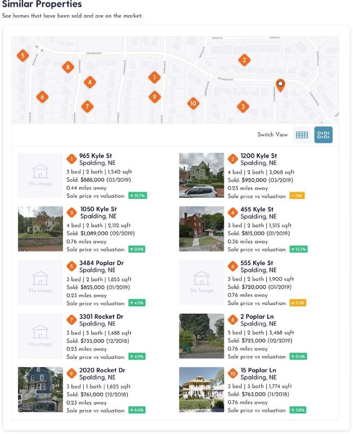
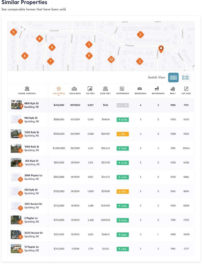
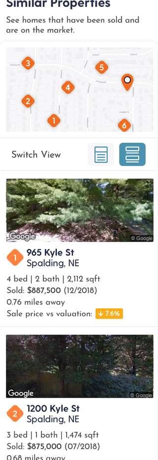
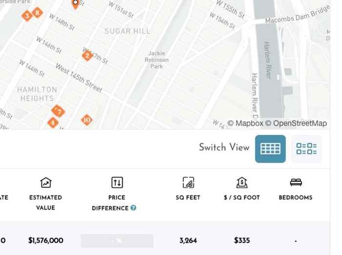
Let’s start with the initial implementation: a first draft that was ripe for refactoring. The task was to create a SimilarProperties component, displaying a map of the neighborhood around the subject property with markers denoting nearby similar properties. Beneath this map, we display data on the other properties by creating individual widgets, organized into 4 different viewports (desktopGrid, desktopTable, mobileGrid, and mobileCards), allowing users to consume the data and compare properties in different formats.
DesktopGrid:
Desktop Table:
MobileGrid:
MobileCard:
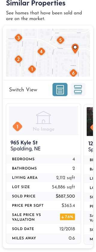
Each Similar Properties widget has stats on the property (sale price/date, square footage, bedrooms, etc.) as well as some comparison with the subject property (price difference and the distance between properties). We also allow the user to click on any individual Similar PropertiesWidget, which in turn renders a modal showing a side-by-side comparison of the selected property against the subject property.
Now that you have an explanation for how this component is expected to work, you may find yourself beginning to formulate how you might try to architect this component if this were your project. Aren’t you a proactive engineer? Unfortunately, you are probably horrified to see what the file structure looked like in the first effort. This is the folder structure before the refactor:
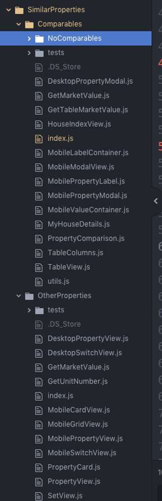
At first glance, you’ll notice how impossible the directory structure is to read and reason out, and how hard it is to surmise what was happening. Any good engineer should be able to look at a component structure, and at least get an initial clue as to how its logic is organized, but that is not the case here. It was confusing as…..heck. So we took on this project to make it better — more readable and more reusable.
You’ll see here that the SimilarProperties the component is made up of two directories, each with about ten different js files. At a quick glance, we have NO idea of how the code works based on its file structure. Even upon further investigation, it took a while to wrap our heads around what was going on.
The file structure of a component should give insight as to how a component works. Helpful names and nesting allow developers to get an idea of the organization of code and logic just by looking. Each parent directory should reflect a greater “parent” of the page and any functionality taking place within that parent will be reflected in its child directories. In this case, that clearly is not happening, and this is quite a headache to try to wrap your head around.
Looking at this structure, the first question that comes to mind is “What is the difference between Comparables and OtherProperties? (and why is the latter nested among the former?)” We want to structure these files to reflect how this component should work. The second detail that sticks out is that we have multiple files with similar names, in particular, the SwitchView and PropertyView files, and all of the different viewports to view the OtherProperties. I’m guessing we can consolidate here. Why not make one SwitchView component and one PropertyView component, using props to implement different logic necessary to handle multiple device types? Lastly, we know that there will be two different viewports for mobile, and two for desktop. It will probably make the most sense to maintain this separation, as we don’t want to reorganize unless necessary, but let’s make it obvious how the components are organized depending on the device.
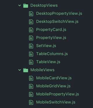
Knowing the goals of this component we want to eventually restructure our directories as such: Comparables (meaning the component that will either render a view containing the other properties or an empty placeholder if none) => NoComps or OtherProperties => Comparisons (this is just a bonus feature that triggers the modal comparing the two properties), DesktopViews, MobileViews., and SwitchView.. Within the DesktopViews we’ll have the TableView and GridView, and within the MobileViews we have CardView and GridView.. Lastly, we’ll try to consolidate all of the switch logic into one singular SwitchView component.
Ideally, our components can react to different device types, and retroactively render content based on that. In this case, the components we need to render are different enough that I think it makes sense to keep the components separate. This is fine and there’s no need to create unnecessary optimizations, but we want to make it clear to an engineer working on this project which component will be rendered for mobile versus desktop. So we separate out anything mobile related into a directory, and anything desktop related to another directory. Eventually, we’ll remove utility functions, and consolidate as necessary. But for now, we’ll start with this.
Instead of nesting all of these files within the parent directory, I explicitly move anything desktop related to its own directory and the same with mobile.
Instead of nesting all of these files within the parent directory, I explicitly move anything desktop related to its own directory and the same with mobile.
Here, we want to transform the switch functionality into one single component. The idea is to have a bar that will toggle between two views. It needs to look like this:
DesktopSwitch view:
MobileSwitch view:

These switch views are different, but behave the same: they each have two icons, with an active and an inactive state, and when clicked the app toggles between two distinct views. We can turn these into a single component! As an aside, when looking at the code I can instantly tell that we can consolidate, as they appear so similar to repetitive code.
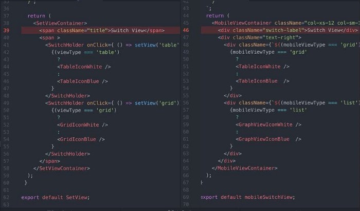
We can use props to set which views to trigger, depending on whether the device is mobile or desktop, and set variables for both the icons to render and the corresponding component. Observe:
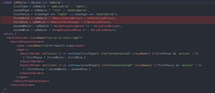
By checking the device type, we can conditionally set both the view type and icon, and by using a setView callback (passed as a prop), we can tell the parent component PropertyView which view to display. This is why React is cool, it’s extremely simple to implement logic to show four distinct components, without having to repeat code and actually include all four views into the DOM. No longer do we have four different files (two for each viewport size) for both SwitchView/PropertyView, but one single switch component that informs one single property component to render one single organizational component to display all the OtherProperties widgets.
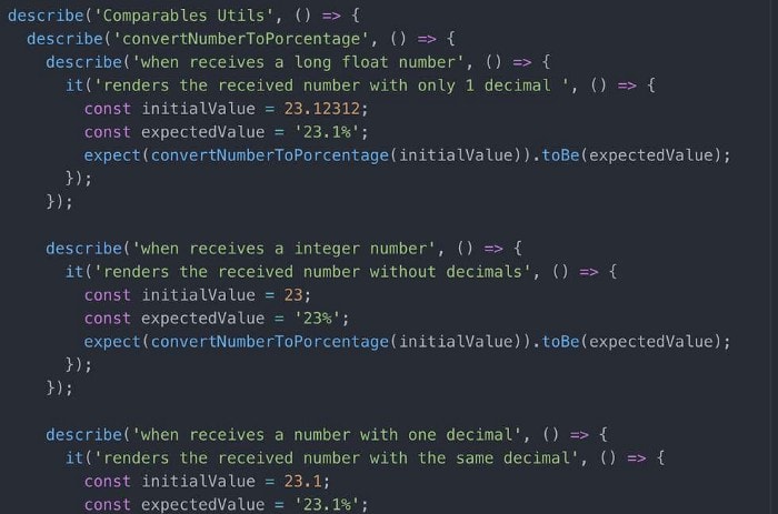
Another thing we successfully consolidate into one singular source of truth was the formatting functions used across multiple components. There is a fair amount of data formatting that needs to happen, so let’s consolidate that as well. Functions like GetMarketValue and GetUnitNumber existed within the parent directories, and cluttered up the readability of the folder structure. Not only is it necessary to extricate this type of functionality into a common place for readability, but by separating them out, we can easily import than into other components unrelated to this feature that might require some of the functionality we define here. Another benefit to this refactor is that by separating out the formatting functions into a utility directory, we can easily write unit tests to ensure the maintainability of the app in the future. These js functions aren’t tied to the actual components themselves, so they can be independently tested.
Obviously this doesn’t cover 100% of the steps in this refactor, but this way of thinking about organization and reusability allows us to wield React to destroy disorganized code, and thus our new structure looks like this:
Doesn’t looking at this make your life way better? You get a clearer idea into what is going on thanks to stronger naming conventions, simple directory organization, etc. This is the type of proactive action and care we expect of our developers at The Lifetime Value Company. This particular product feature’s evolution combined with built-in React tools provided a perfect way to demonstrate this belief.
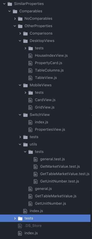
In the end, we came up with a streamlined and efficient feature. The files and folders now better represent the logical hierarchy of the code, allowing the casual viewer to gain an intrinsic idea of how the components work together. By combining similar functionality and organizing helper functions, we keep the project as small and efficient as possible. In the end, this project saves future engineers from immense frustration at having to work with ineffective code, as this should now be exponentially easier to understand and iterate upon further. This reduces burnout and anxiety for the engineers and in turn increases productivity and gives us a better platform to hire the next great engineer. Is that you? Take a look at our open engineering positions.


Top comments (0)