
Written by Mohammad Faisal ✏️
Tables are a vital part of almost any web application, especially heavily data-driven applications.
In this tutorial, we’ll review the importance of choosing the right table component for your project and demonstrate how to create tables in React using one of the best and most feature-rich libraries available: material-table.
Here’s what we’ll cover:
- Why do you need a table component?
- Why use material-table?
- Installing material-table
- Creating a table
- Adding Material Icons
- Using icons in your table
- Adding actions to material-table
- Overriding table components
- Custom rendering
- Exporting data to
.csvand.pdf - Grouping data
- Searching
- Sorting data
- Alternatives to material-table
- rsuite-table
- React Table
- MUI-Datatables
- Is material-table actively maintained?
Why do you need a table component?
A plain HTML table is very powerful and can be used to present data quickly. You can even add customized styling to make it your own. If you’re only concerned with presenting simple data to your end users, a plain old HTML table should be enough for you.
But plain HTML tables have some limitations, including:
- Look and feel — plain HTML tables are pretty basic in terms of styling. You have to add a lot of styles to make an HTML table look professional
- Features — HTML tables don’t support any additional features such as searching, sorting, etc.
- Performance — HTML tables are not optimized for performance because there is no default support for pagination or lazy loading
Table components are designed to help you solve these and other issues associated with plain HTML tables. A good table component should have the following features built in:
- Searching through data
- Sorting data
- Filtering columns
- Download options
- Style customization
- Row actions
- Row selection
- Grouping data
The features mentioned above are commonly found in modern applications that present data in table format.
Why use material-table?
material-table is virtually the only table library that supports all of the aforementioned features.
The library is built on top of Material UI, the most popular UI library in the React ecosystem. material-table will blend in perfectly if you are already using Material UI.
With the ability to customize the look and feel of a table build with material-table, you can use it in any React project.
If you’re a visual learner, check out this video tutorial to help you get started using material-table.
https://www.youtube.com/watch?v=T4dtGAGCXVU&
Installing material-table
First, create a new project using Create React App.
npx create-react-app material-table-demo
After the project is created, go into the root folder of your project:
cd material-table-demo
And add the following dependencies to use material-table:
npm install material-table --save
npm install @material-ui/core --save
Or, if you want to use yarn:
yarn add material-table
yarn add @material-ui/core
That’s all you need to get started with material-table.
Creating a table
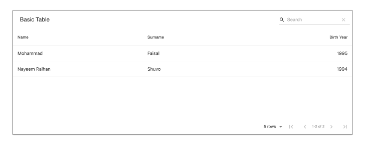
To render a table with material-table, you have to supply the data (an array of objects) and the name of the columns to map with the data. The columns will specify which piece of data will go in which column.
Let’s create a new file named BasicTable.jsx and add the following code:
import MaterialTable from "material-table";

const data = [
  { name: "Mohammad", surname: "Faisal", birthYear: 1995 },
  { name: "Nayeem Raihan ", surname: "Shuvo", birthYear: 1994 },
];

const columns = [
  { title: "Name", field: "name" },
  { title: "Surname", field: "surname" },
  { title: "Birth Year", field: "birthYear", type: "numeric" },
];

export const BasicTable = () => {
  return <MaterialTable title="Basic Table" columns={columns} data={data} />;
};
This piece of code will render the following table:

Nice! Our data is displayed properly and we also have the default search and pagination functionality — and we didn’t need to write a single line of code.
But wait, something is not right. If you direct your attention to the arrows drawn on the image, you’ll notice some weird text. This is because material-table internally tries to use Material Icons, which we need to manually.
Adding Material Icons
To add Material Icons to our table, we must first install the dependency inside our project.
npm install @material-ui/icons --save
Or, with yarn:
yarn add @material-ui/icons
We have added Material Icons to our project.
Now let’s say we want to import a single icon. Do we need to add the whole set of icons? Obviously not — that would make the app too heavy.
Below we’ll demonstrate the wrong and correct ways to import Material Icons to use in your material-table.
Wrong way:
import { AddBox, ArrowDownward } from "@material-ui/icons";
This will result in importing all the icons.
Correct way:
Instead, we should try to only get the specific icon:
import AddBox from "@material-ui/icons/AddBox";
import ArrowDownward from "@material-ui/icons/ArrowDownward";
Following this best practice, let’s create a special component to add all the required icons into the project and reuse that everywhere.
Create a new file named MaterialTableIcons.js and add the following code:
import React, { forwardRef } from "react";

import AddBox from "@material-ui/icons/AddBox";
import ArrowDownward from "@material-ui/icons/ArrowDownward";
import Check from "@material-ui/icons/Check";
import ChevronLeft from "@material-ui/icons/ChevronLeft";
import ChevronRight from "@material-ui/icons/ChevronRight";
import Clear from "@material-ui/icons/Clear";
import DeleteOutline from "@material-ui/icons/DeleteOutline";
import Edit from "@material-ui/icons/Edit";
import FilterList from "@material-ui/icons/FilterList";
import FirstPage from "@material-ui/icons/FirstPage";
import LastPage from "@material-ui/icons/LastPage";
import Remove from "@material-ui/icons/Remove";
import SaveAlt from "@material-ui/icons/SaveAlt";
import Search from "@material-ui/icons/Search";
import ViewColumn from "@material-ui/icons/ViewColumn";

const tableIcons = {
  Add: forwardRef((props, ref) => <AddBox {...props} ref={ref} />),
  Check: forwardRef((props, ref) => <Check {...props} ref={ref} />),
  Clear: forwardRef((props, ref) => <Clear {...props} ref={ref} />),
  Delete: forwardRef((props, ref) => <DeleteOutline {...props} ref={ref} />),
  DetailPanel: forwardRef((props, ref) => <ChevronRight {...props} ref={ref} />),
  Edit: forwardRef((props, ref) => <Edit {...props} ref={ref} />),
  Export: forwardRef((props, ref) => <SaveAlt {...props} ref={ref} />),
  Filter: forwardRef((props, ref) => <FilterList {...props} ref={ref} />),
  FirstPage: forwardRef((props, ref) => <FirstPage {...props} ref={ref} />),
  LastPage: forwardRef((props, ref) => <LastPage {...props} ref={ref} />),
  NextPage: forwardRef((props, ref) => <ChevronRight {...props} ref={ref} />),
  PreviousPage: forwardRef((props, ref) => <ChevronLeft {...props} ref={ref} />),
  ResetSearch: forwardRef((props, ref) => <Clear {...props} ref={ref} />),
  Search: forwardRef((props, ref) => <Search {...props} ref={ref} />),
  SortArrow: forwardRef((props, ref) => <ArrowDownward {...props} ref={ref} />),
  ThirdStateCheck: forwardRef((props, ref) => <Remove {...props} ref={ref} />),
  ViewColumn: forwardRef((props, ref) => <ViewColumn {...props} ref={ref} />),
};

export default tableIcons;
The cool thing is if you don’t like the icons from the material-icons, you can change the look by switching to some other icon library.
Using icons in your table
Now let’s import the icons into our table component where we want to fix the issue.
import tableIcons from "./MaterialTableIcons";
Next, pass the icons into the table. Update your code with the additional icons prop:
<MaterialTable title="Table" icons={tableIcons} columns={columns} data={data} />;
Now our table will look something like this:
Now it’s perfect! Let’s explore some other features.
Adding actions to material-table
We can add two types of actions to our material-table:
- Actions for each row (e.g., deleting or updating a row)
- Actions for the whole table (e.g., adding a new item to the table)
We can easily add actions by passing an actions array prop into the table.
If the action is row-specific, we don’t need to say anything. If the action is for the whole table, we have to pass isFreeAAction = true into the table.
Here’s an example:
import MaterialTable from "material-table";
import tableIcons from "./MaterialTableIcons";

export const TableWithActions = () => {
  return (
    <MaterialTable
      title="Table with actions"
      actions={[
        {
          icon: tableIcons.Delete,
          tooltip: "Delete User",
          onClick: (event, rowData) => alert("You want to delete " + rowData.name),
        },
        {
          icon: tableIcons.Add,
          tooltip: "Add User",
          isFreeAction: true,
          onClick: (event) => alert("You want to add a new row"),
        },
      ]}
      ... other props as before
    />
  );
};
We are removing the data and column props to remove duplicates. Our table will have two additional buttons now — one in the top right corner (Add button) and a Delete button for each row.

This enables you to specify the actions for your table. There is a disabled property through which you can determine whether you want to enable action or not.
Overriding table components
Now let’s say you don’t like the look of the action buttons and you want to render a custom action button. Or maybe you don’t like how the table cells look. material-table enables you to change the look and feel of any component.
To achieve this, the MaterialTable component takes an additional parameter named components where you can override almost any part of the table.
To show how this works, we’ll modify the Delete button from our previous example. Let’s say we don’t want a Delete icon; instead, we want an actual text button.
All we have to do is add the following prop to the table:
<MaterialTable
    components={{
        Action: (props) => (
            <button onClick={(event) => props.action.onClick(event, props.data)}>
                Custom Delete Button
            </button>
        ),
    }}
    ... other props
/>
Now our table will look like this:

See the material-table docs for a complete list of customization options.
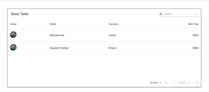
Custom rendering
It’s nice that we can override the components that are provided by material-table. But what about rendering our own columns? We’ve seen that we pass the columns and data props into the table and material-table itself takes care of the rendering.
Now let’s say we have an image URL that comes from a remote source. We don’t want to render the URL (because that’s stupid 😛).
In this scenario, we can render whatever we like, such as an image component, for example.
To do that, we have to modify the columns that we pass into the table.
Let’s modify our previous example like the following to add imageUrl and render that:
import MaterialTable from "material-table";
import tableIcons from "./MaterialTableIcons";

const data = [
    {
        name: "Mohammad",
        surname: "Faisal",
        birthYear: 1995,
        imageUrl: "https://avatars0.githubusercontent.com/u/7895451?s=460&v=4",
    },
    {
        name: "Nayeem Raihan ",
        surname: "Shuvo",
        birthYear: 1994,
        imageUrl: "https://avatars0.githubusercontent.com/u/7895451?s=460&v=4",
    },
];

const columns = [
    {
        title: "Avatar",
        field: "imageUrl",
        render: (rowData) => <img src={rowData.imageUrl} style={{ width: 40, borderRadius: "50%" }} />,
    },
    { title: "Name", field: "name" },
    { title: "Surname", field: "surname" },
    { title: "Birth Year", field: "birthYear", type: "numeric" },
];

export const ImageTable = () => {
    return <MaterialTable title="Basic Table" icons={tableIcons} columns={columns} data={data} />;
};
Now our table will look like this:
Exporting data to .csv and .pdf
The export feature is by far my favorite feature of the material-table library. When you’re building data-heavy applications, you may need to enable users to export the data to Excel or PDF. Traditionally you would have to use some custom Excel library to do that job.
With material-table, you simply pass an option that says exportButton : true, and you’re good to go.
import MaterialTable from "material-table";

export const BasicTable = () => {
    return (
        <MaterialTable
            ... other props
            options={{
                exportButton: true,
            }}
        />
    );
};
Now there will be an additional icon at the top of the table that enables users to download data both in .csv and .pdf format.

Just a single line of code, and you’ve already supercharged your table.
Grouping data
Let’s say you have a list of people, each of whom has a name, age etc. If you want to see people of the same age, how do you show this in your table?
material-table enables you to group data super easily. In any other type of table, this would be an extremely difficult thing to do dynamically.
With material-table, all you need to do is pass another option named grouping :true.
<MaterialTable
    ... other props
    options={{
        grouping: true,
    }}
/>
Now you should see something like the following if you drag the Name column header to the top of the table:

material-table internally uses another awesome library named React DnD to achieve this.
Searching
We have already seen that, by default, material-table enables us to search through data. You can override the look and feel of the search bar by adding styles in the options.searchFieldStyle.
If you don’t want to show the search bar for some reason, you will have to pass search : false, like so:
<MaterialTable
    // other props
    options={{
      search: false
    }}
/>
Now there should be no search field in your table:

Sorting data
material-table also enables you to sort your data very easily. All you have to do is pass another option, sorting : true.
<MaterialTable
    ... other props
    options={{ sorting: true }}
/>
All your columns should now be sortable:
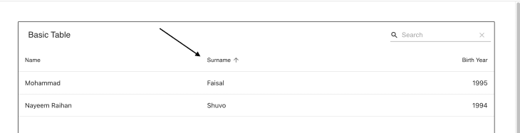
Remember, by default, material-table will try to sort your data lexicographically. If you want to sort with some other mechanism, you can modify that by overriding the columns property, like so:
 columns={[
      {
          title: 'Name',
          field: 'name',
          customSort: (a, b) => a.name.length - b.name.length
      },
      .. other columns
  ]}
This give you complete control over how you sort your data.
Alternatives to material-table
We focused on material-table for this tutorial, but there are certainly other table components to use in your React app. Let’s highlight a few prominent alternatives to material-table.
rsuite-table
rsuite-table has a wide range of features and is great for creating professional-looking tables. It supports almost all the features we we mentioned above but doesn’t have a download data option. Also, data grouping is not supported out of the box.
React Table
React Table is not a component library like the others mentioned here; it is a collection of hooks that enables you to add features to any table component. According to the official website, React Table is a “table utility, not a table component.”
You can use React Table to add sorting, filtering, grouping, pagination, etc., to any table component.
MUI-Datatables
MUI-Datatables is a lightweight version of material-table. If you don’t need the full range of features described above, this library offers a lighter alternative.
Is material-table actively maintained?
As robust and feature-rich as material-table is, maintenance and support have waned since the original creator left the project. Other contributors are still maintaining the library, though not as actively. However, there is a fork of the current project called material-table/core. This version is not yet as polished as material-table, but it is under active development and frequently updated. Although it doesn’t yet support the entire range of features described above, material-table/core is compatible with the new Material-UI v5, which is great! material-table remains the more popular library, with roughly 150,000 downloads per week as opposed to material-table/core's 23,000 weekly downloads at the time of writing. But material-table/core is a viable alternative if you're using the latest version of Material-UI and looking for a library with more active support.
Final thoughts
As you can see, material-table solves almost all the problems and covers all the use cases you’re likely to encounter when building data-heavy React apps. It’s almost too good to be true.
But there is a catch: material-table is heavier than all the alternatives mentioned above. Using bundlephobia, we can see that material-table is over 200KB when used in production.

So if your data needs are simple, using this library might be overkill. You may want to choose some other lightweight library, such as rsuite-table, which is around 30KB in size, or even Rect Table, which is only 15KB.
I hope this guide helps you make a more informed decision next time you need to choose a table library for your React project.
The complete code used in this demo is available on GitHub.
Full visibility into production React apps
Debugging React applications can be difficult, especially when users experience issues that are hard to reproduce. If you’re interested in monitoring and tracking Redux state, automatically surfacing JavaScript errors, and tracking slow network requests and component load time, try LogRocket.

LogRocket is like a DVR for web apps, recording literally everything that happens on your React app. Instead of guessing why problems happen, you can aggregate and report on what state your application was in when an issue occurred. LogRocket also monitors your app's performance, reporting with metrics like client CPU load, client memory usage, and more.
The LogRocket Redux middleware package adds an extra layer of visibility into your user sessions. LogRocket logs all actions and state from your Redux stores.
Modernize how you debug your React apps — start monitoring for free.


Top comments (0)