
Written by Andrew Baisden ✏️
There are quite a few ways to achieve good styling within a React Native application. In this tutorial, we’ll review the traditional methods of styling in React Native and introduce you to a popular alternative: CSS Modules.
The barrier to entry for designing and creating custom mobile applications is quite low thanks to the power of React Native and the fact that it supports native HTML and CSS styling out of the box. If you’re already familiar with web development and have experience using React for the web, then you’re in luck because those skills are going to translate over very easily.
React Native styles vs. CSS Modules
The core layout design system used in React Native is CSS Flexbox, the most popular design system among developers for building webpages. Having the power of Flexbox baked in makes designing mobile applications super accessible to advanced and beginner-level developers alike.
React Native apps are commonly styled using either inline styles or styling props. CSS Modules offer a portable, more robust alternative to using traditional React Native styles. CSS Modules enable you to use locally scoped styles in your React Native app, which makes your code significantly cleaner and more readable.
In this guide, we’ll show how each method works with practical examples and demonstrate why you should consider using CSS Modules to style your React Native app.
Styling in React Native: Traditional methods
React Native lets you style your whole application using JavaScript. Every component can use a prop named style, which enables you to write CSS styles for those components.
There are two main methods that React Native has for creating styles: inline styling and using a style prop to style subcomponents. Essentially, you have a StyleSheet.create method to define multiple styles at once, like an inline stylesheet in CSS.
Here’s an example to show how inline styling works in React Native:
App.js file
import React from 'react';
import { View, Text, SafeAreaView } from 'react-native';

export default function App() {
  return (
    <>
      <SafeAreaView>
        <View
          style={{
            flexDirection: 'row',
            justifyContent: 'space-evenly',
            alignItems: 'center',
            backgroundColor: '#6804CD',
            width: '100%',
            height: 30,
          }}
        >
          <Text style={{ color: '#ffffff', fontWeight: 'bold' }}>Alpha</Text>
          <Text style={{ color: '#ffffff', fontWeight: 'bold' }}>Bravo</Text>
          <Text style={{ color: '#ffffff', fontWeight: 'bold' }}>Charlie</Text>
          <Text style={{ color: '#ffffff', fontWeight: 'bold' }}>Delta</Text>
          <Text style={{ color: '#ffffff', fontWeight: 'bold' }}>Echo</Text>
          <Text style={{ color: '#ffffff', fontWeight: 'bold' }}>Foxtrot</Text>
        </View>
      </SafeAreaView>
    </>
  );
}
Inline styling is great for quick, small applications and also in scenarios where you want to test some code without having to do a full implementation. However, as you can see, there is a lot of duplication and the code does not adhere to DRY principles. This type of code would not scale well because there is a lot of repetition that could be replaced with a CSS class.
Because inline CSS has to be written in camel case syntax, unlike traditional CSS styles, it will take slightly longer to convert normal CSS styles to this syntax. You can’t just copy and paste code.
Furthermore, it is considerably more difficult to to make inline styles responsive because media queries simply don’t work. The only options would be to create some kind of business logic to get it working or to use another method altogether.
The example below shows how to produce the same result using style props:
App.js file:
import React from 'react';
import { StyleSheet, View, Text, SafeAreaView } from 'react-native';

export default function App() {
  return (
    <>
      <SafeAreaView>
        <View style={styles.container}>
          <Text style={styles.text}>Alpha</Text>
          <Text style={styles.text}>Bravo</Text>
          <Text style={styles.text}>Charlie</Text>
          <Text style={styles.text}>Delta</Text>
          <Text style={styles.text}>Echo</Text>
          <Text style={styles.text}>Foxtrot</Text>
        </View>
      </SafeAreaView>
    </>
  );
}

const styles = StyleSheet.create({
  container: {
    flexDirection: 'row',
    justifyContent: 'space-evenly',
    alignItems: 'center',
    backgroundColor: '#6804CD',
    width: '100%',
    height: 30,
  },
  text: {
    color: '#ffffff',
    fontWeight: 'bold',
  },
});
The React Native StyleSheet approach is the default method for implementing CSS styles within a React Native application. StyleSheets are basically an abstraction and very similar to traditional CSS StyleSheets. Code is significantly easier to read and the addition of class names ensures that the code remains DRY.
This CSS-in-JS approach is quite popular, although there is a debate among the community as to whether or not JavaScript and CSS should be in the same file. This is most often referred to as a separation of concerns, which stipulates that you should not mix JavaScript and CSS together; each should exist in its own file.
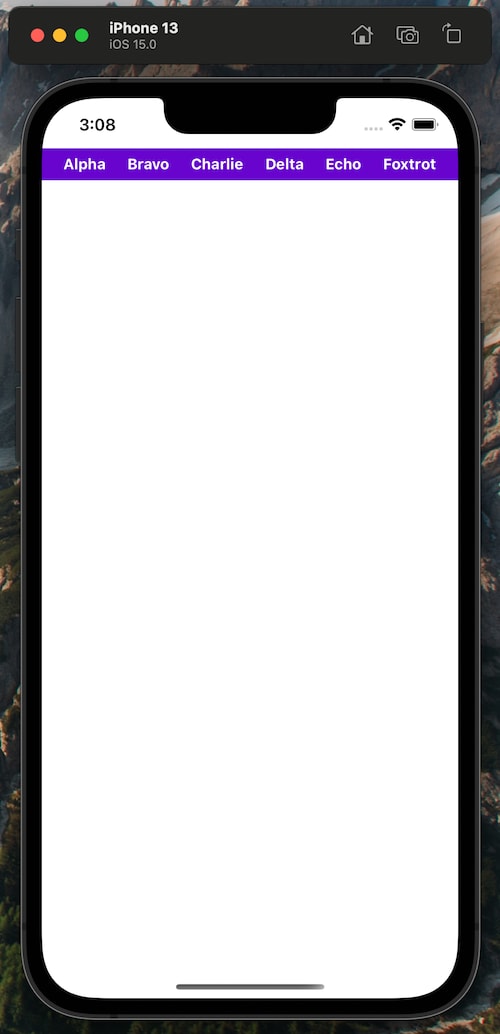
Here’s what the code looks like in an app when rendered:
Why you should use CSS modules
A great alternative to inline styling and using style props is to use CSS Modules. CSS Modules are great because they enable you to have component-scoped CSS that is highly portable and localized for the component to which it is assigned. You no longer need to worry about collisions between selector names such as IDs and classes in other CSS files that might have the same naming convention.
By default, CSS Modules are files that are scoped locally, so there are no conflicts with other CSS files. With CSS Modules, the files are written in pure CSS but are converted to objects in JavaScript, making them more robust and safer to integrate.
The only difference between normal CSS and a CSS module is the file extension. Normal CSS uses the header.css file naming convention whereas CSS Modules uses the header.module.css convention.
CSS Modules: A practical example
Below you’ll find the same code we used in the examples for inline styling and using style props, but this time we’ll use CSS Modules to style our React Native app.
App.js file:
import React from 'react';
import { View, Text, SafeAreaView } from 'react-native';
import style from './App.module.css';

export default function App() {
  return (
    <>
      <SafeAreaView>
        <View style={style.container}>
          <Text style={style.text}>Alpha</Text>
          <Text style={style.text}>Bravo</Text>
          <Text style={style.text}>Charlie</Text>
          <Text style={style.text}>Delta</Text>
          <Text style={style.text}>Echo</Text>
          <Text style={style.text}>Foxtrot</Text>
        </View>
      </SafeAreaView>
    </>
  );
}
When using CSS Modules, you can see how clean the code looks. There is no CSS StyleSheet in this file. Instead, it has to be imported, which keeps the code separated. Each element has a style class, which comes from the App.module.css file. The CSS is now localized for each individual file, so there should not be any naming conflicts.
App.module.css file:
.container {
  flex-flow: row;
  justify-content: space-evenly;
  align-items: center;
  background-color: '#6804CD';
  width: '100%';
  height: 30;
}

.text {
  color: '#ffffff';
  font-weight: bold;
}
The code inside the App.module.css file is plain CSS. There is no camel case; it’s just a normal CSS file, so you get the full, unadulterated power of CSS. This includes media queries, hover events, etc. If you have some CSS in another file, it’s easy enough to copy and paste it over — no conversion required.
Designing a React Native app using CSS Modules
Let’s dive a bit deeper and design a full-scale React Native app using CSS Modules.
Before you start, ensure that your development environment is set up. For the purpose of this tutorial, we’ll use the Expo framework and platform for developing React Native applications.
Prerequisites:
- Expo (for developing React Native apps)
- React Native (for developing React Native apps)
- React Native CSS Modules (for getting CSS Modules to work in React Native)
- React Native Paper, a collection of customizable and production-ready components for React Native
Setting up a React Native app
We’ll create the React Native frontend using the Expo CLI tool.
The following libraries will be required:
- react-native-css-transformer, which transforms CSS into a React Native-compatible style object and handles live reloading
- babel-plugin-react-native-platform-specific-extensions, which transforms ES6
importstatements into platform-specificrequirestatements if the platform specific files exist on disk. - babel-plugin-react-native-classname-to-style, which transforms the
classNameproperty into astyleproperty
First, create a folder for the project and then run the command below:
npx expo-cli init frontend
Choose a blank template and continue the setup.
cd into the frontend folder and then install the dependencies below using your BASH application:
>yarn add babel-plugin-react-native-classname-to-style babel-plugin-react-native-platform-specific-extensions react-native-css-transformer react-native-paper --dev
Open the project in your code editor and replace the code in your babel.config.js file with the code below:
module.exports = function (api) {
  api.cache(true);
  return {
    presets: ['babel-preset-expo'],
    plugins: [
      'react-native-classname-to-style',
      ['react-native-platform-specific-extensions', { extensions: ['css'] }],
    ],
  };
};
Next, add the following to metro.config.js in your project's root directory (create the file if you don't have one already):
const { getDefaultConfig } = require("metro-config");

module.exports = (async () => {
  const {
    resolver: { sourceExts }
  } = await getDefaultConfig();
  return {
    transformer: {
      babelTransformerPath: require.resolve("react-native-css-transformer")
    },
    resolver: {
      sourceExts: [...sourceExts, "css"]
    }
  };
})();
Finally, add the code below to your app.json file in the root directory:
{
  "expo": {
    "packagerOpts": {
      "config": "metro.config.js",
      "sourceExts": ["js", "jsx", "css"]
    }
  }
}
With that setup out of the way, it’s time to run the command below to start the server:
yarn start
You should see links and a QR code to open the Expo CLI developer tools. Open it in a browser window and then choose either a device or simulator to get it running.
Designing the frontend
Create a file named App.module.css and put it in the root directory. Copy the code below into the corresponding files and you should see a really cool app designed using React Native and CSS Modules.
App.js:
import React from 'react';
import { SafeAreaView, Text, View, ImageBackground, TouchableOpacity } from 'react-native';
import { Appbar } from 'react-native-paper';
import { Platform } from 'react-native';
import style from './App.module.css';

const MORE_ICON = Platform.OS === 'ios' ? 'dots-horizontal' : 'dots-vertical';

const image = {
  uri: 'https://images.unsplash.com/photo-1510414842594-a61c69b5ae57?ixid=MnwxMjA3fDB8MHxwaG90by1wYWdlfHx8fGVufDB8fHx8&ixlib=rb-1.2.1&auto=format&fit=crop&w=2070&q=80',
};

export default function App() {
  return (
    <SafeAreaView>
      <Appbar.Header>
        <Appbar.Content title="Valkyrie Sky" subtitle={'The journey of a lifetime'} />
        <Appbar.Action icon="magnify" onPress={() => {}} />
        <Appbar.Action icon={MORE_ICON} onPress={() => {}} />
      </Appbar.Header>
      <View style={style.container}>
        <ImageBackground source={image} resizeMode="cover" style={style.appbg}>
          <View style={style.main}>
            <View>
              <Text style={style.mainheading}>McWay Falls, United States</Text>
            </View>
            <View style={style.location}>
              <Text>⭐️ 5.0</Text>
              <Text style={style.locationicons}>🕜 7 Hours</Text>
              <Text>✈️ 200 km</Text>
            </View>
            <View style={style.booking}>
              <View style={style.party}>
                <TouchableOpacity style={style.partybtn}>
                  <Text>-</Text>
                </TouchableOpacity>
                <Text>5</Text>
                <TouchableOpacity style={style.partybtn}>
                  <Text>+</Text>
                </TouchableOpacity>
              </View>
              <View>
                <Text>🕗 5 Days</Text>
              </View>
            </View>
          </View>
          <View style={style.content}>
            <View style={style.contentheading}>
              <Text style={style.selected}>Descriptions</Text>
              <Text style={style.unselected}>Facility</Text>
            </View>
            <View>
              <Text style={style.description}>
                McWay Falls is an 80-foot-tall waterfall on the coast of Big Sur in central California that flows
                year-round from McWay Creek in Julia Pfeiffer Burns State Park, about 37 miles south of Carmel, into the
                Pacific Ocean.
              </Text>
            </View>
          </View>
          <View style={style.book}>
            <Text style={style.bookcost}>$450</Text>
            <TouchableOpacity style={style.bookbtn}>
              <Text style={style.bookbtntext}>Book a Tour</Text>
            </TouchableOpacity>
          </View>
        </ImageBackground>
      </View>
    </SafeAreaView>
  );
}
This is a fairly simple design. There are text, button, and image elements inside. There is also an app bar at the top, which was created using the react-native-paper package. It’s just a design for demonstration’s sake; there is no functionality.
App.module.css:
.container {
  background-color: rgb(44, 0, 95);
  width: 100%;
  height: 100%;
}

.appbg {
  height: 100%;
  width: 100%;
}

.main {
  position: absolute;
  bottom: 0;
  background: rgb(242, 231, 255);
  width: 100%;
  height: 70%;
  border-radius: 30px;
  padding: 30px;
}

.mainheading {
  font-size: 20px;
  font-weight: bold;
  color: rgb(22, 22, 22);
}

.location,
.booking {
  display: flex;
  flex-flow: row nowrap;
  justify-content: flex-start;
  align-items: center;
  margin-top: 20;
  margin-bottom: 20;
}

.locationicons {
  margin-left: 20;
  margin-right: 20;
}

.party {
  display: flex;
  flex-flow: row nowrap;
  justify-content: space-evenly;
  align-items: center;
  background: rgb(208, 166, 255);
  border-radius: 30px;
  width: 100px;
  padding: 5px;
  margin-right: 20px;
}

.partybtn {
  background: rgb(183, 149, 221);
  padding: 5px;
  border-radius: 5px;
}

.content {
  background: #ffffff;
  width: 100%;
  position: absolute;
  bottom: 80;
  height: 300px;
  border-radius: 30px;
  padding: 30px;
}

.contentheading {
  display: flex;
  flex-flow: row nowrap;
  justify-content: space-evenly;
  margin-bottom: 20px;
}

.selected {
  color: rgb(84, 0, 105);
  font-weight: bold;
  font-size: 18px;
}

.unselected {
  font-weight: bold;
  font-size: 18px;
  color: rgb(133, 125, 125);
}

.description {
  line-height: 25px;
  color: rgb(133, 125, 125);
}

.book {
  position: absolute;
  bottom: 78;
  display: flex;
  flex-flow: row nowrap;
  justify-content: space-between;
  padding: 30px;
  background: rgb(44, 1, 114);
  width: 100%;
  border-radius: 30px;
  height: 90px;
}

.bookcost {
  color: #ffffff;
  font-size: 20px;
  font-weight: bold;
}

.bookbtn {
  background: #ffffff;
  border-radius: 10px;
  padding: 7px;
  height: 30px;
}

.bookbtntext {
  color: rgb(44, 1, 114);
  font-weight: bold;
}
There are quite a few CSS styles in here. They are named appropriately, so it should be easy to understand where they are in the code and what they’re doing.
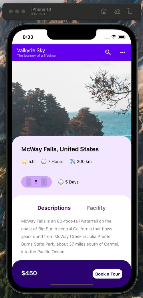
See the final design below:
Conclusion
As you can see, it is very simple to use CSS Modules within a React Native application. This was a fairly straightforward example; of course, the true power of CSS Modules becomes apparent when you have multiple files that all have components. Creating locally scoped styles will significantly improve the readability and cleanness of your codebase.
LogRocket: Full visibility into your web apps

LogRocket is a frontend application monitoring solution that lets you replay problems as if they happened in your own browser. Instead of guessing why errors happen, or asking users for screenshots and log dumps, LogRocket lets you replay the session to quickly understand what went wrong. It works perfectly with any app, regardless of framework, and has plugins to log additional context from Redux, Vuex, and @ngrx/store.
In addition to logging Redux actions and state, LogRocket records console logs, JavaScript errors, stacktraces, network requests/responses with headers + bodies, browser metadata, and custom logs. It also instruments the DOM to record the HTML and CSS on the page, recreating pixel-perfect videos of even the most complex single-page apps.


Top comments (0)