
Written by Emmanuel Odioko
✏️
CSS Houdini frees developers of the constraints associated with traditional CSS, enabling them to efficiently create unique designs and animations. CSS Houdini can extend CSS styling and even create new features that aren’t part of the standard CSS toolkit, all without the reduction in performance that’s associated with polyfills.
In this article, we’ll explore CSS Houdini's definition, functionality, and unique contributions to frontend development. We’ll also explore several use cases. It’s important to note that CSS Houdini is still in the experimental phase as of this writing, so it does not have full browser support.
Prerequisites
To follow along with this tutorial, you should have the following:
- Basic understanding of HTML, CSS, and JavaScript
- Familiarity with frontend development concepts (e.g., styling, layout, and animations) is helpful, but not required
What is CSS Houdini?
CSS Houdini is a set of APIs that expose parts of CSS engines. You can use these APIs to easily create extensions on top of CSS, building features that don’t currently exist and painting them to the browser.
Houdini extends CSS via JavaScript so that developers can create something new and implement it in the browser without waiting for a particular feature to be made available in CSS. Its APIs provide developers with direct entry into the CSS Object Model (CSSOM), empowering them to write code that the browser can interpret as CSS and enabling the creation of new CSS features.
You can think of Houdini as a low-level JavaScript API for the browser API engine, similar to how service workers are low-level APIs for JavaScript cache.
Some might argue that PostCSS transforms CSS and that there are also several JavaScript libraries that extend CSS. However, I would argue that those libraries just write JavaScript that mimics other things we already have with today’s CSS.
JavaScript enables developers to manipulate existing CSS styles through DOM interaction, but Houdini's APIs aim to allow developers to extend existing CSS capabilities and even create entirely new styles, unconstrained by limitations.
It’s important to reiterate that, at the time of writing, CSS Houdini’s APIs do not have full browser support, and some are still in the experimental phase.
Styling and layout before CSS Houdini
Before the introduction of CSS Houdini, web developers had to make do with using standard CSS to style and layout their webpages. JavaScript, although powerful for handling dynamic behavior, did not have direct access to the rendering engine or the ability to manipulate the CSS parsing process in a granular way.
Here's a very basic example of how developers handled dynamic styling with JavaScript prior to the introduction of CSS Houdini:
// Dynamic Styling with JavaScript
// Without CSS Houdini
// Change the color of an element using JavaScript

// <div id="myElement">Hello, World!</div>
const myElement = document.getElementById('myElement');
myElement.style.color = 'red';
With this approach, JavaScript is used to manipulate the inline style of an HTML element. However, this method is limited to basic properties, and extensive dynamic styling and manipulation of the rendering pipeline isn’t feasible.
Here’s a basic example where JavaScript is used to trigger a CSS-based animation:
// Animation without CSS Houdini
// Without CSS Houdini
// Create a simple animation using JavaScript and CSS

// <div id="animatedElement">Animate me!</div>
const animatedElement = document.getElementById('animatedElement');
function animateElement() {
  animatedElement.style.transition = 'all 2s';
  animatedElement.style.transform = 'translateX(200px)';
}
// Trigger the animation
animateElement();
While this approach provides a level of dynamism, developers are constrained by the predefined properties and the timing functions provided by CSS.
Why CSS Houdini?
CSS is continually evolving, but the pace of new feature introduction and adoption is often slow, leading to challenges in cross-browser compatibility. CSS features often take significant time to achieve widespread compatibility across different browsers. Some notable examples are: CSS flexbox, CSS grid, CSS Transitions and Animations, CSS Variables, and Custom Properties.
As web developers eagerly await widespread support for additional CSS features, they often rely on pieces of code, called polyfills, to fill the gaps in browser support. Polyfills enable the use of modern CSS properties and functionalities in browsers that do not natively support them, but they do come with their own set of minor performance drawbacks.
As an example, the flexbox property is widely supported in modern browsers, but older versions of Internet Explorer (IE 10 and below) have limited or no support. In such cases, a polyfill can be introduced to mimic the flexbox behavior in those browsers:
//Basic polyfill implementation

/* Flexbox Polyfill for IE 10 and below */
.flex-container {
  display: -ms-flexbox;
  -ms-flex-pack: justify;
}
.flex-item {
  -ms-flex: 1;
  margin: 10px;
}
CSS polyfills can be useful for extending the support of modern CSS features to older browsers, but they do have some drawbacks, including reduction in performance, increased page weight, maintenance challenges, browser-specific issues, and more. One notable drawback is the performance impact associated with re-rendering. This can limit the effectiveness of polyfills in certain scenarios.
The introduction of CSS Houdini was not a declaration of the failure of polyfills, but rather a strategic move toward a more versatile solution. The primary advantage of Houdini lies in its capacity to enhance styling processes, providing a more efficient and standardized approach. A secondary advantage is its ability to seamlessly create styles that transcend different browser environments.
How does browser rendering work?
To fully understand the need for CSS Houdini, we’ll need to consider a brief overview of the browser rendering process: 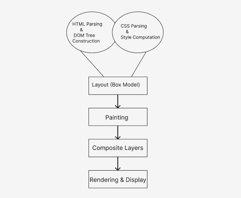 Let’s take a closer look at the browser rendering process for HTML parsing, as well as CSS parsing and style computation.
HTML parsing
The browser begins by fetching the HTML document from the server. The HTML parser reads and parses the HTML code to create a DOM tree, like so:
<!-- HTML document fetched from the server -->
<!DOCTYPE html>
<html>
<head>
    <title>Rendering Pipeline</title>
    <!-- Associated CSS stylesheet -->
    <link rel="stylesheet" type="text/css" href="styles.css">
</head>
<body>
    <div id="content">Hello, world!</div>
    <!-- JavaScript can manipulate the DOM after it's parsed -->
    <script src="script.js"></script>
</body>
</html>
CSS parsing and styling
Next, the browser fetches and parses the associated CSS stylesheets. The CSS parser generates a CSS Object Model (CSSOM). The DOM and CSSOM are combined to create the render tee, where each node represents a visible element along with its styles:
/* CSS stylesheets defining the appearance of elements */
#content {
    color: blue;
    font-size: 20px;
}
Layout (box model)
The render tree is used to create the box model, defining the position and size of each element on the page. The browser calculates the layout of elements based on their styles, dimensions, and relationships.
Painting
The browser starts painting the pixels on the screen according to the layout. Painting involves filling pixels with colors, images, and other visual properties.
Composite layers
Modern browsers often use hardware acceleration and create separate layers for certain elements (e.g., animations or transforms). These layers are composited to form the final rendered output, thereby enhancing performance.
Modern browsers often handle hardware acceleration automatically, but certain CSS properties trigger it. Here’s an example:
/* CSS triggering hardware acceleration with transforms */
#content {
    transform: translateZ(0);
}
Rendering and display
The final rendering and display are handled by the browser once all previous steps are completed.
How can developers interact with the rendering process?
Developers can manipulate and interact with some of the rendering pipeline at certain stages using JavaScript. Let’s see exactly where developers can intervene.
HTML parsing intervention
Developers can dynamically generate or modify HTML content using JavaScript, either before or after the initial HTML parsing by the browser:
document.body.innerHTML += '<div id="newElement">Dynamic Content</div>';
CSS styling intervention
JavaScript can dynamically add, remove, or modify CSS styles:
var element = document.getElementById('content');
element.style.color = 'red';
Layout (box model) intervention
Developers can dynamically change the layout by modifying CSS properties that affect the box model, such as width, height, margin, and padding:
var element = document.getElementById('content');
element.style.width = '300px';
Painting intervention
Developers have limited control over the painting process, but they can trigger repaints by changing certain styles:
var element = document.getElementById('content');
element.style.backgroundColor = 'yellow';
Rendering and display intervention
JavaScript can continue to manipulate the DOM even after initial rendering, responding to user interactions or events:
document.getElementById('content').addEventListener('click', function() {
    alert('Element Clicked!');
});
The seamless integration of JavaScript throughout the page load process showcases the immense potential of CSS Houdini which leverages JavaScript within the browser.
What are low-level APIs and worklets?
Low-level APIs provide a more direct interface to the browser's internal CSS engine, granting developers granular control over various CSS processes.
They enable developers to create custom properties, modify existing ones, define custom parsing and rendering rules, and even tap into the layout and paint cycles. These APIs form the foundation upon which higher-level features and tools are constructed, offering a deeper level of customization and control.
Worklets are similar to web workers in concept, letting developers run JavaScript code in the background, away from the main script. You can think of them as instructions for the browser's backstage crew, tailored for the styling and layout tasks that CSS Houdini focuses on. They essentially work with and enhance the browser's visual engine.
This background operation makes things happen at the same time, leading to a faster and more efficient performance. It's like having a specialized team working behind the scenes to improve the visual experience on a website.
Worklets operate independently, not connected to the main thread, and can be triggered at different stages in the rendering process. They're like modular components that seamlessly fit into the browser, making it easier for developers to implement advanced styling and layout features.
These modular components are effortlessly added and activated using a short line of JavaScript. This easy integration enhances the browser's capabilities, giving developers the power to improve web design and layout.
Let’s take a closer look at CSS Houdini’s low-level APIs and worklets.
Typed Object Model API
The Typed Object Model (Typed OM) API is part of CSS Houdini’s efforts to provide a low-level API for dealing with styles and layout in the browser. It allows developers to create and manipulate typed objects representing styles.
Before the Typed OM API, developers had to manipulate styles by dealing with strings. For example, to change a specific style property, you‘d need to parse the existing string, modify the value, and then set it back as a string:
// Manipulating styles as strings
const element = document.getElementById('myElement');
let currentWidth = element.style.width; // Get the current width as a string
currentWidth = parseInt(currentWidth); // Convert to a number
const newWidth = currentWidth + 50;
element.style.width = newWidth + 'px'; // Set the new width as a string
This process was not very efficient and was often prone to errors. Also, manipulating styles as strings didn't provide type safety. Developers had to be cautious about data types and ensure that the correct units and values were used.
The Typed OM API introduces a more structured and type-safe way to work with styles in JavaScript. There are a few steps to implement it, and the process may vary depending on your specific use case.
Before using the Typed OM API, perform feature detection to ensure your browser supports it. You can use JavaScript to check the availability of specific Typed OM features or objects:
if ('CSSStyleValue' in window) {
  // Typed OM is supported
} else {
  // Fallback or inform the user
}
Next, modify your stylesheets to use properties that are compatible with the Typed OM API. For example, instead of directly using strings for styles, consider using the Typed OM-compatible objects.
Now, identify areas in your JavaScript code where you can replace traditional string-based style manipulations with the Typed OM. Update your code to use the Typed OM API for style-related operations.
You can use the Typed OM methods to retrieve and update styles in a type-safe manner. For example, use get to retrieve a style value as a Typed OM object and set to update a style:
const styles = element.attributeStyleMap;
const currentWidth = styles.get('width');
const newWidth = currentWidth.add(50);
styles.set('width', newWidth);
Below is a simple example showcasing the use of the Typed OM API to change the height and width of an element:
...
    <title>Typed OM Example</title>
<body>
    <div id="container" class="container">
    </div>
    <script src="script.js"></script>
</body>
...
.container{
  height: 200px;
  width: 200px;
  background-color: brown;
}
Here’s the initial container: 
// Select the container using JavaScript
var container = document.getElementById("container");

// Log the type of height and width styles
console.log("Type of container.style.height:", typeof container.style.height);
console.log("Type of container.style.width:", typeof container.style.width);

// Log the computed styles using Typed OM
console.log("Computed height:", container.computedStyleMap().get("height"));
console.log("Computed width:", container.computedStyleMap().get("width"));
console.log("Computed width value:", container.computedStyleMap().get("width").value);

// Set the height and width using Typed OM
container.attributeStyleMap.set("height", CSS.px(400));
container.attributeStyleMap.set("width", CSS.px(400));

// Log the updated computed styles
console.log("Updated height:", container.computedStyleMap().get("height"));
console.log("Updated width:", container.computedStyleMap().get("width"));
Here’s the container with updated height and width: 
Properties and Values API
Houdini's Properties and Values API takes CSS variables to a higher level of flexibility and control. Unlike traditional variables, it empowers developers to define data types, set default values, manage inheritance, and even animate these variables.
This enhancement results in more dependable code, adaptable design patterns, dynamic animations, and improved testing capabilities. Features like the registerProperty() method and the @property rule enable developers to easily register and use the full potential of these customizable properties.
This API not only simplifies the code, it also opens up new possibilities for creating expressive and responsive designs. Here are some of its features:
- Type checking: Enables you to define valid data types for your custom properties (e.g., integer) and also catch typos and unexpected values that can break styling
- Default values: Allows you to specify a fallback value if a custom property isn't explicitly set; this feature improves consistency and avoids unexpected rendering bugs
- Inheritance control: Permits you to choose whether your custom property inherits its value from its parent elements, like regular variables
- Animation and translation support: Enables you to animate and transition custom properties alongside other CSS properties and create dynamic and interactive effects
Let’s take a look at how the Properties and Values API is implemented:
<html>
<head>
  <title>Properties and Values API Example</title>
  <link rel="stylesheet" href="styles.css">
</head>
<body>
  <button id="change-color">Change Color</button>
  <div class="box">This box will change color.</div>
  <script src="script.js"></script>
</body>
</html>
@property --custom-color {
  syntax: '<color>';
  initial-value: blue;
  inherits: false;
}
.box {
  width: 100px;
  height: 100px;
  background-color: var(--custom-color);
  transition: background-color 0.5s ease-in-out; /* Enable smooth color transitions */
}
In the above code, the @property at-rule defines a custom property named --custom-color with a default value of blue and inheritance disabled. The .box class applies a background color using var(--custom-color), referencing the custom property. The transition property enables smooth color changes.
The following JavaScript code gets references to the button and the box element:
const button = document.getElementById('change-color');
const box = document.querySelector('.box');
button.addEventListener('click', () => {
  const newColor = 'red'; // Or any other valid color value
  box.style.setProperty('--custom-color', newColor);
});
Here, an event listener is attached to the button. Clicking the button triggers the JavaScript code to update the custom propery’s value; the --custom-color property is set to a new color (red) using style.setProperty(). The browser detects the change and applies the new color to the box element in a smooth transition.
We can take this example a step further by animating it, like so:
<!DOCTYPE html>
<html lang="en">
<head>
  <meta charset="UTF-8">
  <meta name="viewport" content="width=device-width, initial-scale=1.0">
  <title>Colorful Box Animation</title>
  <link rel="stylesheet" href="styles.css">
</head>
<body>
  <div class="container">
    <h1>Colorful Box Animation</h1>
    <div class="box" id="colorful-box">This box will change color.</div>
    <div class="buttons">
      <button id="change-color">Change Color</button>
      <button id="toggle-rainbow">Toggle Rainbow</button>
    </div>
  </div>
  <script src="script.js"></script>
</body>
</html>
@property --hue-offset {
  syntax: '<number>';
  initial-value: 0;
  inherits: false;
}
body {
  margin: 0;
  display: flex;
  justify-content: center;
  align-items: center;
  height: 100vh;
  background-color: #f0f0f0;
}
.container {
  text-align: center;
  padding: 20px;
  background-color: #fff;
  box-shadow: 0 4px 8px rgba(0, 0, 0, 0.1);
  border-radius: 8px;
}
h1 {
  color: #333;
}
.box {
  width: 300px;
  height: 300px;
  background-color: hsl(var(--hue-offset), 80%, 50%);
  border-radius: 8px;
  margin: 20px 0;
  display: flex;
  align-items: center;
  justify-content: center;
  font-size: 1.5rem;
  font-weight: bold;
  color: #fff;
  text-shadow: 1px 1px 2px rgba(0, 0, 0, 0.5);
  transition: background-color 0.3s ease-in-out;
  animation: rainbow 3s infinite ease-in-out;
}
@keyframes rainbow {
  0% { --hue-offset: 0; }
  100% { --hue-offset: 360; }
}
.active {
  animation: none;
}
.buttons button {
  background-color: #4caf50;
  color: #fff;
  padding: 10px 20px;
  font-size: 1rem;
  border: none;
  border-radius: 4px;
  cursor: pointer;
  margin: 0 10px;
  transition: background-color 0.3s ease-in-out;
}
.buttons button:hover {
  background-color: #45a049;
}
const changeColorButton = document.getElementById('change-color');
const toggleRainbowButton = document.getElementById('toggle-rainbow');
const colorfulBox = document.getElementById('colorful-box');
changeColorButton.addEventListener('click', () => {
  const newColor = 'indigo';
  colorfulBox.style.setProperty('--custom-color', newColor);
});
toggleRainbowButton.addEventListener('click', () => {
  colorfulBox.classList.toggle('active');
});
This code sets up functionality for a simple webpage with three elements: a button to change the color of a box, a button to toggle a "rainbow" effect on the box, and the box itself.
When the changeColorButton is clicked, an event listener changes the custom CSS property '--custom-color of the colorfulBox to indigo, effectively changing the background color of the box.
The toggleRainbowButton is linked to another event listener, which toggles the active class on the colorfulBox when the button is clicked. This class contains CSS rules to create a rainbow effect on the box, giving the user the ability to switch the visual appearance of the box between a static color and a dynamic, rainbow-like display.
Here‘s the box, animated to dynamically change colors: 
Font Metrics API
The Font Metrics API is a proposed interface that exposes font metrics, offering access to typographic layout results. It is intended to provide detailed information about font and other relevant parameters, helping developers achieve precise text layout in web applications.
As of this writing, this API lacks browser implementations and comprehensive documentation and, due to its proposed status, is not currently supported in browsers.
Painting API
The CSS Houdini Painting API enables developers to define how an element is painted on the screen. It provides a way to create custom graphics, background images, and visual effects that go beyond the capabilities of traditional CSS.
The primary purpose of the Painting API is to give developers more control over the rendering process of elements. With traditional CSS, developers are limited to a predefined set of properties for styling.
The Painting API breaks through these limitations by enabling the creation of custom paint worklets, which are JavaScript modules defining how an element should be painted. CSS Houdini's paint worklet is automatically enabled in Chrome 65+, so you can easily add custom images without relying on external files or predefined functions.
To use the Painting API, you’ll need to follow a specific workflow:
- Define a paint worklet: A paint worklet is a JavaScript module that defines the custom painting logic. This module should implement a paint method, which receives a
CanvasRenderingContext2Dcontext and other parameters - Register the paint worklet: Use
CSS.paintWorklet.addModuleto register the paint worklet with the browser. This is an asynchronous operation, so you should wait for the promise to resolve before applying the custom paint logic - Use CSS properties: Define CSS custom properties that can be dynamically updated to influence the custom painting logic
- Apply the paint worklet: Apply the custom paint worklet to specific elements using CSS properties
Let's take a look at a simple example using the Painting API to draw a gradient background dynamically. We'll create a custom paint worklet that takes two colors as input and draws a linear gradient:
&<!DOCTYPE html>
 HTML <html lang="en">
<head>
  <meta charset="UTF-8">
  <meta name="viewport" content="width=device-width, initial-scale=1.0">
  <link rel="stylesheet" href="styles.css">
  <title>Painting API Example</title>
</head>
<body>
  <div class="custom-element"></div>
  <script src="script.js"></script>
</body>
</html>
CSS (styles.css):
body {
    width: 100%;
    height: 100%;
    background-image: paint(gradient);
  }
JavaScript (script.js)
CSS.paintWorklet.addModule('paint-worklet.js').then(() => {
    console.log('Paint worklet module loaded.');
  });

JavaScript (paint-worklet.js)
registerPaint('gradient', class {
    paint(ctx, size) {
      const gradient = ctx.createLinearGradient(0, 0, size.width, size.height);
      gradient.addColorStop(0, 'red');
      gradient.addColorStop(1, 'blue');

      ctx.fillStyle = gradient;
      ctx.fillRect(0, 0, size.width, size.height);
    }
  });
Here’s the resulting gradient:  Now, let’s look at a different example using a paint worklet to create an animation:
<head>
  <link rel="stylesheet" href="./styles.css" />
</head>
<body>
  <div id="example" class="background">
    Paint worklet, Logrocket's Example!
  </div>
  <script>
    if (!CSS.paintWorklet) {
      document.body.innerHTML("PaintWorklet not supported by this browser");
    }
    async function init() {
      await CSS.paintWorklet.addModule("./paint-worklet.js");
      const example = document.querySelector("#example");
      let start = performance.now();
      let x, y;
      document.querySelector("#example").addEventListener("click", evt => {
        example.classList.add("animating");
        [x, y] = [evt.clientX, evt.clientY];
        start = performance.now();
        requestAnimationFrame(function raf(now) {
          const count = Math.floor(now - start);
          example.style.cssText = `--animation-tick: ${count};`;
          if (count > 4000) {
            example.classList.remove("animating");
            example.style.cssText = `--animation-tick: 0; background-color: red;`; // Change background color here
            return;
          }
          requestAnimationFrame(raf);
        });
      });
    }
    init();
  </script>
</body>
</html>
.background {
  width: 100vw;
  height: 100vh;
  font-size: 3rem;
  background-color: rgb(72, 79, 84);
  display: flex;
  justify-content: space-around;
  align-items: center;
  font-family: Arial, Helvetica, sans-serif;
  color: rgb(214, 219, 224);
  text-align: center;
  cursor: pointer;
  /* Required for animation by the worklet */
  --animation-tick: 1;
}
.background.animating {
  background-image: paint(custom-animation);
}
body,
html {
  padding: 0;
  margin: 0;
}
// paint-worklet.js
registerPaint('custom-animation', class {
  static get inputProperties() {
    return ['--animation-tick'];
  }
  paint(ctx, size, properties) {
    const tick = parseInt(properties.get('--animation-tick').toString()) || 0;
    const centerX = size.width / 2;
    const centerY = size.height / 2;
    ctx.clearRect(0, 0, size.width, size.height);
    for (let i = 0; i < 10; i++) {
      const radius = i * 10 + tick / 10;
      const opacity = 1 - i / 10;
      ctx.beginPath();
      ctx.arc(centerX, centerY, radius, 0, 2 * Math.PI);
      ctx.fillStyle = `rgba(255, 255, 255, ${opacity})`;
      ctx.fill();
    }
  }
});
Here’s the resulting animation:  When the document is loaded, the code checks if the browser supports the Painting API. If it’s supported, it initializes the custom animation by loading the paint worklet module. When the
 #example element is clicked, it triggers an animation effect using the custom paint worklet. The custom paint worklet creates a dynamic animation with concentric circles based on the --animation-tick value.
Animation Worklet API
The Animation Worklet API is part of the CSS Houdini initiative and provides a way to create custom animations that run in a dedicated worklet thread. Offloading animation calculations to a separate thread can help improve performance and avoid jank or stuttering in complex animations.
You’ll need to first register an animation worklet using the registerAnimator function. This associates a custom animation class with a name that can be used in CSS:
// animation-worklet.js
registerAnimator('customAnimation', class {
  animate(currentTime, effect) {
    // Custom animation logic
    // Update the state of the animated element based on the currentTime
  }
});
Once the animation worklet is registered, it can be referenced in CSS using the animation property:
CSS
.element {
  animation: customAnimation 3s linear infinite;
}
In this example, the animation worklet was registered with the name customAnimation. Unfortunately, there is currently little or no support for this API:
<script>
    // Check if animationWorklet is supported
    if (CSS.animationWorklet) {
      // Animation Worklet is supported
      console.log("AnimationWorklet is supported in this browser");
    } else {
      // Animation Worklet is not supported
      document.body.innerHTML = "AnimationWorklet not supported by this browser";
    }
  </script>

Limitations of CSS Houdini
At the time of writing, there are some common limitations associated with CSS Houdini:
- Browser support: Some browsers, such as Chrome and Firefox, have implemented certain aspects of CSS Houdini, but others lag behind
- Incomplete specification: As CSS Houdini is still evolving, some parts of the specification are not finalized; certain features may change or be subject to updates in future releases
- Security concerns: Extending and manipulating the rendering process raises potential security concerns. Browsers must carefully manage CSS Houdini’s APIs to prevent malicious use or unintended side effects; this may be why browser adoption is moving slowly
- Learning curve: Working with CSS Houdini requires a solid understanding of web technologies, CSS, and JavaScript. The learning curve can be a bit much for developers who are new to these concepts
- Limited documentation: At the time of writing, the documentation for CSS Houdini is not as extensive or well-established as that of other web technologies. Developers looking for help may have difficulty finding adequate resources
Conclusion
CSS Houdini has emerged as a powerful toolset that revolutionizes the way developers approach styling and layout on the web. CSS Houdini’s APIs empower developers to extend the capabilities of the browser, providing a level of customization and creativity previously unseen in the history of traditional CSS.
The magic the CSS Houdini aims to perform is reminiscent of the famous illusionist. Its creativity and flexibility will help developers to break free from the constraints of predefined styles and animations, fostering innovation and unique design solutions. Keep coding!
Is your frontend hogging your users' CPU?
As web frontends get increasingly complex, resource-greedy features demand more and more from the browser. If you’re interested in monitoring and tracking client-side CPU usage, memory usage, and more for all of your users in production, try LogRocket.

LogRocket is like a DVR for web and mobile apps, recording everything that happens in your web app, mobile app, or website. Instead of guessing why problems happen, you can aggregate and report on key frontend performance metrics, replay user sessions along with application state, log network requests, and automatically surface all errors.
Modernize how you debug web and mobile apps — Start monitoring for free.


Top comments (0)